

Introduction
Billions of people access the Internet from devices with all different screen sizes. To assure a good looking, usable website on every single device, it's gotta be responsive. And a flexible, adjustable layout is the core of any responsive design. The little demo below shows how the size and position of the page elements change — how they "respond" to size changes of the display area. Go ahead now, grab the slider and let it rip!
Demo 1: Grab the slider to see how the layout of this wireframe adapts to smaller screens.
Responsive Layout Maker (RLM) is currently the only App that supports this fundamental part of the responsive web design workflow. With the drag-and-drop visual workspace for adding content and creating custom breakpoints, designers, developers and even content creators, can prototype interactive and responsive wireframes. The end result is a fully custom responsive layout design tailored around unique content and business needs, with code that is crisp, clean and production ready.
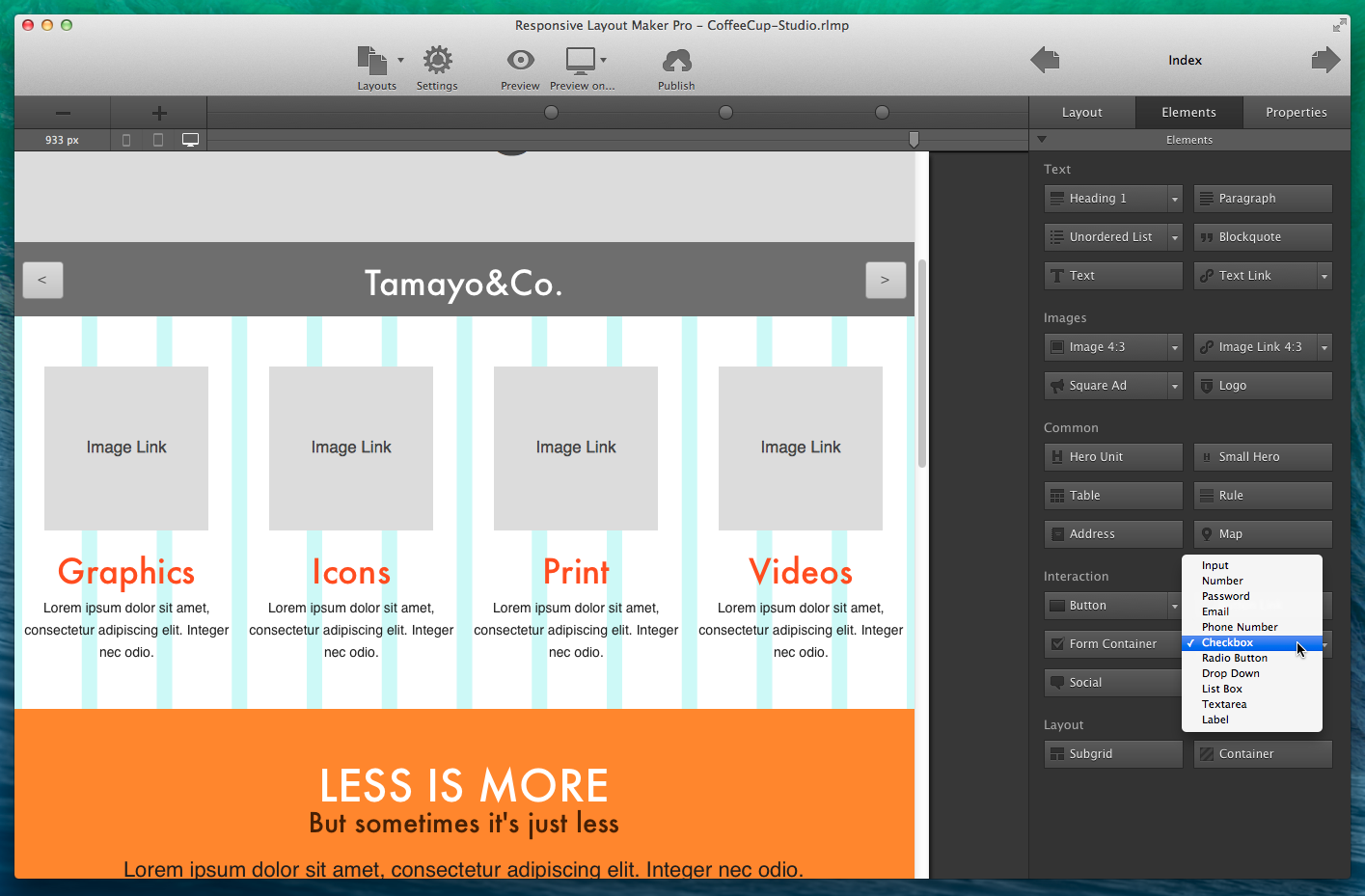
Figure 1: Responsive Layout Maker Pro — a truly unique piece of software
Responsive Layout Maker is a versatile App that can be used to:
- Design custom responsive layouts around unique content and business needs (don't cram it into a rigid template).
- Prototype responsive design scenarios and create web site wireframes in an actual browser.
- Mock up site pages or full websites by dragging and dropping site elements.
- Facilitate client interaction and collaboration by demonstrating functional and responsive interactive website wireframes.
- Prototype complex (and simple) responsive behavior and actions by:
- Resizing the viewport to see what your content looks like at any screen size.
- Adding custom breakpoints for full layout control at any screen size.
- Defining major responsive actions like column width changes, column swaps, stacking and more.
- Customizing element properties like font sizes for content driven design adjustments.
- Create bulletproof, production ready layout designs (export, just add content and color and voila, your responsive site is ready).
That‘s right, throw away the pen and paper sketches. Restructure as you go and use the exported layout to build your responsive site with the HTML Editor, Web Editor, or any other Editor. Impress clients with an interactive, responsive, functioning wireframe and get projects in at a premium, while reusing the code. Yup, no recoding, double work or eraser needed!
Working with Layout Maker can be broken down in 5 main functions. Each function or step is explained in one of the next Chapters, give them a quick read, so you can hit the responsive web running.
TABLE OF CONTENTS
Chapter 1: Managing rows and columns using the layout controls.
Chapter 2: Adding content elements like paragraphs, buttons and images
Chapter 3: Adjusting element styles and perfecting the layout design.
Chapter 4: Responsify the layout design with custom breakpoints.
Chapter 5: Explanation of responsive terms and functions.
Chapter 6: Responsive Layout Maker VS Responsive Layout Maker Pro
Chapter 7: How-to's and Resources.
Chapter 8: Exporting/Publishing with Responsive Layout Maker