

A solid, custom, responsive layout design in 9 simple steps
This article will teach you how to create a structure of a responsive page design, focusing only on the placement of the content without applying any design styles. We’ll show you how to drop-in page components like headings, paragraphs, images, and buttons on the flexible canvas, use the slider to change the display width, and make layout changes where needed with just a few clicks. Learning these skills is an important first step in mastering responsive design.
Before we start, it is good to note that bullet-proof responsive layouts are built with a grid system. A grid consists of rows and columns, very similar to a spreadsheet. This helps to keep the content organized and displayed correctly, independent of device or screen size. A grid system also helps to make easy, fast, and predictable layout adjustments, for when content is added or when the available display size changes.
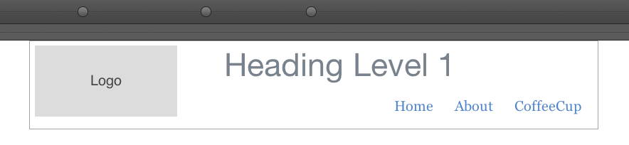
The columns are placed in rows and can vary in width. The actual content elements like logos, headings, links and so on can be ‘dropped’ in the columns.
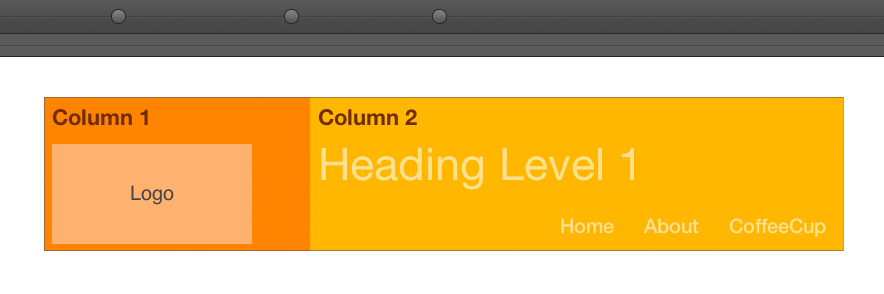
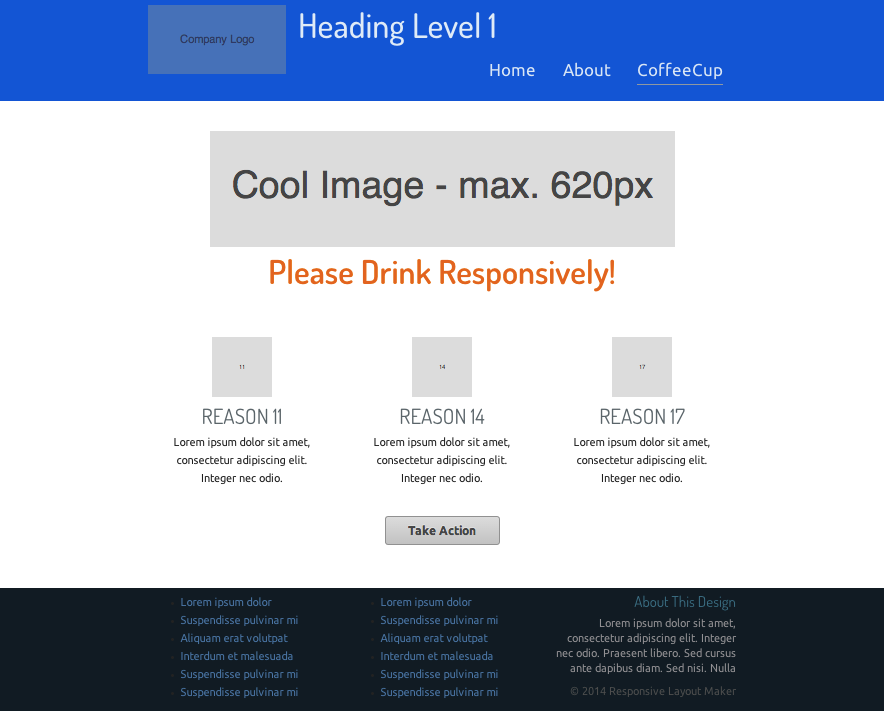
The figure above shows a row with 2 columns. The 1st (dark orange) column contains the logo. The 2nd (lighter orange) column contains the header text and navigation menu links. Columns can be easily positioned below each other, giving us design flexibility when we want to adjust the layout for optimal use on small screens. How this works will be clear in just a few minutes!
Ready? Let’s go!
Step 1: Managing Rows and Columns
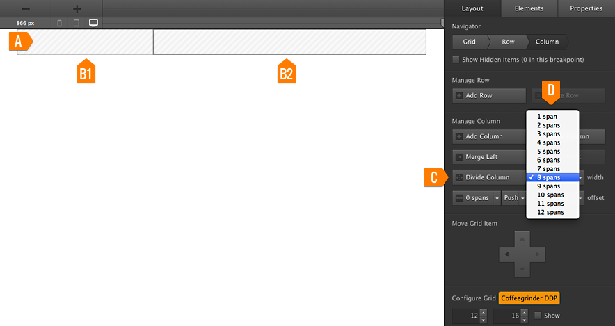
Let’s start by dividing the 1st Row (a) into the desired number of Columns (b1 and b2). This can be done by clicking on the column and pressing the “Divide Column” (c) button. The width of each column can be changed using the “Span Width” (d) drop down right next to it.
For this design we are going to need 2 columns in this (header) row. The 1st column will contain the Logo and take up a width of 4 spans. The 2nd column will contain heading text, a few navigation links and takes up the rest of the row (8 spans).
The empty columns will be filled with content in the next step. If you’re interested you can read a little more about how a grid system works before we continue.
Grid configuration and column flow
It is easy to configure the grid according to preferences or design needs. In this case we are using a 12 column grid. If the total column spans exceed that number, the last column(s) automatically flow below the 1st column. This natural behavior comes in really handy when we want to make layout adjustments for smaller screens. We will come back to this in Step 8. More information about grids and grid systems is available here »
Step 2: Adding Content Elements
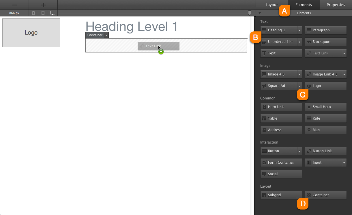
The content elements can now be dropped into the 2 containers. Click on the “Elements Pane” (a) to see a whole collection of different content elements. Let’s make the 1st drop really easy: choose the “Heading” (b) button on the top-left, click and drag the button onto the 2nd column. Pooofff, the heading is in place...sweet!
Now do the same for “Logo” element (look for it in the “Image” group (c)).
2.1
The navigation links will be grouped in their own container. This is not strictly necessary, but it gives us more flexibility later, like for example customizing the background. The “Container” (D) element can be found at the bottom right of the pane . Go ahead and drop it below the heading in the 2nd column. Then grab a “Text Link” and drop it into the container.
Step 3: Adjusting Content Elements
Building a simple navigation menu is straightforward. For making a more sophisticated responsive drop down menu we recommend downloading Menu Builder.
Double-click the text link that was just dropped in the container. This will make the right-side control panel switch to the properties pane. Let’s start by giving the element a clear “Class Name” like for example nav-link (a). We know that we will be adding more navigation links and that we don’t want them to bump into each other, so let’s go ahead and add some left and right margins (b).
The links will be positioned on the right of the page. Hit the “Float-right” button (c) and the link moves to the desired position.
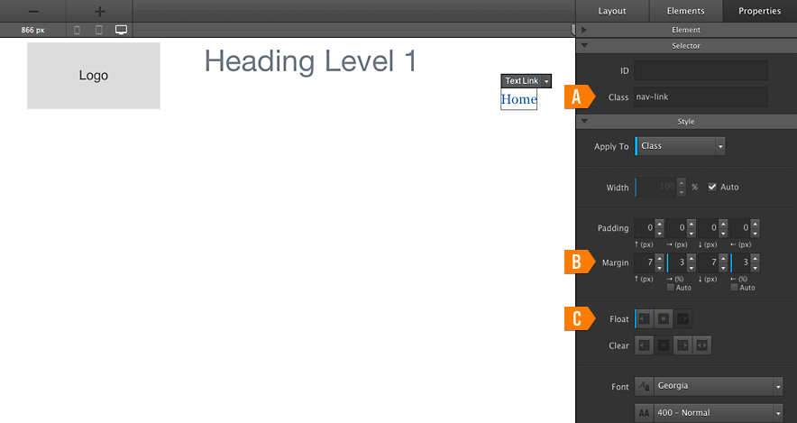
For more links simply click the “Duplicate” button at the top of the properties pane. The cool thing is that since they share the same class any tweaks will automatically apply to all links! Go ahead, select a link and increase the font size (this control can be found right below the float button (c) we just used) to 16px. You will see that the font sizes of all links will increase at the same time. The link text can be changed at the top of the properties pane (if needed).
That’s it — the header row is ready!
Semantic HTML is awesome
If we want to be fancy pansy, we should make the HTML for the various container elements semantic. The row tag can be switched to header using the “Change Tag” drop down at the top of the properties pane. The container with the navigation links can be changed to sementic “nav” element.
Using semantic HTML is important, but not as important as making sure that your site displays correctly and is usable on all device sizes, so let’s continue with our responsive layout design!
Step 4: Adding a ‘Main’ Section
The purpose of this section of a design is to immediately grab the attention of the visitor and make a favorable, lasting impression. Most often this is done by using a large polished image or a cool animation. Frequently this section also contains a slogan and/or call to action.
We are going to add a nice big centered image with a width of 600px (on large screens). Start by adding a row on the “Layout Pane”. We only need a single column so after this we can jump straight to the “Elements Pane”. Drag and drop a 4:3 image from the image group and double-click the image. This brings up the powerful “Properties Pane”.
To increase the image size we need to increase the “Max-width” (a) from 200px to 600px. To center the image check the “Margin Auto” check boxes (b) and change the “Display Property” to block (c). Done!
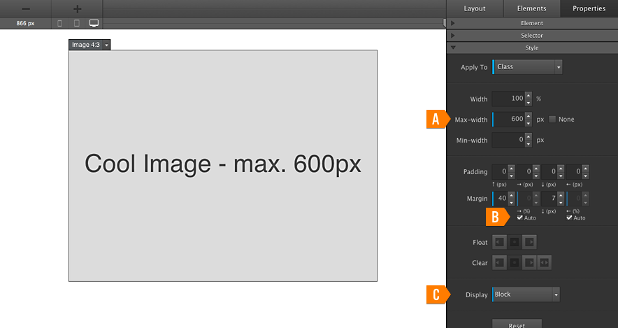
For a finishing touch let’s add some margin to the top (40px in the example) and give the image a meaningful class name.
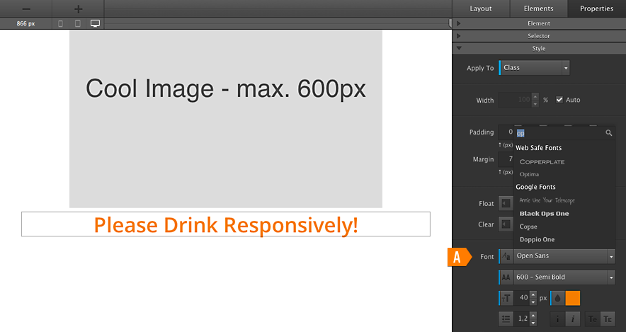
Depending on the purpose and needs, additional elements can be added to the main section. A catchphrase is for example easy to add by dropping a heading element. Our apps incorporate a number of cool typographical controls, including Google Fonts integration (a), for customizing text. This is a bit beyond the scope of this tutorial, but finding your way around there is fun & easy. Just play around and all will be clear!
Step 5: Adding ’Support’ Sections
These sections are used to reinforce messages, convey additional information, spark interest in related items, and so on. In this design we are going to use 3 columns with some additional information.
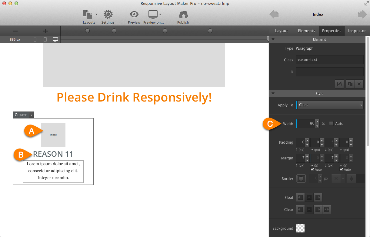
Add a row and change the column span to 4. This will leave room for 2 additional columns with the same width. Select a 1:1 Image from the image drop down, then drag it into the column. Adjust the max-width to 80px and center the image (a) following the same steps as above (margin: auto; display: block).
Now select a Heading 4 and drop it below the image (b). In the fonts area on the properties pane press the “Align: center” button and make further customizations as desired (I am using Open Sans at 25px and a grey/blue color).
Lastly drop a Paragraph below the heading and customize as needed. Edit the text to your desired wording by double clicking the Paragraph Element, adjusting the width to 80% (C) and centering the text to provide a nice effect. Row 3 - Column 1 is done!
Here comes the really easy part: select the column and hit “Duplicate” twice. Voila, a very well balanced support section has been born.
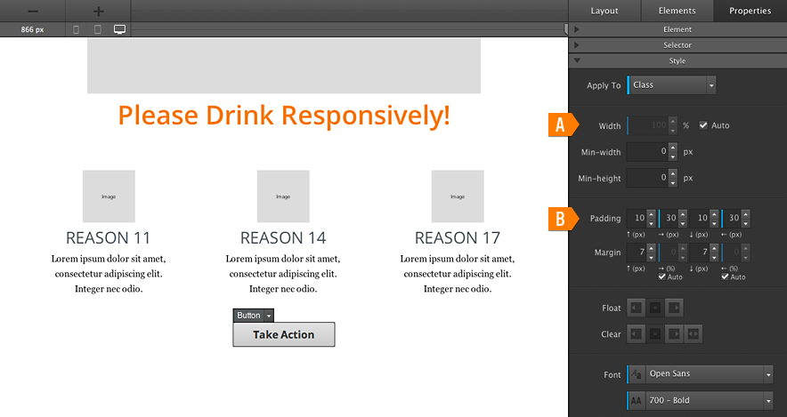
Step 6: Adding a ‘Call to Action’
Add another row and drag in a Button element. Give the button a meaningful class on the “Properties Pane”. Then change the width to auto (a) and add some left and right padding (b). Now all that is left is centering the button (same settings as centering an image), and customizing the button text and font properties.
Some top margin can be added to the (row) element as needed. Kabaaaam, another step squared away!
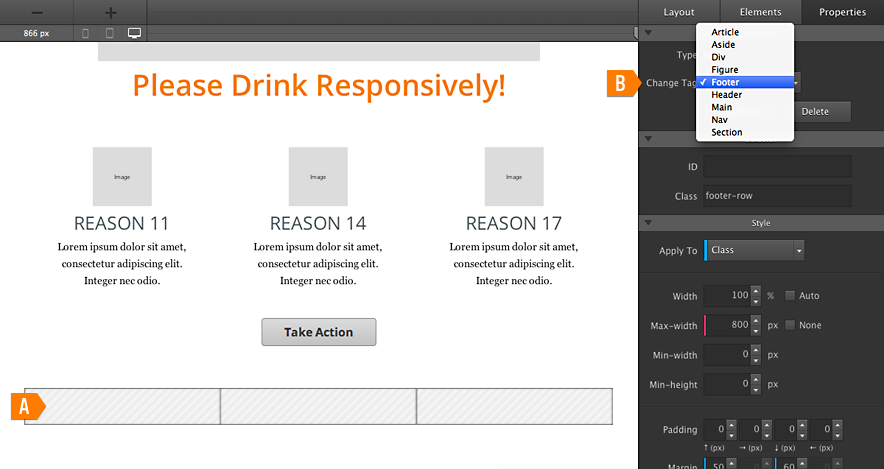
Step 7: Adding a Footer.
Add another row and divide it into 3 columns (a) each 4 spans wide. (You might want to change the tag to footer (b) while you have the row still selected.) Now go to the “Elements Pane” and switch the text link to an “Unordered List” using the arrow on the button. Then drag the “UL Link” element into the 1st and 2nd column. Adjust the number of list elements, number of words and other properties on the “Properties Pane” as needed.
Let’s quickly design an awesome 3rd column: respectively drop a Heading 6, a Paragraph and a Text element. On the properties tab adjust each element as needed. In this design the text is right-aligned, with some tweaks to the font sizes and color. (You can grab the project file below to view the settings).
This means that the core layout is complete — in just 7 short and simple steps! Now let’s do what we came here for: we’re gonna make sure that our layout design looks awesome on, and adapts nicely to, every possible screen width. From Google Glass to a 56-inch screen and back.
Step 8: Let it rip!
Grab the slider (a) and move it to the left. Everything looking good? Continue!
As soon as the content starts feeling crammed together, or the layout otherwise looses its appeal, add a breakpoint (b) by hitting the plus sign (c).
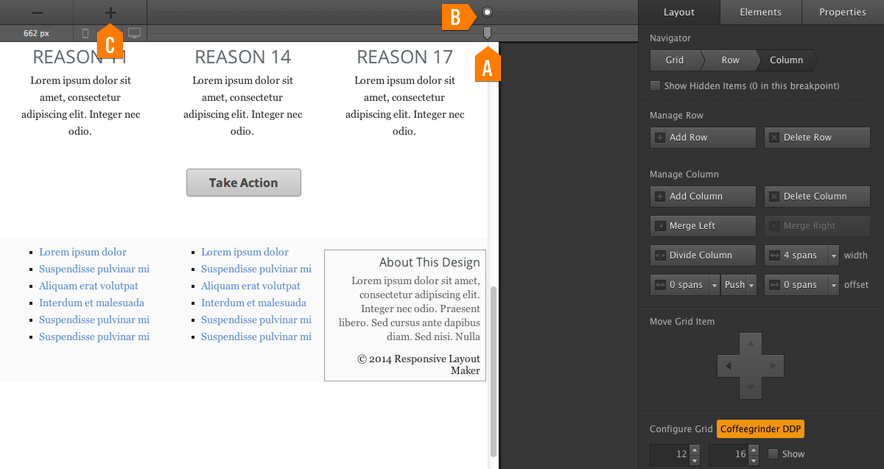
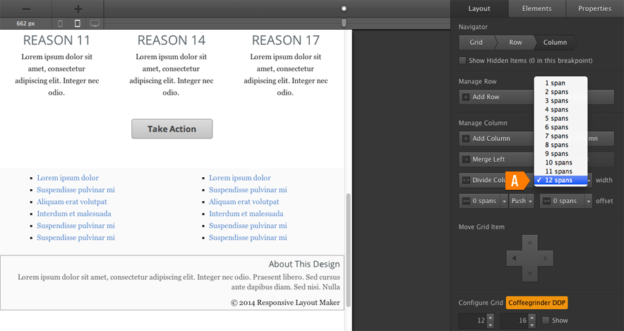
In this design it is the footer that starts feeling suboptimal 1st. This happens at a display width of about 660px. With RLM this is a 2 minute fix (at most), so don’t hesitate to add a breakpoint and make design tweaks at the very first feeling of discomfort.
Here’s the fix: Select the 1st footer column and change the span width to 6. Do the same for the 2nd column. Now select the 3rd column and change the span width to 12 (a). Problem solved — in what, 30 seconds? How cool is that!?
Step 9: Keep Responsifying…
Now that we’ve had a 1st taste, it is impossible to stop! So let’s continue sliding and whenever we feel slightly unhappy with our layout, we add a breakpoint and provide a fix. Here are a few things I did to keep the layout look good ‘all the way’.
9.1
At the 514px breakpoint the font size of the main heading is decreased. This prevents it from wrapping and pushing the other elements down. Also, the columns in the supporting section are all using a full (12 span) width when the display size is below 514px.
Some top margins have been decreased in order to ‘pull content up’ and prevent unnecessary scrolling.
9.2 - more responsification...
At the 341px breakpoint the 2 columns in the header row are instructed to take up the full width. The image and header are centered (using margin:auto, display:block).
That’s it! A bulletproof responsive layout design that looks good on each and every device in just 9 quick steps. Impressed? Then come over and pay praise to this powerful guy (or take it for a complementary spin and start crackin’ out responsive layouts like a boss too).
The project:
Download the ‘No-Sweat’ TemplateA little demo of the ‘No-Sweat’ design.
Bonus: A Stretching Header (and footer)
Page elements that take up the full width of the display window can be a nice aesthetic addition to a layout design. The content stays centered, and usuable. and seems to be positioned on top of an element with a background (video, image or simply a color) the keeps growing.
Creating these designs with Responsive Site Designer is painless. Setting the width of the header row to “None” removes the width limitation. The content can be centered by adding a subgrid. Simply drag the content into the subgrid and the basis of the updated design is ready. The width of the subgrid row(s) can be controlled individualy. Background colors (or images) can be used for a nice visual effect. The updated project can be previewed here or downloaded below to view the details.
Typography is design...
But since different font settings take up different amounts of space, they have a direct impact on the layout and responsive behavior. That’s why we felt advanced font controls have a place in a responsive prototyping and layout creation app. In this extended example I took advantage of the Google Font integration and added spice by using Dosis for the headings and Ubunto for the paragraphs. If you’re looking for more cool font combos you should check out this article from the talented inSquare Media people.