

Customizing Content and Styles
Each element, including the grid itself, the rows and columns, can be customized. These customization options are located on the Properties Pane. Depending on the selection, a different set of controls is available.

Did you know?
Need even more advanced design powers? Responsive Layout Maker Pro has a bunch of other controls, so it might be the one for you.
The customization options Layout Maker offers have been created from a layout creation perspective and based upon a prototyping / wireframing workflow. Text for heading elements can for example be edited, allowing for content-driven prototyping and the creation of meaningful wireframes. In addition a number of font-style controls like size and line-height are available for making production ready responsive layouts. However, full design oriented controls like font-shadow are beyond the scope of Layout Maker.
The properties pane consists of three areas, the Element, the Selector, and the Style area. Each area can be collapsed by clicking on the little black arrow.
The Element Area
For each element type, the selected type is shown at the top of the pane, a different set of controls is available here. Figure 2 shows a couple of variations.
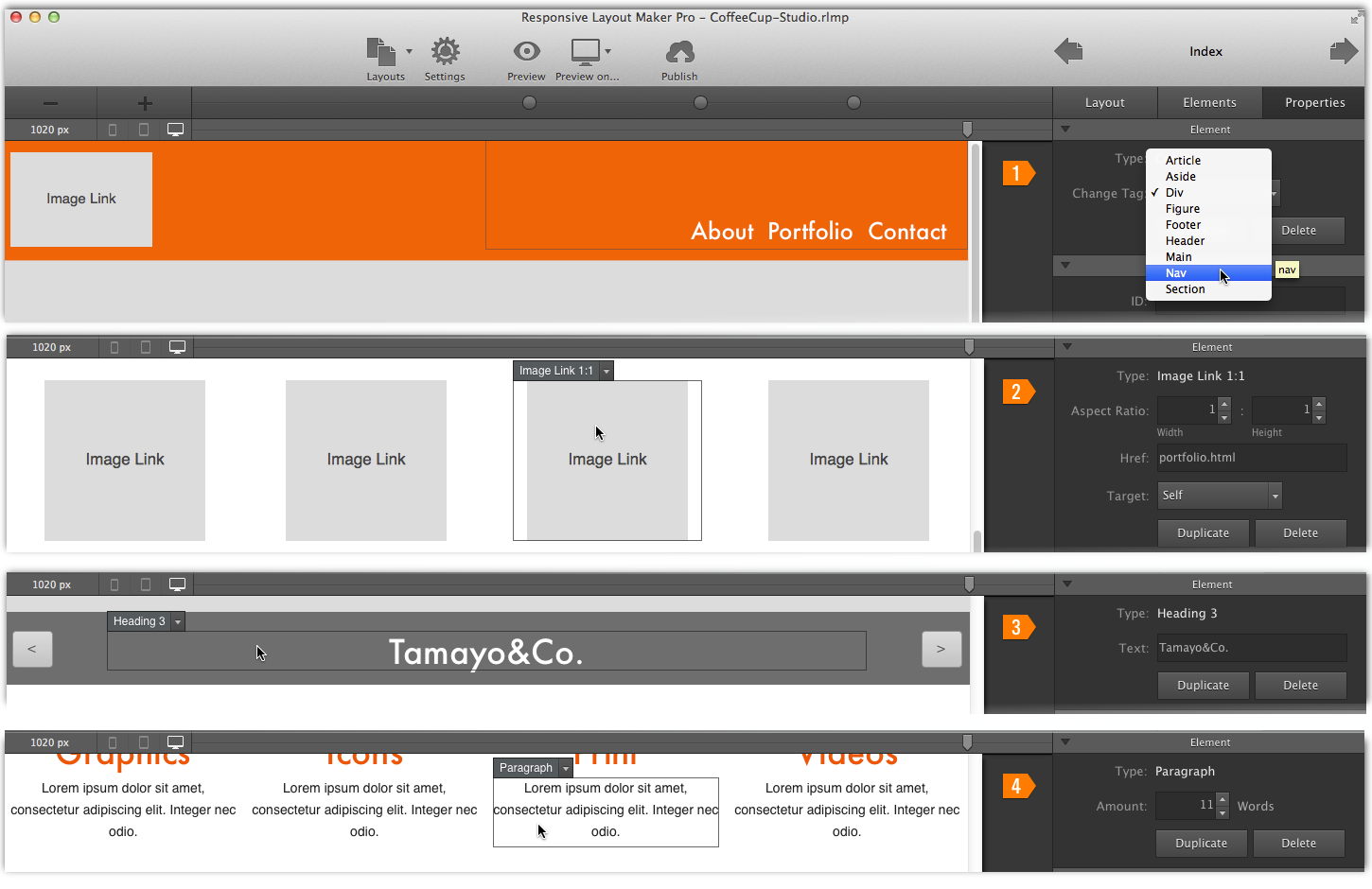
For elements who's main function it is to hold or 'contain' other elements, the tags can be changed to semantically describe the function of the element. A column that holds the navigation elements can made a nav element (example 1 in Figure 2), a container who's purpose it is to hold an image can be tagged with figure, and so on.
For heading elements the text can be changed by triple clicking the element (example 3) which will bring up the text editor pane. Paragraph (example 4) and links can be edited in the same way. (example 2). Just select any element, see what the options are, and tweak to your liking, the interface will make it easy.
For image (placeholders) the aspect ratio can be defined. Make sure that this ratio resembles the aspect ratio of the images you intend to use later in the website. Also note that the text and settings configured in the elements area are the same for the entire display spectrum, making a change here will have the same effect on every screen width.
The Selector Area
The IDs and Classes for elements are automatically generated when style changes are made with the controls on the Style Area (see Figure 1). However, Responsive Layout Maker is also one of the very few visual web design Apps around that can work with custom classes and IDs!
IDs can be used to apply specific styles to a single element. IDs have to be unique on a page, but can be reused in other pages throughout the project. Use them sparsely though, the use of classes is preferred, especially when elements share design characteristics.
Custom classes should be used where ever possible. This will allow for editing the styles of multiple elements (with the same class applied) at the same time. This comes in handy when making style changes within layout maker, but also when hand-tweaking a design following Export.
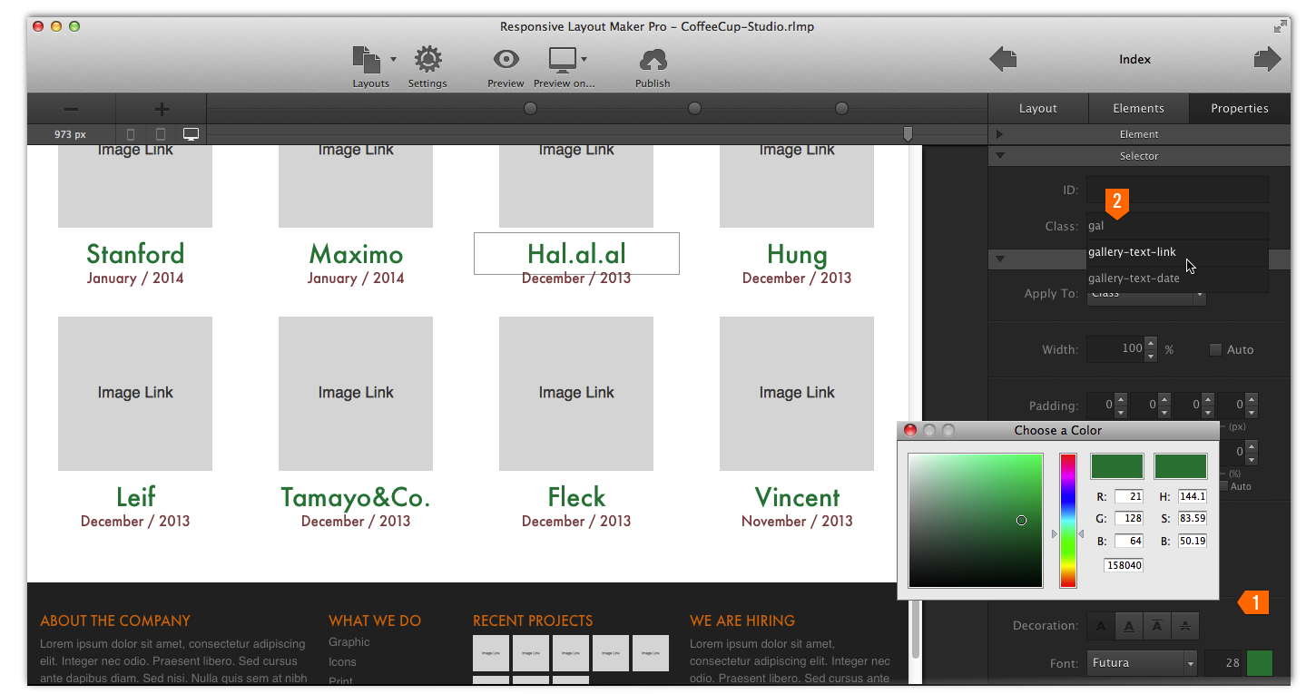
In the above example all eight (8) gallery links use the 'gallery-text-link' class and although only one of them appears to be selected, they are all changed to green (1) at the same time. If you’re using these elements on other pages as well, they will be changed too. In case you want one specific link to stand out, simply assign it an ID and apply the desired style changes to that single link element.
To promote the use of custom classes, and reuse of IDs throughout the project, we added a handy auto-suggest feature (2) to the input boxes. This makes it easy to find the class (or ID) you’ve been using before — on any page in the project — by simply typing a few of the letters of a previously used selector.
The Style Area
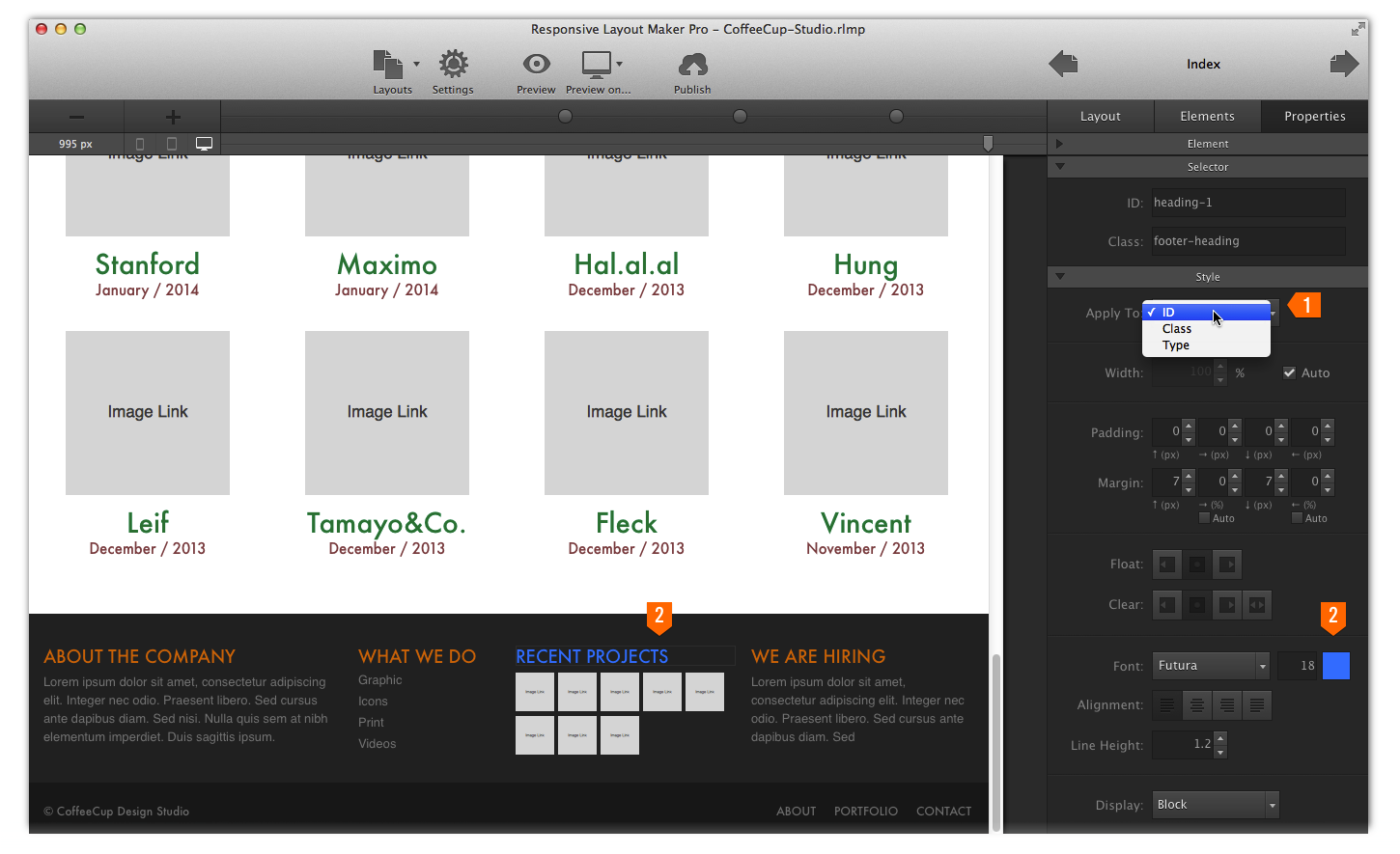
Depending on the selected element type, a series of different style (CSS) controls is available. The tool set focusses on controlling styles that are relevant for responsive prototyping and delivering bullet-proof responsive layout designs. Using these visual controls layout styles can be easily applied to different selectors (see 1 in the figure below), from most to least specific: ID, Class, and Type.
The 'Type' selector can be used to make global changes and set default styles for elements. For example adding a specific (max) width to all rows or applying different default type settings like font, font size and color to paragraphs should be done with the type selector.
For making changes to a series of the same element the 'Class' selector should be selected from the drop down. Now the style changes will apply to all elements in the design that have the same class, including future elements the same class name is given too.
Note that these changes will not take place if the same type of style has also been applied to an ID. For example, changing the font size for a heading with the class selector active in the drop down won't have any visible effect if that heading element also has an ID for which a font size is specified. The same is true for any other heading elements that are using the same class — the styles set for the ID will take precedence over the styles applied to a class. It seems obvious that for making specific changes which will only apply to a single element, the ID selector has to be active on the drop down. In the example below 1 selects the ID, and 2 shows that the color change is only applied to the 'recent projects' element (note: normally you might want to use more meaningful ID names, like 'projects-footer- heading' for example).
The available controls in the style area vary with the selection. All elements have controls like margin and padding, and width or height — essential styles for developing and managing responsive layouts. Most elements also have float, clear, and display controls for advanced layout management. Font size also plays an important role in responsive layout design. A 28px heading might look good in a wide desktop oriented design, but will look awful on a small mobile device like a phone. A smaller font takes up less space and fits better in layout designs for small screens. Therefore texts tend to become gradually, sometimes this is done in 4 or 5 steps, smaller when the display width decreases. In addition Layout Maker features a set of (background) color and font controls that support the prototyping and wireframing process.
All controls are intuitive, 'visual', interfaces to corresponding CSS properties. The functioning of these properties is well documented in numerous places, and repeating that is beyond the scope of the Quick Start Guide. However, we are working on a number of write ups on how these controls / properties can be used to create layouts and define responsive actions. We also compiled a glossary with a brief first introduction and explanation of these terms.
Now let’s explore how we can use all these tool in combination with the sliders to create responsive layouts that never break...