

From an unreadable newsletter, to a responsive version in just a few hours
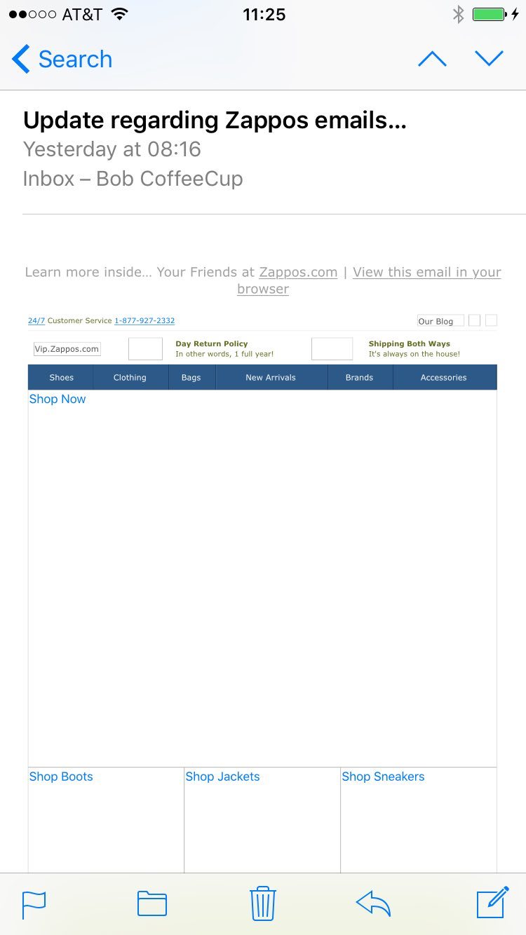
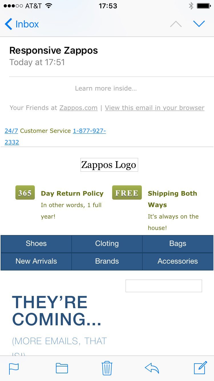
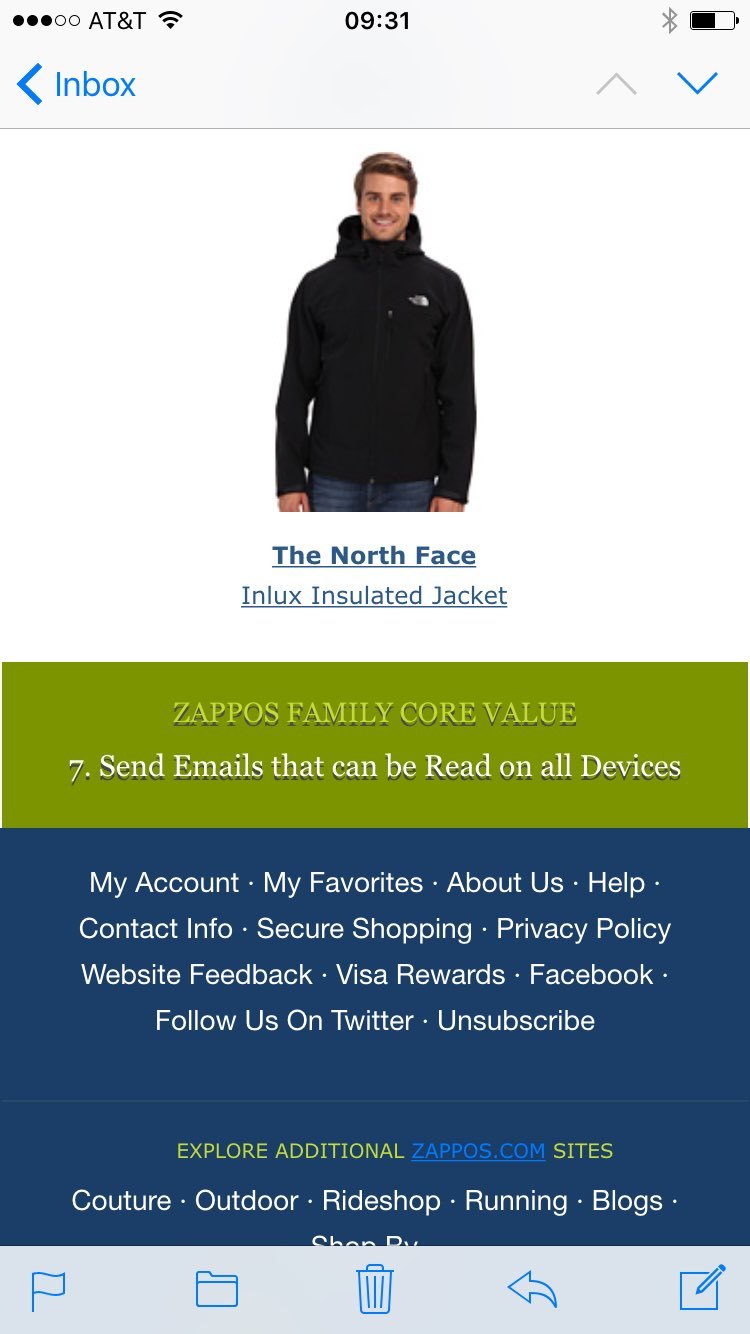
I got this email from Zappos™ with the intriguing subject “Update regarding Zappos emails…” Now, I don’t open every Zappos™ email, but this one sparkled my interest. So I ‘thumbed’ the email on my mobile and saw…nothing really.
The problems with image-based emails.
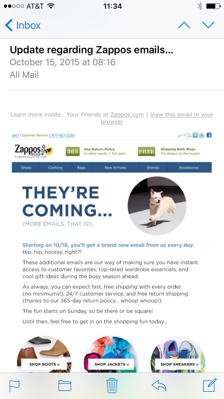
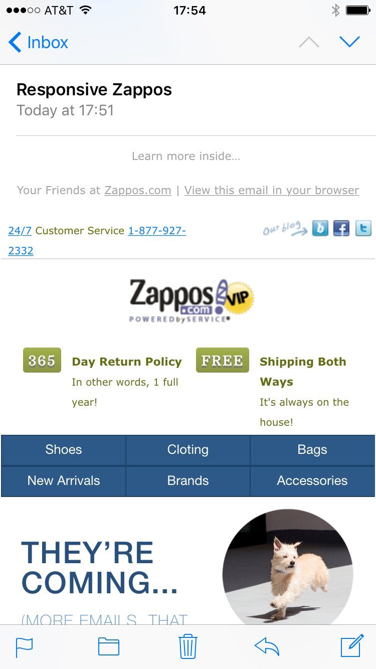
This view was not unique to my situation, nor caused by a bad internet connection. For about 50% of the recipients, images do not show by default. Either because they choose not to waste data before determining something is of interest, or because their email clients likes it that way. Just like many others, I usually don’t take the effort to dig deeper and simply delete these hollow messages, but in this cause I decided to take the extra step and see if the images would reveal anything. What I saw after all the images were downloaded made me chuckle, they actually told me they were going to send me more empty messages!
Another drawback of image-based emails is that the content is not searchable in the email clients. Just imagine that after a few days you want to track back that nice pair of boots you are sure you saw come by. How are you going to find it back if the text was in an image?
The interesting thing here is that most of the message above, all text, text styles, as well as the ‘commitment’ buttons, can: 1) easily be done in HTML, making it show up for all openers by default and searchable, and 2) can be made responsive, so the message is readable on mobile devices (accounting for about 60% of email opens).
Following the big success of my previous weekend project (over 4k views in 2 weeks and a heap of kudos :) ) I decided to spend another couple of weekend hours on something new. This time, remaking the Zappos email design and making it responsive. Just think about how tremendously big the Zappos audience is, and how many millions in revenue a slightly better engagement (open, click, conversion) rate must mean to them.
So, how to go about all this?
That’s why I created this article! First I am going to recreate the original Zappos newsletter using HTML with Responsive Email Designer. This takes up the biggest part of this write up, but you will learn a thing or two about email design. When that is done, making design and layout adjustments for small screens (aka responsifying for mobile) is surprisingly straightforward! At the end of the article by we’ll be comparing the old static version with the new responsive design on my mobile device. The differences in viewing experience and usability are rather big! Here’s a table of contents of some sorts, just in case you want to jump ahead:
Image-based emails have several drawbacks.
Overview of this article (you’re here now!).
Recreating the original static and image-based design in HTML.
Adjust design and layout for mobile email recipients.
Comparing the static design with the responsive alternative.
Not using RED yet? It will be handy to have a copy of Responsive Email Designer purring on your machine, so we went ahead and compiled fully functional versions of RED for Business, so you can follow along!
Download RED For Windows Download RED For OSXNow, let’s go ahead and continue with some email design goodness...
Recreating the email design
Replicating their entire newsletter design only took me about 3 to 4 hours. That includes looking at their code to see what exact colors, font styles and so on they are using. Each step in the rebuild was logged on short videos so everyone can follow along and verify this is for real. I also made the project available for download at the end of this article.
The first video below shows the making of the navigation and the design of the ‘hero section’ in HTML. At the end of this video, I included a little sneak peek of the fully responsive end result as well!
The Navigation
In the video you see how I created the 1st navigation button with some background, padding and font styles. It’s as easy as it looks!
Since we will have six buttons, each button is placed in a column with a span 2. The 6 buttons will span the full width of 12 columns (6x2=12!). After that is simply a matter of duplicating the first column and editing the text (and adding links which I skipped in the video) for the other buttons to complete the navigation section.
The borders are created in a special email client agnostic way (since Gmail on Android sometimes does not listen to width instructions). I am setting a darker background for the row, then I apply a margin to the actual buttons/links. Since the buttons share the nav-button class, the border style updates (and all other style changes for that matter) apply to all buttons. To add the left border to the first button only, simply set the style for the ID instead. Sweet indeed!
The Hero Unit
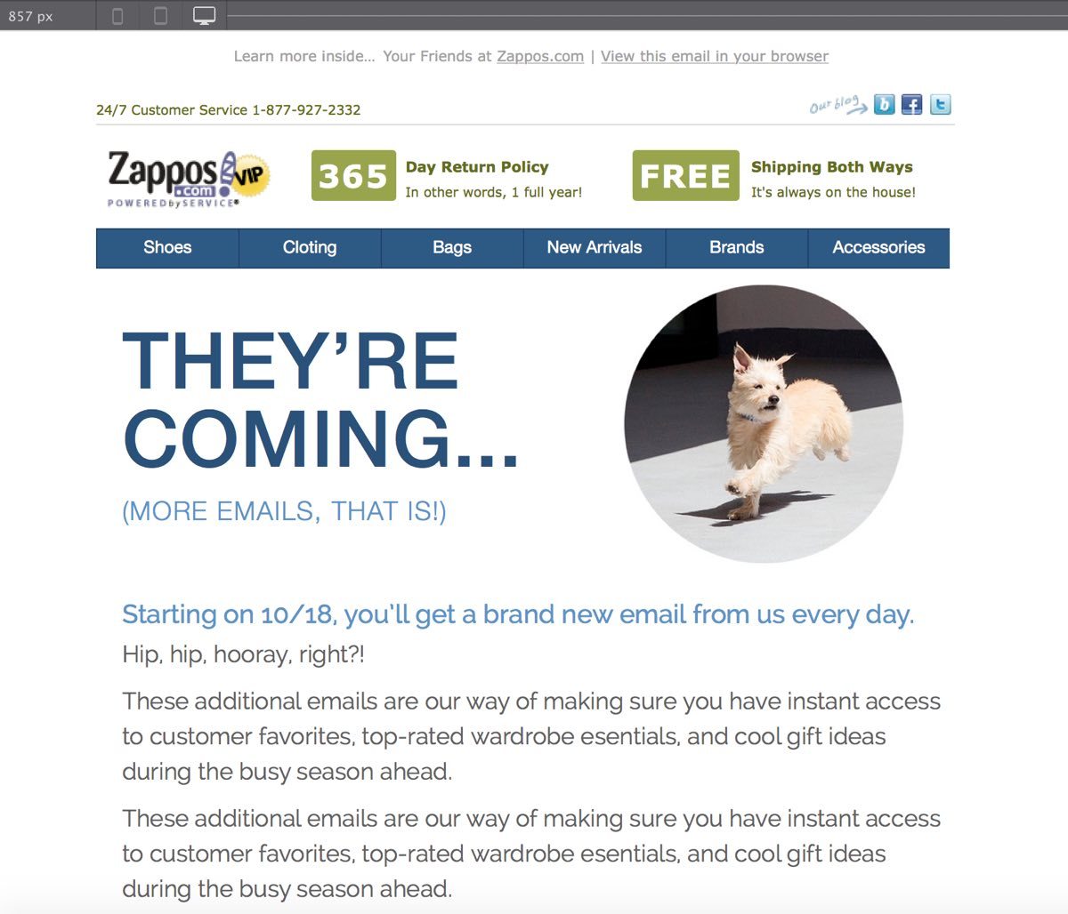
For this part I added a new row with two columns. The column on the left with the text is slightly wider than the column that will hold the image (span 7 versus 5). In the left column I dropped a Heading, edited the text to replicate the original content and gave it font styles that (closely) resemble what was in the image.
Since the hero unit and message text were all encoded within an image, I could not look at the HTML to exactly replicate this part. I think it’s close enough for a weekend project though. The same goes for the use of proper class names throughout the project. Unless I really had a plan with that element I simply let the app generate the name instead of breaking my head on semantic names during the weekend...sorry!
Since the running dog picture in the second column is part of a larger image I had to cut it out and add it to the project as a local image. The reduced max-width makes it resemble the size of the original. Now the message that actually motivated me to do this project…“we’ll be sending you more empty emails”…ouch!
A paragraph with a few simple font styles — an extra light Font weight, uppercase Transform, 1px letter spacing and color — completes the hero section of the email. And the cool thing is, the text and styles will always show up on every email client, no more empty messages!
The Message
Another text section that many people will have missed because it was (unnecessarily) hidden in an image. Again, since I can’t look at the exact design styles in an image I am just approximating the design in the video to the best of my abilities.
A new row with a single column is used for this section. The Heading is added and the original styles approximated. I am using a Text element instead of a Paragraph because it’s easier to control the spacing between the text blocks (Outlook email clients add default spacing below each paragraph, sometimes that’s ok, but I did not care for it here...).
I did not record adding the actual text. Though, I did include the geeky exciting part, styling all the text blocks at the same time because they share the same class.
With that, the entire big non-showing image in the original email has been replicated in pure HTML and looks very, very similar.
Want to try it yourself?
Please be our guest. The buttons below will download fully functional versions for RED for Business. Just pick your OS and be on your way!
Download RED For OSX Download RED For WindowsAfter a while some exporting limitations will apply. But if you like the app that’s easy to solve.
The Shop Section
Usually, each section gets its own row. In this case, I am initially using a single column and I make it take up ⅓ of the width. Following that it’s simply a matter of adding the Image element, copying the image URL and using that in the design. Then the column can be duplicated twice and the shop section is nearly complete. Giving the column and image a (semantic) class could come in handy if we want to apply some style to all of them later on.
Clearly the URL needs to be updated for the duplicated two images. However, as you can see in the video, I accidentally clicked on the link when grabbing the 1st image (oops!). So I updated these links later. And, if you paid close attention, you will have seen that I did not update the image Alt text. Something you always should do in production emails!
I took care of the recommendations separator in the same video. The column gets the greenish background color and the Heading element the corresponding font styles. Sometimes I approximate to save some time, but in this case I looked at the code: the font-family is Verdana with Font-size of 10px and color value #FFFFFF with Text-transform to uppercase and Text-shadow values of 0 1px 0 #555. All easy to see and I believe I used those exact values (although it was a weekend so I can’t be 100% sure…)
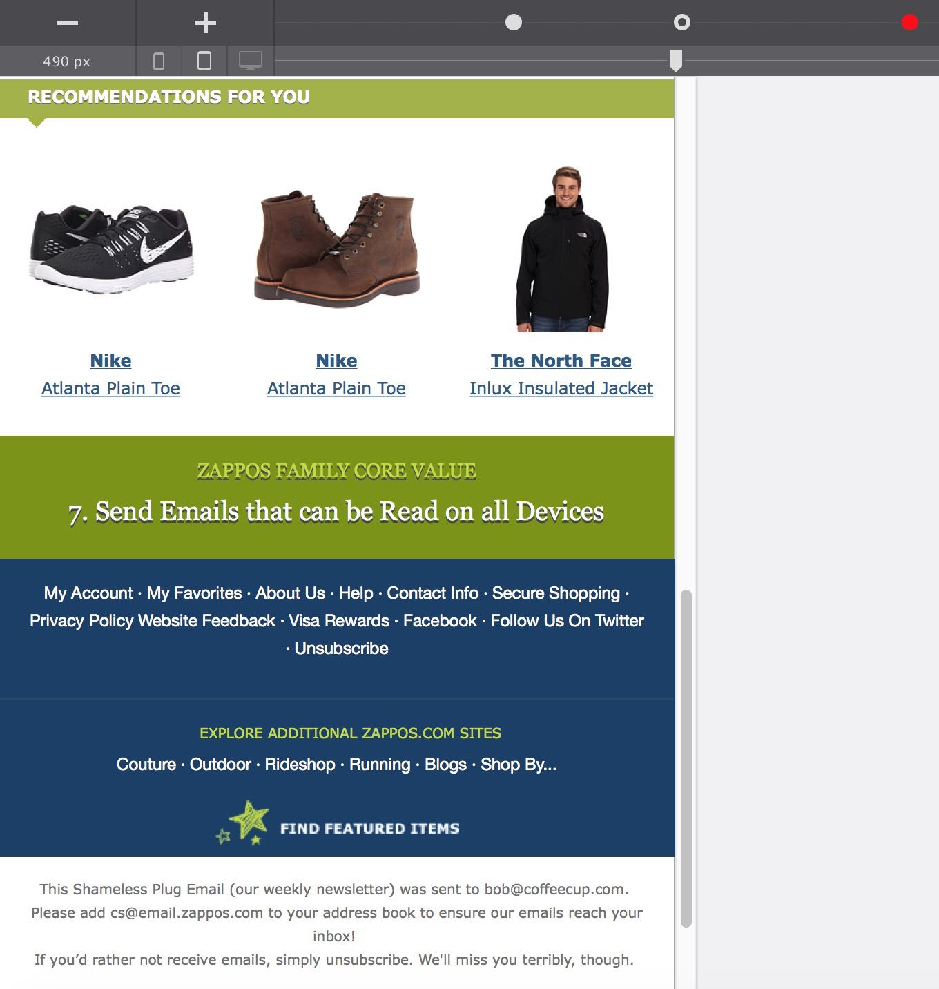
The Recommended Products Section
The structure and setup of this section are very similar to the ‘shop’ section. It contains a row with three columns. The content in each column is different, but the styles for each content element are the exact same. Another case for sharing classes, duplication and content replacement. In this case I copied the first image, pasted it in the other columns and updated the link afterward. You’ll see that I grabbed the image links from a little help text file. This made them easier to copy and paste in while recording...learning as we go!
The two caption links below the image are the main structural difference with the previous section. Dropping them in is fast, but adding the proper styling plus editing them takes a little time. When the styling is complete I use my keyboard to copy them, select the images in the next columns and paste them below. This part is included in the video in the next section.
A real link could be added to these elements using the Href input box located at the top of the Design pane.
The Family Core Values Part
Background coloring and font styling is basically all there is to this section. Nothing we’ve not seen before!
That core value plug about sending responsive emails I just could not resist including. I hope they understand since I am making the project available for free in return. :)
The Footer Navigation
What to say at this point? Adding elements and tweaking styles is the now familiar name of the game. It’s mostly getting used to the various ways of getting the same, desired, design result. Left padding inside the column makes lining up elements fast, applying margin to elements gives more flexibility. When to set the background color to a row, and when on a column? Sometimes both are fine.
In the end, it’s just a matter of experience or sometimes even preference. The cool thing about RED is, since there’s less time spent on coding, there’s more room for structuring content and creative designing. Here’s how I did the two footer blocks (bear in mind that the kids started to want some attention at this point…)
What do you think? Should I have applied that background on the row instead of the columns? Also, I copied and pasted that green color with my keyboard again. Spoiler: we’re gonna add a great solution for sharing and reusing colors soon!
The Disclaimer (and design reflection)
A single paragraph with hard carriage returns, in email design the result is most often more sacred than the method (which is not always true for web design). The Text Editor offers tons of cool options such as the ability to assign classes to selected text, and edit or update their styles at the same time.
Yes, I missed adding the email and unsubscribe links here. I show how these type of things are done when doing the preheader though!
The Top Three…
1. Preheader text. If done well, the preheader can be one of the most powerful content parts of any email design. In many email clients, the recipient can view the preheader text before the email is opened. And on some mobile clients the preheader text gets even more room than the subject line!
An entire article could be dedicated to this important newsletter element, but let’s limit ourselves to a few quick takeaways. First of all, preheader text that reads ‘view in browser’ or something similar is useless. This does not give people any encouragement to open the email. Also, people are working in their email client, why would they want to switch to a browser at all? If an email is properly designed and coded, there’s simply no need to jump to a browser either.
Secondly, preheader text can be different from the first lines that are shown in the email itself. Just a little CSS will take of that...and Responsive Email Designer will do it automagically for you. Yup, people will judge you on having meaningful preheader text, and rightfully so!
In the email, I am going to first put the top three rows in place. The preheader is divided in two columns so I can place the text parts on top of each other on smaller screens. That means we can control the wrapping and don’t have to make the text unreadably small.
Most of the formatting that happens is similar to what I showed before, with one exception. I am adding an inline link with specific styles. That in itself is not that groundbreaking. This however is: since I give that selection a class name, I can style other selections fast, simply by adding the same class! Any changes you want to make later, will automatically apply everywhere that class is used. Neat!
2. Support and social links. This row is also divided into two columns, one for the support text and one for the social links to the blog, Twitter and Facebook. The blog icon is simply an image that will be linked in. For the other two I am using our Social box element.
To replicate the Zappos™ design it’s mainly a matter of using their images and redoing the spacing and alignments. The default setting probably gives away that we are a fan of bigger social icons...
3. Logos and perks. The logo is placed in its own column on the left. This will allow us to position it above the content on the right on smaller screens later. The really exciting part in this section is the recreation of the (seemingly important) green buttons in HTML. This way they will show up for 100% of the email openers, meaning that roughly twice as many people will see them. Not bad!
So, will these buttons show up as designed in every email client? Unfortunately, not exactly. Many CSS properties that have been mainstream on the web for years have not made it into many email clients yet. However, Responsive Email Designer creates emails according to the principles of progressive enhancement. In short, this means that there’s a good fallback in case a property is not supported. In this specific case the worst thing that can happen is that a different font is displayed, without shadow, and that the background shows a solid color instead of a gradient. I applied these setting below to look at that worst case scenario. Still a lot better than showing nothing 50% of the times right?
More about using progressive enhancement in email design can be learned here.
Tweaking the layout and design so the email looks good at any width.
Responsive email design is significantly different from responsive web design. Luckily RED shields the user from most of these hair tearing email hacks. One of the differences that is noticeable in our apps (Responsive Email Designer versus Responsive Site Designer) though, is the use of a default breakpoint.
In Responsive Site Designer there are no (fixed) breakpoints to start with. They can be custom added where required, making the workflow content & design driven and device independent. In Email Designer, a default breakpoint is always present.
This default breakpoint is depicted by the red dot above the width slider. Frequently you’ll want to start making style and layout changes as soon as the breakpoint becomes active (as soon as the slider goes to the left of it). Check out the video below to see how the first changes for screens smaller than the default breakpoint (660px) are made.
Following the default breakpoint, the support text pushes to the left side of the design. (Note, I now noticed that the video processing service I used cuts off a tiny part on the left, I am sorry about that. It should not affect the big picture though!) This is solved by adding some left padding. The big thing is the layout rearrangement for the logo and perks row. The logo is moved above the perks and centered, creating more room for these carefully crafted green buttons and explanatory texts.
To achieve this, the logo column gets the full width (12 spans out of 12, control located on the Layout pane) and is centered (align: center on the Design pane). The navigation bar is pushed down a little by applying a margin on the buttons. Then span width for the other button and text columns is adjusted (increased a little) as well. Presto!
All these changes will only apply if the email is opened on screens smaller than 660px. On the right of the red dot, the old styles (and layout) still apply.
The dots represent media queries aka breakpoints. Please be aware that, in contrast to web browsers, not all email clients support them. Yet another difference between RWD and RED. This means that the changes we just made, do not affect how the email displays on these email apps (Gmail on Android mainly). These recipients will simply get a scaled version of the desktop version. But the people that are using (mobile) email clients that do support media queries, will get a significantly enhanced email reading and interaction experience!
Let’s see what we need to do to make this email kick-butt below the 500px width too.
Breakpoint #2
First we need another breakpoint. The exact placement is not very relevant, as long as it happens before the design starts feeling squashed. Yup, custom breakpoints create design and editorial freedom!
On that breakpoint the content in the hero sections gets adjusted again in the same way as we saw before. This is also the place where I fulfill my promise of stacking the preheader text. The columns get a span width of 12, texts are centered and spacing adjusted. The navigation is changed at this breakpoint as well, check it out:
Changing the navigation buttons is simply a matter of updating the spans. If we want to have 3 buttons next to each other, each button gets a span width of 4 (3x4=12). That was a fast update!
More responsive tweaks and breakpoint #3
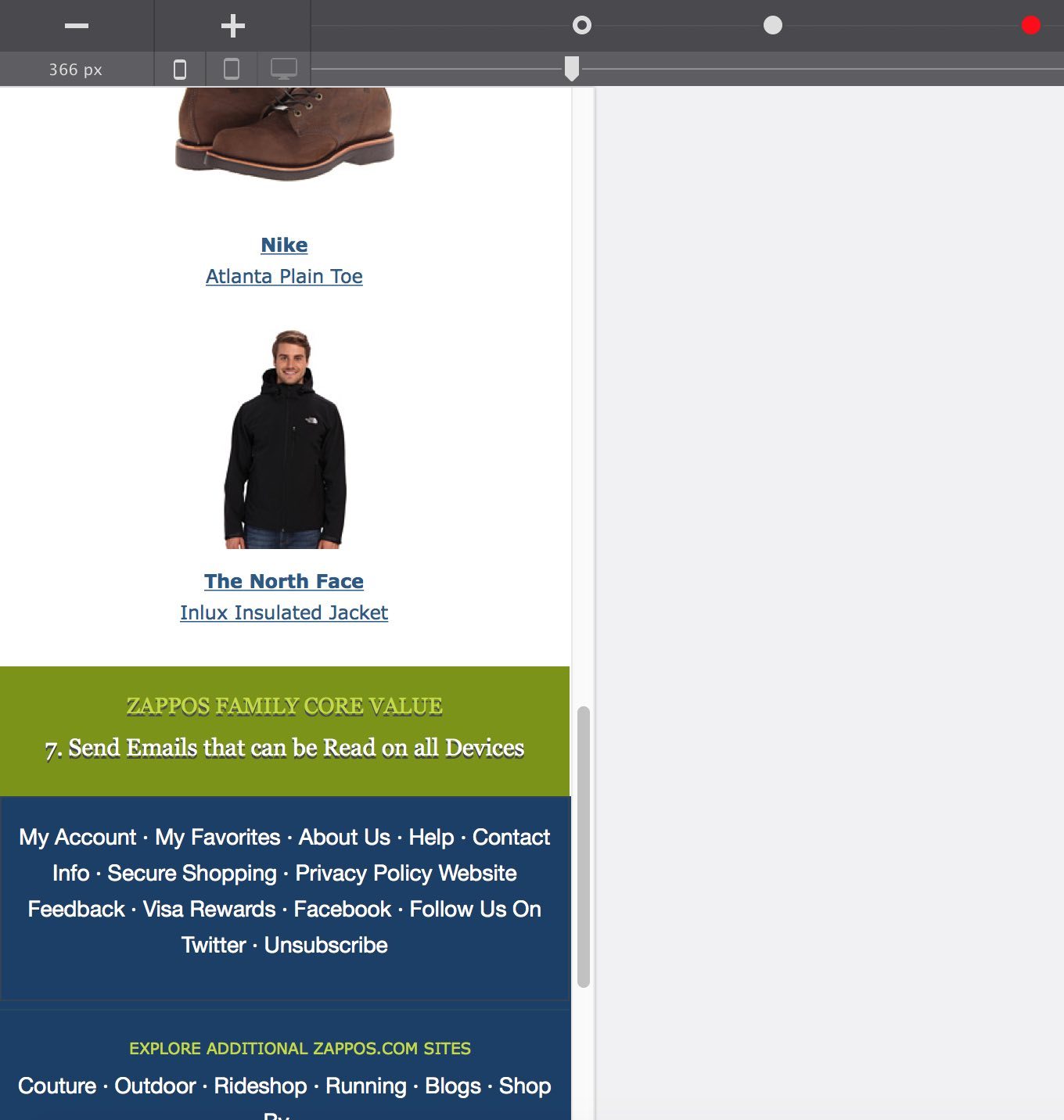
I made several more tweaks to the design at the ~500px breakpoint. Working on parts towards the bottom of the email I decreased the core value texts sizes and centered them. In the second blue (footer) row I stacked the columns and centered the content as well. You can see a screenshot of that part below (hey, it was a weekend, had to call it a day at some point!).
A screenshot of the design and layout of the bottom section at the following breakpoint (at ~375px) is added as well. The main change there are the columns with the recommended products, they span the full width now, giving the images a lot more display room.
The video below first shows the original non-responsive and image dependent Zappos email, followed by views of the completed project at a wide pixel range. Not bad for a couple of hours of work, just wish the recording and writing had gone a little faster!
The icing: comparing a static and responsive email
To properly finish this off, we have to compare these original and replicated emails on mobile as well. Both with and without images! Below are the various screenshots; the original ones are same as the images I started the article (and project) with. First, let’s compare the emails without images loaded:
Yep, I could (should) have used alt text for the picture, but what would it have been? Shop now? Or, running dog? I could not decide...
Now you can be the judge, which email makes the best first impression and invites you to read along without images? Which of the emails does a better job in conveying the message without images? For which of the emails without images would you take action and download the images?
Let’s compare the email with images loaded:
Which of the emails with images is easier to read and understand? For which of the emails is it easier to stumble upon a button of interest? And what about click-action; in which email is it easier to click a specific navigation button or a social link with a finger or thumb?
Similar questions can be asked about the bottom of the email.
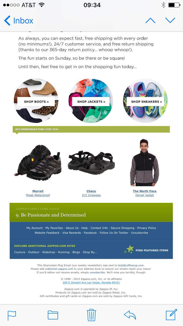
Which email shows the product(s) or communicates their core values best? Which email allows you to find and jump to your Zappos™ account?
We would be really interested in learning from your opinion on these questions and compiled a little survey that takes 3 minutes to fill out. Please take the survey here, you’ll get our love and more of these write-ups in return. A free ‘yet-to-be-released’ app can be earned as well (we’re setting apart about 10 copies)!
This brings me to the end of this little project. You can download the project file below and look at the details, I will try to post a cleaner version, fixing some details and using more semantic selectors over the next week or so. Hope you appreciated it and if so, please share!