

Populating the layout design with content elements
This part of the application is so intuitive that it barely needs any explanation. Simply decide on your content needs, drag them on your layout design, done!
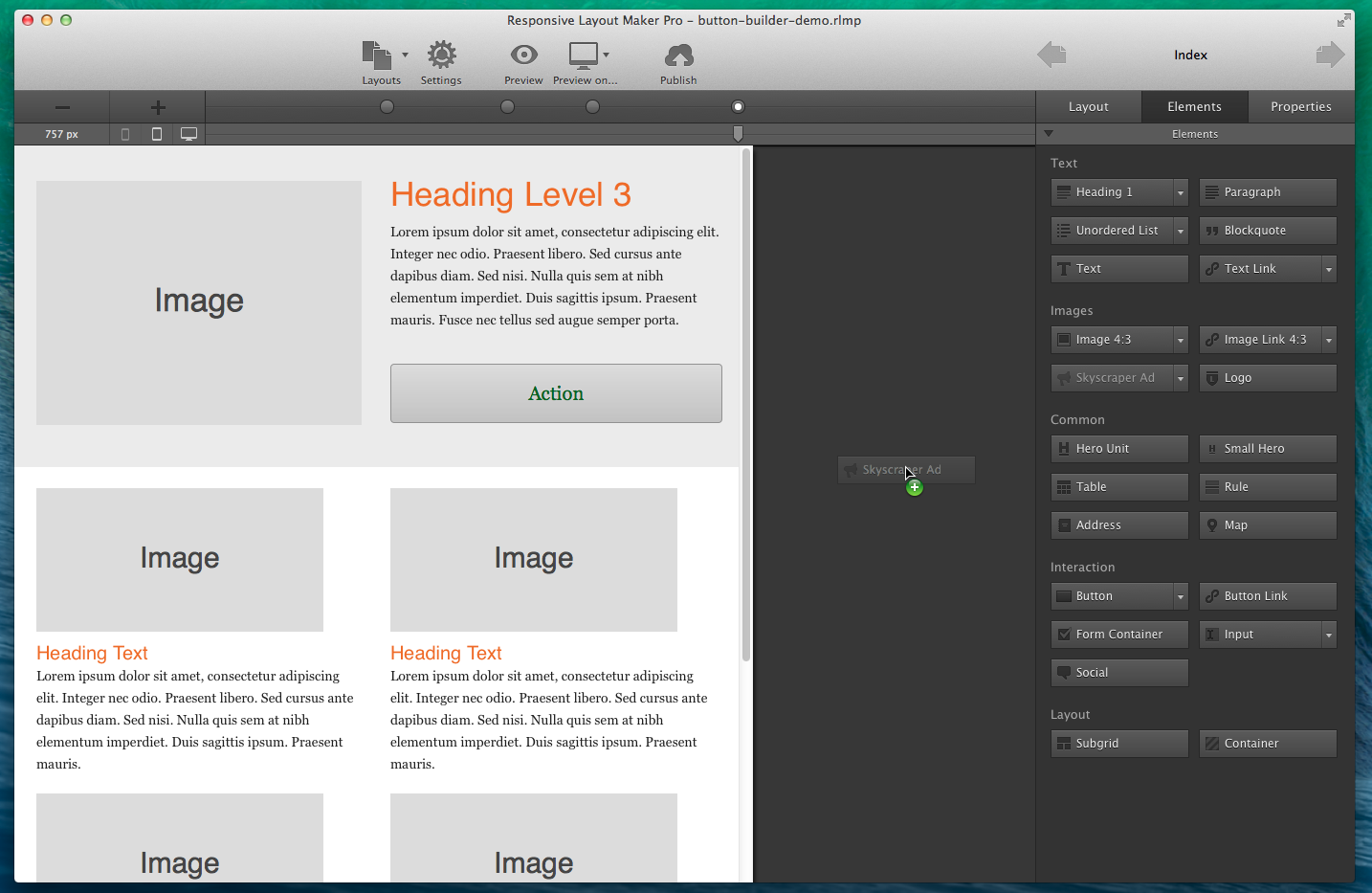
The Elements pane features a large selection of 31 (with 28 variations!) common website elements that can be used for prototyping and designing responsive page sections, entire pages and complete websites. Use the drop down to select element variations such as h1 through h6, or specific input elements. Then grab the element and drop it into a content column.
Did you know?
Responsive Layout Maker Pro contains a few more elements. Subgrids and other advance elements and additional options to your design arsenal.
Element Actions
Elements can be moved to other sections of the layout. Simply select the element by clicking and holding the mouse down, or use the selector tool positioned on the top left of each element. Move the mouse to the desired section of the layout and release the mouse to let the element drop.
A horizontal bar indicates the exact place where the element will be positioned. In addition a line is visible around the parent element and the parent type is shown.
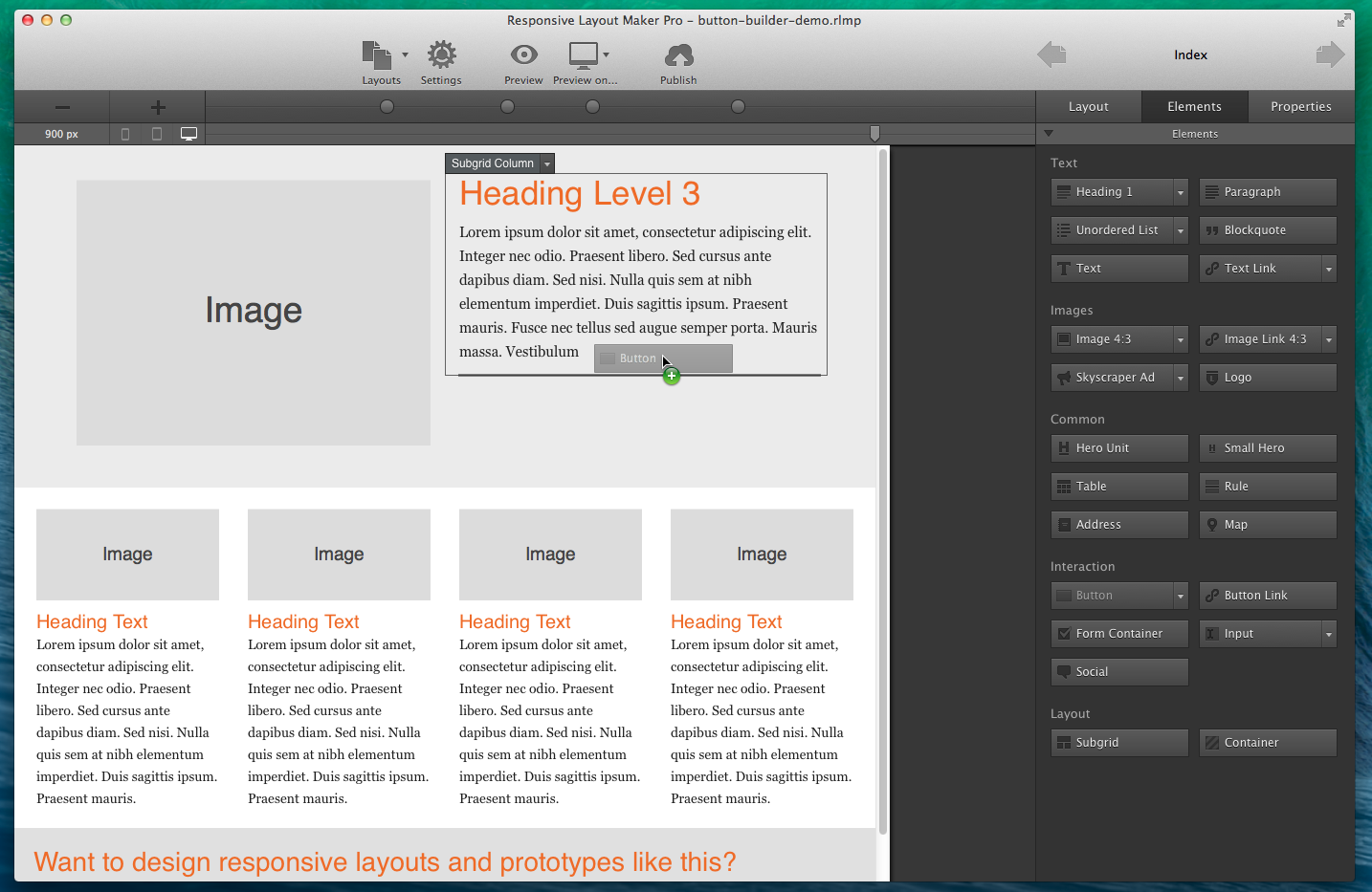
The Subgrid and Container Elements
The elements pane feature two special elements: Subgrid and Container. These elements use additional, more granular, control when making responsive layout designs.
An example where a subgrid can come in handy is the common (ad) sidebar. On smaller devices there is little or no room to show that next to the main content. But hiding it entirely is usually not the best option. With subgrids sections of the sidebar can be positioned in between the main content so they are visible when the visitor scrolls through the page.
Containers offer additional grouping and can be used to keep elements organized and define responsive behavior inside a column.
Editing Elements
The content and styles of each element can be customized. The controls included in Layout Maker are mainly dedicated to the wire-framing process and creation of responsive layouts. Mainly because there's a thin line between site design and prototyping / layout construction — if you feel controls essential to the latter are missing, please let us know! The content and property controls are located on the Properties tab, let's get right to it.