hi there -
I have a grit with three columns, each column has a container inside. No problem to have all three columns next to each other.
Attached is a test in which I am working on a layout with columns only. I only can get them next to each other without having a gap (using Margin 1% or 2%).
Can someone please provide a hint how to do, or not possible etc. Thank you.

Frank Schneider
Registered User
40 posts

Steve
Senior Advisor
3,126 posts
What I would do is adjust the padding or the subgroup column to push the content in. If you look at my website in the footer you can see how I achieved it.
Taking over the world one website at a time!
Steve Kolish
www.misterwebguy.com
YouTube Channel:
https://www.youtube.com/channel/UCL8qVv … ttneYaMSJA
Steve Kolish
www.misterwebguy.com
YouTube Channel:
https://www.youtube.com/channel/UCL8qVv … ttneYaMSJA
Frank Schneider
Registered User
40 posts
Hi Steve -
When I watch CCs youtube examples, I most often see that just the column type is used. While I did a layout adding always a container type in the column I was able to get it done (basically never used a margin for column and container).
Would you mind unravelling the column versus container and column with container thingie please? No even speaking of the subgrit lol , that's a different topic.
Thank you.
When I watch CCs youtube examples, I most often see that just the column type is used. While I did a layout adding always a container type in the column I was able to get it done (basically never used a margin for column and container).
Would you mind unravelling the column versus container and column with container thingie please? No even speaking of the subgrit lol
, that's a different topic.Thank you.
Steve
Senior Advisor
3,126 posts
Give me some time I'll make a short video tutorial showing how to do this. I probably won't get to it until tonight.
Taking over the world one website at a time!
Steve Kolish
www.misterwebguy.com
YouTube Channel:
https://www.youtube.com/channel/UCL8qVv … ttneYaMSJA
Steve Kolish
www.misterwebguy.com
YouTube Channel:
https://www.youtube.com/channel/UCL8qVv … ttneYaMSJA
Frank Schneider
Registered User
40 posts
Thank you Steve. Looking forward to it.
Back to the subject. I have the same three white columns in a subgrid and I can see the box as following:
row > 12 span column > subgrid > subgrid row > ( ??? div class="coffee-span-3 coffee-902-span-6 coffee-559-span-12". )
I do not understand this. div class="coffee-span-3 coffee-902-span-6 coffee-559-span-12" twice and div class="coffee-span-3 coffee-902-span-12" twice are subgrid column, correct?
Or further above as <div class="coffee-span-3 coffee-902-span-6 coffee-559-span-12 subgrid-column-5" id="website-template-subgrid-column">
I can span my column to 4 having them next to each other but no gab just like without subgrid. I trying to get what you have in the Recent work row where there are gaps in between.
Is this done using a custom.css? I don't see how this can be done with RLMP element settings. I must be blind.

Eric Rohloff
Senior Advisor
20,302 posts
Your grid is 12 spans wide and your columns are 4 spans wide so there's no room for margin.
Add 2 spans to your grid.
Add 2 spans to your grid.
I can't hear what I'm looking at.
It's easy to overlook something you're not looking for.
This is a site I built for my work.(RSD)
http://esmansgreenhouse.com
This is a site I built for use in my job.(HTML Editor)
https://pestlogbook.com
This is my personal site used for testing and as an easy way to share photos.(RLM imported to RSD)
https://ericrohloff.com
Frank Schneider
Registered User
40 posts
Hi Steve -
I got it done with and without subgrid. But one issue arose. The outer right of the right tile flows over the max. grid and row (or column size when looking it from the subgrid point of view).
I got it lined up with the outer edge of the header image by reducing the max width of the row until it fits, for example a vertical iPad screen (768px). However, the issue is that one would need to set for every pixel a new breakpoint so that in a regular desktop browser the margin to the right scrollbar of the browser window is maintained. Otherwise, it flows into the browser's scroll bar. Obviously, that does not make any sense to set for each browser window width a break point and then to set a new row max width. It tried many combintation with max width on and off in combination with width in %. Also in different elements. It remains flowing over to the right. and does not maintain the same margin on the left browser window edge.
Any ideas please? See attached file.
Thank you.
Frank Schneider
Registered User
40 posts
Hello Eric -
That is a good tip and I tried with 13 and 14 grid instead of 12 grid, see attached file.
Yes the outer grid margin is maintained in the browser now and that is great but the gaps between the tiles become to wide (14); better with 13 grid but then it does not align with the right grid margin. It should be like a chess board with 10 or 20 px between them, each tile is 350px in width due to images; that's why 12 grid with 1080 px max width. When somebody has a larger window, the 1080 grid floats centered in the gray background.
Thank you.

Adam East
Registered User
3,293 posts
Frank Schneider wrote:
Thank you Steve. Looking forward to it.
Back to the subject. I have the same three white columns in a subgrid and I can see the box as following:
row > 12 span column > subgrid > subgrid row > ( ??? div class="coffee-span-3 coffee-902-span-6 coffee-559-span-12". )
I do not understand this. div class="coffee-span-3 coffee-902-span-6 coffee-559-span-12" twice and div class="coffee-span-3 coffee-902-span-12" twice are subgrid column, correct?
Or further above as <div class="coffee-span-3 coffee-902-span-6 coffee-559-span-12 subgrid-column-5" id="website-template-subgrid-column">
I can span my column to 4 having them next to each other but no gab just like without subgrid. I trying to get what you have in the Recent work row where there are gaps in between.
Is this done using a custom.css? I don't see how this can be done with RLMP element settings. I must be blind.
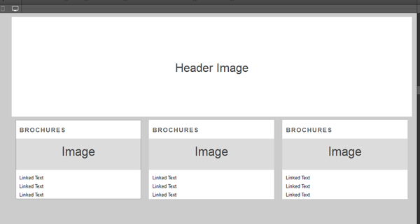
To do this Frank you can add a container to each column and color it white rather than the column itself. This will allow you to apply a padding to the columns to achieve the look you are after. Here is what it would look like:
http://cl.ly/image/3I1M003c2q1Z/2015-01-25_21-34-27.png
Eric Rohloff
Senior Advisor
20,302 posts
Adam did what I did.
http://ericrohloff.com/coffeecup/ccforum/rlm/just-columns.png
http://ericrohloff.com/coffeecup/ccforum/rlm/just-columns.png
I can't hear what I'm looking at.
It's easy to overlook something you're not looking for.
This is a site I built for my work.(RSD)
http://esmansgreenhouse.com
This is a site I built for use in my job.(HTML Editor)
https://pestlogbook.com
This is my personal site used for testing and as an easy way to share photos.(RLM imported to RSD)
https://ericrohloff.com
It's easy to overlook something you're not looking for.
This is a site I built for my work.(RSD)
http://esmansgreenhouse.com
This is a site I built for use in my job.(HTML Editor)
https://pestlogbook.com
This is my personal site used for testing and as an easy way to share photos.(RLM imported to RSD)
https://ericrohloff.com
Have something to add? We’d love to hear it!
You must have an account to participate. Please Sign In Here, then join the conversation.