Not sure if this is correct - Post ID...

User 126492 Photo


Ambassador
1,524 posts

I know that you probably should start building your page to match a mobile phone, but I thought I would start from 992 pixels and see what would happen.
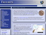
All I did was create a Button Link ready for building a menu, after making the button I changed the background and text colour, the original was a white button with blue text.

When I went to preview the button in a browser there was my button, but, when I slowly reduced the browser width the button reverted to a white with blue txt, strange I thought.

Anyone any idea why this would happen.

http://www.freebits.co.uk/bootstrap/index.html

Above is the result I got, but later I made changes to the button at mobile size and when I viewed that I got the two different fomatted colours.

Have attached the .rbb file


Attachments:
Jim
---------------------------
User 2484360 Photo


Registered User
3,293 posts

What you're describing sounds like you are working within in a breakpoint. If you select the smallest breakpoint and then move your slider to the left of that, you should see some of your styles disappear. What you would have to do then in re-apply those styles there as well. This is because Bootstrap is a mobile first framework, you create the site from smaller size screens to larger ones.

Hope that helps. :)
User 188640 Photo


Registered User
895 posts

Try deleting everything. Go below the lowest break point and create and format your button. Then try the slider up to the larger break points. See if that keeps your formatting.

EDIT- Adam beat me with an explanation. :D
A Rose is Just a Weed in a Corn Patch!

Have something to add? We’d love to hear it!
You must have an account to participate. Please Sign In Here, then join the conversation.