

Your help guide for our #1 responsive apps
Welcome to the resource headquarters for the most advanced responsive design apps on the web. This article offers a global overview of the capabilities of our visual responsive design apps. Please note, there may be slight variations depending on the app you are using: Responsive Site Designer, Foundation Framer, Bootstrap Builder, etc. Before you know it you’ll be designing like a boss, creating masterpieces like the one you see below!
Find the tutorial you need
The main workflow and functions are summarized below, with links to more in-depth articles. You can also view the complete help-index if you’re seeking instructions for something specific.
Visual Learners Love Our Video Tutorial Article
Watch our widely popular video instructions where you create a fully responsive page in under 30 minutes. It was the happy result of a rainy weekend, and has already topped 10k views! They are sure to get you up to speed lickety-split!
Watch the Instructional Videos ➠
Get acquainted
Our responsive apps combine flexible layout creation with an intuitive workflow and powerful design tools. The ability to adjust the layout and design based upon display width, the core of any device-agnostic design, is unique to our collection. Shielded from technical complexities by the User Interface, you can let your creative juices flow free!
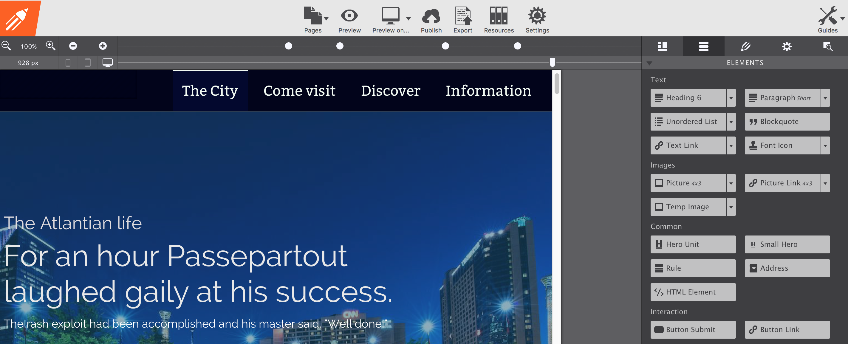
Section 1: The real-time preview and text editing area
This is the largest visible part of the app and the one that you will be looking at most of the time. The embedded browser displays the site in progress, any changes to the content or design are reflected in real time. Designing in a browser has the advantage that the site will reflect what the end-user will experience when viewing the actual live production site.
Texts can be edited in place; activate the text editor by triple-clicking any text element (or use the right-click menu). Then type, paste, select and style with familiar text formatting tools.
This is also the area where site elements can be added and rearranged. Select a new element on the right (part of section 2) or grab any existing element and drop it on the desired spot.
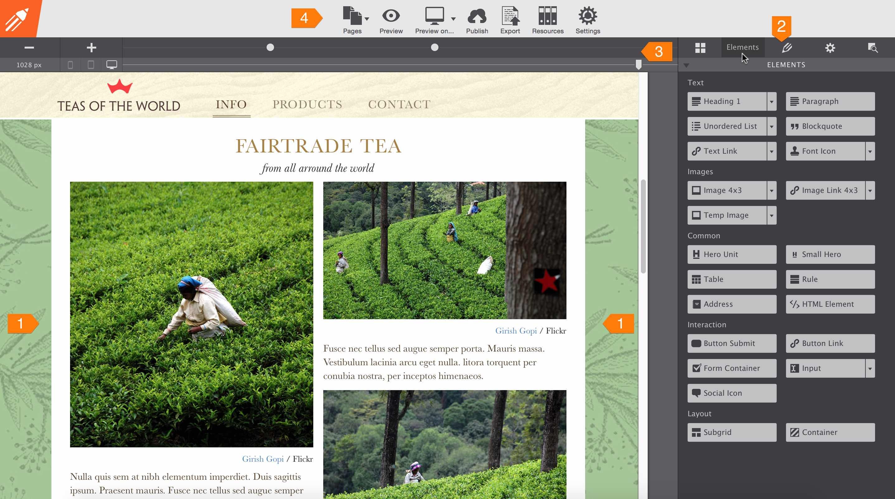
Section 2: The power packed control panes
On the right-hand side there are 5 different panes. These panes give granular control over the layout, content, and styles of the pages. The first pane is for creating and managing the layout. Here you can add or (re)move rows, define column span widths (what part of the row a column ‘spans’) and configure the responsive grid. Grids are like a flexible spreadsheet, working wonder in keeping the content organized and lined up on all (device) widths. A bit of a background about the use of grid systems in web design is given in our article Grids for Bullet Proof Responsive Design.
The layout pane works very much like the one in Responsive Layout Maker, which is explained in our article Managing the Responsive Grid with Layout Maker. The article will be updated soon to better explain handy controls like Push & Pull and to make it more neutral, covering both of the apps.
Layout changes, such as stacking columns to accommodate for smaller screen widths, can be controlled here as well. In our responsive apps, stacking columns is simply a matter of changing the column width using an intuitive drop down at a breakpoint. Breakpoint creation and management is described in the next section below, while our article Responsive Actions - The Stack describes in more detail how the stacking of columns works.
The second pane is called ‘elements pane’. This is the pane that is active and visible in the image above. All content elements such as text, images, buttons, icons and so on can be found here. These elements can be placed anywhere on the page with a click or drag-n-drop. The pane also contains two layout elements, one for subgrids and an (empty) container. The subgrid element allows you to make layout changes within a (main) column or row, providing a lot of extra control for creating advanced layout designs. A container can be used to group elements, a good example would be to use it for building a navigation menu .
The third pane, the ‘design pane’, provides all the style power of CSS3 through intuitive, easy to use, controls. The custom (multiple) class and ID selectors assure an efficient design workflow without limiting flexibility.
The fourth, the ‘page settings pane’, contains input controls for the head section. Here you can add the page title, specify meta data keywords and link-in resources like for example JavaScripts.
The ‘inspector pane’ is the last pane in this section of the app. The pane is very similar to the web inspectors found in browsers such as Chrome and Firefox. The top half of the inspector pane shows the DOM tree; a list of the page elements and their nesting. Mousing over an element highlights the element and shows its dimensions, in the preview section. Elements can also be selected and moved to other positions. Double-clicking an element will bring up the design controls (pane) for that element. The CSS that is applied to the selected element is shown in the bottom half of the inspector pane.
Section 3: Width slider and custom breakpoints
These two tools can be found in all our responsive apps. The reason is simple, a custom design that will look good on any device—from super small to tremendously big—can not be created without them. The slider can be used to make the viewport smaller (or larger), showing what the design will look like at every possible width.
Breakpoints, represented by the little white dots above the slider, can be added when design adjustments need to be made to accommodate for different display widths. Simply click the plus button on the left to add a breakpoint at the current slider position. At that point, major changes can be made, like for example going from a 4-column to a 2-column layout to create more (horizontal) room for the content. Smaller changes, like reducing the font-size for headers to prevent them from wrapping, can be made as well.
What’s a custom breakpoint and when to use one...
We have been asked this question a lot: “What are the recommended widths for adding breakpoints?“ With so many diverse devices with varying screen resolutions and sizes there is only one answer:
There are too many different device sizes to possibly design for, so add a breakpoint whenever the design ‘breaks’.
The possibility to create a breakpoint where needed makes them custom (compared to having to work with hard coded ones). And that, the ability to make changes when needed, is the real key to any truly responsive design. This is also exactly the reason why having a viewport slider, is the only way to design for all devices.The simple answer above also captures the essence of the more formal definition of what a breakpoint is, which we formulated when we released Responsive Layout Maker early 2014. Please follow the link for more insight in the use of breakpoints for responsive layouts and designs.
The three icons on the left of this area indicate the device area the slider position corresponds with. Desktop monitors, tablets, and phones come in a variety of sizes, making it impossible to ‘design for phone’. Instead, a responsive design has to look good and perform well at every width — the icons are merely an indication of what type of device might be used for viewing the site at the current width.
Section 4: The app toolbar
The main toolbar gives access to functions less relevant to the design workflow. There are buttons to reach the page manager or manage project resources such as images and additional files. You can also use the toolbar functions to preview the design on any installed browser, or to export and publish the site.
Ready to jump in head first?
Fantastic, learning by doing can be great fun! So, we’ve put together a detailed walkthrough where you complete a 3 page responsive design in a series of easy to understand steps »
Grab yourself a cup of coffee (or a beer if that’s your gig) and take your time. We know you’ll be stunned by the final result and be excited to apply what you learned to your site(s).
Get more help information
The above is just a global overview of the mechanics of our responsive apps and sufficient for many to get started. For more details on a specific function or ‘how-to’, simply follow any of the links above. You can also find some of the most important links to popular articles in the Help Index. New articles and how-tos are added on a regular basis, make sure you subscribe to our newsletter to get the latest updates.