

Adding Elements to Your Project
Elements are the components that make up your website and include items like headings, paragraphs, images, buttons, etc. With Responsive Site Designer, Foundation Framer, and Bootstrap Builder it’s easy-peasy to add these content elements to your project! Please note there may be slight variations depending on which app you are using. Let’s jump in...
There are two ways to place content elements, Click or Click-n-Drag.
Click-n-Drag
Click an element from the Elements pane and drag it to the desired location. Boom—see the element appear!

Click
Click any element to pop it into the layout. The element will automatically insert below the selected element or in the selected column.
To select a column or element, you can click it, or use the pulldown in the left corner when hovering over it with your mouse. Did the element drop into the wrong place? Grab it with your mouse to move it around.
Multiple Options
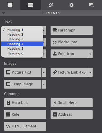
Some elements offer multiple variations that you can identify by the small ↓ to the right of the element’s name. Click on the dropdown to open all the choices for that element.
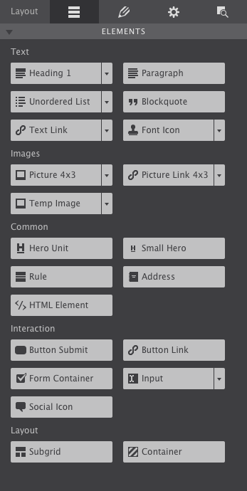
Element Types
Express what’s on your mind using the most popular group of the bunch, text elements. These components know how to scale and shift for the best viewing experience on various screen sizes. Take your pick of text headings ranging from H1-H6, paragraphs, and a few other text elements available in HTML.
The list element gives you 3 style options: unordered (bullet points), ordered (numbered bullet points), and description (indented).
A text link allows you to link to another location (another section on the same page, another page, a different website, or a file referenced online). Once you add this element to the page, click over to the Design pane to apply the URL of the link. You can also add links within text elements using the Text Editor. You can start the editor by clicking on the pencil on the design pane. Right-clicking and selecting edit or triple clicking also starts edit mode.
You can use the pulldown to select a plain text element.
Our responsive apps are pre-loaded with 1600+ font icons to jazz up your site. Drop the font icon element into place, and choose from the collection on the Design pane. You also have the choice of making this icon a link.
The next set of content elements are for images and graphics. The picture element is a newly introduced HTML specification that gives designers and developers a method to use different images based on, for example, display width or resolution. This means mobile browsers don’t have to download ginormous images intended for desktop viewers.
Unfortunately, at the moment of this writing picture is not supported by Internet Explorer and Safari. This is only a minor inconvenience considering we added a javascript based solution to make it work exactly the same in these browsers. Yet, it does mean that when testing the display width in these browsers, a refresh is needed to pull in the new image.
How the picture element works
The picture element serves as a wrapper for one or more image elements. The designer can instruct the browser to display a specific image, out of the set of images available in the picture container. In our visual design apps the image can be changed at any breakpoint. It is good practice to use smaller images for smaller display widths. This will make the page (and images) load faster and give a better the user experience. Want to learn more about this cool element and how to use it? Check out this helpful tutorial.
Unique to CoffeeCup is the ability to set a focal point on an image. Use this control to zoom-in on a specific section, which is great for smaller displays. See this in action with the photos of the Gatekeeper. You’ll notice as you make the browser skinnier, the image will bring into focus his hat, thus cutting out the less important part (background) of the image.
Use the pulldown to choose from various sizes or use the picture link element to make the image clickable.
Temp images are typically used as placeholders for future images and you can adjust the size ratio within the design pane.
The common elements help to enhance the look of a page. The hero units are combined elements, a heading and paragraph wrapped in a div container. They are frequently used to display attention grabbing text with an associated small caption. Other common elements include a formatted address, or the rule to place a line across the container that can work as separator, breaking up content and sections.
Have an embed code for a widget? How about a navigation menu or a code from YouTube? Or maybe you’d just like to add some custom HTML? Add the HTML element to your layout then switch over to the design pane to add your markup.
The interaction elements are for the more skillful web developers. If you have created a custom form, then use the form container, input, and button submit elements. Use them as a placeholder for your custom fields in the design. You will need to export the page source to complete the configuration for these elements. Using Web Form Builder? Then instead use the HTML element to paste the fully completed and functional form.
Layout elements are the last group on the elements pane and include the subgrid and container. These special elements give you more granular control over the placement of content. Like a taco, you can stuff extra elements within them.
A container allows you to group elements together and control the positioning, like for example, centering them within your layout. By applying boundaries, a width limit, to the container you can, for example, have a row with a different background that extends the full width of the screen while constraining the content elements to a certain size. Containers can be used in many ways but one good example of its use would be for navigation as explained in this article.
A subgrid element is a group of containers where you can add rows and columns within an existing column. Using a subgrid allows for more responsive flexibility at smaller screen sizes. Once you position the subgrid you can add content elements to the subgrid columns and set the span width to accommodate for the different display sizes.
Dive into our article regarding the Grids for Bulletproof Responsive Design for more in depth details regarding working with subgrids and containers.
Now let’s give these elements some personality by styling them using the design pane.