

Overview of the design pane
The CoffeeCup responsive suite features a long list of powerful design controls. These buttons, dropdowns, spinners, check - and color boxes make using the design power of CSS3 accessible and intuitive.
The design pane consists of two main sections. The first section, element, pertains to the content parts of the currently selected element. Here you can assign custom selectors (classes and ID) and, depending on the element type, edit other content related aspects.
The style section contains the design controls. The top part defines what selector (element type, class or ID) and state (hover, active etc.) the styles specified below will be applied to. There are six control groups for defining styles related to typography, element dimensions, placement and position, element backgrounds, borders and effects such as shadows.
This article gives an overview of the different sections of the design pane. Not every control can be discussed in detail or with examples. That would make this a rather long, maybe even a boring read. Instead, this article will contains links to a (growing) number of articles that focus on a certain group of controls or design example.
Working with selectors
In CSS a selector is used to select the element or group of elements, that a style declaration is applied to. A style declaration consists of the design rules, such as font size or background color, for the selected element(s). It is good practice to initially apply styles to an element type. That means that all elements of that type, like for example all paragraphs, get the defined style applied. Styles can also be applied to classes, in which case all elements of the same type that share the selected class get the same style. Finally, styles can also be applied to a single element using an ID selector.
Although this might sound complicated to people new to CSS, it is something that is very easy to work with in CoffeeCup. For example, to define a specific font style for all paragraphs, simply select a single paragraph and set the apply to dropdown to type. Now this paragraph, and every other paragraph, will automatically get the styles applied that are defined in the style groups below, like font family, size, and so on.
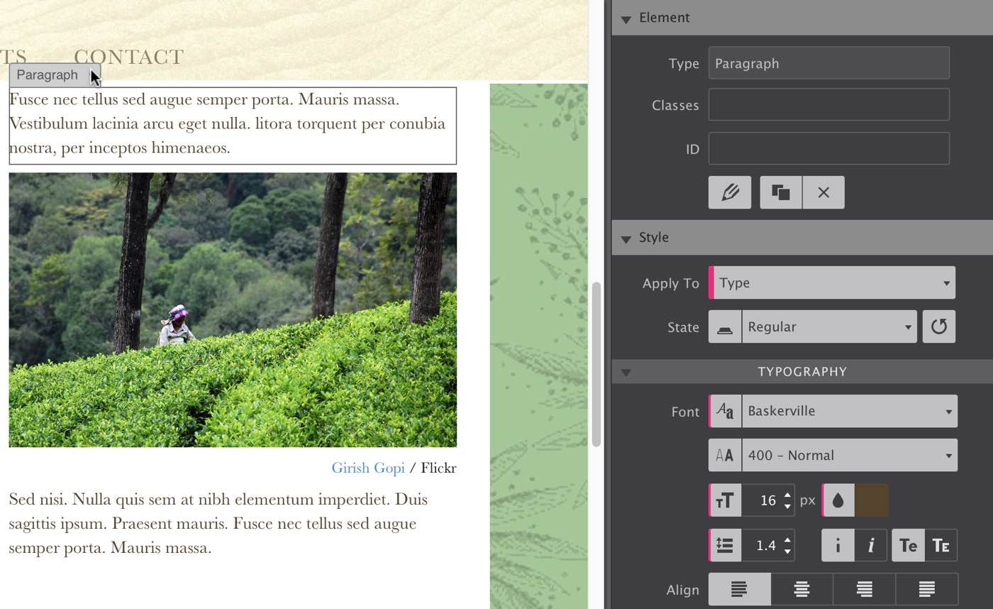
When styles are applied to an element type, the controls will show a pink line. In the example above all paragraphs use Baskerville as font-family, with a size of 16px, a brown/orange color and a line-height of 1.4. The other font styles are undefined, which means that the default styles of the framework will be used.
Each frameworks uses different default styles
Talks about the reset and minimal coffeegrinder styles and bootstrap and foundation coming soon!
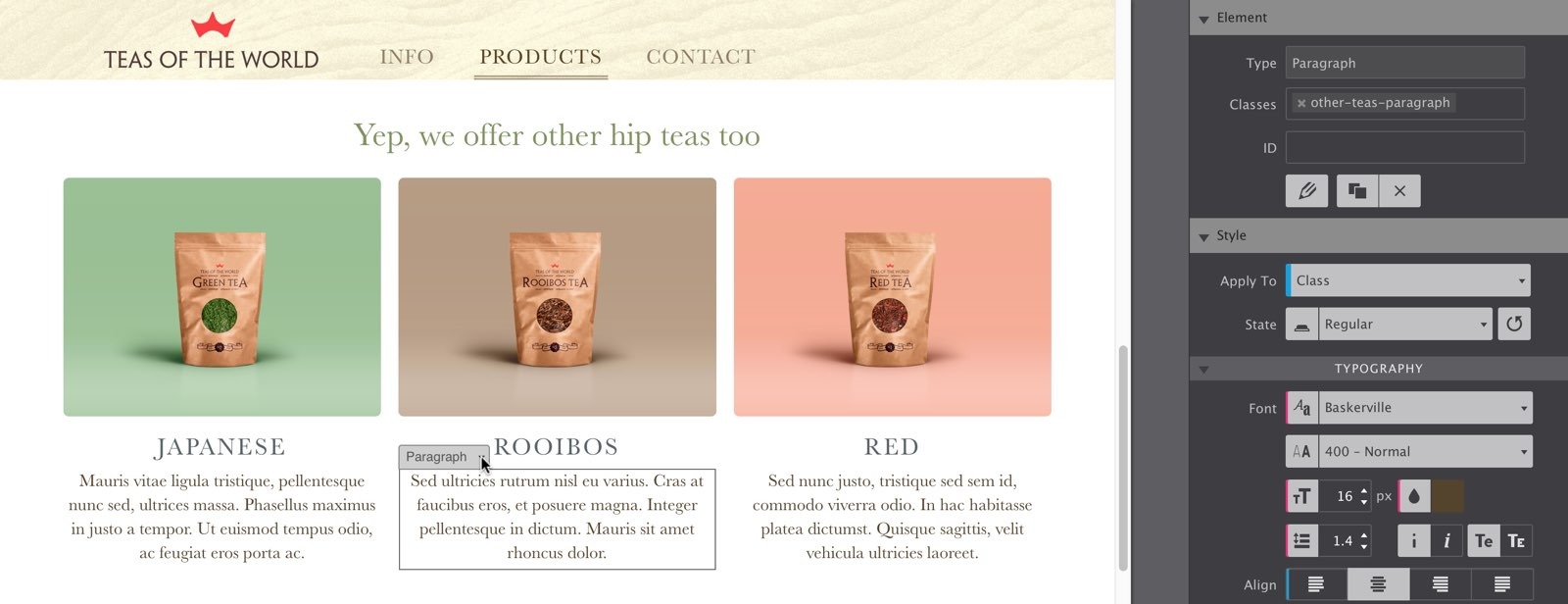
Styles are (should be...) applied to a class when a design variation of an element is used. For example, in the Tea Theme the paragraphs under the three images are center aligned. These paragraphs share the same class, so any edit will apply to all three at the same time. Style definitions applied to a class show a blue line, as can be seen on the align control in the image below. They are more specific, and take precedence over styles set for the type.
To apply a style to an individual element, you can use the ID selector. These style definitions show an orange line on the control. Styles that are set to an ID always take precedence over styles set for type and class and can not be shared.
Use multiple classes for variations of...variations!
In the Tea theme referenced above, buttons are placed below each of the three different tea sections. The typographic styles are common throughout the theme and applied to all button elements (applied to type). However, the dimensions are special to the “more info” variation of the buttons. Therefore, they are given a class to specify the special size.
Each of the buttons has a different color. This could have been done using an ID, but then that button can not be reused (remember, an ID is unique). By using a second class, the buttons can be given a different background color as well. If styles are changed while a button with the single class is selected, this will apply to all buttons using that class. Unless that style is defined differently on a button using more classes.
If styles are defined on a button with multiple classes, they will only apply to other buttons that have both classes as well. Buttons with only one of the classes will remain unaffected.
A good understanding of how CSS selectors work is very helpful. With the visual controls and color codes (pink, blue, orange), our responsive apps offer a great learning environment for those who want to familiarize themselves with CSS selectors. Now, let’s have a look at the different groups for applying these nice design styles.
The different design groups
The style controls have been placed in six groups, in accordance with their function.
Typography & text editing
The frequently used first group contains the typographical controls such as font-family, weight, size and color. These controls apply the styles to all the text in the element.
Styles can be applied to specific words, or even individual letters, as well. Clicking on the pencil at the top of the design pane, or triple-clicking a text element, starts editing mode. In this mode you can type or paste texts directly in the element. Also, the pane on the right is replaced with familiar text formatting controls. With these controls you can create text links or format the text, for example applying bold and underline to selected text. There is, however, something really special about the editing pane as well...
Reuse and mass-edit links and other text styles with classes
Just like working with elements, each text format applied to a selection can be given a class name. This makes it easy to reuse the exact same text style settings throughout the design. Simply select the word or words, and type the name of the style definition in the class name input box. A nifty auto-complete function will help you find the class name you are looking for as well. Now, as soon as the cursor leaves the box (hit the tab key or click anywhere) the previously defined format will also be applied to the new selection. Hold on now, it gets even cooler than this!
In case the design of a specific format needs to be adjusted, they can all be changed at the same time. Simply select any of the occurrences, edit, and the styles will be consistently applied throughout the entire site. No need to laboriously change text links one at a time. Selecting and tweaking one link style, changes all links that share the same class name. Now that’s a time saver!
Dimensions
The next group contains the controls for managing spacing and dimensions of an element. Depending on the element type, different controls will be available. Text element have settings for width, padding and margin. Most other elements also have controls for defining a maximum (and minimum) width, as well as a maximum (and minimum) height.
Width is set in percentages in a responsive design. This keeps the element in proportion to its parent when the display width changes. Margin is the space between an element and the border of the parent or surrounding elements. Margins are defined in percentages as well. To center an element, both left and right margin need to be set to auto and the display needs to be block. We'll talk more about the display control in the next section.
The padding is space between the content of an element, e.g. an image, and the border of an element. So if an image would have a green background and 2 pixel padding applied, visually the image is surrounded by a 2px border.
The min and max controls are pretty straightforward, they make sure an element never becomes larger, or smaller than the specified value.
Element position
Placement and positioning of elements using CSS can be very straightforward or, depending on the design ambitions, quite a bit more complex. In this overview, we will concentrate on the most frequently used settings.
By default, most elements in CSS are block level elements. That simply means that they will stack on top of each other, unless they are told otherwise. A comprehensive way of placing elements next to each other is changing the display setting from block, to inline-block. The combined width of the elements that need to appear next to eachother needs to less than 100%. This includes any added margins or paddings.
The display can be set to none to hide elements, for example for small screens. The list of display properties is long and it is beyond the scope of this article to go into detail on each of them.
Another method of placing elements next to each other is to use floats. A floated element will move as far to the left or right as possible which can impact the order in which elements were originally placed. Elements following a floated element will flow around it, like for example text around an image. A float can be neutralized by adding a clear to the next element. In this example, the image would still float left or right, but the text would not wrap around it. Because floats can impact surrounding elements, they can be a bit more challenging to use.
The positioning control can change the placement of the elements. Elements are positioned static by default. They follow the normal flow of the document and the positioning properties don't have any effect. A relative positioned element can be moved “relative to” its normal position with the top, right, bottom, left controls. It can now also overlap other elements and be moved forward (top visibility) or backward (behind other elements) with the z-index control.
An absolute positioned element is positioned relative to the element it is placed in (the parent element). For this the parent needs to have a position other than static. A fixed position is frequently used for sticky headers or logos. The element is positioned relative to the browser window, and does not move when the window is scrolled.
The overflow property specifies what happens if there is not enough room for the content to fit in the box. If for example the display window becomes smaller a paragraph can be clipped at a certain maximum height. This could stop a paragraph from growing vertically for smaller display widths.
The vertical align comes in handy when two elements that take up different heights, like for example a paragraph and icon font, are placed next to each other using inline-block.
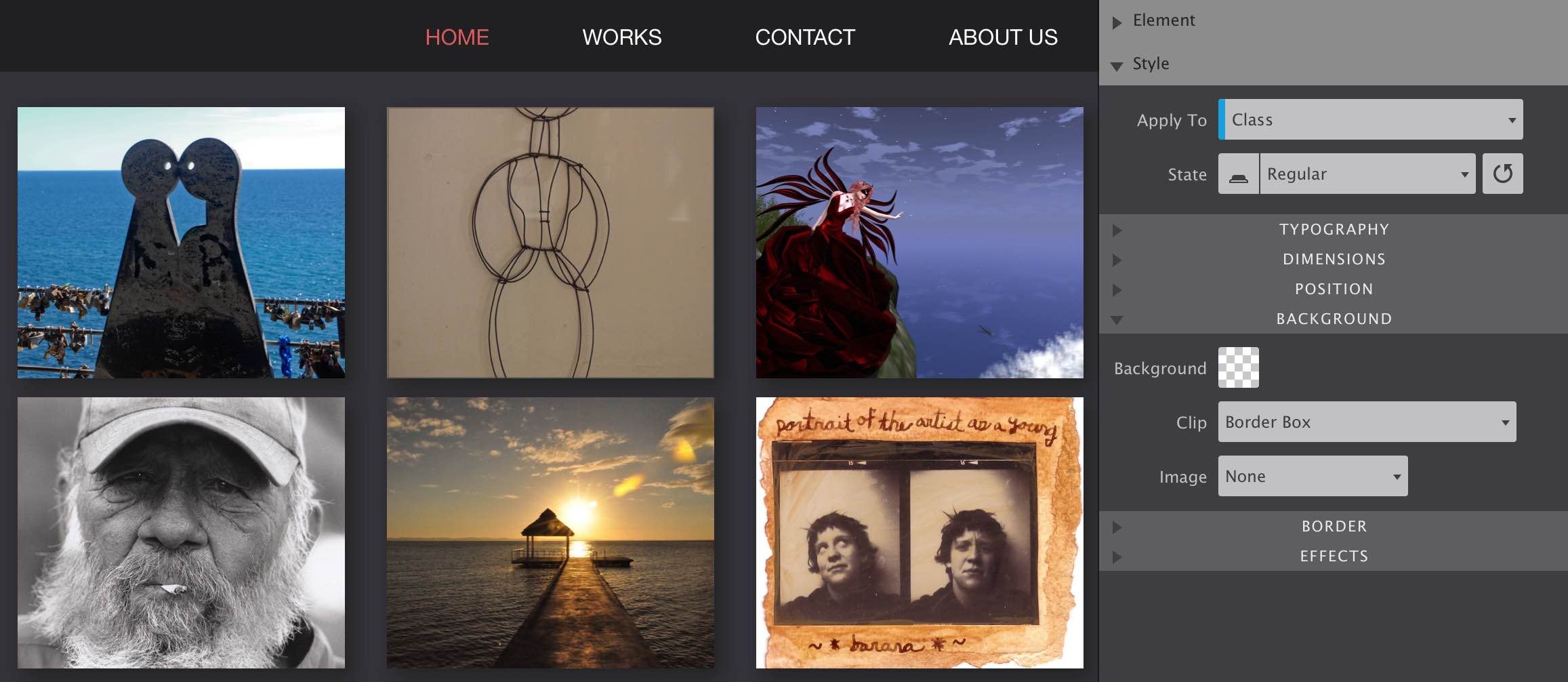
Background
Every element, from a row to a horizontal rule, can be given a background. This can simply be a background color, but also an image or linear gradient. The specified background color will also be visible if the image or gradient, which are positioned on top of the color, are transparent.The (background) image control can be used to select the type of background. If set to none only the background color will be displayed (if specified). An actual background image can be linked from an online source (URL), or selected from the local project resources. If either option is selected, a number of controls becomes available that can be used to specify the placement, size and behavior of the image. A more detailed overview of the functioning and design purposes of these controls can be found in our background property article written by Adam.
The last background image option is to use a linear gradient. Up to 4 color variations can be picked. For each color you can specify where it stops (and the other begins). The direction of the gradient can be defined using degrees; 180 degrees goes from top to bottom and 90 from left to right.
Border
For each element a top, right, bottom, or left bottom can be defined. To specify the values for all borders, click on the circle in the middle of the border select control. All lines of the control will light up, all borders are active. To work on, for example, only the right and left borders, click on the left and right lines of the control. The border width, style and color will only be applied to the active borders.
Activating a border on the control...does not add a border!
This simple activates the border(s) you will be working on. Therefore, no border on the element will be visible until a border width that is larger than zero and a border style other than none are defined.
The border radius control works the same way. First activate the borders that you will be working with, then specify the desired radius. Adam made an article that talk in more detail about the border and border radius controls.
Effects
A shadow can be defined for (the box of) each element. The exact shadow effect can be controlled in detail with the color, inner or outer shadow, blur, offset (x, y) and spread controls as can be seen in this article. Additional tools such as opacity and transform will be added to this group soon!
Styling states
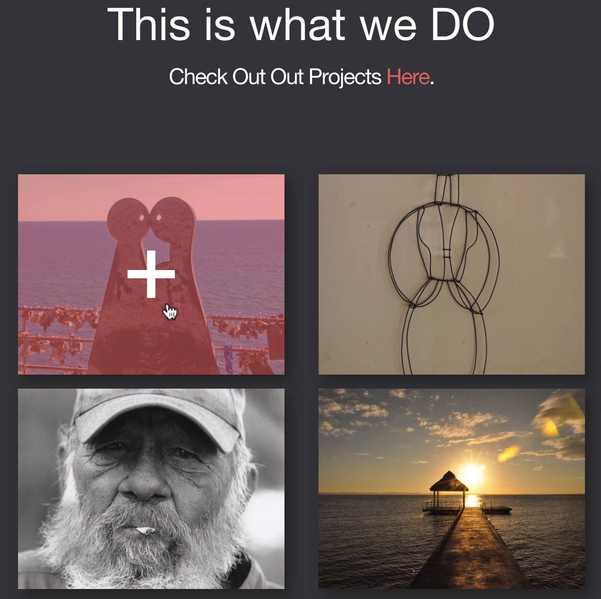
In CSS an element can be given different styles depending on the state. The hover state, when the mouse is positioned over the element, is frequently used to draw attention to an element, or to entice the visitor to click a link. Working with states is super easy—simply select the state you want to design for, from the state below the selector control. Now everything you design, every style that you define in any of the control groups, will only be applied to that state.
In the example below we are using containers with background images. Inside of the container we placed a text link that is fully transparent; both text and background color have zero opacity applied to a common class in the regular state. On the hover state we change these settings; the text (cross) color is white and the background red and semi-transparent.
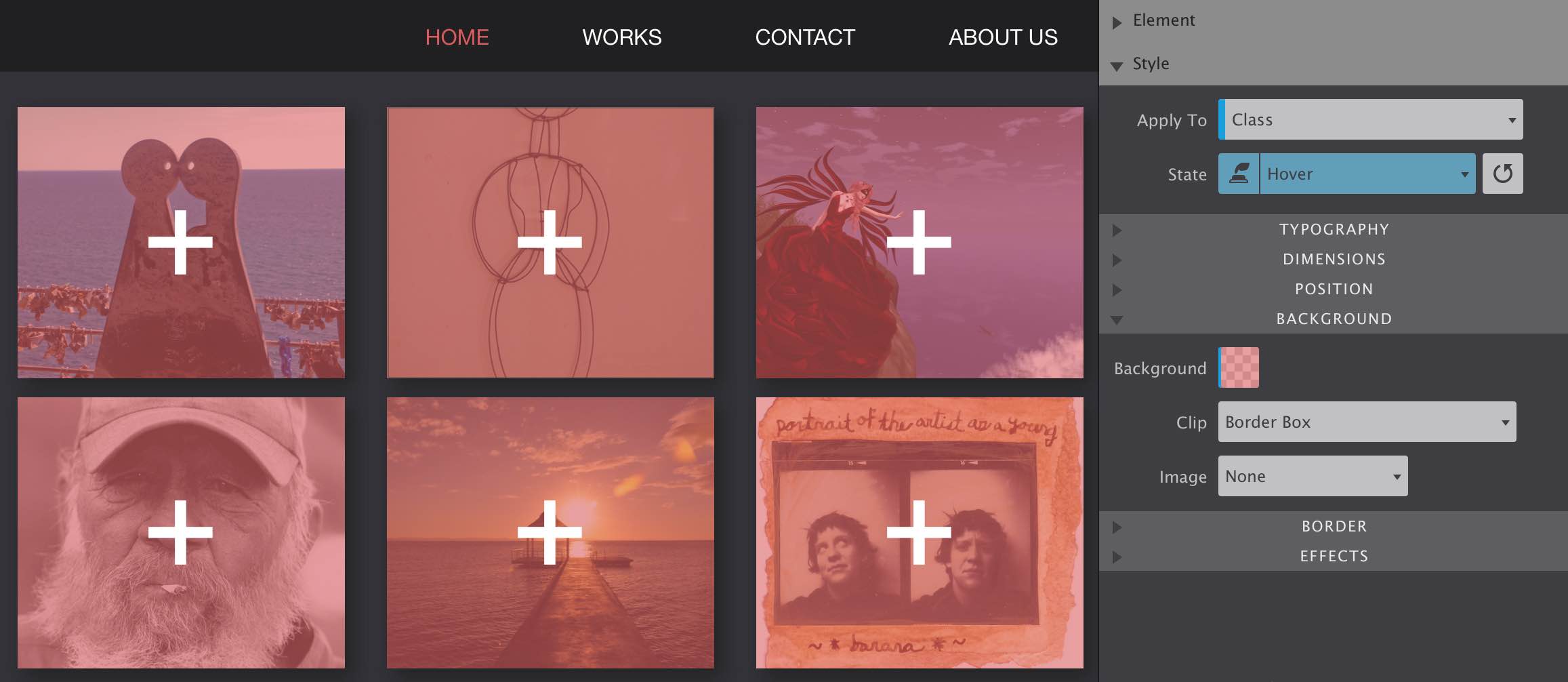
In preview mode or in the browser, when the mouse hovers over any of the text links, the hover state will override the regular state. Keep in mind that for triggering clicks on mobile additional clues might be needed. These mobile devices have touch screens, making the hover state unavailable.
Other states are active (the moment a link is pressed), visited (a link that has been visited), and focus (an input element can have focus).
Concluding
I hope this overview of the design pane, with a few tips and how-to’s mixed in, will kick-start your responsive projects. Just as the app itself, this article is not “done”. Sections will be added as we expand the functionality of the CoffeeCup Suite. The plans are big and development goes fast, you will be happy if you already own it!
Also, we will continue our writing. Links will be added for more in-depth articles on specific functions or design cases. Make for example sure to check out Suzanne’s article on working with the different elements, including the new picture element.
For any feedback or requests, you can hit me up on twitter. Or just leave a note in the vibrant CoffeeCup forums or our Facebook page. Want to share this article? Please go wild with any of the button at the top of the page, Twitter, Facebook, Pinterest or Google+ are all good to me!