

Responsive Website Design Cheat Sheet
Ready to start building an awesome website but don’t know where to start? We’ve got you covered. I’ll break down the fundamentals for working with Responsive Site Designer, Foundation Framer, or Bootstrap Builder. I’ll also point you to the right direction for helpful tips and popular questions and show you how to incorporate the additional plugins and apps bundled with the Responsive Design Pack.
Start small then go big!
- Learn how the Toggle Breakpoints control will help you expand your working window.
- Designing mobile first
Build your grid
Add content to your canvas
- Read more about the available elements
- Browse the CoffeeCup Components Library
- Sync up content using Symbols
Style to your content
Add new pages to your project
Responsify for wider screens
- Watch the Slider & Breakpoint video
- One click to add custom breakpoints
- Use the Zoom Controls to build for screens larger than your working machine.
Enhance with apps like Form Builder & Content Slider
Publishing
Improve site performance
Promote your site with responsive emails and newsletters
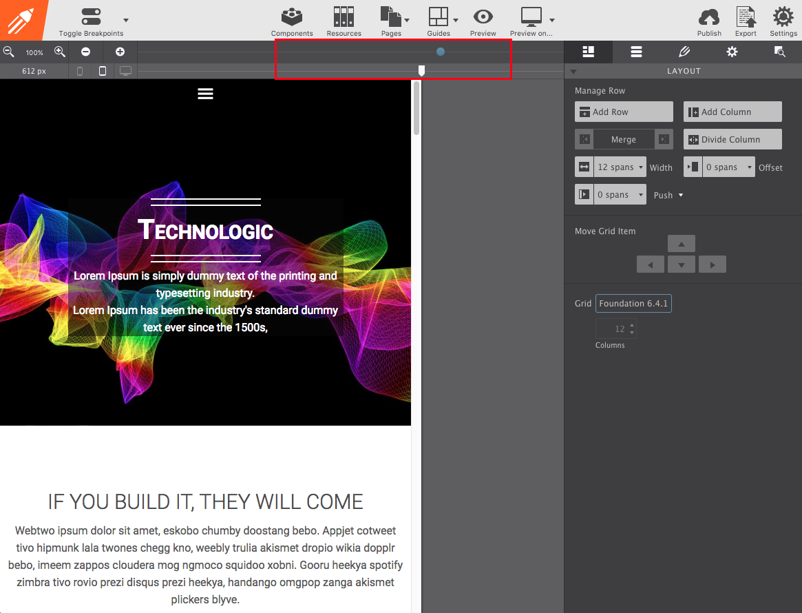
Design your website for smaller screens first, then make adjustments for wider screens. When you begin, make sure the width slider is positioned to the left of the first (smallest) breakpoint. All of your default styles will be set when you are in this position.
Helpful Resources
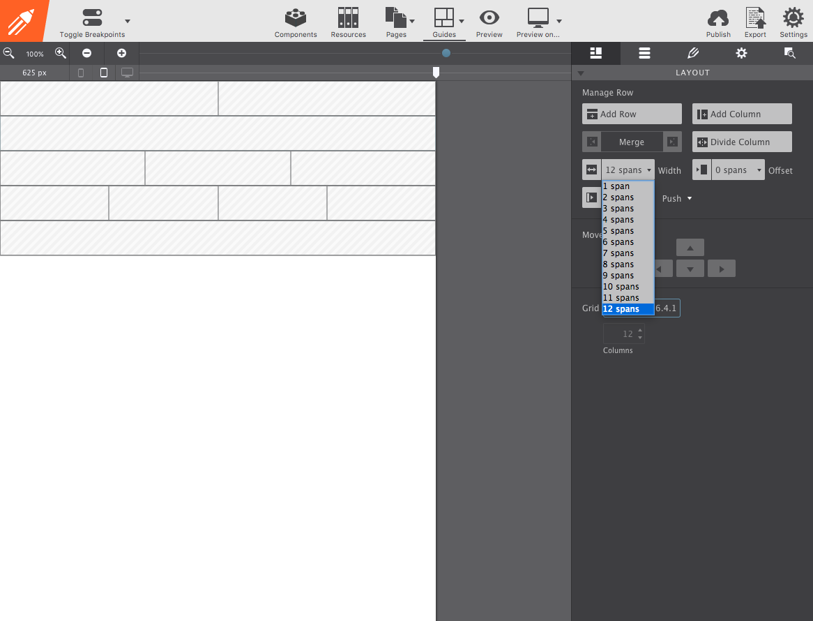
Responsive design is a lot like working with a spreadsheet — yup just like Excel! From the Layout pane  add rows and divide the rows columns. The columns will be used to hold your site content. A row can be divided up to 12 columns (aka Spans) across. These columns are divided and merged together depending on what content you need it to hold.
For example, let's say you want two items at the top of your page, a logo and your company name, then you would add a row and divide it into 2 columns. Both columns can be whatever Span width you want (up to 12). Make them equal 6 Spans each, or you can manipulate the width depending on what needs more room. You'll also be able to change the Span widths of the columns for larger screens (more on that later). Rise and repeat throughout the page.
Helpful Resources
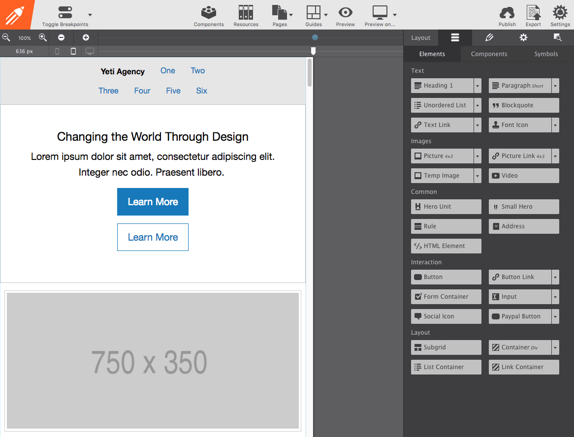
From the Content pane  drag-n-drop items into your layout. Choose from a large selection of content elements. Nestled in this section are also the tools for accessing Components (customizable site items like menus and photo sliders) and Symbols (for syncing common content like your navigation).
Helpful Resources
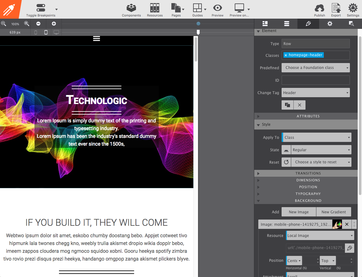
Double click any item on your canvas to launch its style properties. The Design pane  will load on the right allowing you to change colors, size, position, set link destinations, and so much more. To edit text, triple click on the canvas to open the inline editor. Type right on the screen and make text style variations.
Helpful Resources
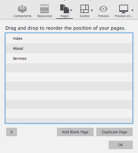
Manage all the pages in your website project using the Pages icon. From here you can jump to the Next or Previous page in the site. You can also Add a new Blank page or Duplicate an existing page.
Helpful Resources
Move the width slider at the top to the right to view your design at larger screen sizes. When the slider passes over a breakpoint (the little dot at the top) you can apply layout and style changes that will activate whenever the viewer is on a screen of that size. Make text larger, buttons bigger, or change column spans to make content spread out to accommodate the larger width.
Helpful Resources
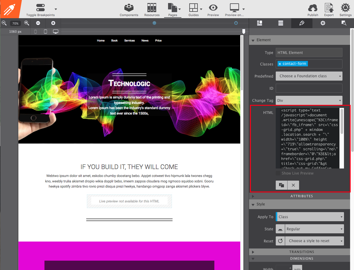
Easily add plug-ins to your site using the HTML Element. Web Form Builder is wildly popular due to its ability to craft contact forms, make surveys, as well as collect payments & donations. Craft your form in the app and copy/paste the code into your site. This works for other apps like Responsive Content Slider too!
Helpful Resources
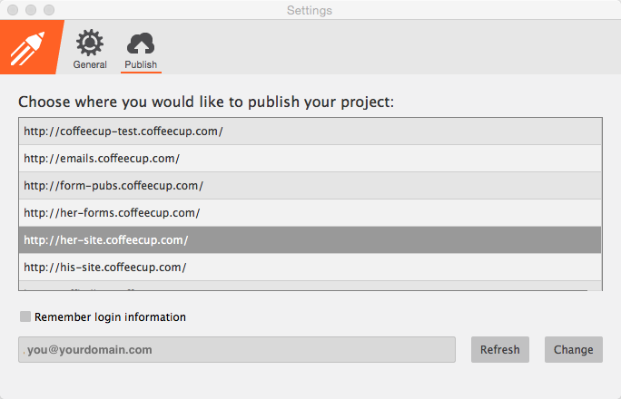
When your website is completed, publish in one-click to your CoffeeCup S-Drive account. Hosting with a third party provider? Hit the Export button to save all the files to your computer and then upload them to any server.
Helpful Resources
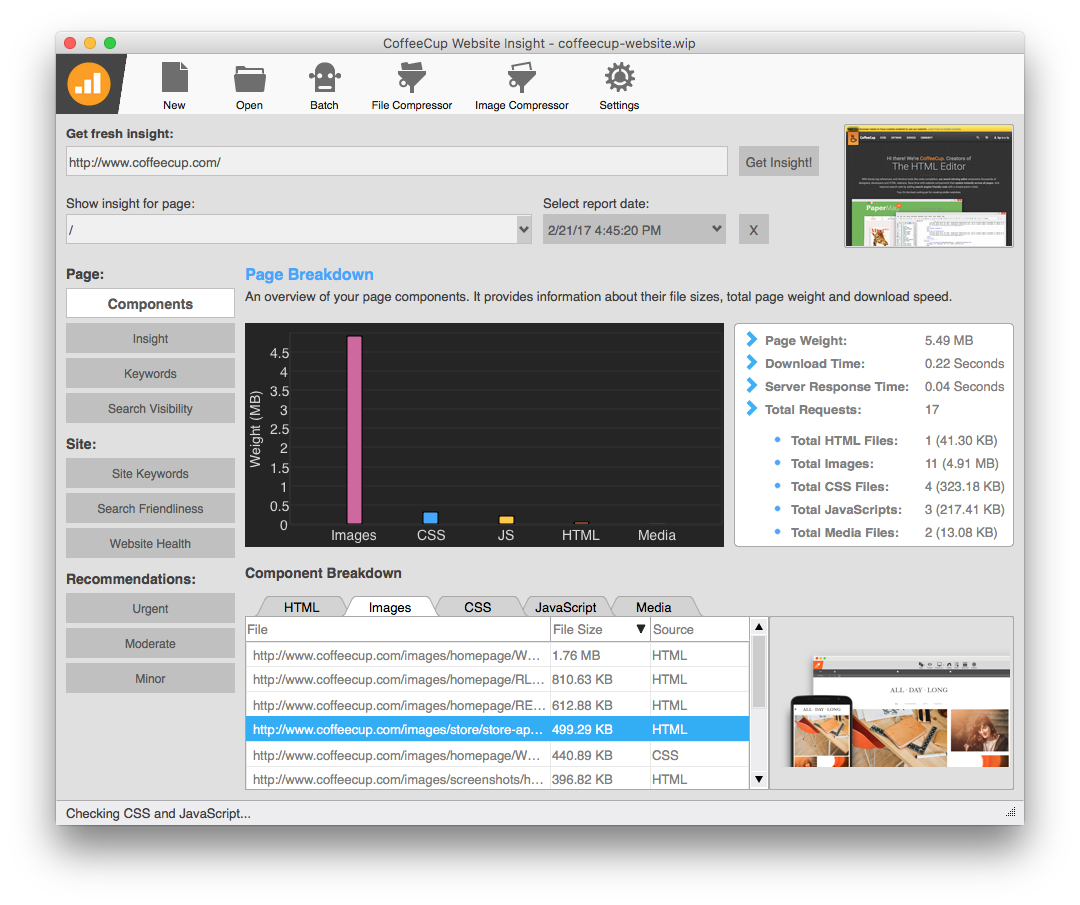
Once your site is live and ready for primetime, there are a few extra steps you can take to maximize its performance. Probe sites for valuable SEO intel and find areas for improvement with Website Insight. And then use Sonar to get comprehensive data on how your web page is performing across devices.
Helpful Resources
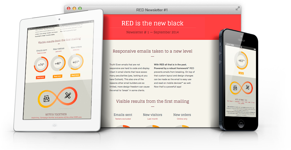
With your site rockin-and-rollin’ online it’s time to spread the word so people can find you. Using the code-free Responsive Email Designer you can cook up custom newsletters, emails, and sales notices that display beautifully everywhere.
Helpful Resources
Build Epic Sites with the Responsive Pack
Create killer sites with interactive photo galleries, plus contact & payment forms. Generate unlimited SEO reports. Upload to the web. Then build mobile-friendly emails and newsletters to drive traffic to your design. Includes 65 responsive form themes plus 1 year of hosting for free! Yup — this pack is HUGE!