

It is always helpful to have predefined classes when designing any website. That is why both Coffeegrinder and Bootstrap 2 have included a few predefined classes that can make building your website even faster than before.
Coffeegrinder
Coffeegrinder is the default Grid system for Responsive Layout Maker and was created by us (yes, we are rock stars)! It also contains predefined classes that can speed up your workflow. We are going to cover the different types of predefined classes available to you in Coffeegrinder and explain some of the various formats.
What is a class?
The class attribute is used to specify one or more class names for any HTML element and point it to a class inside of a style sheet. You can name the class whatever you like as long as the name matches (both in the CSS and HTML) and does not start with a numeric value.
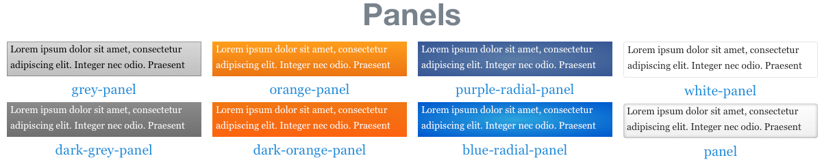
Panels
Panels are a way to style the background of an element. All elements, Columns, Rows and even the Grid can accept a panel class. To apply the class simply, select the element you wish to style in Responsive Layout Maker and enter one of the 8 class names listed below.
- grey-panel
- dark-grey-panel
- orange-panel
- dark-orange-panel
- purple-radial-panel
- blue-radial-panel
- white-panel
- panel
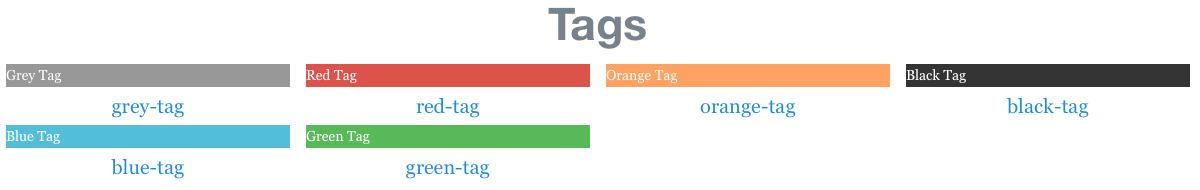
Tags
Tags allow you to set a background color for most text based elements (Paragraph, Link, Text etc.) but they cannot be used on Columns, Rows or the Grid. The following class names can be used to set a tag:
- grey-tag
- blue-tag
- red-tag
- green-tag
- orange-tag
- black-tag
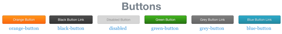
Buttons
We all love to color buttons and with predefined button classes we can do just that. These button classes can be applied to any element, however, just note that they do have a :hover pseudo class applied. This means when the element is hovered over there is a different style effect applied to it. You can use the following predefined button classes in your layout:
- orange-button
- black-button
- disabled
- green-button
- grey-button
- blue-button
Images
Most images that you add to your website are typically in a box style format (square or rectangle). Styling your images allows you to alter their appearance giving them a different look. There are two predefined classes in Coffeegrinder for styling your images:
- round
- framed
Both of these classes are semantic, which basically means they do what they say and can only be applied to images, so do not try adding them to the Grid!

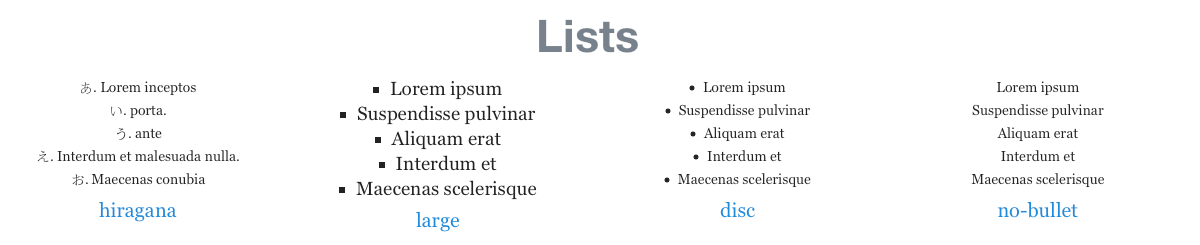
Lists
Lists play an important part in how information is displayed in your page. Just like we have in this article, we have used lists to display the predefined class names available to you in Coffeegrinder. These classes can only be a used on the List element. There are four main list styles you can apply:
- hiragana
- large
- disc
- no-bullet
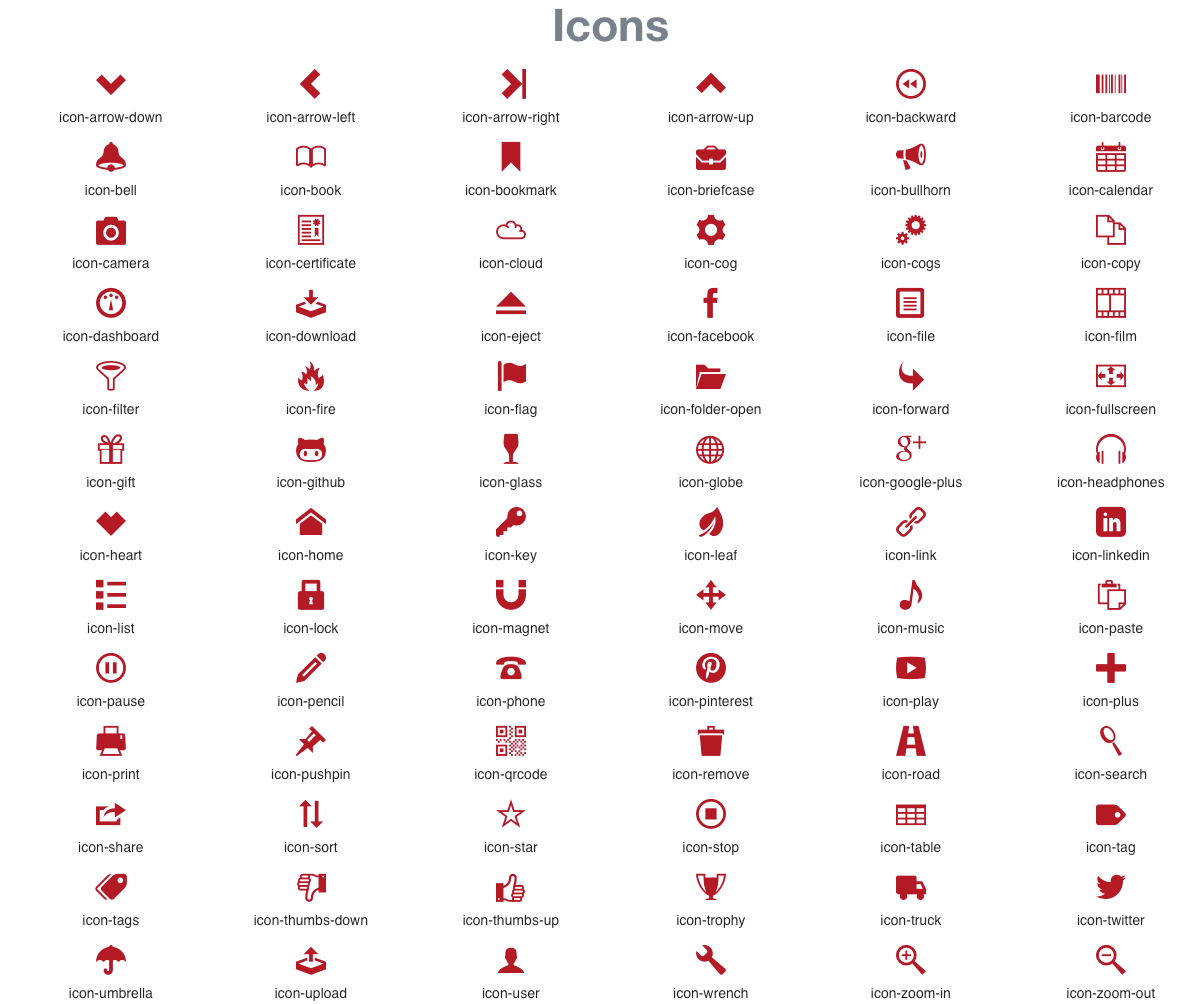
Icons
Icons are all around us in the ‘real’ world and in the ‘digital’ world. In the real world they represent “No Smoking, STOP, Trespassers will be Shot, etc.” In the digital world icons can be used to represent a word, action, or service just like in the real world. Font Icons are not images, they are text that is rendered in the likeness of an image. If you remember Wingdings, it is the same look and has improved over time. What this means, is that you have less load time and the weight of your page is smaller. Which increases the user experience and the visual design of your webpage! Font icons are to be used with the Text Element.
Coffeegrinder offers 1,200+ icons to choose from in your Layouts and since this list is so large, we are going to make a separate site entitled Font Icons available in Responsive Layout Maker.
Bootstrap 2
Bootstrap 2 offers many predefined classes that you can find on their components webpage. Most of these classes can be applied inside the program or after export. They work in the same way the Coffeegrinder classes work but some classes can only be applied to elements whereas others can only be applied to Columns, Rows or Grid.
Some predefined classes in Bootstrap 2 can cause Rows and Columns to be challenging to select once they are applied. There are two options to overcome this issue:
- Apply the class to your element after export.
- Select the element that is nested in the Column then go to the Layout Tab and use the Navigator to select the Column or Row.
Code well my friends!
Missing some settings?
This is because Responsive Layout Maker Pro was used for the creation of this article. One or more of the settings used here might not be available in Responsive Layout Maker. For the most part however, you can continue through the article adjusting the settings that are available to you.