

Row & Column Management in the Grid
Keeping the content and page elements organized at every possible display width is virtually impossible without the use of a good grid system. Grid based layouts convey order and consistency by subdividing the content and design areas into a series of rows and columns. Printed publications like news papers and magazines have been using grids for decades and over the past few years their popularity in web design has increased rapidly. If you want to learn more about grids you should read Grids for bullet proof Responsive Design.
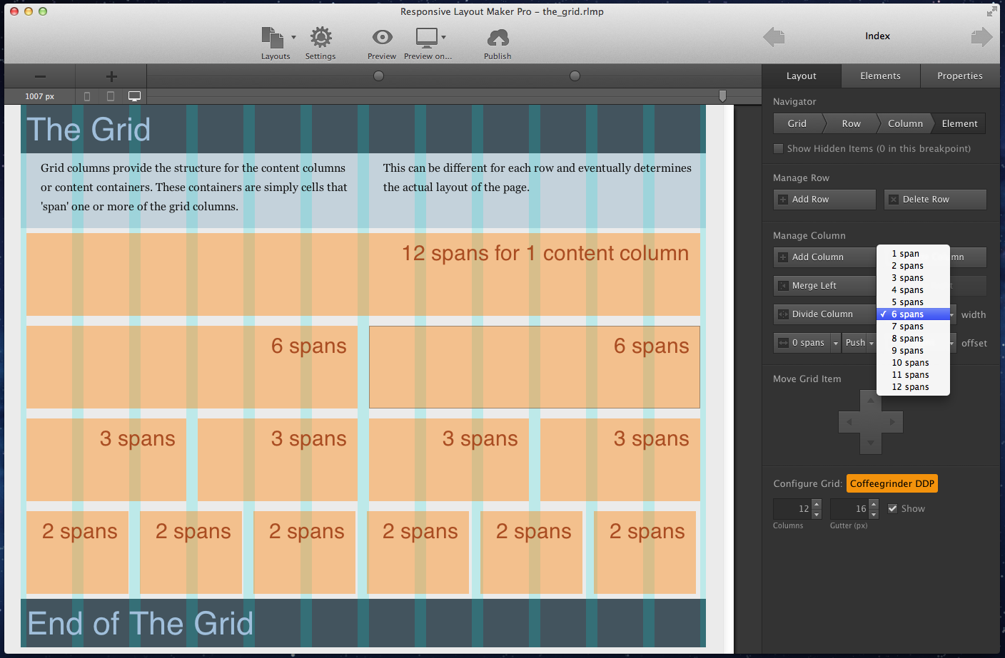
One of the main characteristic of a responsive grid is the usage of content containers, or content 'cells' as found in spreadsheets, that ‘span’ a certain number of grid columns. Other page elements like paragraphs, images and so on are positioned in these containers. The width of these containers can be easily managed and plays an important role when defining responsive actions like for example The Stack. But now we're getting ahead of ourselves, before responsive behavior can be added the content or content placeholders need to be in placed in the containers. So let's start by choosing a grid system and setting up some content cells.
When the application starts, it automatically opens with the default grid system, Coffeegrinder DDP. Other grid systems can be selected through the file > new from > .. dialog. We have a write up in the works that explains the structure and differences of various popular grid systems. For now, if you never worked with grid systems before you can trust us that Coffeegrinder DDP is a solid system to get started with. And if you have been using grid systems before, the choice is entirely yours. :)
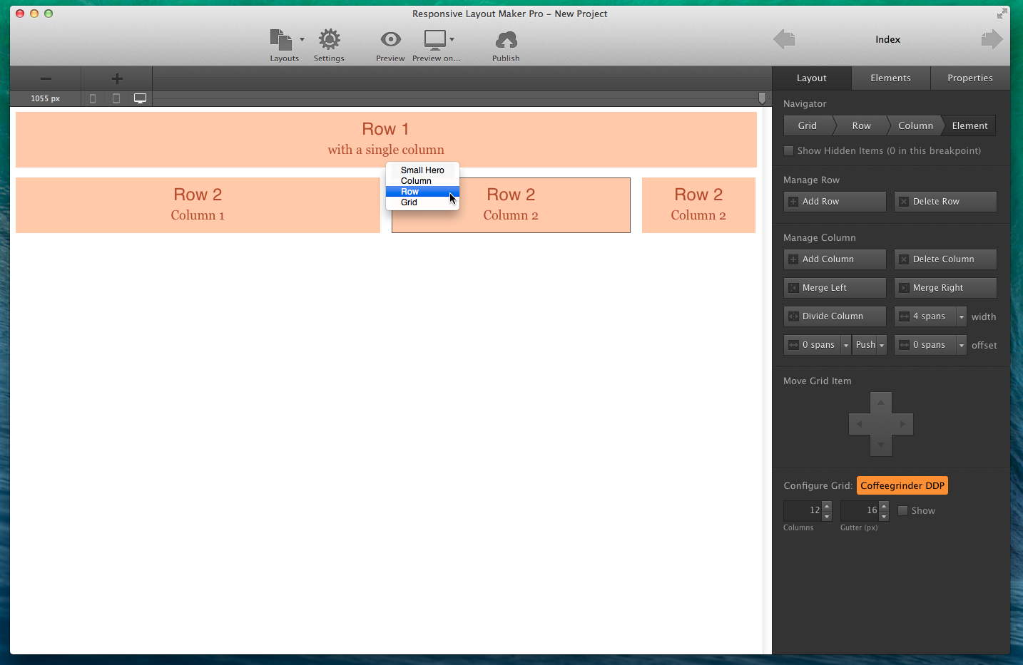
After the selection of a grid system, the application opens with a layout consisting of two rows and the Layout Tab active. The first row has one content container, the second row is divided in three containers or 'layout columns'.
The 5 feature control groups of the Layout Tab:
The Navigator
A layout consists of four basic building blocks: The Grid, Rows, Columns and Elements. The Navigator helps you select them and it shows your current selection. Click on the left in the navigator to select the parent or grand (grand...) parent of your current selection. You can also select elements by clicking on them or use the drop down positioned in the top left of each column.
If the design contains hidden items, something that is common practice in responsive sites, you can activate the checkbox below the navigation control to make them all visible. This makes hidden elements selectable so they can be moved or edited.
Manage Row
In this section you can add and delete rows from your layout. A row consists of one or more columns which in turn hold elements. The Delete Row button is only active if a row is selected.
Manage Column
A row can be divided into Columns. The available actions in the Manage Column section depend on the current selection. If a column is selected all actions are available. Columns can be added, deleted, split up (divided) or merged. Merging columns comes in handy if both columns already contain elements that you want to combine.
For every column you can control the width or 'grid span'. A span of 6 in a 12 column grid means that the column takes up half of the grid width (6 out of 12 total columns). The span width can be adjusted at any screen width — this is explained in detail in Chapter 4.
When the total span of the combined columns exceeds the available columns in the grid, 12 in this case, the columns on the right that don't fit will be pushed down. The columns stack but since they stay in the same row, the row is made to expand vertically. Increasing the grid span for columns at smaller screen sizes is a good way of making more width available for the columns and elements so they remain usable.
Don't get in the habit of putting all columns in a single row though, that will limit the responsive flexibility of the layout design.
Move Grid Item
The move tool can be used to move rows up or down, and columns left and right. Elements like images and paragraphs can be moved using the mouse, but rows and columns can not. Make sure a column or row is selected when you use the mover. Also please note that columns can not be moved to another row.
Configure Grid
Adjust the number of columns and gutter size to create the grid configuration you are most comfortable working with.