

When using Responsive Email Designer there are many different email clients that you have to take into consideration when you are designing your email. While there are many out there (hundreds), by designing your email for the top 10 most used email clients, you can ensure that 95% of your customers are receiving a clean, crisp and responsive message from your email campaign.
First thing you need to know is who these top 10 email clients are. According to Email Client Market Share the most used email clients are:
- Apple iPhone - 26%
- Gmail - 13%
- Outlook - 13%
- Apple iPad - 13%
- Apple Mail - 8%
- Google Android - 5%
- Outlook.com - 5%
- Yahoo! Mail - 5%
- Windows Live Mail - 2%
- Thunderbird - 1%
Now this next bit of information is a bit hard to believe but is true none-the-less. Currently, there are only two email clients that support Responsive Emails. Yes, you read that correctly, only two! These are Apple Mail and iPhone iOS 7/iPad. We have been saying Macs are better for years, believe us now? ;)
What this means for you is that 47% of all email client users will receive a responsive email while the other 53% will not. Your email will still be visible and usable, it just will not be responsive. This does not mean that your email can not be tailored to fit each of these email clients though. Knowing how to create an awesome responsive email for all of the different clients can be confusing to say the least.
Margin Support
A good example is how margins are not supported in Outlook.com, but it is supported in all the other major clients. To correct that, the alternative would be to use half margin, half padding. The reason being is Outlook.com does not support margin, and Outlook 2007-2013 does not support padding on div’s and p elements. If you would like 6px margin-bottom on your p tags, use 3px margin-bottom and 3px padding-bottom to have an uniform look between all email providers.
The most common question asked is “Where should I start?” and the best answer is with the client that supports the least amount of settings, or the major components of Responsive Email Design. This article will help you understand how to create an all encompassing email that will look good in all of the top most used email clients.
What you need to know…
The best place to go to see which email client supports which CSS property is Campaign Monitor
Before we get started, there is something that you should know. Responsive Email Design is not like building a responsive website. Browsers are slowly adapting and adding support for CSS3 and HTML5 however many email clients are being hardheaded and have not moved in years. Some email clients have even taken a step backward in support for responsive design; an example would be Outlook. Outlook uses Word to render its emails, yes, Word… This just goes to show that emails are quite different from website design.
Do not be discouraged by this, just because responsive design is not supported as it does not mean that you can not have a well laid out email, there are just some hurdles to overcome to make it happen. The one thing we have found is you should keep your email simple as the more complex the design, the more likely it is to fail on the popular clients.
Next, you need to forget all the CSS3 and HTML5 you learned when designing an email as we are back to a table based layouts, nested tables and inline CSS. This fact made us cry as well, so go ahead and let it out... We'll wait… ;)
Email Testing!
You NEED to test your email designs continually on a regular basis. This is because of the ever changing world of CSS support in different email clients. Just because your email design looks good in Gmail this week, does not mean it will next week. Responsive Email Designer will do most of the work for you when it comes to the code portion of the design but you always need to be aware if changes were made in what a specific client or service supports.
Backgrounds & Images
The good news about background colors is their supported across the board. Unlike colors, when using background-images, gradients and images in your email design you should be aware that most email providers hide images by default. You should keep this in mind when designing your email by trying not to include important content using images, as your viewers may not see it without having to enable a setting in their client. Using text is always the safest choice.
With images being suppressed by default in most email clients, many will display the ALT text as a replacement or alternative to showing the image. This allows you to use word(s) to signify what the image is, giving you some measure of control over the displayed information.
As with ALT tags and images, it is always important to provide a fallback color for any background image you plan to use in your email design. A fallback color allows you to set the color that would replace the image if it is not displayed since not all clients support images as mentioned earlier.
Background-image is not fully supported
Outlook.com and Outlook 2007-2013 do not support the background-image property. Responsive Email Designer provides a fallback option which allows you to set a background image for the supported clients and have a fallback color for those that do not support it.
As a workaround for the background-image support in Outlook 2007-2013 and Outlook.com is to consider how you place the image. Does the image really need to be a background image, or can it be placed with an Image Element and still have the same effect? For example, you have an image that is 10px x 100px that you want to use as a background image:

You could place the image above in your design by using the background-image property as It would be simpler and shed some time off the design process, but not all clients support background-image. However, if you were to take the above image into an image editing program and increase the width to 10px x 600px (or the width of your column) you could then insert the image using the Image Element to provide the same effect:
By using the Image Element, it allows the image to be visible all email clients. It may be a bit more work, but in the end it will provide with a better viewing experience.
There are a few other settings located under the image element that do not function in some clients, but these are more esthetic settings such as border-radius, box-shadow etc.. Our take on this is if you are going to use them, then use them and not worry that they will be visible in all clients.
When trying to incorporate background colors on a row when the background color on the columns are different, there are a few things that need to be done to make sure the design is compatible with the majority of email clients.
The simplest way to achieve this is by placing the contents (Heading 1, Paragraph etc..) of the column inside a Container Element that will then allow you to set the margin and padding on the container rather than setting them on the Paragraph or Column. Rather than setting the margin and padding directly on the column, applying them to the containers instead allows you to make sure the backgrounds of the column are the same height. This will then visually give you the effect that the columns are the equal height.
Text Links, Buttons and Social Elements
When working with Text Link, Buttons, or Social Network Elements in RED you have to reconsider how you position them in your design. With the float property not widely supported, it has not been included in the Properties for Text Links or Social Network Elements. This means you just have to use different properties to achieve the same task.
To have your links, buttons, and social icons show correctly in all email clients we have to think outside the box of normal website design. As in web design to have a menu that is horizontal and evenly spaced you would normally use the float option on a UL. However, in an email design this is not the best practice to accomplish a list of links. Let’s say you want to create a Menu, Button Nav or Social Elements like the ones below in your email design:
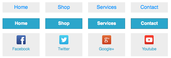
If you have four links as above and would like to have them evenly spaced (centered) in your layout an easy workaround to place these in your design would be to place each of the links in their own four respective column rather than having them all in one column. Such as this:

This will allow the text links, buttons and social icons to be horizontal and have a set amount of space in between each Element.
There is another option to consider. Rather than assigning a Text Link Element navigation for the web pages you wish to link in your email you could include them in the text of your Paragraph Elements using the in-line text editor. Doing this, greatly simplifies your design and ensures it will display correctly in all email clients.
Fonts, Text, Align & Display
Google Fonts are a great tool in web design and can be in email design as well. When taking fonts into consideration, only Apple Mail and iPhone iOS 7/iPad support the @font-face property. The @font-face would include any of the Google Fonts you wanted to use. However, you can still use these fonts to style up your emails as RED will place a fallback font family of Helvetica, Arial, and sans-serif into the code automatically. This is a worry free issue but is still worth mentioning.
When using Text Shadow, note that it will work for all supported clients but simply will not be visible in Outlook 2007-2013 or Google Gmail.
Alignment can be your best friend by allowing you to align left, center and right almost any element flawlessly. However, there is one catch. In Outlook 2007 and 2010 align-right does not function in the way it should as it makes the elements stack on top of one another rather than side by side. We recommend you do not use the right align feature but instead place the elements you need to reposition inside its own column. Please note that in Outlook 2013 the right align feature works (crazy right?) just as intended.
The display property is used to hide or show columns, rows, or elements in your email design. Outlook 2007-2013 and Google Gmail do not support this setting; however, there are workarounds that are included in RED to allow you to hide an element. Be sure to test your design when hiding elements to ensure the settings took effect.
Bringing it all together - Creating a Cool Email
Let’s go ahead and create a very simple email design together so that you can use what you have learned and build your responsive email.
Download Project Files
Download the project files below so you can follow along then go ahead and open RED and start a new project.
Responsive Email Designer Trial Project FilesStep 1:
First start by adding a Constrained Row with two Columns (A & B), then delete all other Rows in the project. Select Column B and divide it twice changing the span width of each column to two spans. This will leave you with Column A, B, C and D.
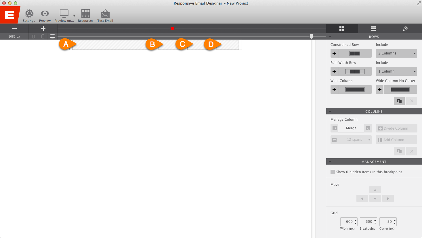
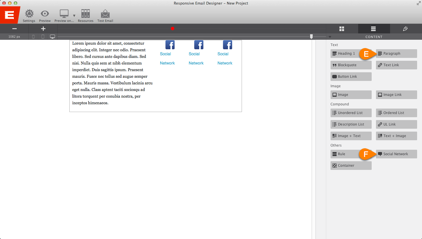
Next, drag over a Paragraph Element (E) into Column A and a Social Network Element (F) into each Column; B, C and D.
Triple click the Paragraph Element to enter the text editor and edit the text to say “Get 20% off all in store purchase this month only!". Next, apply a class name of pre-text, reduce the font-size to 12px and change the font color to #000000.
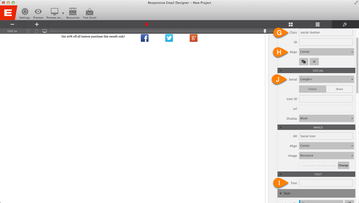
Select the Social Network Element in Column B and apply the class name of social-button (G). Set the alignment (H) to the center and remove the text “Social Network” (I). Repeat these steps for the remaining two social media buttons in the other columns changing the Social (J) settings to Twitter and Google+.
Step 2:
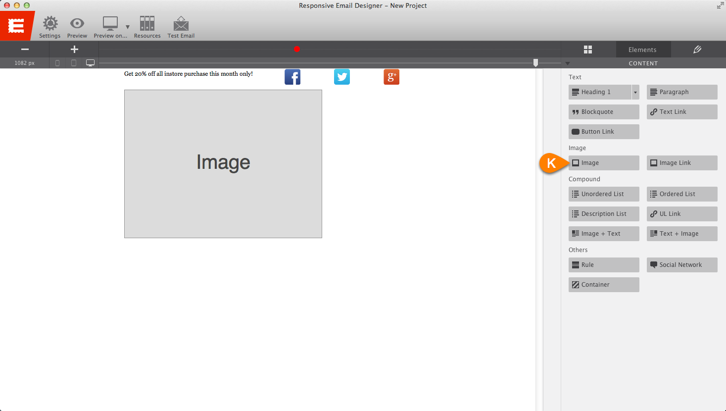
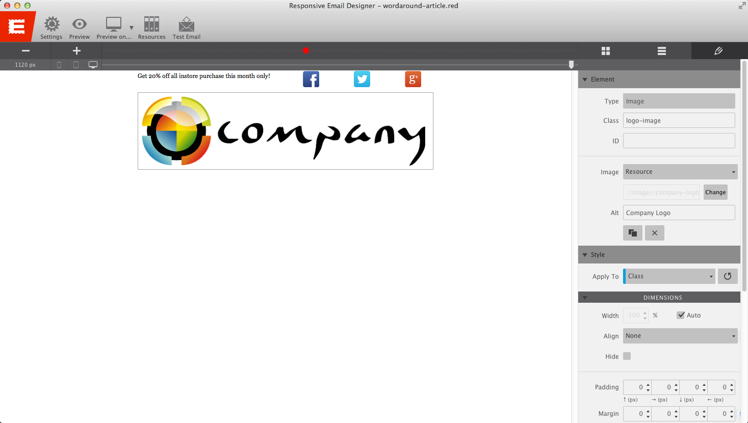
Click on the Layout tab and add a Constrained Row and make sure it appears at below the previous one with one Column and insert an Image Element (K) into the column. Select the image and go to the Properties Tab.
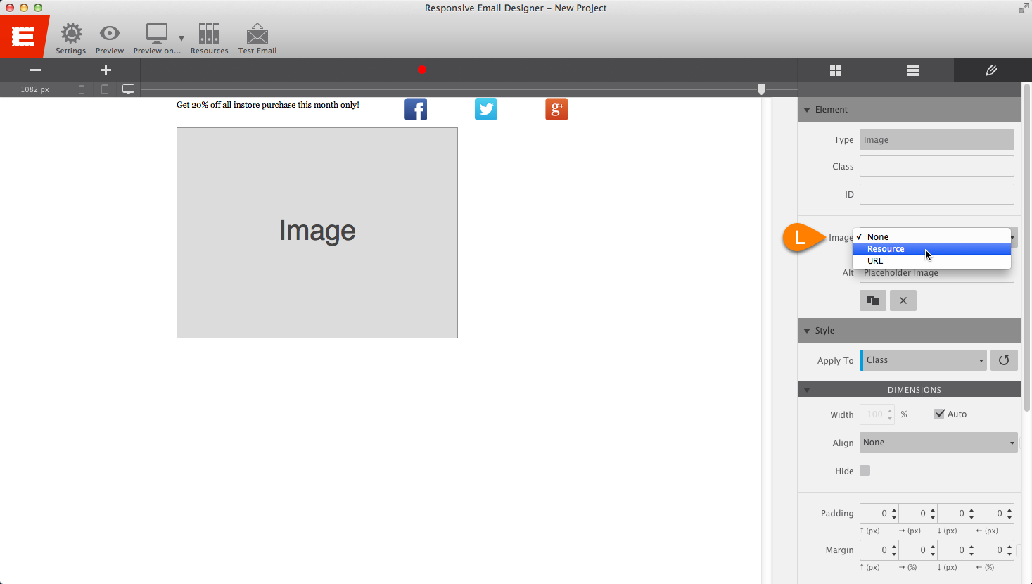
To add your image to the layout, we need to select the image we wish to use by selecting Resource under Image (L). This will bring up the Resource window (M) where we can add images to the project.
To keep the images nicely organized, add a folder called “images” by clicking the Create Folder (N) button and naming it “images.” Next, click the Add Image (O) button and browse to locate the logo image file provided in the downloaded zip file above.
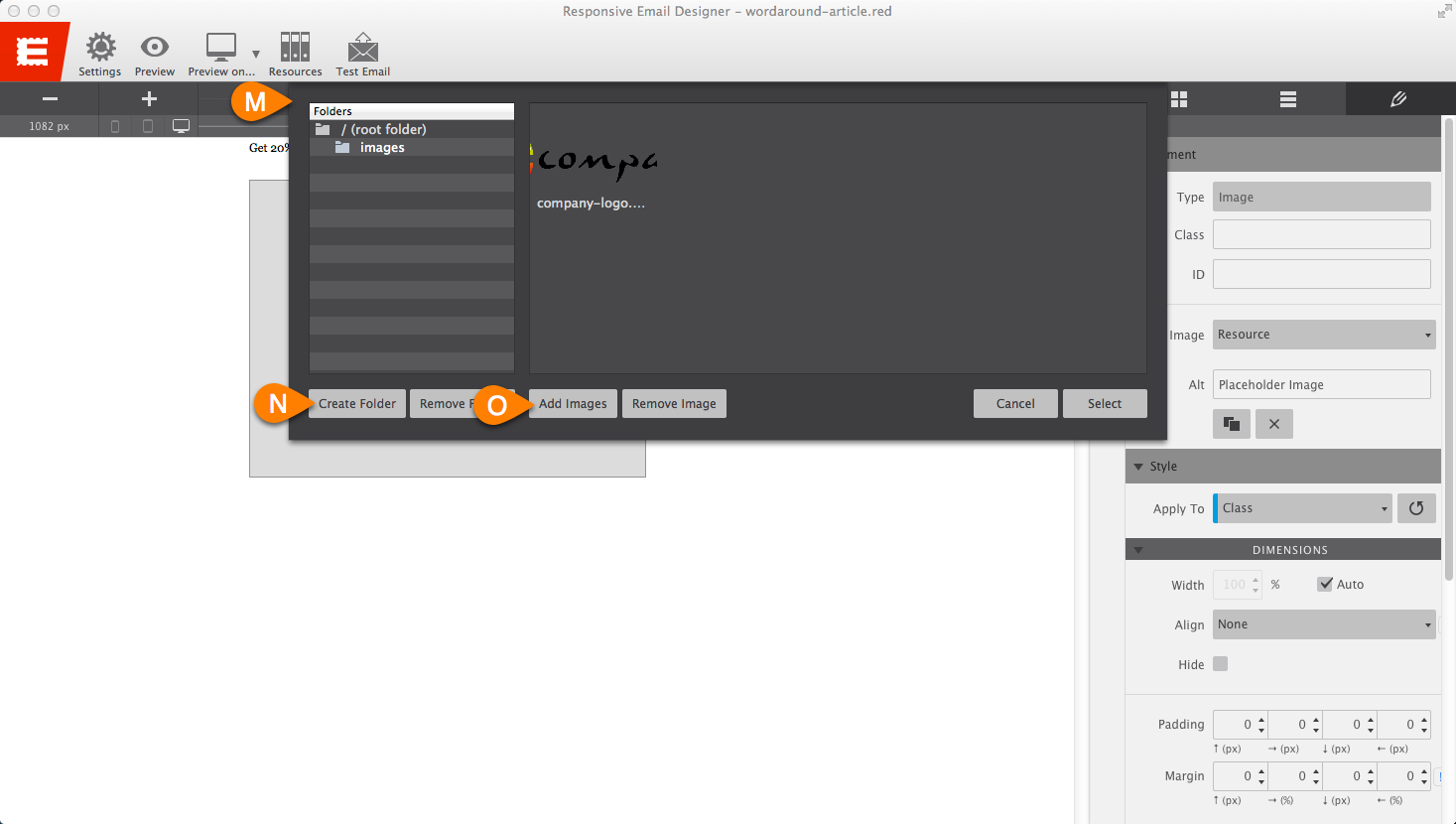
Once the image appears, click on the image and then click “Select.” This will replace the placeholder image with the logo. Next, apply the class-name logo-image to the image and add the ALT Text “Company Logo.”
Step 3:
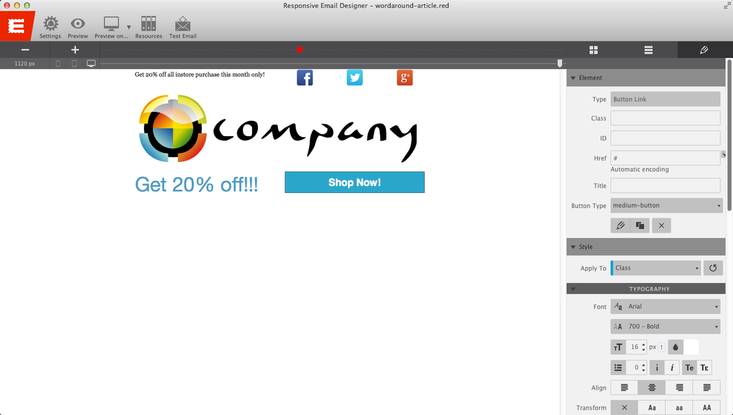
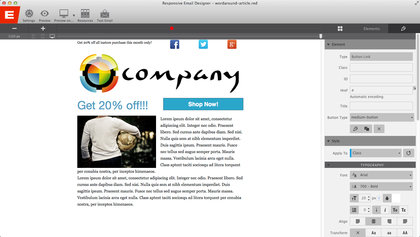
Add another Constrained Row with two columns (P & Q) making sure it appears below the row with the logo in it. Add a Heading one into Column P and a Button Link into column Q.
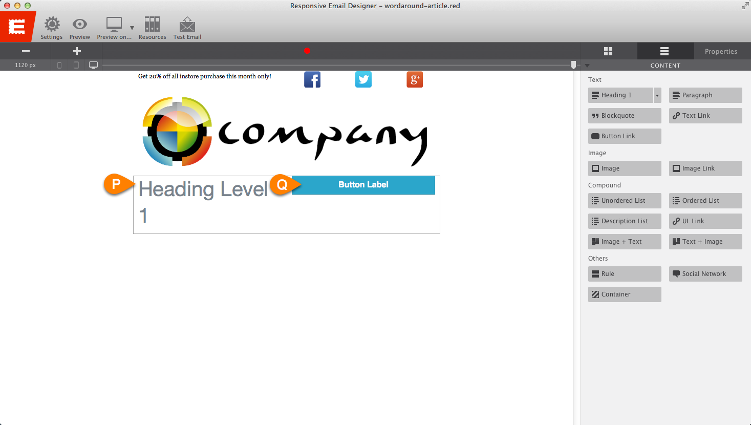
Select the Heading 1 Element and triple click the on the text to enter the text editor changing the text to read “Get 20% off!!!” and change the color of the font to #509bc0.
Next, select the Button Link Element and change the Button-Type to medium-button and then triple click the on the text to enter the text editor changing the text to read “Shop Now!”
Step 4:
Create a new Constrained Row with one column below the row with the button link and drag over an Image+Text Element (R) into the column.
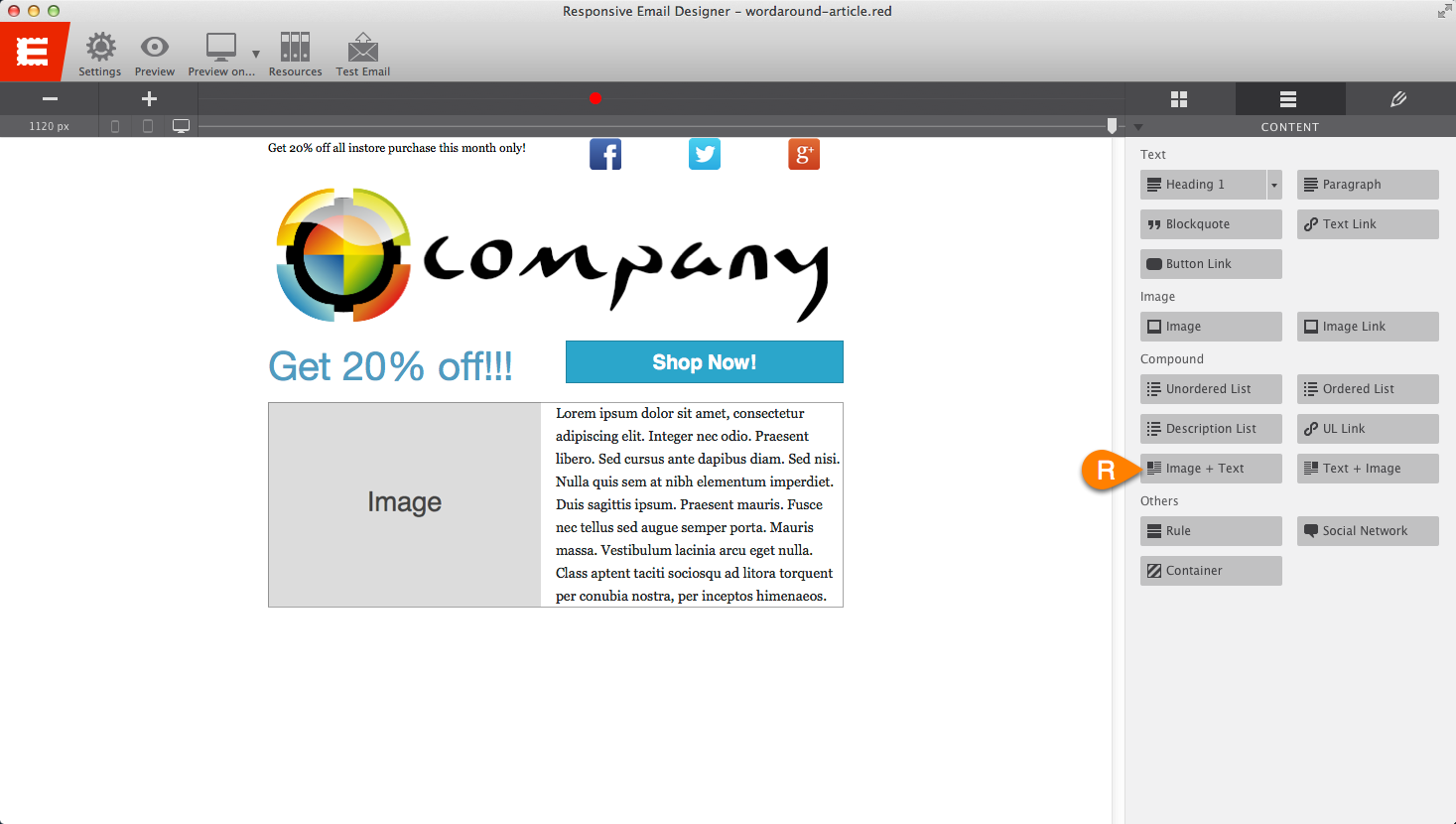
Like we did in Step 2, we need to select the image we wish to use by selecting Resource under Image. In the Resource window click on the folder named “images” and then click Add Image and then browse and locate the image-text.png image from the downloaded zip file and add it to your project. Don’t forget about the alt tag! Give the image an ALT tag that is relevant to what the images is showing or representing.
Next, select the Paragraph Element and duplicate it once. This will provide more content and body for your email. Edit the text to be your desired wording.
Step 5:
Lastly, add a Constrained Row with one column and insert a Paragraph Element into it assign a class name of abuse-paragraph and edit the paragraph text to say “You received this message because you opted-in this address to our newsletter via our website when you downloaded or purchased our products or services. To learn more about how we use your information, please read our privacy policy or contact: abuse@mydomain.com.”
All done!
That is it; you have created an email design that is ready to be responsified!