I have one more section of my site I'm not sure how to tweak.
I have a section that breaks into two columns at higher screen widths, each 6 spans wide.
The left column contains a subgrid with a series of bulleted points. This changes height as the screen width increase with the column getting progressively shorter.
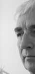
The right column contains a single picture, a woman looking up and to her left at the bullet list next to her.
I want this picture to set at the bottom of the right column as defined by the height of the left column so that she is looking up and over at the column next to her.
I don't know how to configure the right column to size itself the same height as the left and then push the picture to the bottom of the column.
I also don't know if there's another method to achieve the effect I'm looking for.
The section in question is titled "Our work is two steps above the rest"
The project file can be found at https://www.dropbox.com/s/as7tn80059nna … d.zip?dl=0
This is the same project as in my Hoverable Dropup Component post.

Mike Millow
Registered User
10 posts
Mike Millow
Registered User
10 posts
The left column has a subgrid, the picture I am looking to control is in a separate right column.
Would I have different (better) control of this layout if I moved the picture to a column within the subgrid structure?
Would I have different (better) control of this layout if I moved the picture to a column within the subgrid structure?

Inger
Senior Advisor
14,721 posts
Online Now
The best thing is actually not to use columns for positioning content items. Containers inside one and the same column are much more flexible. A column is only as high as needed for its contents, that is why you can't get the image further down.
Using containers and flex positioning will get you where you want to be. Let us know if you need some assistance.
Using containers and flex positioning will get you where you want to be. Let us know if you need some assistance.
Ha en riktig god dag!
Inger, Norway
My work in progress:
Components for Site Designer and the HTML Editor: https://mock-up.coffeecup.com
Inger, Norway
My work in progress:
Components for Site Designer and the HTML Editor: https://mock-up.coffeecup.com
Inger
Senior Advisor
14,721 posts
Online Now
Just for the sake of it, I added a row below yours, just to show what I was thinking of.
https://www.dropbox.com/s/bcmu9fbp7hzwn … 1.rsd?dl=0
https://www.dropbox.com/s/bcmu9fbp7hzwn … 1.rsd?dl=0
Ha en riktig god dag!
Inger, Norway
My work in progress:
Components for Site Designer and the HTML Editor: https://mock-up.coffeecup.com
Inger, Norway
My work in progress:
Components for Site Designer and the HTML Editor: https://mock-up.coffeecup.com
Mike Millow
Registered User
10 posts
Inger, I believe I have recreated the row you kindly provided above in my file. I have the three containers with content. I have them configured to take up 100%, 48% and 48% width above the 640 pixel breakpoint. I have the container set to Flex and the same settings in that configuration section.
When I move your example above 640p I see the behavior I am aiming for.
When I move my attempt above 640p, the first container goes 100% and the next two got 48% but the container with the picture stays in the left column below the text rather than moving right.
What have I missed?
https://www.dropbox.com/s/w9xfnn6abdtw5 … d.zip?dl=0
Hennie
Registered User
161 posts
Give both containers position: left
And the picture a little bit of top margin (20px)
And the picture a little bit of top margin (20px)
Eindhoven :: Netherlands
It's easy to see, once you see it.
It's easy to see, once you see it.
Inger
Senior Advisor
14,721 posts
Online Now
Mike, if you want to use my suggestion, you need to stick both the heading and the first paragraph into the first container. Then there is the next container with the bullet points. You can create paragraphs or sub-containers for each of those points if you like, I had them as paragraphs.
(I think you had a container just for the heading and had stuck the first paragraph in with the bullet points. You can of course do that, but then the left container will be very long. I thought it would look better and more balanced if the first paragraph went right across.)
The third container is for the image.
The column (parent of all three containers) is set to flex, and then to column for small screens. All the containers at width auto.
When you get past the blue breakpoint, you change the parent column to flex direction row, wrap, and the two containers (bullet points and image) have to be limited to 50% (I chose 48 in order to have some space. I think you had missed changing the column to row direction and wrap at this point).
The container with the image I also set to flex - column, and then justify flex-end.
I also chose for the parent column justify space-around, because I thought that would look good. The image got a wee bottom margin as I thought that also would look good. You don't have to follow that slavishly.
Try again
Ha en riktig god dag!
Inger, Norway
My work in progress:
Components for Site Designer and the HTML Editor: https://mock-up.coffeecup.com
Inger, Norway
My work in progress:
Components for Site Designer and the HTML Editor: https://mock-up.coffeecup.com
Mike Millow
Registered User
10 posts
Bravo.
That sorted it, just what I wanted to achieve.
...and I learned more the way the solution was presented to me.
Thanks!
That sorted it, just what I wanted to achieve.
...and I learned more the way the solution was presented to me.
Thanks!
Inger
Senior Advisor
14,721 posts
Online Now
 You're welcome! Good luck with the rest of the site!
Ha en riktig god dag!
Inger, Norway
My work in progress:
Components for Site Designer and the HTML Editor: https://mock-up.coffeecup.com
Inger, Norway
My work in progress:
Components for Site Designer and the HTML Editor: https://mock-up.coffeecup.com
Hennie
Registered User
161 posts
Hennie wrote:
Give both containers position: left
And the picture a little bit of top margin (20px)
Give both containers position: left
And the picture a little bit of top margin (20px)
Wrong solution, my apologies to Mike and Inger, I didn't read the original question.
Wanted to give a quick fix.
 Not!
Not!
Eindhoven :: Netherlands
It's easy to see, once you see it.
It's easy to see, once you see it.
Have something to add? We’d love to hear it!
You must have an account to participate. Please Sign In Here, then join the conversation.