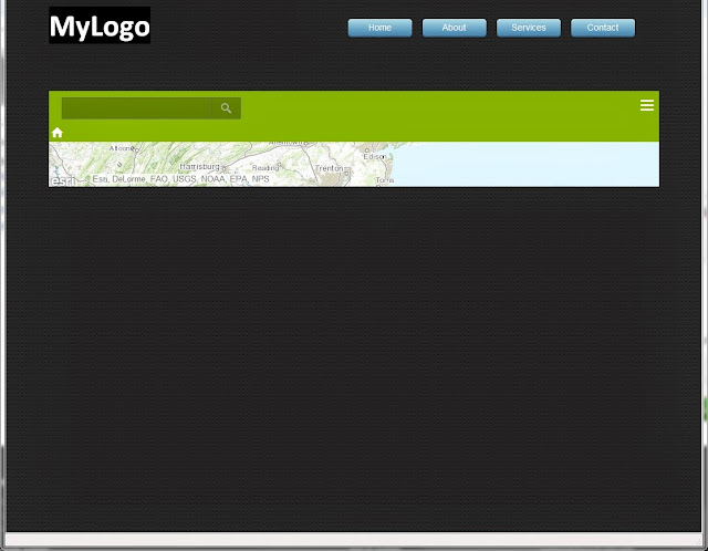
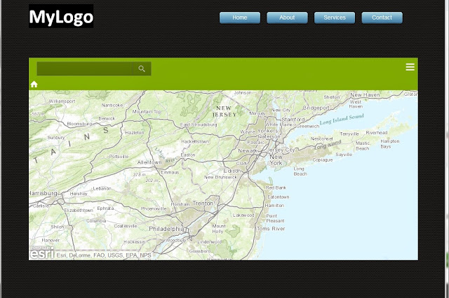
Website: A nav bar up top (maybe 10-20% of screen height) and a map in an iframe at the bottom that fills the remaining height. Needs to be dynamic so the map is filling as much screen space as possible on the device. I'm using the Aplha Pro-Responsive theme since that's closest to the simplicity I want.
Problem: I add the frame with 100% height but it comes up as a sliver. If I change the height to a pixel value it works fine but of course it's not dynamic.
<iframe width='100%' height='100%' src='blah blah' frameborder='0' scrolling='no'></iframe>
Is my problem in the html of my page, css, or both? Any info on where to start digging would be helpful! Site is not on a server, here are some screen shots first with height as 100% then as 500px