

So you’ve got all the content of your page down, along with most of your design. You are almost ready to publish- but there is still one thing missing. Even though your website is responsive (thanks to the magic of RSD), it still seems so static! Responsive Site Designer offers you several options to customize your website- transitions being one of them. However, many users aren’t taking advantage of this neat feature because they don’t know how to use them. It’s very simple, and this tutorial will show you how to mix in transitions and effects to create subtle yet powerful animations that will give your site pizzaz.
What are transitions?
In CSS, transitions provide a way to control the speed of change between different states of an element. Instead of having styles changes take place immediately, with transitions you can make the actions play out more gradually.
Within the app, the Transitions Style section give you the following properties:
- Apply To Choose what properties you want the transition associated width.
- Function Lets you establish an acceleration curve, so that the speed of the transition can vary over its duration.
- Duration How long you want the transition to play out.
- Delay How long from the time the element is triggered before the transition activates.
Let’s practice together with this example.
I start off with the lovely converted theme Suzanne made. You can download the project file below.
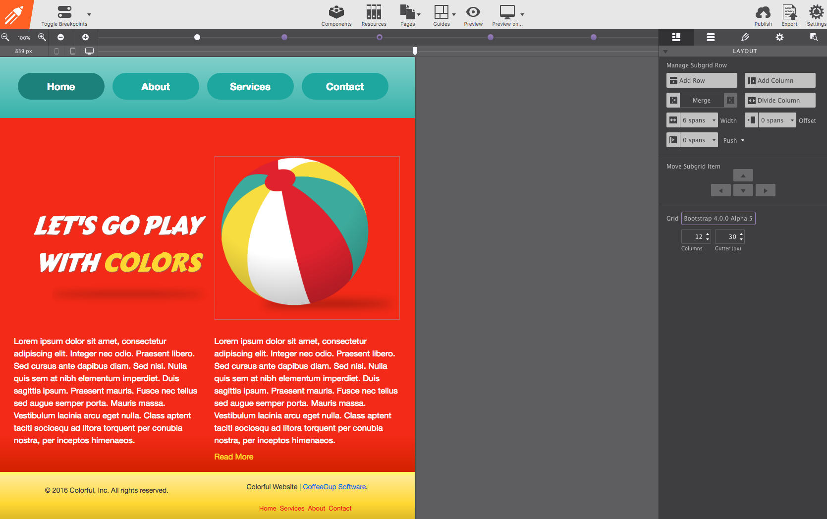
The theme looks great, but it can look even better with some effects!
One thing you should take advantage of is the ability to customize your element’s styles depending on its current state. For example, you can make your image one size in Regular view, and then make it grow bigger when you Hover. Transitions play an important part here as they make sure the movement from Step 1 to Step 2 appears as smoothly as possible (unless you don’t want them to, of course!).
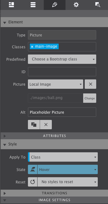
To get some practice on this, we’ll take the beach ball image on the theme and make it grow bigger upon Hover. Since Hover control doesn’t work on mobile phones & tablets, you’ll want to move the app’s viewport slider to a breakpoint for larger monitors. That would be around the 900px spot or higher.. Then, double click on the picture to launch the Design Pane. To modify the image when we hover the mouse over it, switch the State from Regular to Hover. Any further style changes (color, size, animations, etc.) you select while in this mode will from here on out only be applied to the element when it is being hovered.
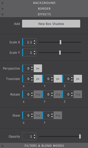
To enlarge the ball in our example, scroll down to the bottom until you find the Effects section. The controls in this section provide you with several options to change the appearance of your image element such as adjusting its X or Y size or rotating it to an angle. Experiment with the different effects to see what each one offers. In this case, Scale X is changed to 1.1
Going into Preview mode (no need to open up the browser!) and placing your mouse over the image, you can see the transformation! Neat!
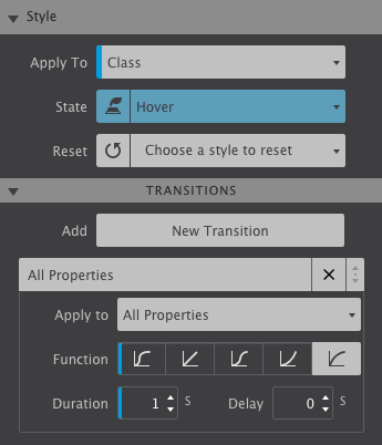
However, the change from Regular to Hover seems too immediate and rough. Let's apply a smoother transition between the two states. This is where Transitions comes in! Using these controls we can manage how fast we want the movement to take place. There should be one transition already in effect by default. Click on the tab to begin configuring.
CC Academy: What are functions?
Functions stand for the transition-timing-function property in CSS. It essentially establishes the acceleration curve that allows your transition speed to vary while it is in effect. The functions available include Ease, Linear, Ease-Out, Ease-In, and Ease-In-Out. To learn more about what each function does and to see them in action, here’s a handy resource.
Apply your Configurations
Making sure the state is still on Hover, we’ll use the function ease-out for this specific transition. I want the duration to last for 1 second, and with no delays from when the action is triggered.
Keep in mind this transition is only applicable for the Hover state. Change the state back to Regular. Here I chose to have the function ease-in-out, and made the duration last 1 second as well.
Witness Animation Magic
Go into preview mode and hover over that bad boy - it now expands and compresses much smoother than before, even making it seem like animation!
Pretty easy, huh? And it doesn’t stop there. You can work your way with the different states to bring even more life to your website.
Below is only a hint of the various ways you can add animations. Here I uploaded three new picture elements and worked with the Out of View state, while adding different effects to each one:
- Increased the XY scale of the image and made the transition last 1 second, so that the beach ball zooms out.
- Shifted down the image around 40px using Translate. I also lowered the opacity, so that it’ll seem like it’s fading in. I made the transition for this much faster, at .5 seconds.
- Lowered the XY scale, as well as the opacity. The transition at .5 seconds makes the image ‘pop’ into view.
For all three different images, they will rotate on Hover by increasing the Z variable, with the transition lasting 1 second. I made the transition back to its regular state last .5 seconds as well.
Awesome! You can now go further beyond with the knowledge of this tool. To download the project we just created, click below!
Check out CCS Grid’s Hero Section Tutorial to see this sucker in all its glory, along with a video that shows exactly how it was done! And while you’re at it, why not learn some more about the power of grid yourself..? ;)