

The Layout Pane
RED brings the power of grid based web design to email creation. Content is organized and aligned using Rows and Columns. These rows and columns can be seen as grid elements, designed to maintain a stable and orderly position of the actual content elements. Each row can include up to 12 columns. The different row and column types allow for specific design effects.
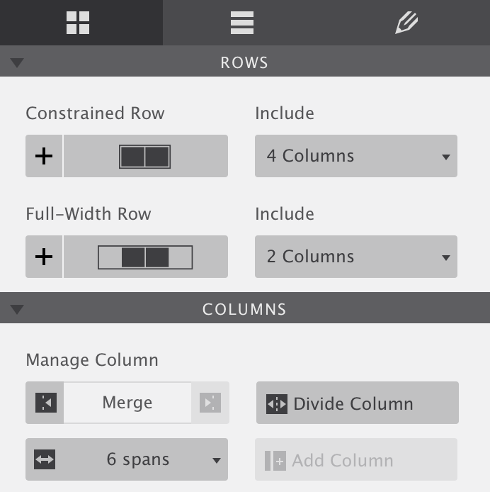
Row and column types
Constrained Row — These rows are ‘constrained’ to be the same width as defined for the overall design. In the default template and example above, the ‘grid width’ is for example 620px. Changing the grid width, changes the width of all constrained rows.
Full-Width Row — As indicated by the name, full-width rows have a width of 100%, stretching the full display width. The columns inside the row are still constrained by the grid width defined for the overall design (620px in the default template). These rows are often used to apply a different background for a section of the email, like for example the footer.
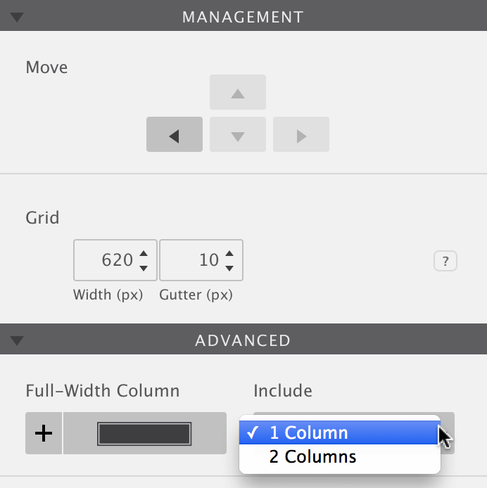
Full-Width Column — This element might need some getting used to, and is therefore placed under the advanced section in RED Personal. It stretches the entire width of a full-width row, minus the gutter. The gutter is the space between adjacent columns. In RED Personal two of these columns can be used in a row. In RED for Business the content can be divided in up to 12 separate columns.
In one of our recent newsletters we used all three types. The background (body) of the email itself is off-white (hex #f2f2f2 for those interested). However, the header section of the email shows three different shades of black across the full-width of the email. This is done by specifying a different background color for these full-width rows, covering the background of the email body.
In the first two rows, the one with the logo and ‘Connect to...’ header, the content is constrained to the specified width (700px for this example). Without padding and margin, the logo pushes against the left of the constrained area. The header in the second row is centered.
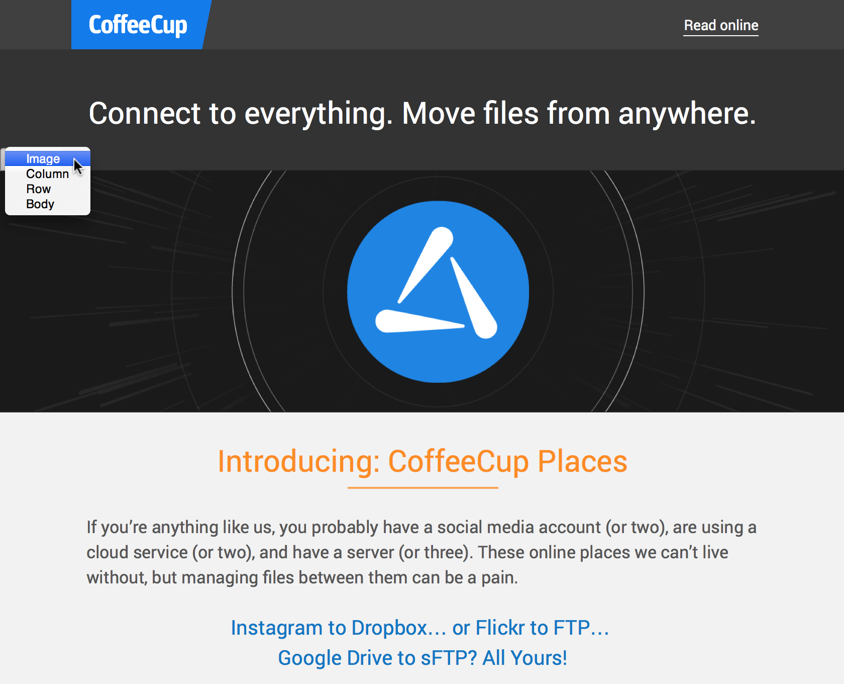
Looking closely at the third row will show that radiating lines coming from the places logo go outside of the constrained area. They (almost) touch the sides of the email, creating a strong visual effect. This is done by placing a wide image, wider than the specified email width, in a full-width column. RED is the only app that offers this powerful design possibility (yes, we're super proud of RED!).
Following the full-width column, constrained rows with a single column and no background are being used.
The power of rows and columns in email design
Rows are used to vertically organize the content blocks. Within the rows, it’s the columns that contain the actual content and create the horizontal separation. This structure creates a big part of the display consistency across email clients.
The merge and divide buttons are used to adjust the layout while designing or creating the email. These changes will apply to all breakpoints (display widths). The width of each column can be adjusted with the span drop down. These changes can be different for each breakpoint and allows you for example to have a two or three column layout for wide screens, and a single column layout for small, mobile, devices.
Please notice that the total span-width of the columns on the desktop design can not exceed 12.
Design adjustments for mobile devices
Responsive Web Design relies heavily on the use of Media Queries, which are supported by all major browsers. Email clients on the contrary have made little progress over the years and most of them do not work with Media Queries. Luckily, this is less important for web based email client as Gmail and Yahoo, as they are mostly used on larger desk- or laptop computers with enough screen real estate. Nevertheless, it is probably not a good idea to follow the web design trend and make really wide (800px +) email designs.
Most of the mobile email opens happen on an iOS device (iPhone, iPads), which do support media queries. The native Kindle and Android email clients support media queries as well. The Gmail app does not support media queries, the email will look the same as in the Gmail web app, but zoomed out. When using a fluid layout (RED for Business only), the email will appear the same as the Gmail web app at a very narrow width.
Here is some good news: We are currently developing a work around that will stack columns in the Gmail app. This will be through a setting that can be applied to a row. It is not as fancy as making granular design adjustments at breakpoints, but will greatly improve the readability and usability on this platform.
Moving elements, columns and rows
Content elements, such as Headings, Paragraphs, and Images can be moved to other sections of the layout with drag and drop. Select an element by clicking and holding the mouse button down. Move the mouse to the desired section of the design and release the mouse to let the element drop. Alternatively, use the selector drop down positioned on the top left of each element.
When an element is moved to a different location, a horizontal bar will appear, indicating the exact place where it will be dropped. In addition, a line is visible around the parent element, and the parent type is shown.
Rows and Columns, on the other hand, are moved using the Move tool in the Management section. Columns can be moved left and right whereas Rows go up and down.
Grid: width and columns
The Grid section contains controls to change the width and gutter settings for the overall design of the email. Width — This determines how wide the content area of the email will be. RED Personal uses fixed layouts, the email will be displayed at the defined size and a scrollbar will appear if the design is wider than the available display space. RED for Business can also use a fluid layout where the content ‘flows’ down and adapts to the available display width. Gutter — This is the space between Columns. This can also be set to zero and managed when working with individual columns. There is no right or wrong, the approach will simply vary with the design needs.That covers the layout pane, let’s have a looksy at the content elements in the next chapter.