

The Elements Pane
Adding content to the email is easy, grab any of the elements and drop where desired. Or simply click on them and the element will be inserted in the selected column, or below a selected element. There are a few text element to choose from, plus a number of other elements like images, buttons and social network items.
The design aspects of these elements can be specified on the design pane. Triple clicking on text elements opens a powerful editor that can be used to add custom texts by typing or pasting. The ability to define and reuse inline text styles is out of this world!
Text elements
The text elements serve different communication and design purposes. Here’s an overview:
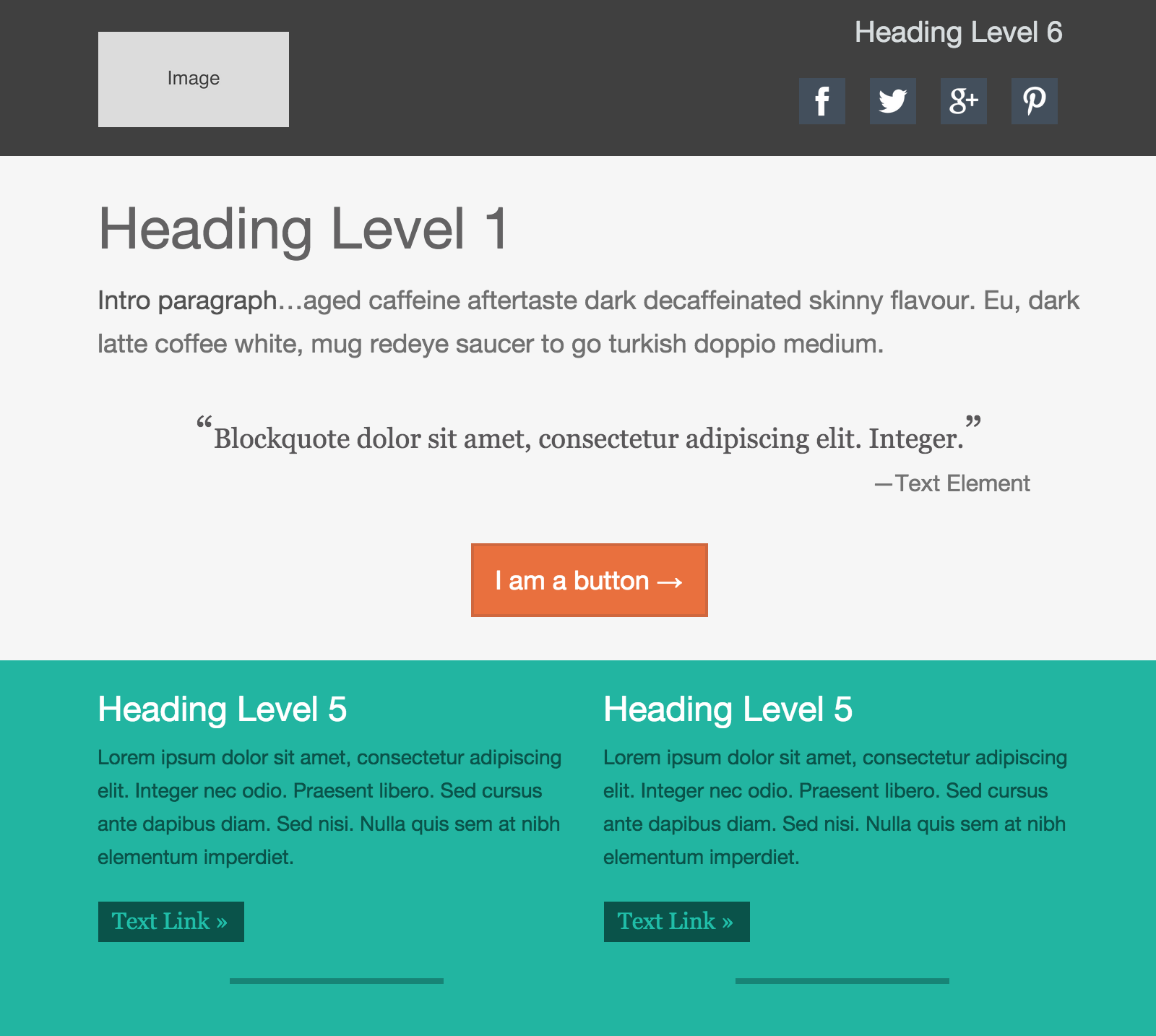
Heading 1 - 6 — Headings help readers to determine the overall outline of the information provided in the email. By reading the headings the recipient should build an understanding of what the email is about and what section or sections are of particular interest. You can use the drop down to select anything between a heading 1 (most import, usually gives an overview of the email) and a heading 6 (for describing smaller sub-sections).
Paragraph — These elements should be used for descriptive and explanatory texts. Try to use different paragraph elements for different sections, instead of adding breaks (<br/>) with the return key. This will make the email easier to maintain and adjust. Using different paragraph elements is also preferred for accessibility, screen readers recognize and can jump between paragraph elements.
Blockquote — The blockquote element is used to represent content quoted from another source, like for example a customer testimonial.
Text Link — Text wrapped with anchor (<a>) tags. The link destination can be specified on the design pane.
Text — Text wrapped with the <span> tags. Some email clients add spacing around elements defined as paragraphs. Since this does not happen with the text element, it can be used to visually place two text elements really close to each other. There's a drawback: This is not a semantic element and will not be recognised by screen readers. In most cases it is therefore recommended to use the paragraph element. However, to create certain visual effects the text element might be used.
Elements Extraordinaire
These elements can be used to add that little extra to the design or link the reader to (landing) pages or (social) places.
Image — Inserts an image element with placeholder image. The actual image can be added on the design pane. The placeholder images with different aspect ratios can be used to create general email themes or templates with the actual content being inserted for a specific campaign. Please note that the ratio will adapt to the actual image used, independent of the placeholder ratio.
Button — The cool thing about these HTML buttons is that they are light-weight and will always display, even when images are not showing. Use padding, borders and different colors on the design pane to create the perfect custom button.
Horizontal Rule — Creates a horizontal line, often used to indicate a new section or thematic change in the design.
Social Box — Customizable icons that can be linked to social network profiles or to share specified pages.
Advanced elements
Whereas the above elements will display consistently across email clients, the advanced elements may be rendered differently in some email clients. This generally is not a problem, just something to take into account. RED for Business features more elements that can enhance a design with slight potential display variations across clients.
Image + Text — The ‘Image and Text’ elements consist of an image and paragraph, wrapped in a parent container. Depending on the sizes of the components, the text will float around the image. This is not supported by all email clients. Outlook for example will display the text to the right (or left) of the image. However, for the supporting email clients the floating text can be a nice touch.