

Responsive design demystified
The intro
These days everybody knows about the continued growth in internet consumption — email, apps and web-browsing — from mobile devices. Many also know that for a consistent positive user experience across all these devices with varying screen dimensions, responsive email and web design is the only viable solution. Yet, responsive web design is often still surrounded with a certain mystique:
“A website that automatically adjusts its layout and design to be readable and usable at any screen width? Wow, sounds really cool, but also intimidating!”
We are partially to blame for this consternation, since we compared a responsive site with a Harry Potter bus — both automagically adjust their width to fit the available width. But really, responsive websites are not that hard to build, so let’s demystify responsive design right here!
Considering that everybody has been used to designing for, and working with, fixed dimensions, some initial hesitation is understandable. ‘Dimensionless’ design is a different concept and requires learning a few new techniques. The good news is that there are only two main ingredients needed to cook up a solid responsive design. As soon as you grasp the concept, and with a basic understanding of these two techniques, responsive design is not hard at all. Especially not with excellent tools such as Responsive Site Designer that take care of all the coding. Let’s start with the concept.
The two key ingredients of a responsive design
A responsive design starts with a flexible, so-called fluid layout. If you think of a fixed, static website as a solid brochure or magazine being always the same size, then a fluid layout proportionally grows and shrinks depending on the available space for displaying it.
A fluid layout is a great start and ensures that the design looks good when the available display space changes within certain limits. However, it still won’t make the design look perfect and be usable across the entire range of varying devices and screen sizes. On a small phone screen, text will become unreadable or only a small part of the width of the website will fit on the screen. Things get smashed up, links become difficult to click and visitors have to constantly pan and zoom to navigate the site. This is where the second ingredient comes in: media queries.
Media queries are the magic ingredient of responsive web design. As the CSS3 successor of ‘media types’ all modern browsers started supporting them quickly. It’s a small bit of CSS code that works by asking (querying) the visitor’s device what its screen size is (how much space is available to display the website). The device provides the dimensions of the screen, and your code responds by delivering specific style rules for that resolution. Now your layout can not only grow and shrink, it can also shift, move, and morph as necessary to fit the screen displaying it.
Let’s talk about these two ingredients in a bit more detail to build a solid understanding of the responsive concept.
The first ingredient: a fluid grid-based layout
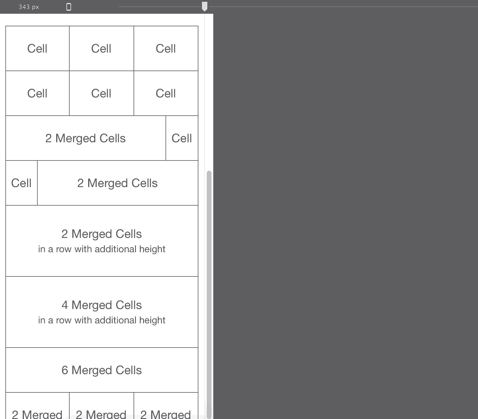
In responsive design we use grids to orderly arrange content elements, at any possible width. This method has been used in (fixed-width) paper-based design for ages and made their way into web design years ago. A grid is a collection of columns and rows that divides up the design space, very much like a spreadsheet. Content elements such as blocks of texts and images can be placed in the ‘cells’. And just like in a spreadsheet, these cells can be merged together or resized to fit the content.

Whereas in a fixed-width design the cells are static — always keeping their original place and size — in a responsive design they are dynamic and can grow and shrink depending on the display width. Such a flexible or “fluid” grid is the first ingredient of a responsive design.
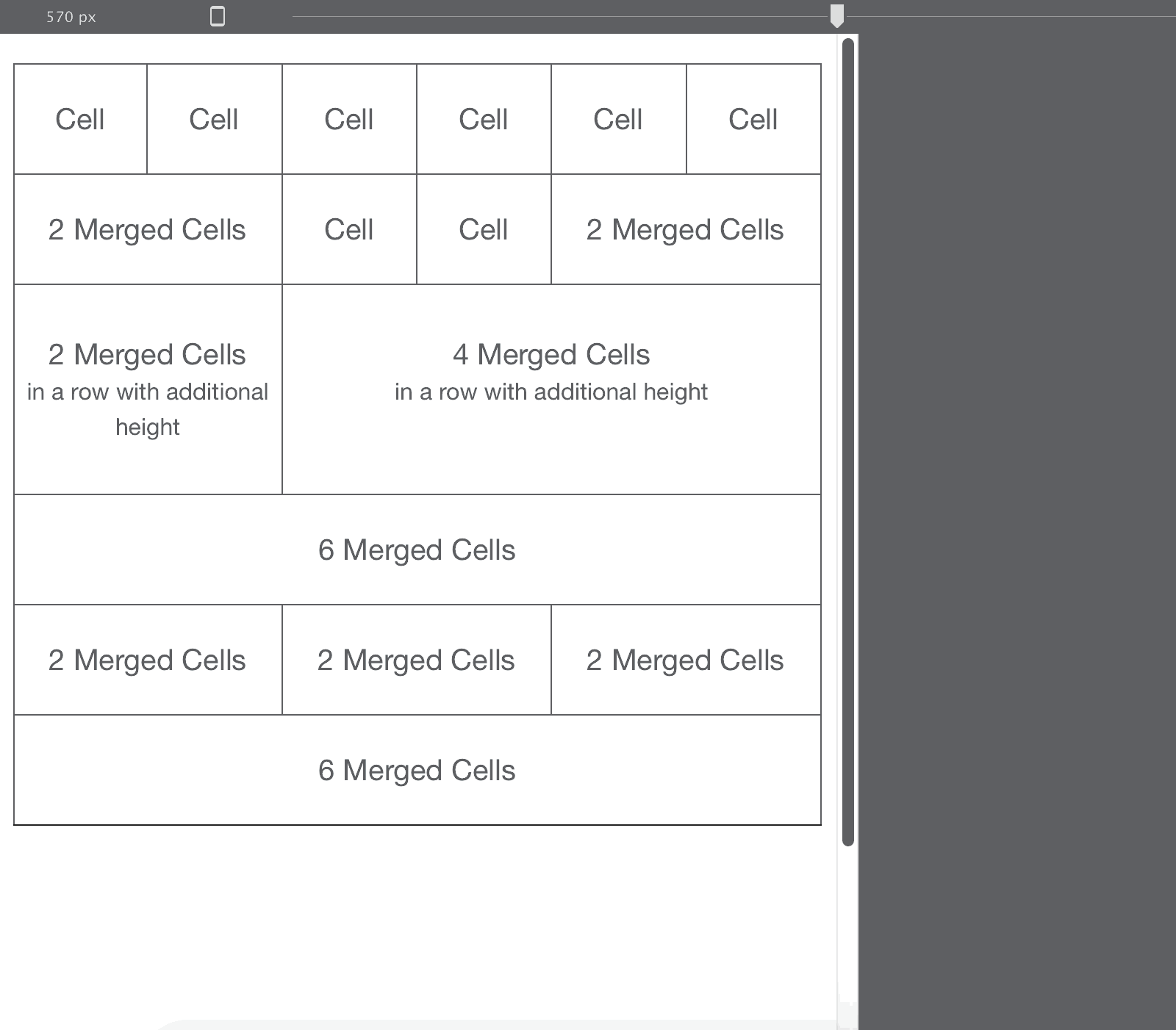
A fluid design uses relative measures like percentages for the page and its elements, instead of fixed pixel measures. In the example above, the cells in the top row would each get a width of 1/6 = 16.67% of the total width. The cell in the bottom row would get a width of 6/6 = 100% of the total, spanning the full available screen width.
All this is all easy to configure with intuitive controls in Responsive Site Designer (RSD), but the details in the section below will help get a better understanding of the concept.
The first ingredient: techniques for being flexible
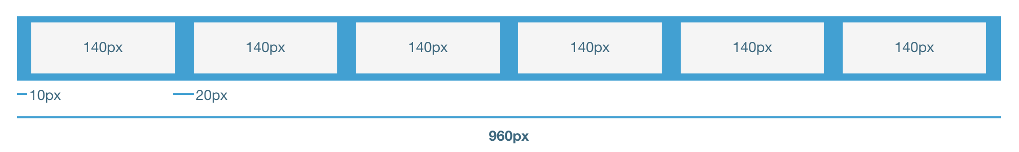
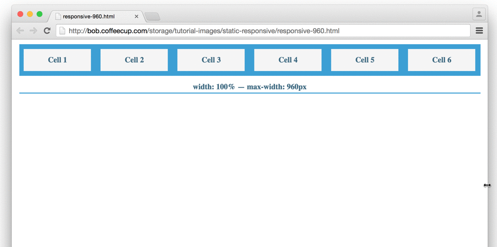
A little history provides a good context here. One of the first web design grid systems to gain popularity and a large following was the 960 grid developed by Nathan Smith. The default (fixed) width of this grid would be — you guessed right — 960px.
Drawing upon our previous example of 6 cells in the top row, and using the 960px as layout width, each cell would get space assigned of 960/6 = 160px. Now, we all know content needs room to breathe; adding a left and right margin to each cell will take care of that. With a 10px margin on the left and right of each cell, a total of 140px would remain for the columns (cells) themselves. This means that the actual content in the different cells will be separated by 20px. This grid would look something like this, and be ‘fixed’ like that under all circumstances:
Under all circumstances? Well, almost. On larger screens, it would. But this type of layout would not be able to take advantage of the additional screen real estate because it would never be able to become wider that the defined 960px. If the browser width would be below the fixed width, only part of the layout or design would be visible. This is illustrated in the animated gif below:

On mobile devices these types of layouts are typically zoomed out until they fit the screen. Yes, on the zoomed out screen, the web content fits and is visible...but not readable, clickable or easily usable! To illustrate this point I made a screenshot of how our example is rendered on my iPhone 6, displayed at the actual width of the phone. Can you read anything?

If the row in the image were to represent a navigation bar with links or buttons, it would not be easy to touch the button of your choice. And talking about choice…how do you know which is the button of your choice if you can’t read the button text?
Making the above layout flexible is pretty straightforward. Each content cell takes up a certain percentage of the total available space, which was set to be 960px. With the cells being 140px wide, each cell takes up 140/960 = 14.58%. The margins next to each cell are 10/960 = 1.04%. Now, if the available width is less than 960px, the cells and margins shrink proportionally:
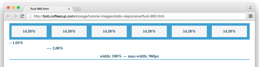
Now all content remains visible, also at smaller display widths. The cells containing the content simply use less pixel width if not enough is available. Yet, they remain in proportion and preserve the original layout structure.
The flexible grid works wonders for small width adjustments, but will it also work on small mobile devices? Unfortunately, it won’t. One more technique needs to be called upon for a site to be fully responsive. We’ll talk about that next.
The second ingredient: layout and design adjustments where needed
Whereas the ‘shrinking and growing’ works fine for limited width differences, the site would become ‘squashed’ — unusably small, really hard to read, click and navigate — on smaller screens like smart phones. To prevent that from happening the cells can be stacked. By using stacked cells, more of the vertical screen real estate is used, and the browser does not have to zoom out to make all the content fit. This technique is illustrated in the image below.
We started off with six cells in the first row for wide screens and adjusted that to three cells next to each other for smaller screen widths. Where did the other three cells go? These last three cells of the row are now placed — stacked — below the first three. This repositioning of cells repeats throughout the design; columns are placed below each other where needed, to give them more horizontal room.
Eureka, you got it! The foundation of any good responsive design are content columns (cells) that have a flexible width and can be repositioned to use vertical, instead of horizontal, space where and when needed.
If you’re interested in the mechanics of how this works, please read the section below. It does help clarify these ‘automagical’ layout adjustments and introduces you to some responsive terminology such as breakpoints. If you want to go even deeper, you can hop over to our article Grids for bullet-proof Responsive Design where we explore the advantages of the grid-based approach for device-agnostic layouts in more detail.
Ingredient two: The technique behind screen width dependent layout (and design) changes
Repositioning content is done using media queries. These are relatively simple CSS rules that can be used to apply certain design styles under specific conditions only. If, for example, a display width is less than 580px — we can define a rule that tells the browser to display specific cells below, instead of next to each other. The places (the widths) where these rules are applied are called breakpoints.
These breakpoints can be placed anywhere across the design and also be used to make other style changes. Yup, they are not exclusively for layout adjustments, the exact same concept of conditional style rules can be used to apply any design change, from different font sizes to the use of smaller images for mobile.
In the example below we added breakpoints to transform the fluid layout from the previous section, into a responsive layout. This prevents the cells from being ‘squashed’ at small widths and makes the layout and content usable at any width and on any device.
In the above example Cell 1 and Cell 2 are instructed to take up half of the width at 675px. The other cells each get a quarter of the width below them. Then, at a width of 550px, the first two are told to take up the full width (minus left and right margin) which makes them stack. The other columns get half of the width, which makes Cell 5 and 6 stack below the two before them. As of 400px all cells take up the full width and stack.
Why not all cells are treated equally? Mainly because this is just an example; I wanted to show you the power and flexibility these breakpoints have to offer. In a real world design there might be good reasons to do something like that though. The first cells might contain the most important content and are therefore given more room than the others.
One of the most A frequently asked questions we get here @CoffeeCup is: ‘when should I apply a breakpoint?’ The answer is surprisingly simple:
There are too many different device sizes to possibly design for, so add a breakpoint whenever the design ‘breaks’.
That’s right, any time a design can be improved at a certain display width, you should add a breakpoint and just do it!
To be clear, all this is done with just a few simple clicks in Responsive Site Designer. Hand coding the above from scratch — setting up the basic layout, adding the supporting styles with proper (minimal) resets, calculating the percentages and adding the classes for each breakpoint — easily took me a few hours. With RSD it took me less than 10 (alright, maybe 12) minutes...no kidding, this is truly a gem of an app.
Feeling hocus-pocussed? No need for that, RSD will take care of all this for you. Just remembering the key concepts — flexible columns plus possible layout and design changes at breakpoints — will help you making stellar responsive designs in a jiffy. And with all with all the power of CSS3 packed behind an intuitive interface you will only be getting better as you go.
With the two ingredients under our belt, we’re ready to move on to the next step where we begin to put our knowledge into action.
Share your thoughts please
For any feedback or requests, you can hit me up on twitter. Or just leave a note in the vibrant CoffeeCup forums or our Facebook page. Want to share this article? Please go wild with any of the buttons at the top of the page, Twitter, Facebook, Pinterest or Google+ are all good to me!