

This is a page in (never ending) progress...
Themes, Projects, Prototypes, Links, Experiments & More: Do you love our snazzy quick start examples (thanks, you’re making us blush) and would like to use them within your website? Or maybe you want to get hands-on with the tutorial and manipulate the sample. Then you’re in luck! Here you may download the Menu Builder project files including both the HTML & CSS menu files. We’ll continue to add additional resources like new themes and helpful links in the weeks ahead so be sure to check back later.
The Polished Theme Section
Designs whipped 101% in shape. Read how we made them, preview them and download them. To open these designs just double-click the file icon (this would be the .mb file found in the folder you downloaded) (after installing Menu Builder).
Minimal Glass Up
A minimal yet strong design with a minimal shade of blue. A subtle shadow lifts the menu up. This menu is very noticeable, but never distracting. At the first breakpoint (denoted by the number 2 area) it gives back height. This prevents content from being pushed down too much on smaller screens. There are two variations of the mobile button. Initially it takes of 50% of the available width. On even smaller screens the text would either overflow the button or was becoming really small, increasing the width to 75% solved this. Obviously other design choices could have been made such as using a shorter word like 'Menu' or even just using the caret icon. Tweaking the text size and button height was another option. Whatever you do make sure to keep it big enough to be 'touched' with a finger or thumb.
Free navigation menu theme: Minimal Glass Up.
Get the resources for Minimal Glass
This navigation menu uses a minimal, but effective design.
- You can preview the menu right here.
- If you like it you can download the resources in a zip file.
Iconic Red
This menu uses icons for a supportive visual effect. Hovering over the buttons makes the icons pop for clear visual guidance and a snazzy effect. The red makes it stand out and bold but the menu colors are easy to customize. The icons can be changed too with a few simple clicks using Web Image Studio.
Free navigation menu theme: Iconic Red.
Get the resources for Iconic
Expressive Icons.
- You can preview the menu right here.
- If you like it you can download the resources in a zip file.
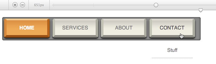
The CoffeeCup Replicate
People asked if Menu Builder was powerful enough to do CoffeeCup. Here's the proof.
Free navigation menu theme: CoffeeCup R.
Get the resources for CoffeeCup R
Cool? We're adding stuff to Menu Builder that will even blow this one away soon. But don't wait, get going with this cool App right away!
- You can preview the menu right here.
- If you like it you can download the resources in a zip file.
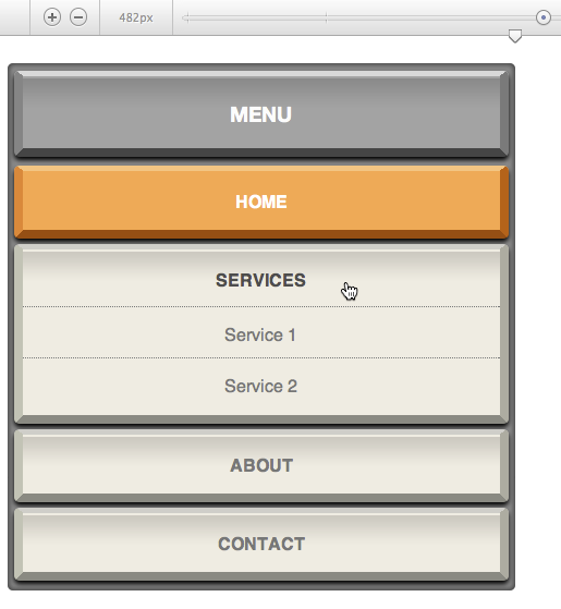
Old Keyboard Menu
This cool design has a lot of cool elements to help make the buttons really pop out and grab the viewer’s attention. Each main button has slightly rounded corners with a hint of shadow. To help the viewer quickly find their way back to your main page, the Home button has an orange color applied. The drop submenu buttons should stand out to the viewer so they can see they are viewing a new list of options. A change of color or button shape is a great way to do this.
Free navigation menu theme: Old Keyboard.
Old Keyboard theme for screens not wider then 510px.
Get the resources for the Old Keyboard menu
The old keyboard menu has a nice vintage look.
- You can preview the menu right here.
- If you like it you can download the resources in a zip file.
The Experimental Section
Prototypes and experiments that are 107 170% creative. More explanation will be added soon.
Glossy colors
And glossy it is.
Free experimental navigation menu theme: Multi Glossy.

Get the resources and be glossy.
- You can preview the menu right here.
- If you like it you can download the resources in a zip file.
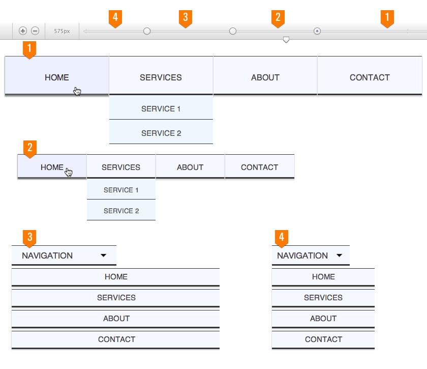
Rounded Steel and width areas
Behold, 3 breakpoints used for size adjustments, 1 for switching to a mobile navigation layout.
Free prototype: Rounded Steel.
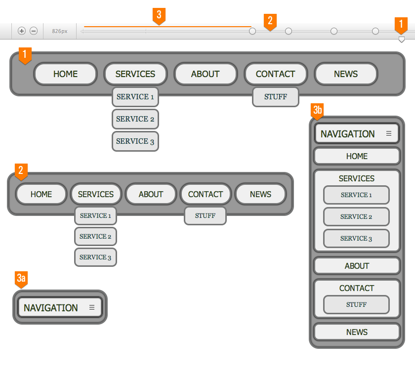
A fierce, strong and proud menu is presented to the users with the wider screens such as bigger laptops, desktops and TV screens (number 1). With the first few breakpoints the size of the menu, submenus, text and buttons are adjusted to make sure the button text has enough room and does not flow out of the buttons. This makes the same menu work well on smaller computers, resized browsers and some of the bigger tablets. The number 2 in the graphic visualizes the smaller size menu, just before the last breakpoint kicks in. This breakpoint transforms the horizontal menu into a mobile layout. The menu is collapsed, only showing the mobile button (3a), until pushed (3b). This layout saves room for the other content and displays on the smaller tablets and mobile phones.
Get the resources and see how this is done.
- You can preview the menu right here.
- If you like it you can download the resources in a zip file.
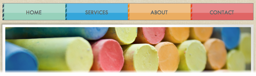
Our Canvas Theme with embedded menu: colorful!
Copy twice, paste twice and done!
Free responsive site theme with integrated responsive menu:
Integrating is easy, get the resources and see how this is done.
- You can preview the design right here.
- If you like it you can download the resources in a zip file.
The link section
- http://bradfrostweb.com/blog/web/responsive-nav-patterns/
- http://css-tricks.com/responsive-menu-concepts/
- http://designshack.net/articles/css/code-a-responsive-navigation-menu/