

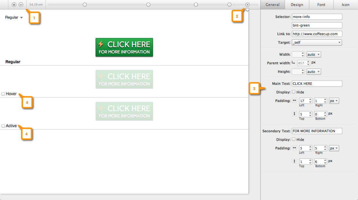
1: Breakpoint Management & Width Indicator
You can add or remove breakpoints with the plus and minus buttons. The numbers to the right show the current width of the display (viewport).
2: Sizer & Breaker
You can simulate the width of the device or screen your button is viewed on with the little triangle named Sizer. The dots allow you to make changes to your design when needed for the different screen sizes. We named this unique tool Breaker. Find out more about Sizer and Breaker.
3: Property Panes
This is where you will be spending most of your time. These panes contain all the design controls you need to build and style your button. Everything from choosing size, color, fonts, spacing and more.
4: Regular, Hover, Active Preview and Interaction Area
This is where you get a live preview of the changes you make to your button. You can switch between Regular which is your normal button, Hover which allows you to edit the settings of the hover state, and active which is when the button is clicked.
You can also interact with the button to test mouse over actions, and clicks when using the Preview selection from the dropdown.