

The General Tab is where you can edit the general settings of your button. Such as Text, Text Padding, width and more! Below is a list of the settings and what they do!
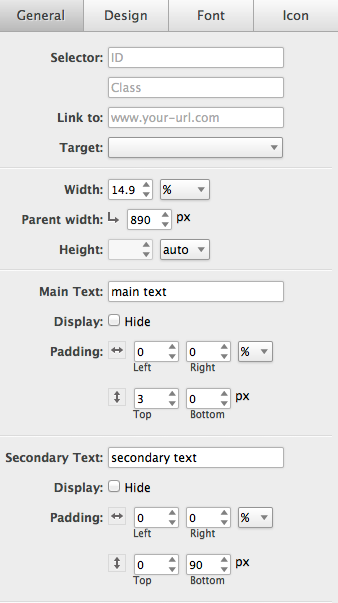
Selector: ID & Class
You are able to name a class and/or ID for your button for easier identification on your webpage.
Link to:
This setting allows you to link your button to a webpage. Simply input the full URL of the webpage you wish to link to.
Target:
Set how the window opens when you link your button.
_blank: Loads the URL in a new window.
_self: Loads the content in the same frame. This is the default browser action and normally does not need to be set.
_top: Loads the content in the top-level framset. Basicly the entire browser window.
_parent: Loads the content in the parent frameset for the current frame.
Width:
Here you can assign the width of the button using %, px or Auto.
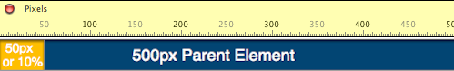
Parent Width:
When using a percentage in the Width option you will need to set the parent width of the button as well. For example, if you have an element of 500px and you set the button to be 10% of the parent element your button will be 50px wide. See example below.
Height:
We recommend leaving this setting on auto. However you can define a height in px if you so choose.
Main Text:
Here is where you can add the main text to your button which is normally the attention getting words like "Act NOW!" or "FREE".
Display
What it allows you to do is hide the word(s) when changing breakpoints. Example, when the screen hits 500px you can remove the Main text from the button by selecting the hide button. This will allow you to increase the font size and have more room for your Secondary text.
Padding:
Here you can apply the left, right, top, and bottom padding for your main text. Padding clears an area around the content, inside the border, of an element.
Secondary Text:
Need more text? You can add it here using the Secondary Text option. Secondary text allows you to add more content to your button and is normally smaller than your main text.
Display
The display feature is a pretty cool function. What it allows you to do is hide the word(s) when changing breakpoints. Example, when the screen hits 768px you can remove the secondary text from the button by selecting the hide button. This will allow you to increase the font size and have more room for your Main Text. Take a look at our example below.

Padding:
Here you can apply the left, right, top, and bottom padding for your secondary text. Padding clears an area around the content, inside the border, of an element.