

Preface: A Mobile Explosion
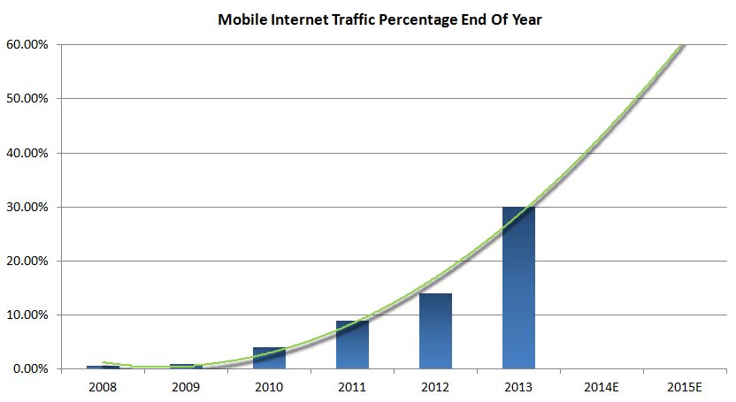
It was the end of 2009, about 8 years after the dot-com bubble burst; the Internet counts close to 200 million domain names, and over 230 million websites (none of them responsive). These websites are visited and consumed by a fast growing number of Internet users rapidly approaching 2 billion. At the same time, with over 4.5 billion subscribers, the estimated number of cellphone users is more than double that number. Yet, global mobile internet traffic was insignificant, only accounting for less than 1% of the overall internet traffic. Ready for the change?
Enter 2014
Every single number continued to show healthy growth, except for mobile internet traffic. That simply exploded! Following an average annual growth rate of more than 700%, mobile devices accounted for over 30% of the traffic to North American websites. All around the world this number is growing on a daily basis, drastically changing browsing behavior and the way websites are consumed. The consequence? A website has to be accessible, usable and engaging on any device, no matter how big or small. People are increasingly reluctant to pan and zoom to laboriously find what they are looking for. Instead, they will try their luck somewhere else and are unlikely to ever return.
With all the different device sizes out there, a design that adjusts or ‘responds’ to the available display space is the only way to assure a consistent and positive experience on every screen. Every website needs to be responsive and adapt to screen dimensions. Soon a troublesome encounter with a static websites will communicate a negative brand experience. Here’s a playful digital darwinism summarizing an oh so realistic scenario:
A website needs to adapt...or die...
It’s not just a playful statement; it is a bit scary as well. Early 2014 the web counted over 800 million published websites, only a tiny fraction (< 1%) of them being responsive. Let’s look at why most sites are static in nature and why that has to change.
TABLE OF CONTENTS
A long history of pixel perfection
For the first 16 years of the World Wide Web, the Internet was largely accessed from desktop or laptop computers with only a small variation in monitor sizes. The standard viewing size allowed people to keep thinking and working in static, pixel-perfect designs and make fixed-width layouts. Businesses and individuals were transferring their print literature (product information, brochures, etc.) to the web with ‘print design rules’ in mind. Designers were for example paying a lot of attention on ‘the fold’. The most important content, the reason and purpose of the site, had to be visible above the fold. Just as with a newspaper, it had to attract and keep the attention of the visitor, without forcing him or her to scroll down.
Fixed width thinking was only natural
The focus on the fold was not the only design principle borrowed from the print world. In general websites tended to be designed with pixel perfection in mind. They were treated as static fixed width brochures that you could browse through with your mouse.
Very much in line with the print design philosophy, the width of the website was decided and fixed from the start. In the early days of the Internet, an 800-pixel-wide design was standard; when technology improved, many sites began displaying disclaimers that a design would be best viewed at a width of 1024 pixels. The wider the design, the more content would fit above the fold!
The rise of mobile web access
In mid-2007, Apple did what had been rumored for a long time: the successful iPod concept was transformed into an iPhone. The device rapidly grew in popularity, and with it the first decent, usable, mobile browser that could render HTML. Browsers on other devices largely relied on the WAP — a standard that proved to be cumbersome both for content providers and content consumers. Providers had to go through the effort of creating a separate, WML-based, version of their content. At the same time consumers were unhappy to be cut-off from the real (HTML) content and the very limited browsing experience. A clear lose-lose situation — which ironically is very similar to creating a dedicated mobile site with a subset of the content just for mobile devices whose owners really want access to the real thing, but more on that later.
Success breeds imitation and what followed was an explosion of Internet enabled devices. These new devices were able to connect over a WIFI or other wireless network and also included a browser that could load full HTML web sites with reasonable speed. Still mobile Internet traffic was virtually non-existent, and the release of all these devices hardly changed that. Browsing the web over a cellular connection was slow and expensive. Wireless routers at home were not just as common and those who had them often preferred the faster, easier to navigate desktop browsing. The mobile browsing experience was still a bit cumbersome and awkward.
Web access in millions of pockets
Although most people jumped on the iPhone (and other smart phones) for other reasons than web browsing, this was the defining moment. The simple act of putting web browsing potential in the pockets of millions everywhere they went, was the start of the mobile web explosion in the years to come. Apple continued to improve the mobile browsing experience. Other companies followed quickly with a whole range of cool phones and tablets. Wireless routers became the standard. The carrier networks improved and mobile Internet started skyrocketing. All this eventually lead to the fundamental change in the way websites are being viewed and need to be built.
That didn’t happen overnight. At the end of 2009 global mobile internet traffic was still less than 1% of the overall internet traffic.
Here comes trouble!
Now, all these fancy devices with small screens created a new problem. Websites were too big to be viewed, or zoomed our and to tiny to be useful. People had to zoom, pan, and swipe the site, trying to find what they came for. Larger businesses reacted by creating separate mobile versions of their websites that catered to small screen sizes. Despite the significant investment it took to build and maintain these sites it did not solve the problem — as before with WAP protocol, people wanted to have access to the real (full) thing. In addition, would the site you made with a specific version of the iPhone in mind also look good on other versions that are bigger or smaller? And what about mobile phones from other manufacturers? The variety of tablet devices? Futuristic devices like Google Glass and a possible iWatch?

How many different versions of your site can you build? For how many different devices and screen sizes are you going to tailor the experience? And that’s not even all, having different versions of a site creates new problems.
The solution: One website to serve them all
Now here’s a smart guy at work. Before most people even recognized the problem, Ethan Marcotte, speaker at our Web Jam Sessions, proposed an approach which he labelled ‘Responsive Web Design’.
The solution he formulated consists of a collection of techniques for creating websites that are easily viewable and usable, independent of screen size or device. The resulting responsive design detects the viewer’s screen size and “responds” by displaying the content in a suitable way for that size and resolution. No need for dedicated sites for desktops, tablets, and mobile devices. It’s the same website and the same content with a automatic custom browsing experience.
Mark his words:
“Responsive design is not about ‘designing for mobile.’ But it’s not about ‘designing for the desktop,’ either. Rather, it’s about adopting a more flexible, device-agnostic approach to designing for the web.” — Ethan Marcotte
It’s not a mobile website and not a desktop website, it’s a “multi-device website” that looks good and works wonders no matter what type of device or display width is used. These websites respond to the screen size by scaling, shrinking, shifting, stacking and swapping, making sure the page layout, and every element in it, looks good, and works perfect, all the time.
This is achieved through the use of a fluid layout and media queries. A fixed, static, layout can be thought of as brick, whatever happens, that page element always has the exact same size. A fluid layout is then easy to imagine: it proportionally scales up and down depending on the available space for displaying it.
With widths that vary between the size of a small phone to a large desktop monitor, more is needed then simply shrinking and growing the entire layout. That is where media queries come in. They take care of small design adjustments like shrinking texts, as well as bigger layout changes like shifting elements, stacking columns and swapping positions.
ACTION: The Fundamentals Of Responsive Design Changes
Making optimal use of the available screen width is one of the key concepts of responsive web design. The layout of the page and page elements adjust, in such a way that each element continues to have enough room to be displayed properly.
When the screen becomes smaller, initially the width of the page elements will be reduced as well. They are scaled down, often proportionally. A proper responsive design makes use of a fluid grid system for the layout. This helps the elements to take up the (new) available space, they shift into a new position while maintain display order and consistency.
At some point that won’t work anymore, the elements get squashed together and start becoming unusable. At that point, room can be created by reducing text sizes or scaling down images faster. These, what we like to call responsive actions, ensure that text remains readable, buttons clickable and images viewable. They preserve the usability and (design) quality of the site.
At even smaller screen sizes the horizontal space is limited and there is often no room for elements to be positioned next to each other. Since every browser has a scroll bar there is plenty of vertical space. Horizontal space is then created by vertically stacking the elements, placing all page elements in one or two long columns. A cute little demo of how the stack works is available here.
Room can also be created by swapping out an element for a smaller representation. A full navigation menu with several buttons is often replaced by a single button. The full menu then becomes available when the single button is clicked.
Designing and maintaining a custom, fully responsive website core is quite a bit of work. In addition to constructing a rock-solid layout, responsive actions where elements swap, stack, shrink or otherwise react to the available display space need to be defined. That’s why we made Responsive Layout Maker. Now any page change we make to our website, starts with a creative, content-driven, prototyping process using this one of a kind app.
Going through a classic hype cycle, responsive web design is currently at the point where it is gaining momentum fast. Initial adoption was slow. As with any other new technique or technology it suffered from unrealistic expectations in combination with a perceived non-urgency. This caused disappointment and skepticism to follow. However, with the continued growth of mobile devices and traffic, the varied screen problem proved to be real and became a pressing matter. While no viable alternative solutions presented itself, more responsive design cases were developed and enthusiasm started growing fast. Let’s go over some alternatives that were explored in the early stages of the mobile explosion.
A mobile site? Probably not!
The initial solution, especially pursued by larger companies, was to create a separate design optimized for mobile users. Essentially this implicated that a second website, similar to the main website had to be designed, created and maintained. Considering the long history of pixel perfection, this was a logical first attempt to solve the problem, but it came with a number of new issues:
- Features, content and links of the full site were not always available, often resulting in error messages and confused visitors. This is especially the case if a shared link to a full site is opened on a mobile device, or the other way around.
- Mobile users will often click on the ‘Access the Full Site’ link. Simply choosing to get access to the ‘real site or content’ then causes a re-load, delays, and in the end a poor browsing experience.
- Designers had to create and maintain two designs, site owners or content managers had to maintain their content in two places. This resulted in a significant additional effort and often mistakes and inconsistencies.
- Because of the wide range of mobile screen sizes, display problems would remain for certain users and devices.
- In-links were split between two sites, reducing link density and search engine rank. In December 2012 Google publicly announced that responsive design was the better and recommended approach.
- People that visited the site before and viewed the full site sometimes felt something was missing or that they landed on the wrong site.
Everybody needs Content Parity
The double-site solution is not just a headache for designers, developers content creators, and everybody else working on the site. This approach also creates issues for everybody visiting the site — for mobile and desktop users, and even search engines.A Mobile App? Cool! Although it won’t solve the website problem…
Mobile apps can be really cool, so why not take that approach instead? There are many considerations, however, there is one single all-encompassing argument:
People will end up on the site, no matter what:
People browse, search, share and click links on mobile devices. That means they will be ending up on the site on those devices through one of the many ways the web offers them. And you don’t want their experience to suck. You don’t want to tell them to download an app or go away either if they don’t. A mobile app can be used in addition to, but never instead of, a responsive site.
There are more reasons, like, what platform to release the app on? There are three main mobile platforms, iOS, Android and Windows. The app has to be maintained for all of them. Development and maintenance can get expensive fast. Much faster then building and maintaining a single (responsive) website. Apps can help customer engagement and be a good idea for a number of reasons, but not to replace a website.
A Social Spot? Absolutely yes! But you’ll still need a website too...
Participating in the social networks is a great idea. You can listen to what other people say and think. You can get into contact with people that share a similar passion or are interested in your product or company. You can learn from people and companies in a number of ways. People can learn from you or hear about your product or company. Feedback and compliments are easily given on social networks. It even can be fun to participate.
One of the problems is that a social spot will never be yours. The network can change its publishing, privacy, data gathering or any, other policy at any time. A social network can also simply stop to exist as we have seen a couple of times in the short history of the Internet. A website on the other hand is a spot on the biggest social network of all — The Web — that you control. (Or should control, cloud based website creators do not always give you an export, publish anywhere solution.)
And what happens when the people that you connect with, or come into contact with your through their ‘friends’ want to learn more? They might as well want to visit your website, with all the details, pictures and other information you deem necessary, to find out. And since that might happen on a desktop or mobile device, you better make sure the site is responsive or all your social work has been for nothing…
You don’t need just a website
Today you do not just need a website, you need a responsive website to provide a positive experience for anybody interested in your content, product, person or company. You need to serve the exact same content from the same URL to everybody, regardless of which device they happen to be using. So there it is: old sites need to be responsified, new sites don’t count if they are not responsive.