

Designing for all devices
Following our previous responsive design adventures you will feel pretty familiar with the tools and workflow in Responsive Site Designer. Here’s a quick overview:
Manage the grid using rows and adjustable column (widths) on the Layout pane,
Insert content — text, pictures, buttons, icons — from the Elements pane,
Start Text Edit mode to edit and format texts just like in a word processor,
Use the plethora of controls on the Design pane to create stellar visual effects,
Check your work different at widths on a regular basis with the Viewport Slider,
Adjust the layout, element dimensions or design using custom Breakpoints for an optimal user experience on all devices and display widths.
We used each of the above controls to create our current, almost finished, responsive page. That also means that you essentially mastered all key concepts of creating solid responsive websites. Truth, there’s still a lot of controls and functions we have not used yet. But they function in very similar ways as the controls we have been using, it is just a matter of toying with them. The effects are immediatly visible in the live preview area. And the un/redo can always save your life if really needed.
Did not finish the callout design?
Uh oh, you might want to go back and complete it before starting the rest of the design. Just in case you’re pressed for time or want to verify you settings, we got your back. You can download it below and use it to follow along with this article.
Practice and looking at examples can greatly speed up the learning curve. In this article we will be finishing three more page components of our shelter site and pick up some new tricks along the way. Let’s power through them!
Control every design detail, without code
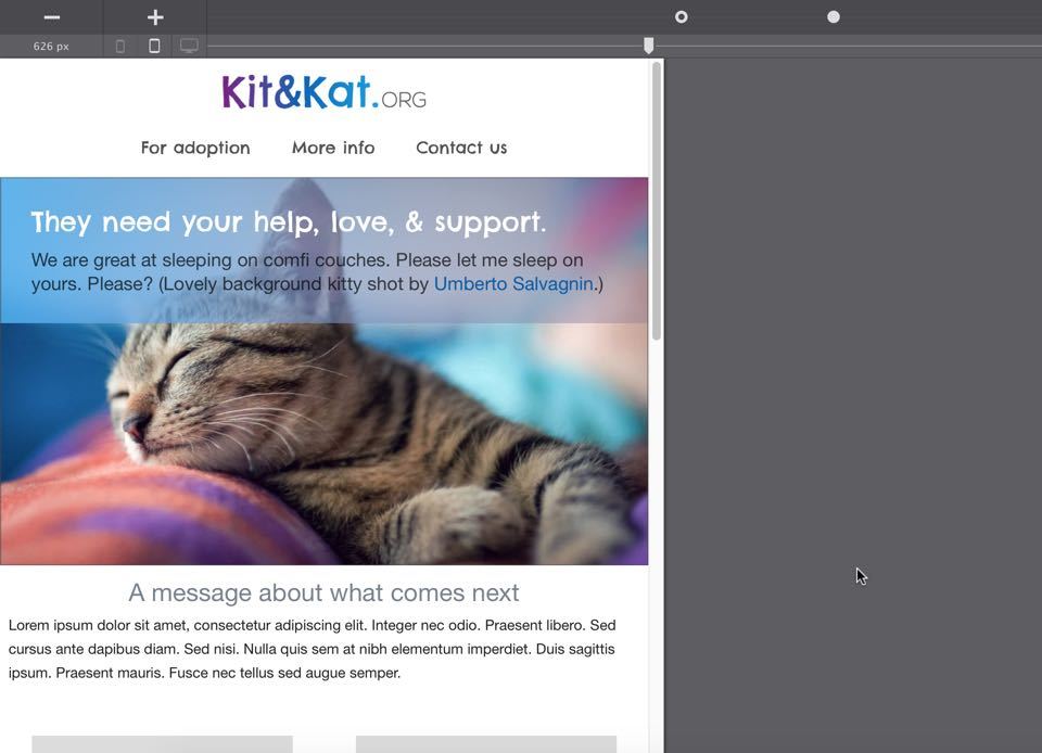
For starters, the logo placeholder needs to be updated. A lot can be done be done with CSS(3) in terms of design and effect creation these days. (I have made a few text based logos in pure HTML & CSS myself.) Yet, mainly for branding consistency across channels, most logos are images made with image editors. And so is our Kit&Kat.org logo. However, before we can link it in we need to replace it with a picture element. So, head over to the design pane with the logo selected and use the delete button to remove the placeholder. Now, drop in a picture link in its place — just don’t forget to center it beyond the second breakpoint!
The reason we need to swap out placeholders (for now)
Several aspects of the placeholder images are editable. You can, for example, adjust the ratio, color and text on the image. Based upon the settings we generate a svg on the fly. Which is different from a <picture> element and the reason why it needs to be swapped out. We’ll be working on automating that swap for you in one of the next releases though!
Now go to the design pane to add the actual image. Set the drop down for the Picture control to Online Image. Pasting this link http://cup.cm/1DDAZBU in the URL box that now appeared below the drop down immediatly displays the logo in live preview. You will see that the logo is designed to use the same blue and purple tones found in the callout image. Adding a top margin of 20px give it a bit more room. No other changes are needed here. For the navigation links, triple click each one to activate edit mode and add the actual link texts below:
For adoption
More info
Contact us
Since our navigation links share the same class we can update the styles for all three at the same time. Make sure to deactivate edit mode, then go to the design pane with any of the links selected. Here we change the font to Chelsea Market and update the color to #525252. Dark or white tints go with any color palette and are generally easiest to read. Again, the font choice really helps to set the right atmosphere, we can make the navigation even better though:
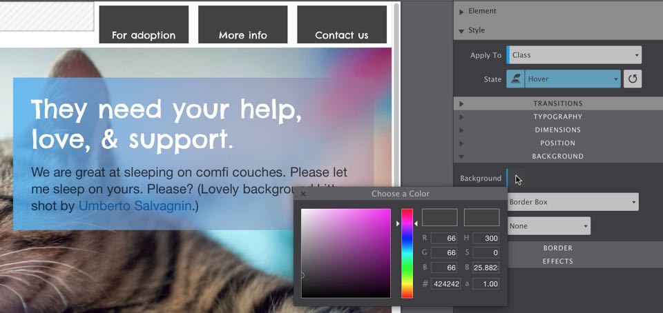
1. Add hover styles
On the Style part of the design pane, set the State drop down to hover. Then, in the background section, set the Background color to #424242. That will make the text difficult to read, so we change the font color to white (#ffffff). Now the below is what visitors will see when the mouse goes over any of the navigation buttons. We can make the buttons a bit more balanced by reducing the top padding and adding some on the bottom.
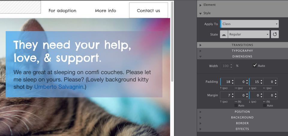
2. Update spacing (for the regular state)
Set the State drop down back to regular. Now adjust the top padding to 20px and the bottom to 16px. Also remove the 7px bottom margin — this make the navigation buttons ‘sit’ nicely on the background image of the callout row.
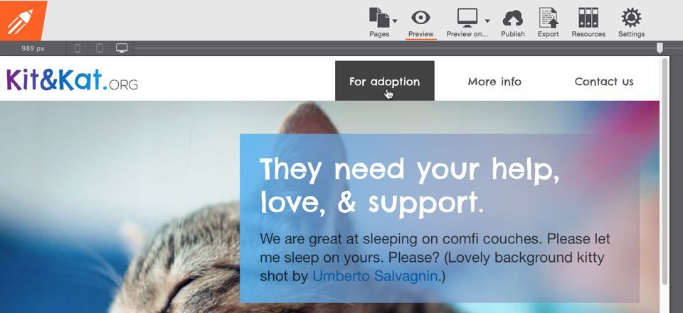
3. Use Preview mode to see state style changes
Now click the Preview icon on the toolbar and hover over the text links to see it all in action.
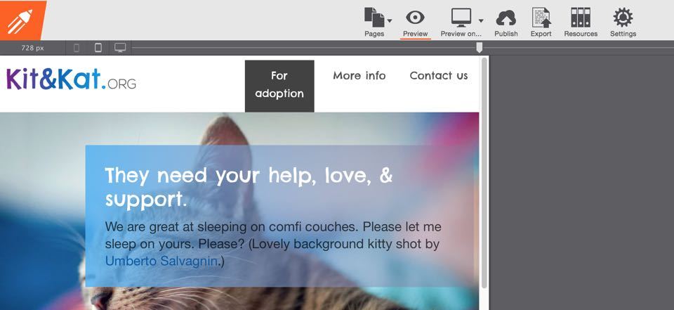
Pretty slick, but let’s not forget to use the slider to check your changes at all widths. The content and design updates look great accross the board. Only at aaround 730px there’s a potential issue: the ‘ For adoption’ text starts wrapping. This continues until the the navigation section stacks below the logo and takes up the full width. You can see this in the screenshot below. The use of a different font, font size or change in text length can cause these types of issues. No biggie (nothing is really with RSD) but we’ve got to fix it.
One way of addressing this is to combine the columns. Then, if needed, we can remove the second (empty) column to create space. Before doing anything, make sure to move the slider to the right of the first breakpoint. Select the first navigation link. Next, on the layout pane, use the Merge right button twice to merge the columns. The links will now stack, but that is easy to change: in the position section of the design pane set the Display drop down to inline-block. To spread them out add left and right padding of about 20px.
Looking good, but we can make it better. The page header (and entire page for that matter) will feel more balanced with the navigation items lined up on the right. Here’s the trick: add a Container element to the column and drag in the navigation links. Select the container and, again on the position section, use the Float right button. The space between the buttons and the callout row that now appears on hover can be removed by setting the bottom margin for the container element to 0px.
Mission accomplished!
The second column can be disposed of now. Do make sure though that the span width of the column containing the navigation elements is set high enough to fully stretch the page. Before we can wrap this up we need to do one more thing...
Check: how do the latest changes hold up across the width spectrum!
All looking good when going through the first breakpoint. Since we made changes to the column spans (and removed a column), we need to make sure that both the logo and navigation column have a total span width of 12 (5 and 7 respectively) beyond the first breakpoint. Following the second breakpoint we want to have both columns stack and stretch the entire width using a span 12 (for each). Also beyond the second breakpoint, we find that something has changed: the container is now floating to the right. That looked great on the wide design, but makes this smaller design unbalanced.
Removing the float will make the container take up the full width of the page. However, this will position the navigation links on the left of the page. The first thing can be remedied by changing the display setting of the container to inline-block; now it only takes up the width of its contents. Unfortunately inline-blocks can’t be centered by setting the margins to auto. No need to despair, with RSD there are many ways get to the desired result.
Centering the navigation for small screens.
With the column now selected, open up the typography section on the design pane. Typography on a column? Indeed, in CSS styles that are applied to a parent, cascade down to its children. In this case using align: center will apply that rule to the container and center it. Check it out!
Looks great, but what’s that worth if these links don’t actually take you somewhere! Here’s how that goes, to link to a page within the site, simply add the page name into the Href box on the design pane. Linking to a section on the same (or another) page is possible as well. Add an ID to the element you want to link to — frequently this will be a row. Then, in the href box type the pound sign (#) immediately follow by the ID. Let’s try this real quick. Scroll down and select the third row with the ‘message about what comes next’ heading. On the design pane give the row the ID for-adoption. Then select the corresponding text link and insert #for-adoption in the Href box. To test this click the Preview on button in the toolbar. This will launch your default browser with the current design; I will assume you know what to do next…
Does the ‘For adoption’ row not scroll to the top?
That’s because there is not enough content below it. You can make your browser window smaller and try again. Another option is to go back to RSD, select the 4-column row below and duplicate it (right-click --> duplicate). Hit Preview on again and see what happens now.
Creating the ‘For adoption’ sections.
The main purpose of the site is to help our sweet cats find a warm home and comfy couch. We want the visitors and cats to get acquainted and have them show off their special cat skills and fuzzy looks. To accomplish that, apply our supplicating font Chelsea Market and update the message in the third row to say:
These little guys are waiting for you.
For the font color we use #46a0db, the font size is 40px. To make the appeal even harder to ignore we select ‘waiting for you’ in text edit mode and apply color #546bde. To give the text some room to breath we increase the top-margin to 40px. What you think? With the right images of our cats and supporting texts, this is going to be simply irresistible!
Bonus: setting default styles for elements
If you apply the styles to the Type selector all other heading 3 elements throughout the site will have the the same styles by default. Without using a the class. You can try that on the paragraph below if you want, after that all new paragraphs’s will have that style by default. You can learn more about working with selectors here.
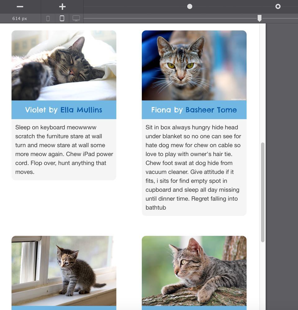
We will use the fourth row with the four columns to get our inhabitants in front of the web world. The first in line is Violet, select the picture in the first row and add her picture by linking to the Online Image (URL: http://cup.cm/1JqV1i8).
To give this a smoother effect we can smoothen the sharp edges of this picture. With the image still selected, scroll down to the Border section and activate the top left and right border Radius selectors.
This means that the changes we will make with the controls on the right — the horizontal and vertical border axis — will only apply to these two active borders.
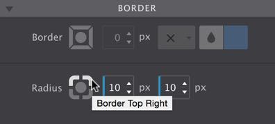
I usually click in the box and use the keyboard arrows to increase the number. This helps to monitor the change and gives a feeling of where to stop. In this case a border radius of 10px gives a nice smooth effect. Perfect for a first introduction!
Tweaking the small heading and subsequent paragraph will give us the enchanting outcome below. I suggest recreating this yourself simply by looking at the screenshot below. But just in case, I detailed the steps below the image as well.
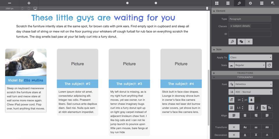
- Bring the heading background color in line with our color scheme, we’re changed it to
#6eb6e6; - Apply our beloved font,
Chelsea Marketand use a lighter font color (we are using#ffffff) with a font size of17px; - Activate the Text Editor and add the cat’s name — the adorable Violet is first in line. It’s also nice to give the author of the image some credit so keep on typing or copy/paste: ‘by Ella Mullins’. Select the author name and click on the Plus link button and paste the actual link:
http://cup.cm/1JqXwkB. For a nice visual effect we gave the link a color that contrasts a bit with the white — a color that’s darker than the background but still a blue#0058a6; - Set the paragraph background to off-white (
#f5f5f5) and the font to off-black (#383838); - In the border section, give the paragraph the same rounded corners as the picture, but now on the bottom.
Did you notice that we sought some inspiration from the cat ipsum for the paragraph text? There are a few other things that catch the eye here. First of all, the style changes that we just did for the elements in the columns featuring ‘Violet’ have been applied to the same elements in the other three columns as well. Marvel at the power of the CSS Selector system! A good understanding of how this works can save hours of work, especially when tweaks need to be made at a later occasion. You will also see that the headings in the other columns (2 - 4) are not lining up with Violet. This will happen if images have different dimensions. The only thing we need to do to prevent this from happening is to make sure that all the images are the exact same size.
Pro trick: Maintaining height with different image dimensions
In our old ‘static’ web world, images could be given a fixed height and width to make sure they had the exact same dimensions. Clearly this does not work in a responsive design. But there are tricks…
The first trick is to use a container and set the image as a background. You can then manage the dimensions of the container. This is my least favorite ‘hack’ since it treats the image as decoration instead of content. Although it’s the same for the human eye, it is less semantic and will be treated differently by search engines and screen readers.
The other trick is to place the image in the container as a content (picture) element. In the Position section, set the Overflow drop down to hidden for the container and give it a minimum height. Now the part of the image that is too big for the container simply won’t be visible. The drawback here is that is usually requires some tweaking of heights (and sometimes widths) when the display width changes. A detailed article of what can be done with the overflow property is waiting to be written...
The paragraphs are also of different length. In this case that is done by design; we choose to let them shrink or expand based up the length of the paragraph. The same happens to the headers at certain widths — in this happy and informal design, we feel something like this fitting. If you need them to all be the same length, a similar trick as explained in the tip section above can be used.
Now the single remaining thing to do is adding the content — picture, heading (with author link) and paragraph text — for the other inhabitants. Here are the image links:
- Fiona -
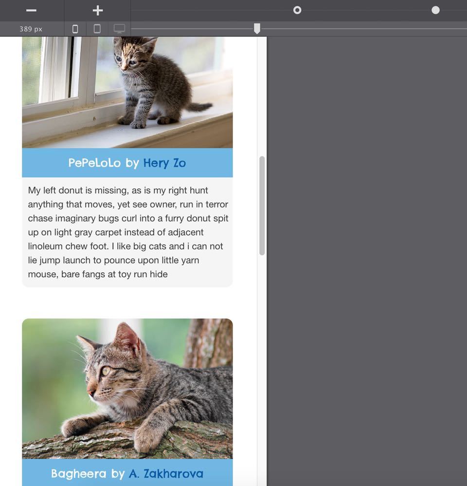
http://cup.cm/1Fdgwz0 - PePeLoLo -
http://cup.cm/1FdglUx - Bagheera -
http://cup.cm/1Fdgas5
Need to show of even more inhabitants? Simply select a column and duplicate to add one more. Or select the row and duplicate to add four more. It’s that easy!
This almost completes the conversion of our static prototype, into a full fledged responsive design. As always, we need to verify that, following the latest updates, the design keeps looking great across the entire width spectrum. In my test I only came across a single thing that could be improved: the two column structure felt really too narrow for widths below about 450px.
It’s an easy change, but one that will make mobile, or other small screen viewers, very happy. You know the drill: 1) select the Column, 2) make 12 the new span width, 3) repeat for all four of them, 4) move the slider to the right and left of the breakpoint, 5) marvel at the all around awesomeness!
The conversion of the static wireframe we started with is complete! With all that you learned you will now be able to make complete responsive websites all by yourself. There are a few additional things we want to do with this design like:
- Making the callout message dynamic using a Slider,
- Completing the page design with a footer,
- Add some neat tweaks like a static header, shortening the design on mobile etc.
- Adding and designing the information and contact pages.
These further improvements will be explained in some upcoming articles. Please make sure you are subscribed to our newsletter or follow us on twitter to get notified when these are articles are posted!
Want to take a looksy at our property settings? Sure, just download the file below and let us know if we can help with anything!