

Coding and designing responsive newsletters is hard
Email professionals say making a custom, responsive email takes days. They would be right—if it weren't for Responsive Email Designer (RED)! This article shows you how to create a custom responsive email, like the example below, in 6 short steps. We included video snippets that show the basic action.
Creating a custom, responsive email in 6 quick steps.
Before we start, it is important to realize that coding HTML emails is like web design....15+ years ago! Yep, back to nested tables for layout, inline styles, and a ton of hacks to solve display issues for uncooperative email clients. Remember IE6 and 7? Compared to coding for Outlook, designing for these archaic browsers would have felt, in hindsight, like a pleasure. Hold on now, there’s no need to be turned off already. There is actually some good news here too.
Responsive Email Designer is a revolutionary app that shields you from this complexity. The real-time visual editor—with the ability to drop elements, use of IDs & classes, plus the availability of familiar CSS styles—makes it feel like you are designing for the modern web! If you’re a web front end designer or developer you could skip this tutorial all together as you will be off to a running start using rows, columns and visual CSS tools to create what feels like a web page.
Also, RED offers more design freedom then any of the regular email editors offered by the email sending services. You can check out our theme page or watch the overview video to see some other examples.
To follow along, it will be handy to have a copy of Responsive Email Designer purring on your machine, so we went ahead and compiled fully functional versions of RED for Business, specially for this tutorial!
Download RED For Windows Download RED For OSXWhat’s the catch? Exporting (for sending emails with our friends from Mailchimp, Campaign Monitor, etc.) is a bit limited. Yet, if desired, it’s also easy to remedy with our RED Mailer service ($9/mo — first 7 days free, cancel anytime) or simply by buying the license. After you have made your first responsive email by following along, we are sure you will find the remedy that fits you best!
Download successful and RED installed? Building up good the vibes? Alright, let’s look at what we're gonna make:
The responsive email we are recreating in 6 steps
Don‘t forget to use the slider to see how this email adapts to smaller screens, and scroll in the window to see all of it. In this design, no fancy images that might or might not show, just three icons and cool styles that will bring the message across. Cool? Alright then, let's get started!
Step 1: Drop in content elements
Add headings, paragraphs, images, buttons, social icons and more.
The element pane offers a large number of content components for constructing your email (message). Simply click on any item, and it will be inserted into the selected column. You can also grab an element and drop it exactly where you want it. Want to move it later? Simply drag and drop to rearrange!
The contents of the email are organized in rows and columns. In the email design example above, a text element is used for the pre-header text in the first row. In the second row, we dropped an image for where the logo will be placed and included a text link that directs recipients to a web page with similar content.
Rinse and repeat!
The steps, especially steps 1–4, are more iterative than sequential. The examples already include a few additional rows and columns to order the content. Some default text blocks were edited to make their intent clear (email title). Also applied are a few basic styles (right aligning the pre-header and online version text blocks) to better organize the content.
In practice you will be doing steps 1–4 a few times, with an emphasis on a specific step depending on the phase of the design. Step 4 will be emphasized when most of the core content and desired action items are in place. Following that, the focus will be on making the design responsive, often requiring you to revisit details from the other steps.
Right, the “similar content” remark was not an accident. Many people believe that this page needs to be the exact same as the email—preferably auto-generated even.
At CoffeeCup we have a slightly different view on this. RED has been designed to deliver the best possible experience to the reader when it is allowed to (by the email client). This principle of progressive enhancement also applies to the web page version. A web page offers more possibilities than an email, and they should be used (when possible and provided the content is sufficiently similar).
What is pre-header text?
A number of email clients, including Gmail and the Apple email clients, preview the first few words of the email behind or below the subject line without the email being opened. This allows the recipient to scan his emails and helps in deciding whether or not to open them. Meaningful pre-header text often increases the open rates of newsletter and sales or marketing emails.
RED has a nifty pre-header feature that allows you to specify the text that shows up independent of first words of the email. Why? Because way too often the very meaningless “View Online” show as pre-header, and who would find that a good reason to open an email!
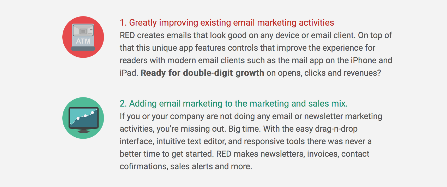
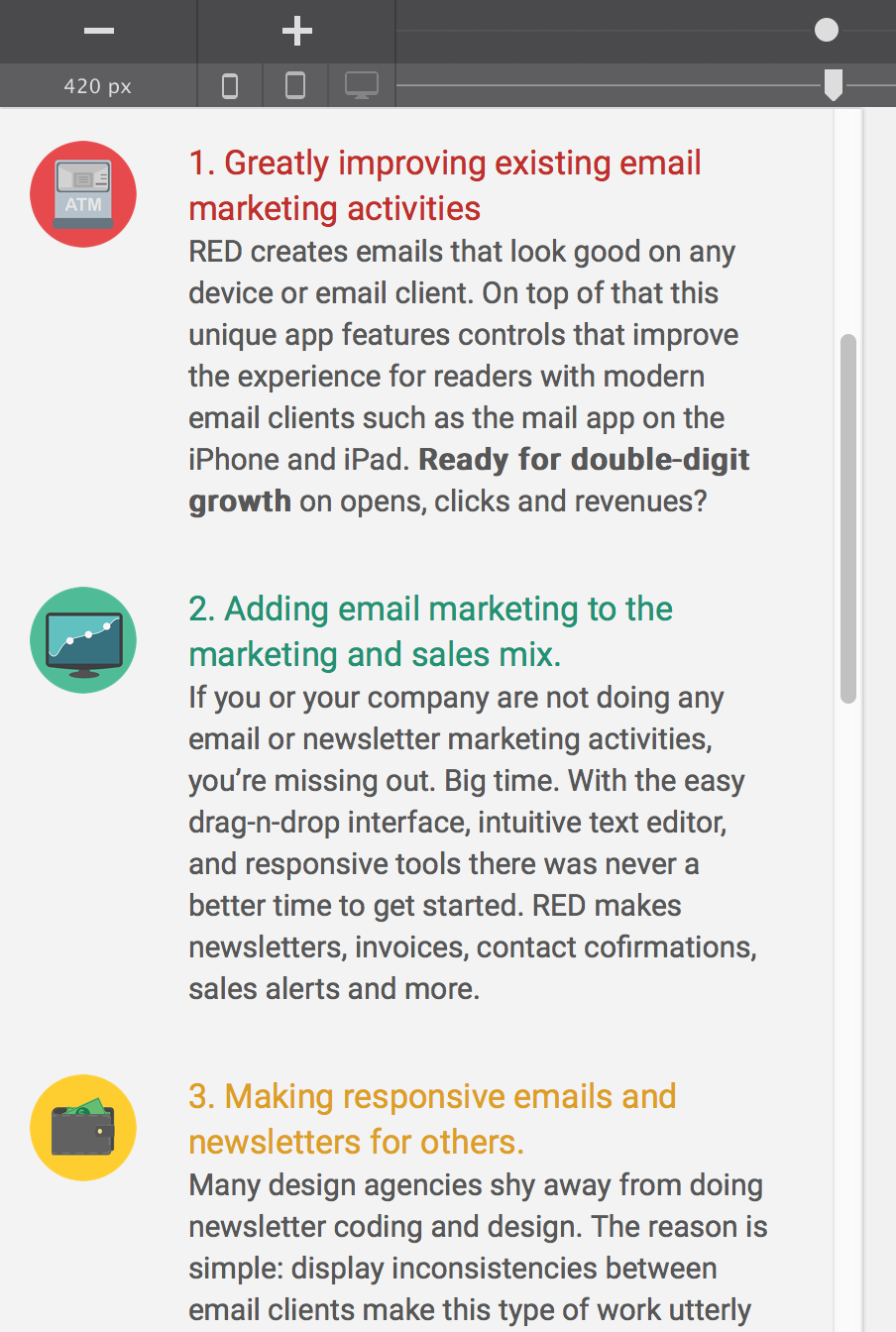
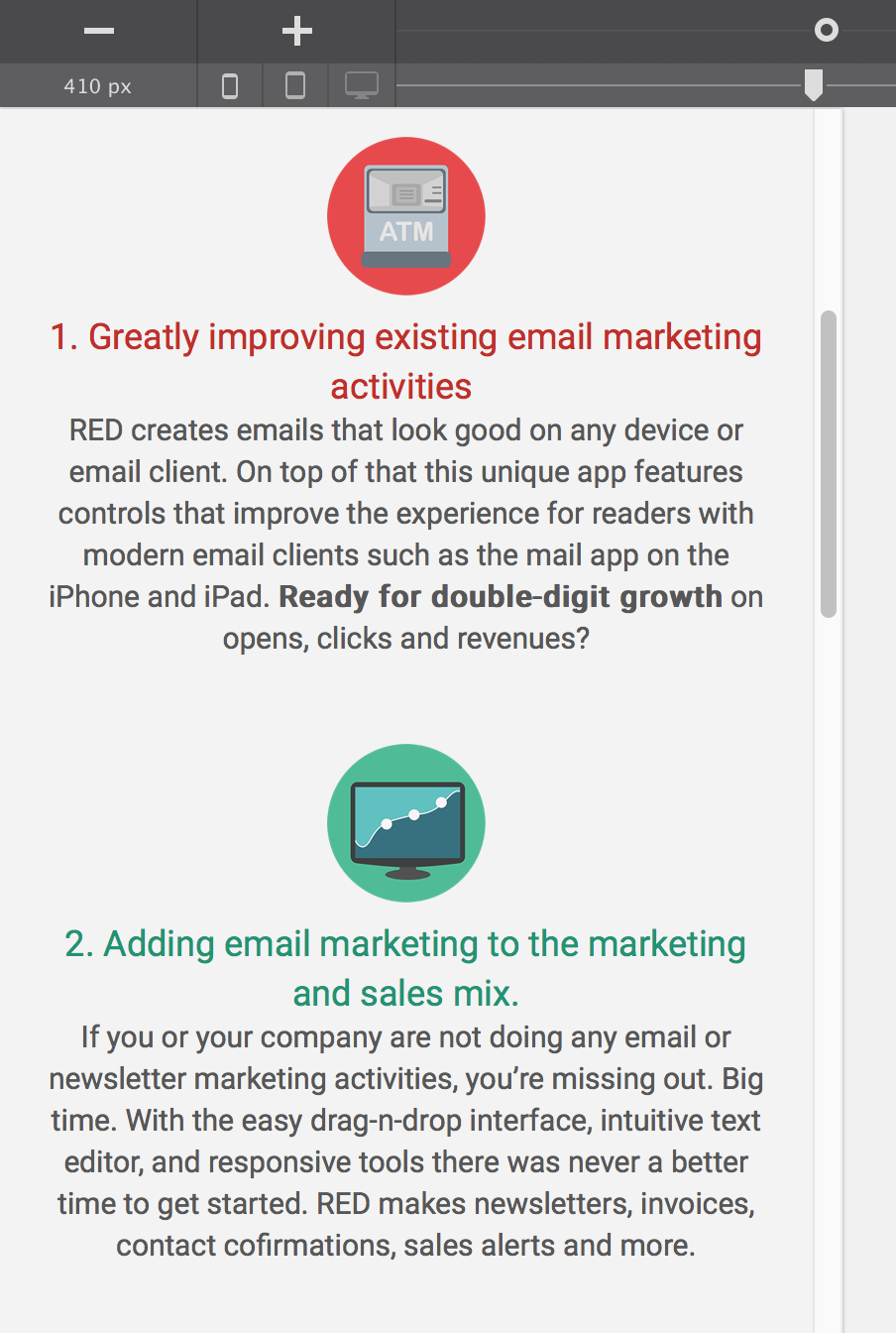
Other content elements in the example email include a Heading (H1) for the email title, with an accompanying text element that reinforces or clarifies the big text. A Section Header (H3) with a clarifying paragraph follows. Next comes the first of three key points. This section contains more detail and is supported by an illustrative image (or icon). Really, writing this down took more time than actually adding the content elements in RED!
Dropping in the first content blocks.
With a rough idea of the first content elements (and their hierarchy) in place, let’s look at what options we have to organize them.
Step 2: Organize your content with a custom layout.
Choose a width, add rows and create columns.
RED brings the power of grid-based web design to email creation. As mentioned, content is organized and aligned in rows and columns. Rows are divided into columns that will be used to place the actual content elements. Should you use 1, 2, 3, 4 or more columns? That depends on the design and is ultimately your choice!
In the example, the row that contains the logo stretches across the entire width of the available display space. For that we use a “Full-Width row”. The content will still be “constrained” by the width of the email body, but the background color of the row will give the visual full-width effect.
Constraining the (body) width of an email.
Various email design tips and best practices are based upon outdated facts or data. This is one of them. Conventional wisdom teaches that the email body—the width of the constrained rows—should be around 600px. This piece of advice comes from a time when displays were small, Outlook was the most used email client, and mobile email reading was virtually non-existent.
Much has changed since then. Today over 50% of emails are opened on a mobile device. Clients such as Gmail now support fluid layouts. Apple Mail, with one of the best email rendering engines, has stepped into the top 5 of most used email clients.
Considering the circumstances we @CoffeeCup are designing and consider it better practice, to set widths around 700px. Sometimes we use even wider designs. RED will still fix (pun intended) the width for Outlook where fluid layouts are not supported, and, generally, only the few readers with small display settings will encounter a horizontal scroll bar.
In the header row, we are using 2 columns, one for the logo and one for the text link. Columns are a great way for placing content next to each other. If elements are placed in the same column, they will stack by default. That is what we want to happen to the email title and subtitle, as well as with the section heading and intro paragraph. These elements are placed in a two constrained rows (no full-width background is needed), both with a single column and therefore, appear below each other.
The next row, the “Feature row” that contains the first key point, uses two columns. These columns are not divided equally; the first column (the one with the icon) gets a width of two (out of twelve), and the text column gets the remaining width of ten. The width of columns can be controlled with the “Span Drop-Down.” Responsive Email Designer uses a 12-column grid, meaning for example that a column with span-6 takes up half, and a column with span-12 takes up the full available width.
The following example shows the structure of our layout. The red text is not part of the actual content but helps to clarify the row and column structure.
The layout structure of our responsive email.
The different row colors only have been applied to make them easier to distinguish. The example is scrollable and shows a pre-header row, a header row, a row used for a further introduction of the subject, and the first feature row. Scroll down to see the feature row and columns in a darker grey color.
One more thing: unconstrained content.
Placing elements outside of the normal flow or ‘breaking the grid’ has always been an important design technique. It’s mostly used to draw attention to certain elements or sections and to give a design a bit of an edge. RED is the only email design tool that allows content to be placed outside of the body.
Some examples of this technique can be found in the themes that come with Responsive Email Designer. In the Red Lines theme, the box that contains the newsletter issue and title information, is placed outside of the body. The Shooting Star design has an image that stretches the entire available display width, showing another interesting use of this technique.
With the initial content elements and layout structure in place, it’s time to get the story straight. Let’s smith those words!
Step 3: Draft the message with the cool text editor
Write your story and edit texts with ease.
The Text Editor starts automatically when a text element is triple-clicked. Alternatively, you can click on the Pencil in the top section of the Design Pane (click the button below “Profiles” to access the design pane) to enable editing mode. Then simply paste your text or type your words right in the element itself.
You can select letters or words to change their appearance using intuitive controls that you are already familiar with from popular word processors. Tweak text size, decoration such as italic or underline, and use font colors or backgrounds to create that nice attention-grabbing typographical effect that will display automatically and consistently on all email clients.
Text always shows up. Everywhere. Images don’t...
In over 50% of the email opens the images are not visible by default. Sometimes they are blocked by the email client. In other occasions the recipient prefers it that way.
Images can be quite heavy and take a while to load when bandwidth is scarce. Text, on the other hand, is lightweight, loads fast, and always shows up. Therefore, images should always be used in addition to, and never instead of, meaningful and descriptive text. Use them to illustrate a point or enhance the design, but don’t rely on them to get the message across because they might not be given the opportunity to do their job. Indeed, in email, images should be treated as (progressive) enhancement.
What is the hidden editor gem? It’s the ability to add a (class) name to any combination of inline text effects and settings! This makes reusing these effects in other sections not only easy and precise but also allows you to make tweaks to the styles for all texts that use them at the same time. Want to make a slight change to the color of all text links? Select one, make the change, and all text links will be instantly updated.
Pretty snazy indeed, we’ll look into that a bit more while working on the design.
Before we continue with step 4, adding the design layer to our responsive email, let’s quickly look at an updated version of the design. In the example below, the various placeholder texts have been updated with (a draft of) the production content.
A few additional content blocks were added as well. Two more “key points” were added (in this case, two other ways people are making money using RED). The “key points” section is followed by three action choices, represented by three pure HTML buttons. Please never (never ever) use images to represent action items such as buttons. There’s too big of a chance they won’t be displayed, leaving the reader confused and unable to make the desired click. If an image is needed, a background image can be a good choice. It will show in most major clients, with the Outlook desktop clients being the big exception, and enhance the call to action when images are displayed.
Real—meaningful—content helps to guide the design direction.
In this version the colors and texts used to indicate the layout structure have been removed. The content is now largely there; it’s clear what we want to communicate. However, the email looks grey and boring and could really benefit from a dose of design love—not only to give the layout more personality, but also to use design to clarify the message and to make it easier to consume. Onwards to the powerful design tools!
Step 4: Design with familiar style controls
Add borders, backgrounds, font-styles, colors, shadows and more to craft impressive emails.
The design pane will launch upon a double-click on any element. The pane can also be reached by clicking on the pencil icon on the (top) right below the profiles icon. Styles can then be applied to the selected element only, or to various elements of the same type at the same time. If you want to follow the design part of this tutorial with the completed project from step 3, you can download it here.
RED for Business features a selector system—Type, Classes and IDs—very similar to what is used in “normal” web design. RED Personal uses a simplified workflow; design styles can be applied to a specific element or to all elements of the same type. After defining how broad or specific the styles need to be applied, any of the controls below the selector drop-down can be used to define colors, sizes, borders, spacing, and more. If you need detailed help on these controls, or anything else in the interface, please consult the RED manual.
Frequently, one of the first design decisions and actions is to choose a fitting font for the message. Or apply a font that resembles the house style. At CoffeeCup we are (slowly) switching from Open Sans to Roboto. Both are friendly Web fonts, supplied by the fantastic (free) Google Font service, and are very readable on screens. In our email example, Roboto is used for all text elements: headings, paragraphs and buttons alike.
To apply a font, first select a text element, for example a paragraph. Then, go to the by-now familiar design pane on the right, and set the “Apply to” drop-down to “All paragraphs” (RED Personal) or “Type” (RED for Business). In the Typography section, select the font family of your choice (our choice was Roboto) from the drop-down. All paragraph elements, old and new, will now have the selected font applied, unless a different font is applied to a more specific selector—class or ID in RED for Business, “To this - ” in RED Personal.
With the paragraph selected, we might as well define all typographic styles we want to use for our paragraphs. The font size is set to be 16px and color hex code #575757 (click on the color tile and type or paste the code in the hex box). The relatively large font size in combination with the calm typeface and background color, makes the text easy on the eye and invites reading. That’s all. A few of these small tweaks can make a big difference (as our Diego shows me time and time again). No other styles have been applied to the paragraphs.
Web font support by email clients
Not all email clients support web fonts. Therefore, it is important to select a good fallback font. In RED for Business this can be done with the second drop-down that appears as soon as a Google font is selected. In our example, we are using Arial as fallback.
Email clients that do offer Web font support include: Apple Mail, Thunderbird, iPhone, iPad, and the native Android email clients. Our article about progressive enhancement in email design shows a nice example of how Google fonts can be used to enhance the design and create a more interesting experience for recipients using one of these email clients.
With a focus on the essentials of responsive email design, as well as broad email client support, RED Personal does not have Google font integration at this moment.
The other styles are applied in a similar way. Simply select an element then define the desired visual effect on the Design Pane. Just follow the listed styles changes below, and the email will have the same appearance as the email that we are recreating.
- Select the preheader text element.
- Under Typography, set the font size to 15px;
- Under Typography, click on the color icon and use #a6a6a6 as color value;
- Under Dimensions, select ‘Right’ from the Alight drop down;
- Under Dimensions, set a 2px top and bottom margin (or padding in RED Personal).
- Select the second row.
- Under Background, click on the color icon and use #404040 as color value.
- Select the image in the second row.
- Under Element, select Local Image from the Source drop down. Add the image to the project resources, then press Select.
- Under Dimensions, choose to left-align the image.
- Select Read online.
- Apply the font settings to the type (use ‘All text elements’ for RED Personal);
- Font styles: Roboto (Arial for fallback and RED Personal), size of 14px, and color #e0e0e0;
- Alight right with a top margin or padding of 3px.
- Select the email title (Responsive Email Designer).
- Under Typography use font Roboto (Arial for fallback and RED Personal) with a light font weight, a size of 33px, color #ff8c00 a line height of 1.2 and center align;
- Under Dimensions set a 10px top margin (or padding RED Personal).
- Select the column with the email title.
- Use top and bottom paddings of 20px and left and right paddings of 10px;
- Set the background color to #ebe8e4.
- Activate the left and right bottom corner controls by clicking on them, then apply 5px (rounded) corners.
- Select the subtitle.
- Use font Roboto, a size of 16px, color #8f8f8f a line height of 1, and italic;
- Under dimensions set Align to Center and use a bottom margin / padding of 10px.
- Use font Roboto, a size of 24px, font-weight light, color #ff471a a line height of 1.2;
- Under dimensions, add a top margin (or padding) of 10px.
- Give it 30px left and right padding. This is used for most columns that contain text in this design. When using RED for Business it is a good idea to give it a class name that is easy to remember for re-usage like for example “main-column”. With RED Personal the padding can be applied to all columns and removed for columns that don’t need it.
BAZUMM! The first four rows have been squared away. How long did that take you? About 10 - 15 mins? Even if it took you a bit longer, it does not really matter. Practice makes perfect, and if you got this far, completing a design is just a matter of repeating the steps you’ve already done. Let’s do one more row here to practice a little more. There are also a few text editor tricks to share that you might like.
Alternatively, you can download the completed project, select an element, and peek at the design pane to learn exactly how we did it. Having this project will also come handy when we start with step 5 and 6. Before that, let’s practice a bit more with the key points row and use the editor for some inline style changes.
To re-create the feature rows, follow these steps:
- Select the small image (icon).
- Under Element, select Source > Local Image and add your image(s) to the project. Then click on the image or icon of your choice followed by Select at the bottom of the dialog and the image will appear in the email. In case you don’t have a suitable icon, you can go here to download the icon set we used in this email;
- Under Dimensions, set the max-width to 80px and right-align the image.
- Select the paragraph.
- The font styles should already be in place; they were done in one of the very first steps. Just in case they are not: we are using Roboto (with Arial as fallback and used in RED Personal) at 16px, and with color #575757;
- Select the column that contains the paragraph and give it the same class name as all other columns that hold text (the “main-columns” we used earlier for the column in the fourth row).
- Here’s where it gets interestingly different... Triple-click on the paragraph to open the text editor, and place the cursor after the word ‘activities’. Now add a period and hit enter. Then, select/highlight the first sentence, and click on the color icon in the editor toolbar and use (you can paste or type this in the hex box) color code #c22d23. The first sentence should now have a nice, distinguishing reddish color.
- Making a selection bold or italic works in the same way. And if you type a name in the top left box, you can reuse what you just did in any section of the email by simply typing the name. How cool is that!
So, that’s how easy designing email with RED really is. Time to get started with the responsification. Since the exact tweaks for mobile screens depend on the original content and design, it’s easiest to follow along with the completed step 4 project opened in Responsive Email Designer.
Step 5: View the email at every possible width
See and test the email design at every possible width.
A truly responsive design looks great on every screen and every size. You see, phones and tablets come in many sizes and resolutions, making designing for “phone” or “tablet,” in general, impossible. However, with the slick slider, you can see what the design looks like at every possible width, pixel by pixel, and cover them all!
Grab the handle, and move it left or right to slide your way onto and past any screen (size). Does text feel squished, are images too tiny, or do you want to change the column structure at any pixel width? Then add a breakpoint…
Step 6: Adjust for an optimal recipient experience
Making magic with custom breakpoints.
Responsive Email Designer is the only app that allows the creator of the email—you in this case—to make adjustments to the design and layout at every possible pixel width. That’s right, anywhere the reading or using experience could be improved, a change should be made. Update everything design or layout-related—like spacing, alignment, column width, font size, or contrast—where and when needed.
Changes are made at so-called “breakpoints.” Simply click on the plus icon, or on the line above the slider, to add one. Then you can change font sizes, adjust spacing, stack columns by increasing their span (width) on the layout pane, and so on. These changes will apply to all (screen) widths to the left of the little dot above the slider. Simply move the slider to the right and left of the breakpoint to see the responsive changes in action.
What’s a breakpoint and who’s listening?
We came up with a formal definition of what a breakpoint is in the context of responsive web design, when we released Responsive Layout Maker early 2014. Much debate has happened over designing for devices and when to add breakpoints ever since. The solution and explanation are simple:
There are too many different device sizes to possibly design for, so add a breakpoint whenever the design ‘breaks’.
This is also exactly the reason why having a slider is the only way to design for all devices.Unfortunately, email design is not the same as web design. Yep, back to where we started this article! Whereas media queries (the CSS that is used to specify breakpoints) are ubiquitously supported by the different browsers, the same is not true for the email clients. Many older clients like the Outlook desktop clients don’t even support fluid layouts!
The main—top 10 most used—email clients that do not listen to media queries include: Gmail (both browser and the mobile app), Outlook (browser and desktop), Windows Live Mail, and AOL Mail. Luckily the email clients that benefit most from responsive design, the mobile email clients on iOS, do listen to media queries and follow their layout and design instructions in detail. That leaves Gmail as the only main mobile email client without support for responsive emails.
The good news is that the RED Email Code Generator (ECG) is loaded with clever hacks and smart tricks that compensate for deficiencies in many clients. For example, a multi column row can be instructed to stack the columns when not enough width is available, even when media queries are not supported. This prevents columns from being uncomfortably small, as they would be on the mobile Gmail apps. (Note: this is implemented as of V1.2.)
But everything will be responsive...eventually. The signs are clear. Yahoo recently announced that Yahoo Mail (both desktop and the mobile app) now will support responsive email designs. And, according to our tests, the mobile Outlook app also plays nicely with responsive designs. The future is looking bright!
With all that behind us, it’s time to do some actual work and responsify our design. The start is simple: just make the display area smaller by moving the slider to the left. Pause now and then to scroll up and down the email to make sure everything still looks good in the middle and bottom parts as well. They will very likely disappear at the bottom when the email gets longer, simply scroll down to see or work with these elements.
In the example, everything looks good until we start passing the default breakpoint represented by the red dot. Slowly continuing to decrease the display area, the size of the paragraph texts starts feeling a bit large relative to the other page elements such as the feature icons. All paragraph font sizes can be changed at the same time, so why not experiment a little and give a slightly smaller size a try!
First and foremost, let’s add a breakpoint at the place where want to make the change by clicking on the plus icon. In our design, we decided to use a font size of 15px for widths below 650px—but sticking with a larger font size for a while would have been cool too.
This is also where the buttons start feeling squashed. To give these important action items some room to do their job select the one on the left. Switch to the layout pane and under the columns section change the spans from 4 to 6. Do the same for the middle button and change this to 12 for the last button. More changes can be made if desired, the last button can for example be given a larger max-width for a different visual effect. You will get the main idea here though, content needs room to breath and this can be done by increasing the span width of the columns.
Continuing to slide to the left, the feature paragraphs become a little suppressed. To give them more room, the icon can be positioned above the paragraph text instead. To do this, select the icon, or column in which the icon is placed, and go to the layout pane. In the columns section, use the drop-down to change the spans from 2 to 12. BAM!
Well, almost. The icon on the right is still a bit weird. The fix is easy; first, double-click the icon, then select the center align option from the drop-down in the dimensions section. Done—for real this time.
Now we need to give the paragraph the much needed space to breathe. Select the element (or parent column) and change the spans to 12 as well. Looking good? Let’s construct the same layout for the other feature rows as well. Just select the respective column or element inside the column and adjust the span so the fill display width is occupied.
That’s all looking pretty good now, but what would this layout look like with centered text? Select a paragraph and make sure the change is going to be applied to the type (all paragraphs). Now click the center align icon under typography and see the text center for all paragraphs. A single click, and everything changes, nice! Personally I feel this looks good in this design with the centered icon, especially when the screen gets even smaller. My vote is to keep it, but I will let you be the judge. If you don’t like it, just press “undo” to reverse the changes or set the align button back to left.
That’s it, ladies and gentlemen, a responsive email design in an hour instead of days. Feel free to test the design on different devices and clients. You will find that all the tricks baked into the Code Generator will make the email display very consistent and certainly prevent the design from breaking. If you want to play with the final— responsified—project, you can download it here.
Anything you found while following along or any suggestions on making the tutorial or design better? Hit me up on twitter, and I will be right with you. If you prefer you can also leave a note in the forums or on the CoffeeCup Facebook page.
Happy Email Building!