

Build an Orbit Photo Gallery
Everyone loves a cool image slider. Within Site Designer this is really easy to implement. Today I’ll demonstrate how to create a revolving photo gallery using the Foundation CSS framework. The graphics will rotate automatically, but I'll also teach you how to add controls so that the viewer can scroll through them manually.
Watch a video, or follow along with the written steps to go at your own pace.
Some Prep Work
Foundation uses a mobile-first workflow, so before you begin be sure the viewport slider is positioned to the left of the lowest breakpoint. This will allow you to set the default configurations for the slider. Tweaks can be done later for larger screen sizes.

If you are curious how the raw code looks within the Foundation documentation you can find that here. Following along with the code version is a great way to learn how it is converted within the code-free Site Designer app.
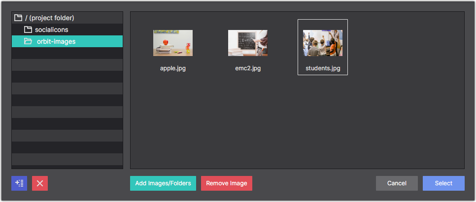
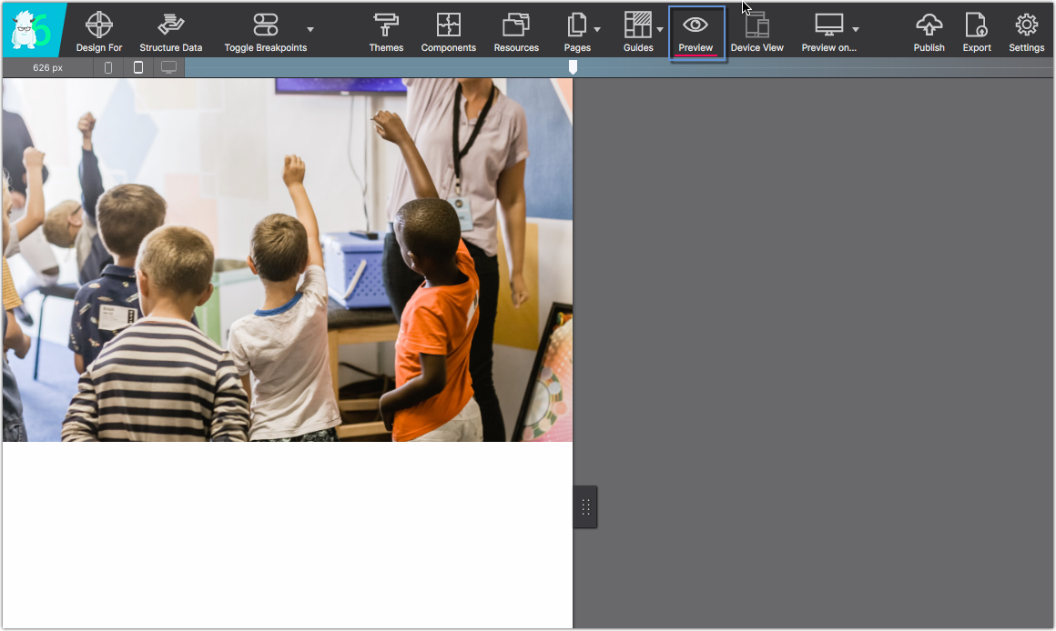
The gallery uses some fun back to school images, but you can always swap out the images with your own! Use the button below to grab these example images to use while you work through this tutorial.
Watch Suzanne Build the Orbit Slider
Step-By-Step How-To Details
Laying out the basic structure
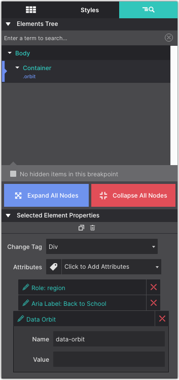
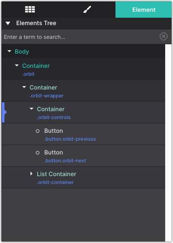
First, start by adding a Container DIV element to the canvas. Give it the Class name orbit. This serves as the parent for the whole photo gallery. If saving as a component to your library you would save at this level.
On the Element pane, apply the following data attributes:
rolewith the value regionaria labelwith the value Back to Schooldata orbit
Next, drag and drop a second Container element into the first Container. Give this container the Class name orbit-wrapper.
Nesting one more time, drag and drop a third Container element into the second Container. Give this container the Class name orbit-controls. If you need, use the Element tree on the Element pane to move the Container elements into each other. Your set up should look like this:
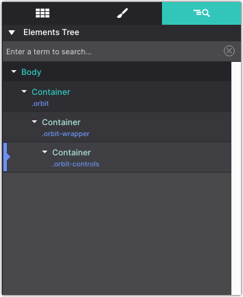
The orbit-controls container will be used for the Next and Previous controls. I find it easier to add and style these once the images are in place, so we will revisit the controls at the end.
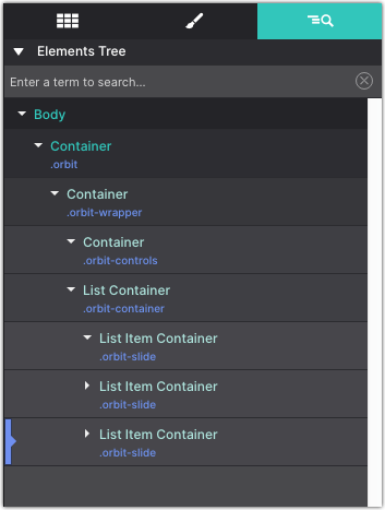
Set up the List Container element for image slides
Add a List Container element. This should be nested into the orbit-wrapper Container. Give this element the Class name orbit-container.
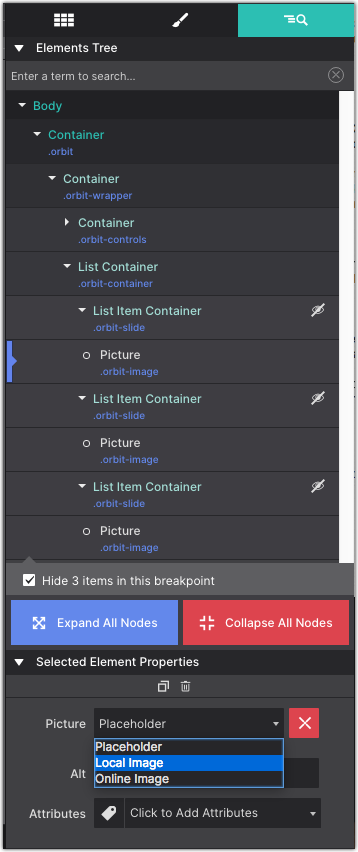
Three List Item Containers are automatically added. Using the Element pane, select each one and give them the Class name orbit-slide.
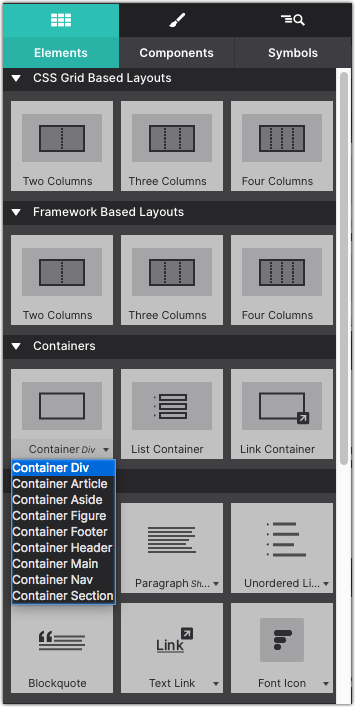
Add a Picture element into each List Item Containers. Each Picture should get the Class name orbit-image.
Adding Gallery Images
Next, it is time to add the images to the gallery! On the Element pane under the Selected Element Properties choose Picture > Local Image to load in the file source. In this example, I added a folder for the orbit images to help keep my files organized. Select Add Images/Folders and load the images resources. You can download the example school images at the top if you haven’t grabbed them yet.
Select the additional Picture elements and replace the placeholder with the image source file. Add some descriptive text in the Alt.
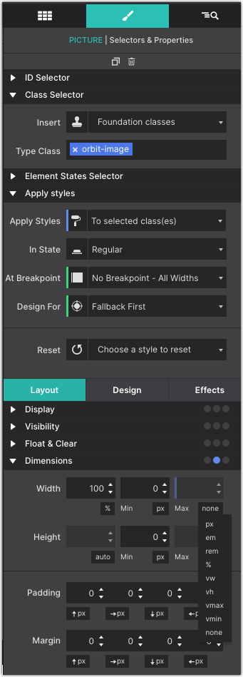
On the Style pane, you can adjust the size of the Picture. In this example, the images take up the full width of the screen. Go to the Style pane > Layout > Dimensions > Width > and change the value to NONE. You might consider adding a Max-Height on the image for larger screens.
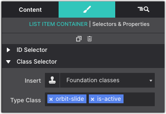
Select the first List Item Container and add the Class name is-active.
Break Time!
Let’s preview the slider on the canvas. Click the Preview toolbar icon to see the gallery in action.
Adding the Directional Controls
Last thing you might like to add some directional controls so that the viewer can scroll previous and next. On the Element pane select the orbit-controls Container. With that selected, go to the Content pane and add a Button element into it.
Double click the Button element to change the text to the < less than symbol . The Button element will get the class name button and orbit-previous.
Duplicate the Button element and change the text to the > greater than symbol . The Button element will get the class name button and orbit-next.
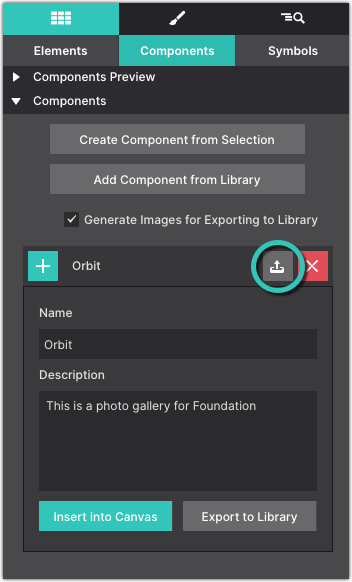
Save this Component to your Library
One of the coolest features within Site Designer is the ability to save and reuse components. This saves you from having to rebuild your favorite website features with each new website. Grab a copy of this project file below. Save the component to your Components Library and use within any Foundation project.
Get Site Designer Today!
Site Designer is the cutting edge solution for rapid, code-free, website design. The app provides a suite of layout and style controls so you can craft a website that stands out and helps your business grow. Purchase Site Designer and get free upgrades for one year plus discounted updates after that timeframe. Check out the stunning theme collection and watch detailed video tutorials to help you get started.