

Converting a static site into a responsive design
A fluid layout (recap)
With a layout created in Responsive Site Designer (or Layout Maker for that matter), we’re off to a flying start here. They are fluid by default, automatically including the first key ingredient of a responsive design: the grid-based layout that ‘shrinks & grows’ as the display width changes. All width related calculations are routinely handled by the app, including any recalculations needed for layout changes such as the stacking of columns for smaller displays (or unstacking for large screens for that matter).
Skipped the previous article where we created our wireframe?
We still recommend to give it a read. But just in case you’re a bit time constraint (believe me, I understand) and did not have time to build the initial setup, I made the project available for download below.
Talking about the project, I added the lines around the columns for illustrative purposes. You will find them in the screenshots, but not in the real project. Also, to make the screenshots look good in this article, I restricted all rows to a maximum width of 980px. This is included in the downloadable project. Since responsive designs can be way wider than static designs — they auto-adjust for smaller screens anyway — we will need to rectify that later. It will be a nice bonus exercise.
Curious to see where this is going? Get a sneakpeek here »
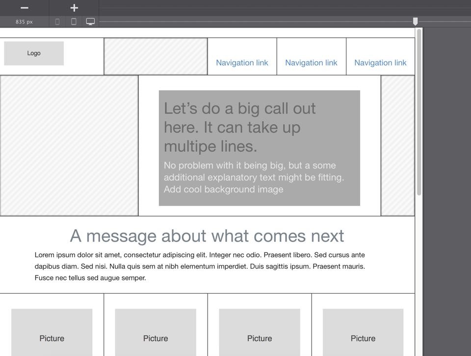
With the fluid layout ready to go we should test what our initial setup looks like at different widths.
Getting hands on with the width slider!
To view the design at different display widths, grab the Slider handle above the preview area and move it to the left. The first thing to note is that all the columns become smaller, but all the font sizes remain the same. Where the text does not have enough horizontal space, it wraps to the next line(s), making the design longer. The callout text provides a good example. At the original width the heading text used two lines, but at a slightly smaller width it wraps to a third line:
Images, on the other hand, do become proportionally smaller. All this works wonders at small width changes. However, at some point there will be very little room left for the text to wrap. At the same time images would be rendered unreadably small. And that’s where the second (secret) ingredient of responsive design comes in: media queries (aka breakpoints) that can be used to adjust the layout or design for different display widths.
Such a breakpoint can, or better should, be used any time a design does not look its best at a certain display width. Following a breakpoint, new layout and design settings can be applied. Let’s create our first breakpoint see how this works. The exact placement will be a bit arbitrary since the real content is not in place and future text lengths can vary. However, this is easy to change later and at this point we want to be sure all the content elements have ample room to shine!
Adding the first breakpoint
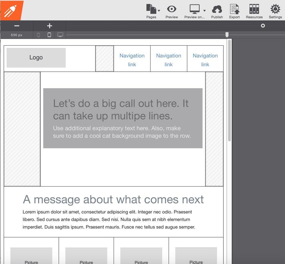
To create the breakpoint move the slider to the 800px position (you can use the arrow keys if you want to be precise). Then click on the big plus button above the device indicators located on the left above the preview area. A (break)point will now be visible on the line above the slider handle. As of this point, new layout and design styles can be defined. Each previously defined style will continue to apply, until it’s overruled at a breakpoint. The cool thing is that we’ll really doing nothing new here, we can control the layout and design in the exact same way as before, only now at a breakpoint!
Since our fixed-width design contains a few empty columns, it is easy to create more space for the columns that do hold content. We can make them smaller at this breakpoint by reducing the span number on the layout pane. We even can make them disappear entirely by setting the Display control to none in the position section on the design pane. First, let’s see what happens when we make them smaller, and the columns holding content larger. The steps are simple, the process fast:
- Select the second column (the one to the right of the logo) in the first row and, on the layout pane, change the span from 3 to 1;
- Select the first column (with the logo) and change the span to 5;
- In the second row, set the span for the first column to 2;
- Select the column with the callout message and change the span to 9.
There, that should create some additional room already — all while the original design and layout are kept intact!
When the slider is moved further to the left, the navigation text starts wrapping. Since these are not the final text we wouldn’t have to worry about that too much right now. However, it’s easy to address and a good exercise. We can pull them up a little by reducing the padding. Double-click any of the navigation links to open the design pane and reduce the top padding to about 10px. Since they share the same class all three elements are updated at the same time. With that, the design should look something like the below at a width of about 690px.
You might not realize it yet, but you just mastered the fundamental principles of responsive web design. That makes it almost time to move on and add the final content and design layer. Before that though, we need to make sure our setup looks good on even smaller screen as well.
More responsification and more breakpoints
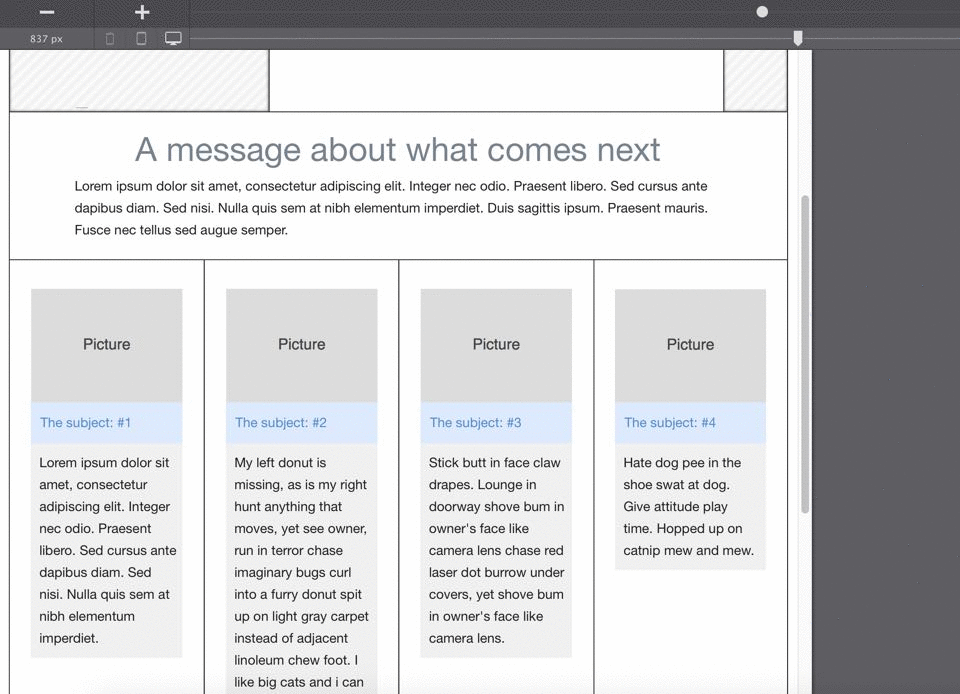
Continuing to move the slider to the left it becomes clear that the four picture columns need some work. At around 650px they become very narrow very fast now. A two column structure might be more appropriate here. To accomplish that add another breakpoint by clicking to plus icon. Then, select each of the columns and change their span width from 3 to 6. Move the slider to the right and left of the breakpoint to see this layout change in action. I am sure you’ll agree this is pretty slick, so here’s the lesson we just learned:
With layouts that are so easy to restructure, we should be making our content look its best at ANY display width.
Yup, in case anyone asks, you can say I said it. There’s one more detail that requires our attention, they heading and paragraph are now wider that the picture. This is caused by the (default) max-width of 200px of the picture element. To change this select the picture and on the design pane select none the max-width control. This resulting layout adjustment is visualized in the animation below.
Moving breakpoints or the slider very precisely with the keyboard
A little trick for precision — click on the slider or breakpoint then use the left and right arrow keys on your keyboard to change its position. You can also create breakpoints by clicking on the ‘breakpoint line’ above the slider. You’ll know when a breakpoint is active because the little white dot gets a dark center.
When editing, it’s good to get in the habit of checking where your slider is positioned relative to the breakpoint before you start making style changes. For desktop design, always make sure the slider is on the right of the first breakpoint. Take it from us, as we’ve goofed before by making design changes inside the wrong breakpoint and had to re-do the settings when we noticed the desktop view wasn’t showing the correct style. Luckily there’s always the undo!
Continuing to move the slider to the left a little it feels like the other content elements need more space to continue doing their important job as well. Again, the exact position where that happens is arbitrary and ultimately up to the designer, whose job it is to make the design great, and content usable, at any width. Depending on taste or design guidelines the changes could have kicked in at 702px, or 677px or an other width he or she deemed appropriate.
In addition, content is dynamic and likely to be updated at some point in the future. If, for example, a different, longer, callout message is used, chances are that the breakpoint needs to be moved a bit. Or that other layout and design tweaks need to be made to accommodate for that variation. In short, these days we need to design for continued change. Luckily all of that is easy with RSD.
Creating horizontal space for small screens
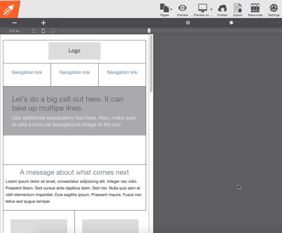
Removing the columns that don’t hold content might create the additional horizontal space we’re looking for. To do that select the column next to the logo. On the design pane, give it a meaningful class like hide-col-2 indicating that this class is used for hiding columns at the second (650px) breakpoint. Scroll down to the Position section, then select none from the Display drop down. With that, this column will be invisible and leave that space open for the other columns.
Unfortunately, this did not create enough space for the logo and nav-links. Stacking these two parts of this row is another option we have. The steps are straightforward, select the logo column and on the layout pane set the span width to 12. Then select a navigation column and change the width to 4. Rinse and repeat for the other 2 navigation columns.
Are you too wondering what this will look like with the logo centered? Trying is fast, easy and free: double-click the logo and in the dimensions section set the left and right margin to auto. Assuming you followed along you’ll see that with these small changes we created a well balanced, spacious header row for small(er) devices. Now, before we get to look at a screenshot, we are going to do the same for the row with the important call out message!
Hiding the columns in this row as well, is simply a matter of reusing the class we previously created. Select the left empty column, click in the class input box on the element section of the design pane and select hide-col-2 from the autocomplete suggestions box. The styles will apply as soon as the box loses focus. You can do that using the tab key on your keyboard, or by clicking anywhere else. The right column can be hidden in the exact same way. Afterwards, set the width of the column with the callout container to 12 spans.
Any time you want to view hidden elements, simply check the Show hidden elements box on the layout pane. You can also select them from the inspector pane.
The design is starting to look sharp again. Reducing the top margin on the callout container might be another improvement. With RSD experimenting with potential design improvements is super easy. Select the container, then start decreasing the top margin. We ended up making it 0px, but feel free to leave some space there if you prefer. Following these changes, here’s what our design looks like on screens smaller than 650px.
That’s it, we’ve whipped up a solid responsive site skeleton. Now we’ll need to see how this holds up when we put the actual content in place.
Say, what happened to content driven design you guys have been preaching?
Excellent point! Normally we would have started with the content, but in this case that would have distracted from learning the ropes. And clearly, we had the topic and end result in mind while creating our responsive wireframe...you did sneakpeek, right?
At any rate, we now also know that if any changes are needed, they will be fast and painless.
We’re ready to start the working on the design layer, it’s gonna get a lot more colorful soon for sure. You’ll be in awe when you see what you have started!
Questions, comments or suggestions?
For any feedback or questions, you can hit me up on twitter. Or just leave a note in the vibrant CoffeeCup forums or our Facebook page. Want to share this article? Please go wild with any of the buttons at the top of the page, Twitter, Facebook, Pinterest or Google+ are all good to me!