

CSS Trick: setting a fixed background to a container.
We all have seen those slick websites that use effects on their page such as scrolling backgrounds (a.k.a fixed backgrounds). With Site Designer, you can easily have this same effect with just a few steps.
Example Template
In this tutorial, we use the complimentary Moma template. If you would like to follow along with us you may download the template below.
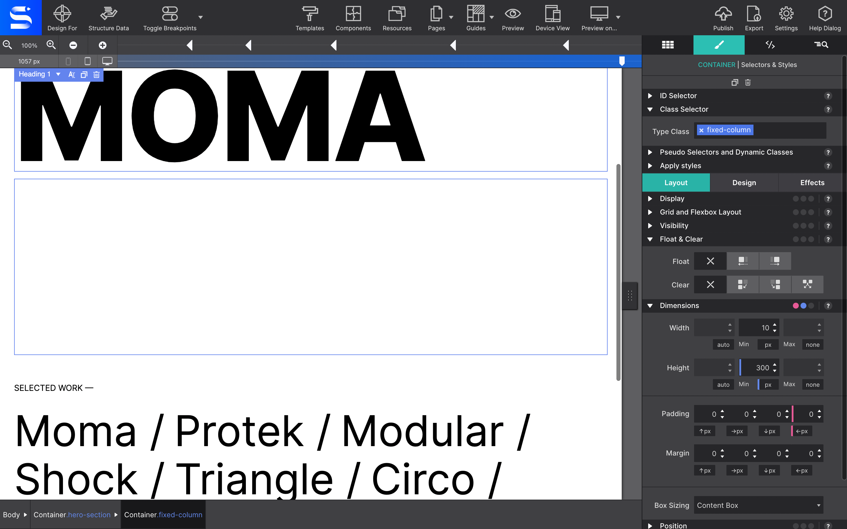
Step 1:
On the Moma Index page there is a large hero image with the class name Container-4. Select that container and go to the Styles pane > Layout > Dimensions section. Under Dimensions set the min-height to 300px.
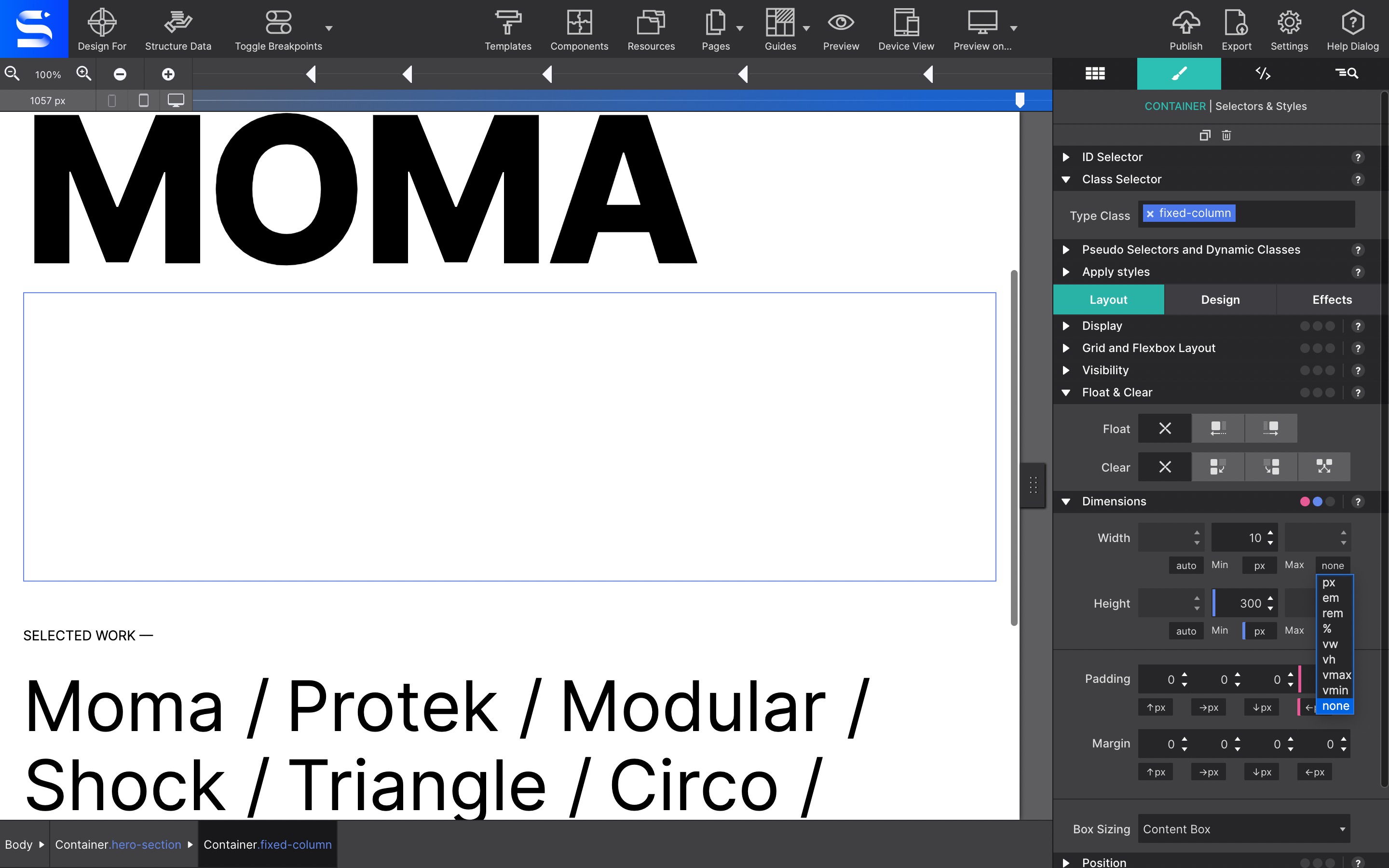
Step 2:
Next set the max-width of the row to none.
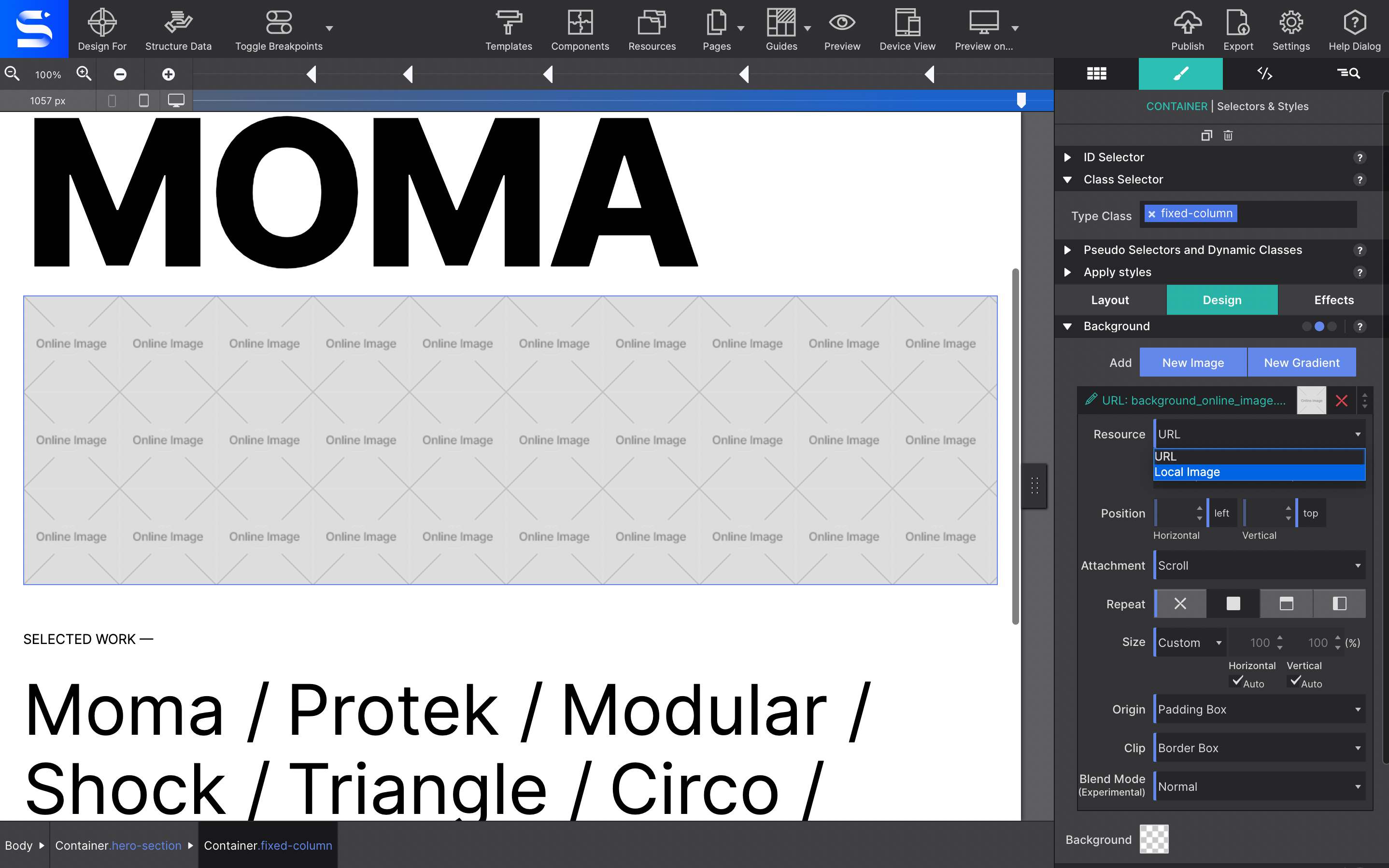
Step 3:
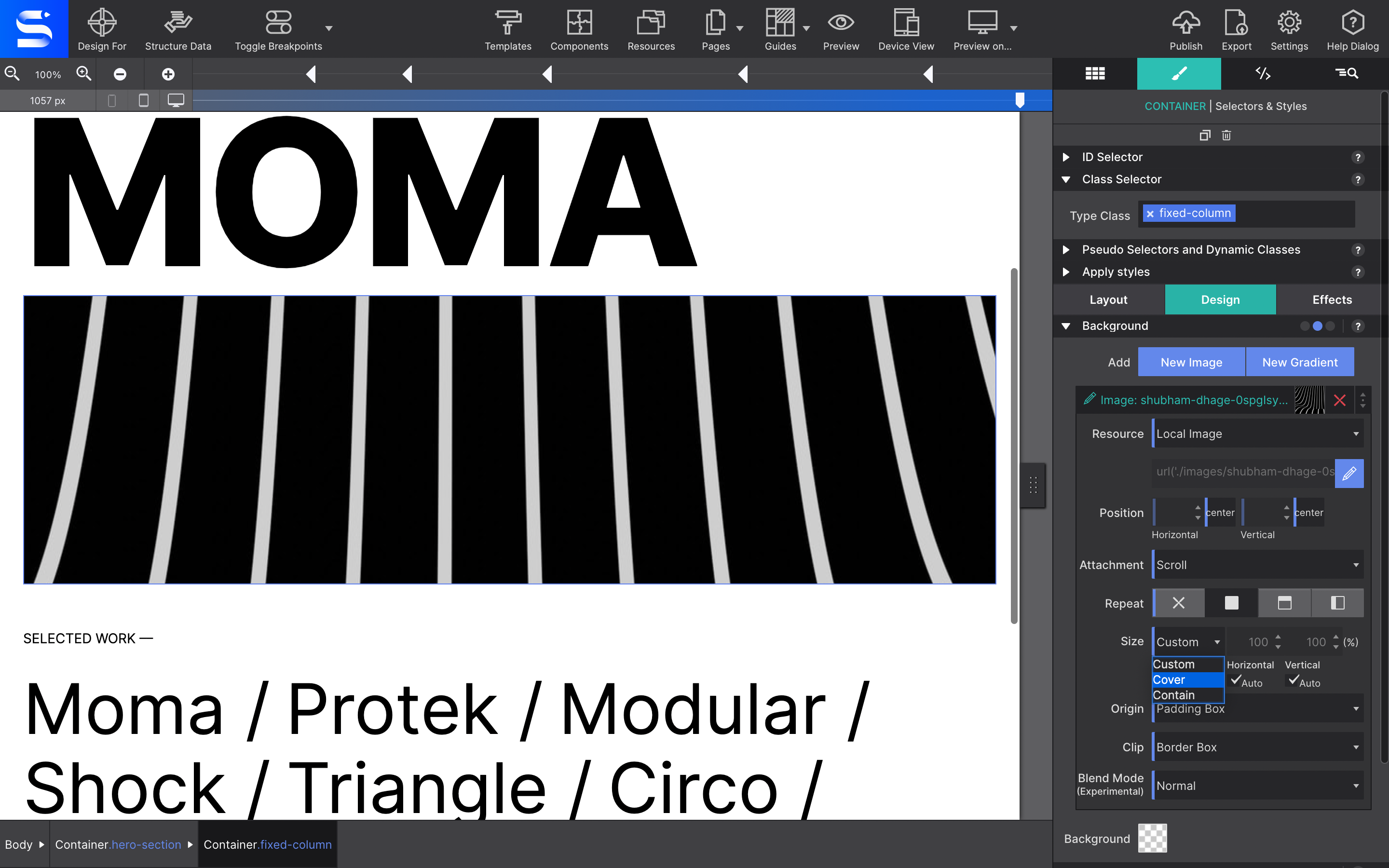
Next you will configure your image source. Go to the Styles pane > Design > Background > Resource > and use the drop down to choose either an online source or Local Image.
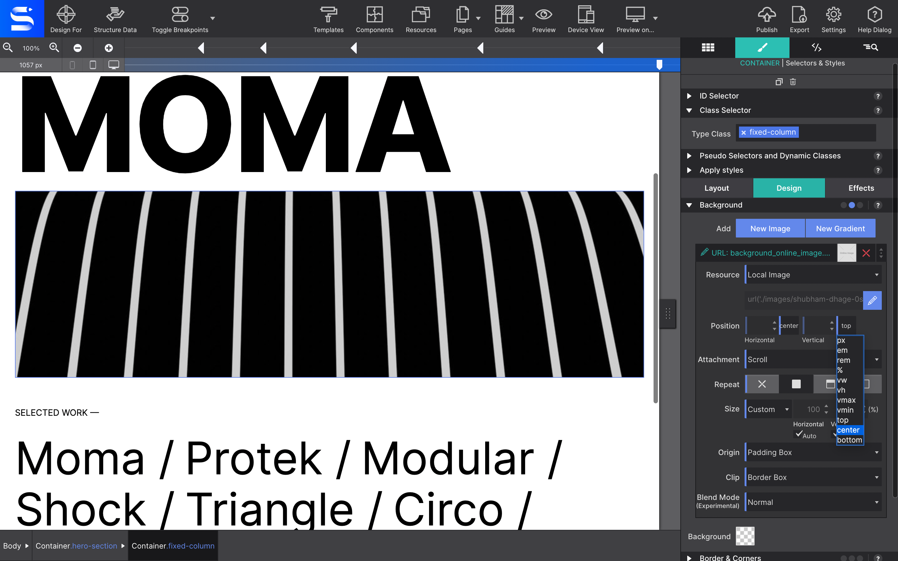
Step 4:
For the position values, choose center for both the vertical and horizontal dropdowns.
Step 5:
Using the Size dropdown, select cover. This will ensure that the background will cover the entire container.
Step 6:
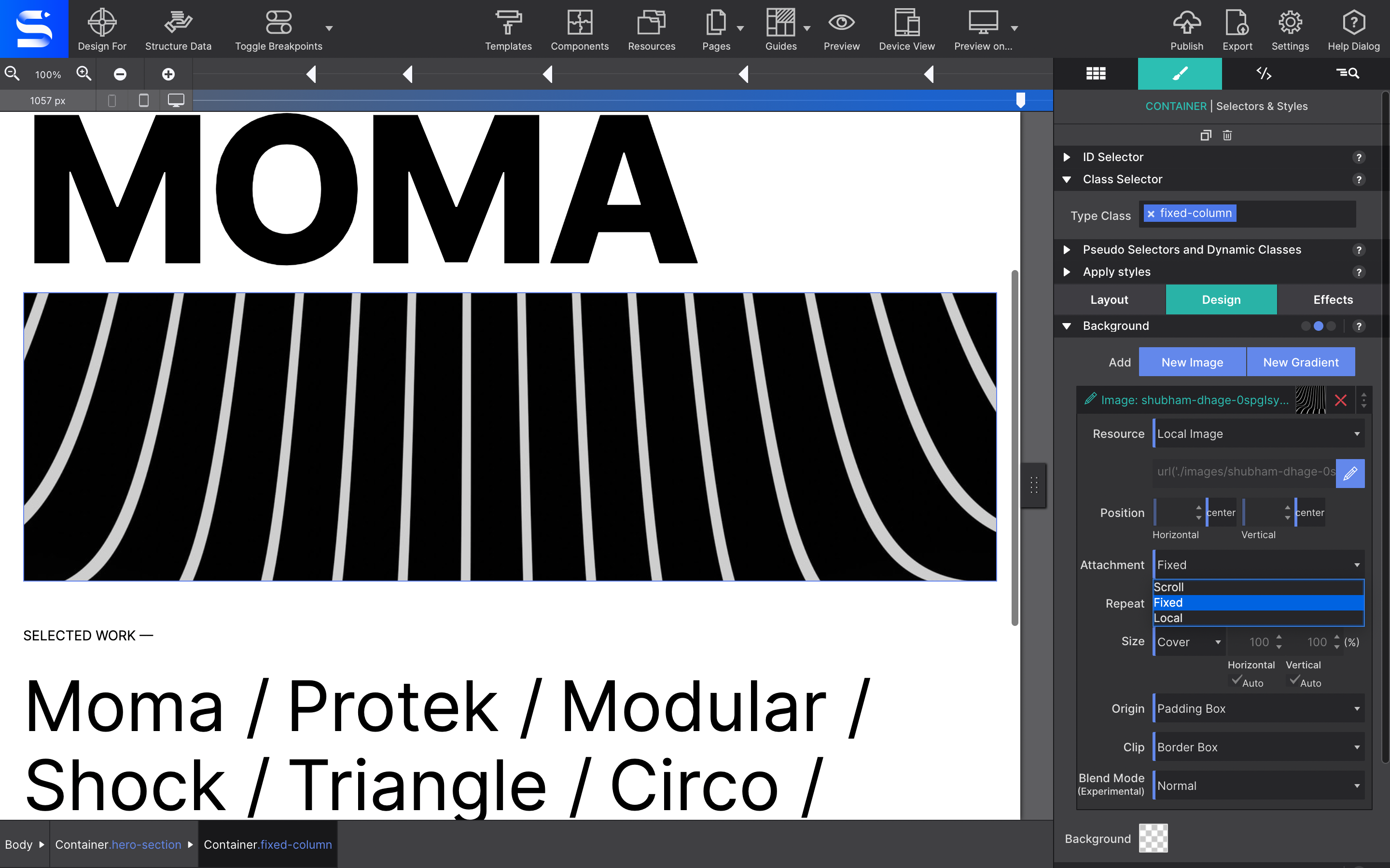
Finally, select fixed for the Attachment.
No bueno for iOS Devices
The fixed position is a killer CSS feature. However, it doesn't work so great on Apple mobile devices. You're image may end up looking distorted. We recomend that you change the Attachment to Scroll for smaller screen sizes.
That's a wrap! Your image will now stay in place as the user scrolls down. Add other elements to the container to further spicy up the region. Now, go take what you have learned and put it to good use. Code well my friends!