

There are currently 19 elements that are available for your forms, split into three sections: Basic elements, Magical elements, and Static elements.
Basic Elements
These are the most typical elements that are found on web forms.
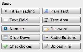
Title/Heading
Creates one line of text on the page. You can adjust the words, color, size, and position of the text the heading uses.
Plain Text
Very similar to the “Title/Heading” element except that it can include any length of text, from a single line to a long paragraph. You can adjust the words, color, size, and position of the text.
Text Field
An input box that collects a single line of text from the user.
Text Area
A box for longer comments. The width and height can be adjusted by entering the number of pixels to be used. When using a responsive theme, the maximum width is configured so that this box is never wider than a specific number of pixels, but shrinks to fit the width of the screen viewing the form.
Number
A field that accepts only numbers. This field features a property that requires users to enter numbers that are multiples of a specified number (Force steps of X at a time).
Password
A text field that hides content as it is written, replacing each character with an asterisk (*).
Drop Down
Offers the user multiple choices for a single query and displays them in list form to save space. Only one option can be selected, but a selection is required.
Radio Buttons
Offers the user multiple choices for a single query and displays them all at once. Only one option can be selected, but a selection is required.
Checkboxes
Multiple choices for a single query displayed all at once. Any range of selections are acceptable.
Upload File
Allows the user to attach a file to the form and includes a “Choose File” button, displaying the chosen file next to the button.
- Allowed Files: Lists file extensions that will be accepted. You can add or remove them using the + and - buttons, and they can be renamed by double-clicking them.
- Save to Server: Saves the uploaded file directly to S-Drive or your web server.
- Store in Database: Saves the file in your database (requires a MySQL database to be enabled).
- Attach to Mail: Includes the uploaded file as an attachment in results emails.
Magical Elements
While most form elements generally involve entering information or selecting from a list, magical elements each have unique properties.
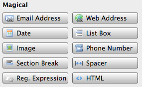
Email Address
Used for collecting email addresses from users. When configuring email notices in the Settings, the auto-reponse message’s “To:” field is preloaded with name properties for this element.
Web Address
Recognizes URLs entered by the person filling out the form.
Date
Lets the user include a date using a handy calendar popup.
- Allow Dates: You can restrict the dates that a user can enter to a specific range, choosing a beginning date and an ending date.
- Date Format: Chooses how a date will be displayed after being chosen from the calendar.
List Box
Offers the user multiple choices for a single query and displays them all at once. Allows large lists to displayed inside of a scroll box, and the user can select large ranges by holding the shift key.
Image
Include images in your form using this element, adjusting the item width and position to place it where you’d like for it to be. Images can also act as links if you provide a URL in the “Link” field in the Properties tab. Provide “Alt” text that will be shown if the image fails to load, and choose a “Target” for the link (where the chosen URL will load). When using a responsive theme, the image will scale down to fit the width of the screen displaying the form.
Phone Number
This type of field auto-validates to ensure that the user is supplying a valid phone number. You can choose from four different phone number formats (U.S., U.K. phone, U.K. Mobile, International). The user will be given a warning message when the field is unfocused if the phone number is invalid.
Section Break
It’s a line to split up sections, and you can style it! When using a responsive theme, the maximum width is configured so that this line is never wider than a specific number of pixels, but shrinks to fit the width of the screen displaying the form.
Spacer
This is an invisible element that is used to create empty space on a form. For example, if you want an element to use just 33% of the width of the form but don’t want anything placed to the right of it, you can include a spacer to fill the other 66%.
Reg. Expression
This is kind of a wildcard “program-it-yourself” element that allows you to create code called a “regular expression” to declare which characters and strings of text will be allowed by the element. See this article for more help.
HTML
This element allows you to create practically any custom HTML elements, in-line styling, and even include JavaScript code (if you’re careful!) This means that you can easily and quickly include, for example, hyperlinks, tables, bullet lists, and more. For more information on the HTML elementread this article for more help.
Static Elements
Static elements are fixed in place, either at the top (Header) or bottom (Footer) of the form.
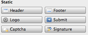
Header
Allows you to style of the topmost portion of your form. You can adjust the color, size, and background image of this space.
Footer
Allows you to style of the lowest portion of your form. You can adjust the color, size, and background image of this space.
Logo
Allows you to style of the lowest portion of your form. You can adjust the color, size, and background image of this space.
Logo
Allows you to place an image directly into the header of the form. It’s a good idea to use a wide, short graphic to avoid ending up with an awkwardly huge header. When using a responsive theme, the image will scale down to fit the width of the screen displaying the form.
Submit
Allows you to style that oh-so-important submit button. Choose its text, font, size, positioning, or even use an image in place of the theme’s default submit button.
Captcha
Used to verify that those filling out the form are human and not robots. To submit the form, the user will need to identify and re-type two words shown on the screen to prove that they’re human. Captcha relies on a key of answers to authorize forms.
- Automatic (S-Drive only): Choose this option if you are using S-Drive’s automated form processing. S-Drive will provide its own set of keys for you.
- Manual: Choose this option if you are manually exporting your form. You’ll need to supply your own keys, both Public and Private. You can get your keys from the reCAPTCHAwebsite.
You can also choose a Captcha Theme from the Theme drop-down box that appears underneath your Captcha selection.