A question of style: page size?

User 597929 Photo


Registered User
1,332 posts

Okay, while using VSD to build the main portion of my site it's become obvious it favors smallish (800x600 seems to be favored, though it accepted 1024x768 without too much fuss) page sizes and the generated HTML creates a single-cell table that encompasses the whole page area and fixes its size.

First question: does anybody really have screens as small as 800x600 any more? Why favor that size (which for graphics-rich content like I'm supplying seems awfully cramped)?

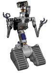
Now, one of my "main" pages will be lots of thumbnails each linking to a full-page graphic on its own page, along with commentary. Without making the thumbnails so tiny as to be almost content-free I don't see them all fitting on one page, even a 1024x768 one--especially with room taken up for nav buttons. For organization's sake the set of thumbnails needs to be reachable by a single main nav button. For an idea of where I'm going with that, see the existing form of the site:

http://www.spinland.biz

and use the nav button for the Gallery. You see, a lot of thumbnails, with multiple groupings and associated commentary. No way that's all going to squeeze into a single 1024x768 page.

So, my next question: is it somehow an example of bad form to have main pages of different size based on content? Am I supposed to break things up into multiple pages? How then have them devolve back to a single "Gallery" link...have the main Gallery page provide its own nav buttons?

A follow-up question: in such cases, is the thumbnail==>page format considered a good one? Is this a case where something like a photo album object would be considered better? I hate to go that route because I think the images have less impact than if they're on their own pages, and using captions for the commentary seems weak.

The gallery isn't the only culprit. My Info page holds a CV that's way too long to fit into the aforementioned page length, too. Again, it seems unavoidable to have to expand on the comfy size limits VSD seems to want to encourage, and to have different sizes almost for every page, depending on content.

Ideas? I'm a 3D modeler, not a web designer, and I really know nothing about the "elements of style" when it comes to such things.

Thanks!
"You can't be a real country unless you have a beer and an airline - it helps if you have some kind of a football team, or some nuclear weapons, but at the very least you need a beer." -- Frank Zappa

Visit Spinland Studios: http://www.spinland.biz
User 37670 Photo


Registered User
2,138 posts

Hi.
For page width, my suggestion is 900 pixels, not much more. The reasons:
1 - still lots of 17 inch monitors out there that don't support much wider
2 - many people don't use the proper monitor settings, which makes things look much wider/bigger than they really are
3 - many people use custom dpi settings, or accessibility aids that enlarge the page. They can get stuck scrolling right and left.
4. A web page that is centered looks good, no matter how much or little space is on each side. You will never see a banking website with a 2000pixel wide page for it's customers.

You can type in your own sizes for your web pages in VSD. The height of the page would be the most important, and yes, it is good form to have some longer pages in a website. You can make your page 2000 pixels high if you need to for the information you want to put on that page. Scrolling down is fine, but right and left is not so cool.

There are many options for displaying images. Thumbnails have been around for quite a while and are easily recognized. Slide shows are also well known. Play around with the photo gallery, have a look on the Internet for other easy to use software and experiment a little. You will eventually find a style that suits your needs.

Here are some links to a few images I have online.
http://www.mainsites.ca/deer2.html Images on a page, nothing fancy
http://www.mainsites.ca/deer.html Slide show with transitions
http://www.mainsites.ca/test/yesdeer.html A theatrical production with themed trasitions
http://www.themopshop.ca/pix.html A 'flip book' style photo gallery

I have more, but these differ from the basic thumbnail 'click here to get bigger image' style that is most used. Some of these can also have a sound track or voice recording play witht he slide show.

E-Learning Specialist
www.mainsites.ca is my website, and yes, some of it is crappy.
User 597929 Photo


Registered User
1,332 posts

Extremely useful info; many thanks!
"You can't be a real country unless you have a beer and an airline - it helps if you have some kind of a football team, or some nuclear weapons, but at the very least you need a beer." -- Frank Zappa

Visit Spinland Studios: http://www.spinland.biz
User 463058 Photo


Ambassador
1,086 posts

Spinny wrote:
First question: does anybody really have screens as small as 800x600 any more? Why favor that size (which for graphics-rich content like I'm supplying seems awfully cramped)?


Larger screens mean more room for other apps rather than big browser windows.

Spinny wrote:
My Info page holds a CV that's way too long to fit into the aforementioned page length, too.


The page length here is fine.

Spinny wrote:
Ideas? I'm a 3D modeler, not a web designer, and I really know nothing about the "elements of style" when it comes to such things.


I would recommend that you avoid the use of frames and place the menu on the left side. Also, fancy fonts should be used sparingly, not for the main type. In this case, there's no fallback font suggested in case the font isn't on the client's computer.
User 355448 Photo


Ambassador
3,144 posts

Spinny,

At home, I have nice flat-screen monitors. At work, I had a 19" CRT, and now have a 19" flat-screen. Both of the monitors I have used a work would do a good job of displaying your menu.

Once I realized that there was a menu, I could mouse over the menu and see what is there. You might want to try lightening up the menu to make it more obvious.
User 597929 Photo


Registered User
1,332 posts

Here's a follow-on question: why put menu buttons on the left? I'm right-handed, and it is extremely counter-intuitive to have to "reach across my body" to reach buttons. I would far better expect them to be on the right, within "easier reach."

What convention drives them to the left?
"You can't be a real country unless you have a beer and an airline - it helps if you have some kind of a football team, or some nuclear weapons, but at the very least you need a beer." -- Frank Zappa

Visit Spinland Studios: http://www.spinland.biz
User 355448 Photo


Ambassador
3,144 posts

Spinny,

I don't really know, but English speakers and readers tend to read left to right and top to bottom, which would indicate important things should be top-left on something you are reading.

As for it being on the right because you are right handed, I do not have to pass my hand across my body to move the mouse across the screen. My mouse pad (and mouse) stay on the right side in easy reach of my right hand. ;)

Actually, as long as the menu is visible, I see no reason to not put it where you want it. If your visitors complain, then you may want to move it.
User 597929 Photo


Registered User
1,332 posts

Heh. Yeah, it was a metaphor, hence my putting it in quotes. On the practical side I use a widescreen monitor and it takes more than one mousepad's width to cross the screen a full distance. I tend to hover the cursor off to the right when no tin use so in realistic terms crossing to the left side of a wide window (like my web browser is always set at) does require some fussing around. Probably just me.
"You can't be a real country unless you have a beer and an airline - it helps if you have some kind of a football team, or some nuclear weapons, but at the very least you need a beer." -- Frank Zappa

Visit Spinland Studios: http://www.spinland.biz
User 68530 Photo


Registered User
4 posts

Is it better to set the width of a web page in pixels or percents? Or is the percentage size not an option with this one?

width="900px" vs. width="90%"

And, when setting the web page width does the width attrib go inside the body tag?

<body width="XX">

Thanks
User 355448 Photo


Ambassador
3,144 posts

David,

Setting a minimum width in pixels will keep you from having floating elements move down.

Setting a width of 90% will allow your page to open to 90% of the monitor size, and if you have text that moves all across the width of the monitor, it will be difficult to read.

I personally would not put any style in the body tag. If you want it with the page, put it in the style section of your page. Something like this:
<style type="text/css">
body {
min-width: 770px;
}
</style>

You can also add background image or color, set the text style for the page, etc.

For a reference on what style settings you can use, check the w3schools site at http://www.w3schools.com/css/css_reference.asp

Have something to add? We’d love to hear it!
You must have an account to participate. Please Sign In Here, then join the conversation.