

Show Content With a Click with the Tab Component
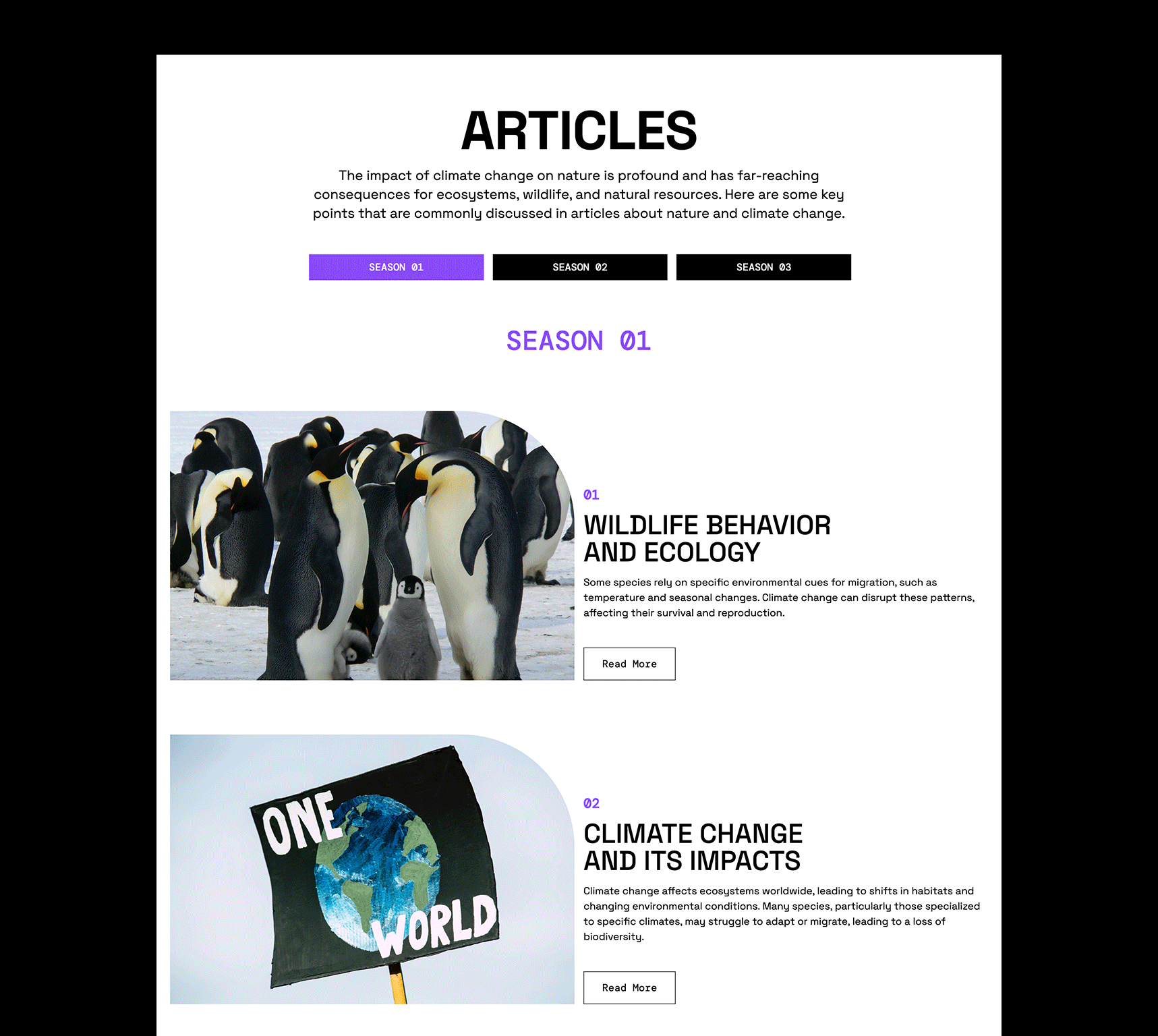
Make content display with a click using the Tab Article Component. The component is great for organizing information and presenting it when the corresponding menu button is selected. This component is being used in this example for organizing media such as blog posts or podcast archives.
In this tutorial we will breakdown how the Tab Article component is constructed and show you how to modify it to fit your custom content.
Importing & Understanding the Structure of the Component
Starting with a Frameworkless Vanilla CSS project, install the Tab Article component from the Component Library app menu toolbar. Select the component from the dialog box and choose Add to Project.
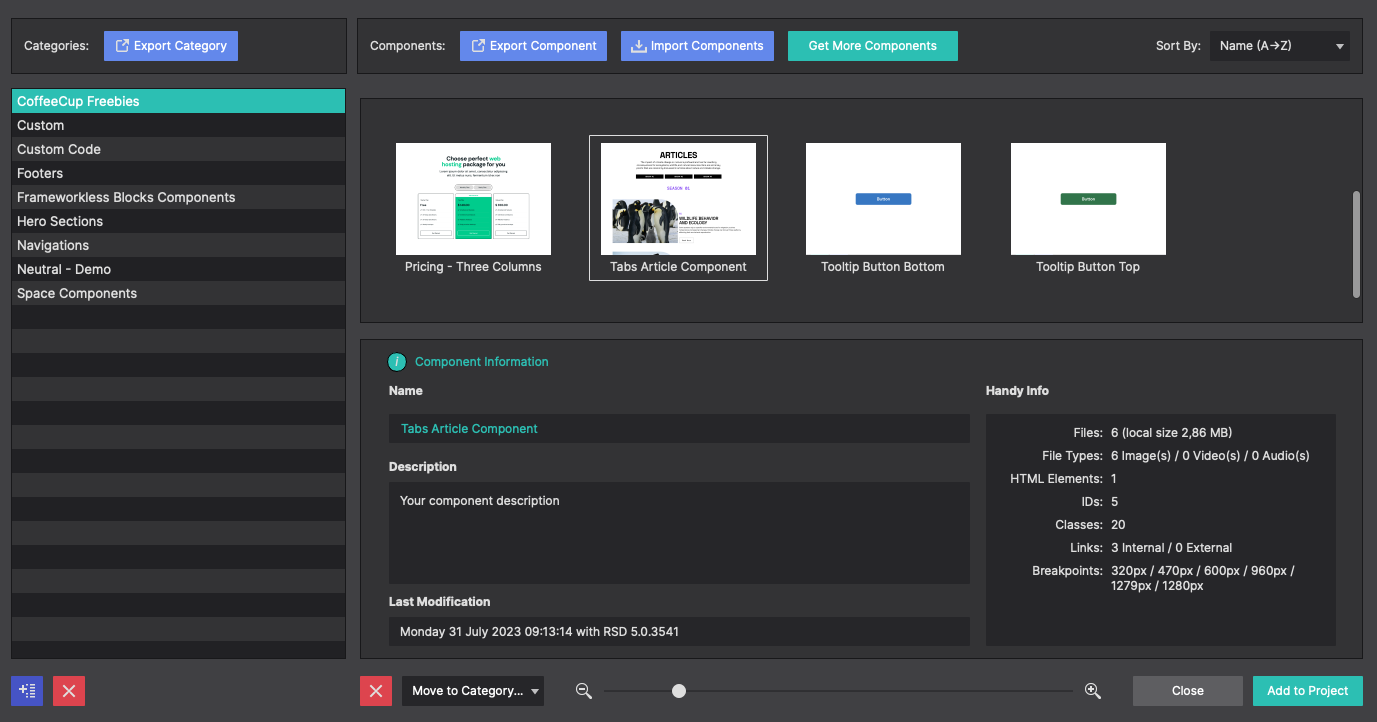
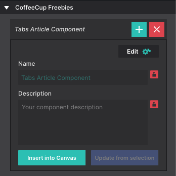
Once imported into your project the component will be available on the Content pane > Components section. Click the + or Insert Into Canvas to inject it into the page.
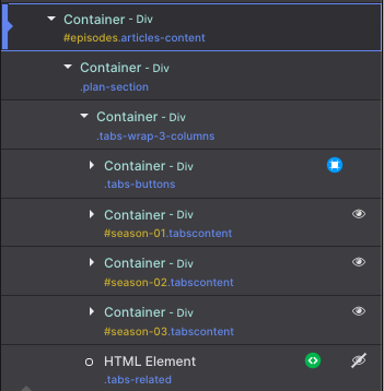
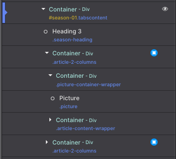
The structure of this component can be viewed from the Inspector pane. It consists of a main parent container “articles-section”. Nested within it are 2 Heading elements and a child Container “articles-content”.
If the component needs to be moved to a new position on the page, you would select the parent container “articles-section” and drag-n-drop it into your new desired location. While you can drag-n-drop on the canvas, we suggest using the Inspector as you can drop it more precisely.
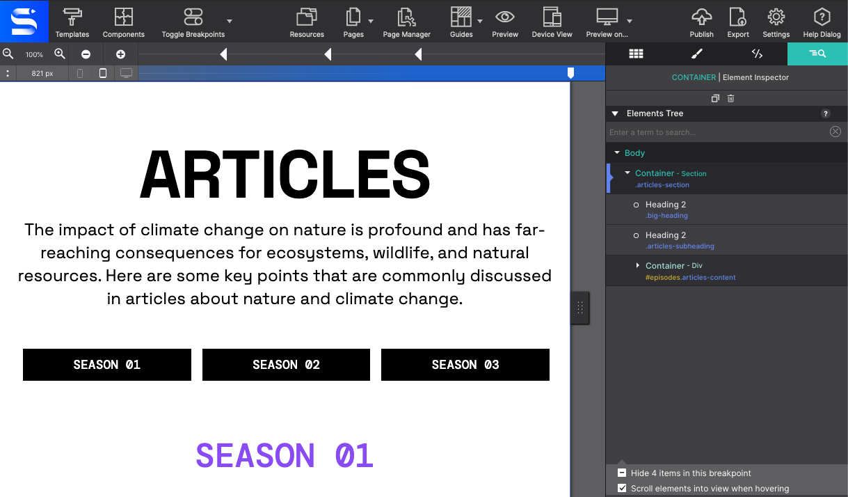
The child Container element “articles-content” when expanded contains all the elements for the tab buttons and the content they each are configured to display. For layout purposes the "Seasons" Buttons Links and the action HTML Element are nested in the “plain-section” and “tabs-wrap-columns” containers.
Modifying the Component
Hovering over items on the canvas will highlight the corresponding element on the Inspector. You can also double click an element on the Inspector to highlight it on the canvas. Selecting an element from the Inspector makes it easier to edit an item that is nested on the canvas.
The Heading elements represent the headline that reads as Articles and the second heading element for the paragraph explanation. Text elements such as these may be edited on the canvas. Double click on the canvas to launch the text edit mode and type in your own messages.
These Heading elements serve no functional purposes to the tabs themselves. So you may delete them if not needed within your project. Use the Trash Can icon at the top of the inspector, upon hover on the canvas, or select the element and hit the delete key.
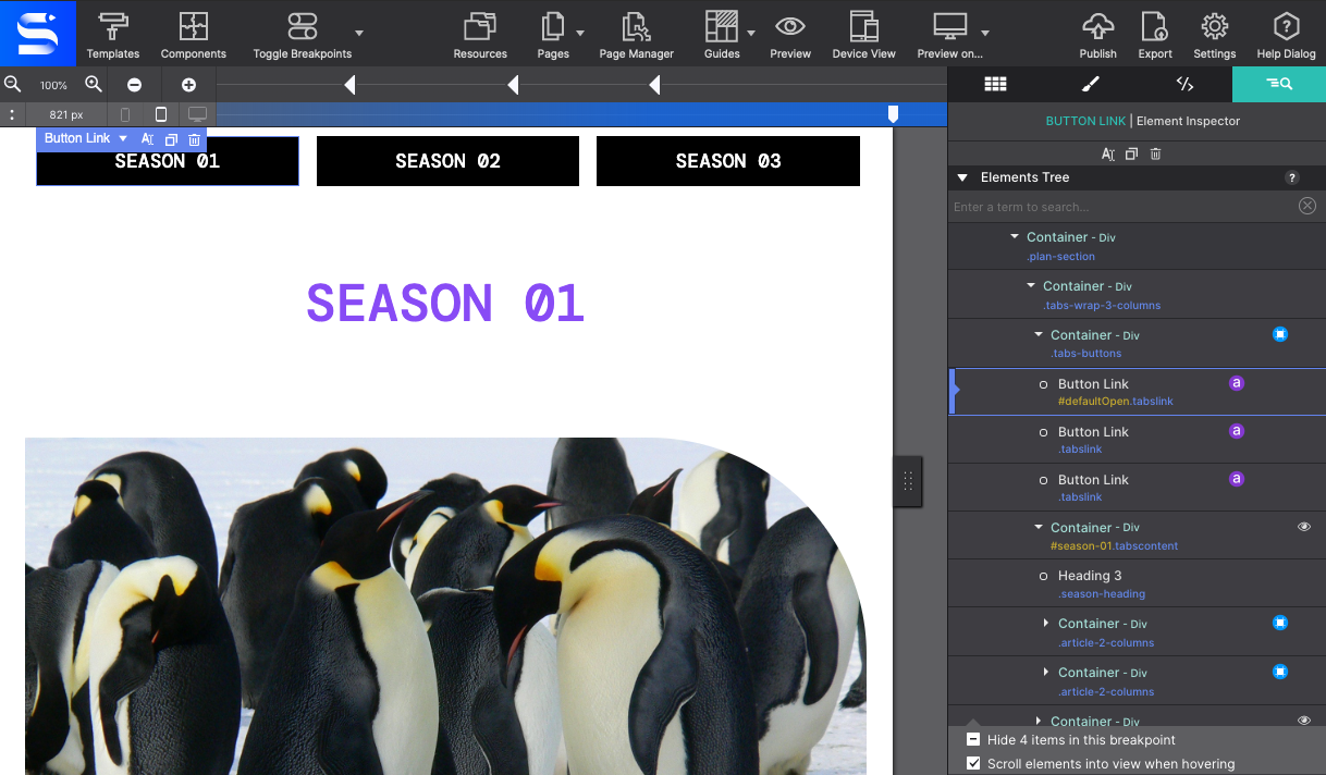
The component includes 3 Button Links, representing Season 1,2, and 3 for the example. Let’s pretend you have content that you want to organize by location. To modify the Button Link text, double click on the canvas and change the text as you see fit. Here it was changed to say North America.
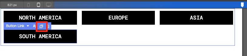
To add additional tabs to the menu, hover over one of the Button Links and click the duplicate button that appears in the context menu. The duplicate button is also located at the top of the Inspector pane as well, which makes it easier to duplicate hidden items.
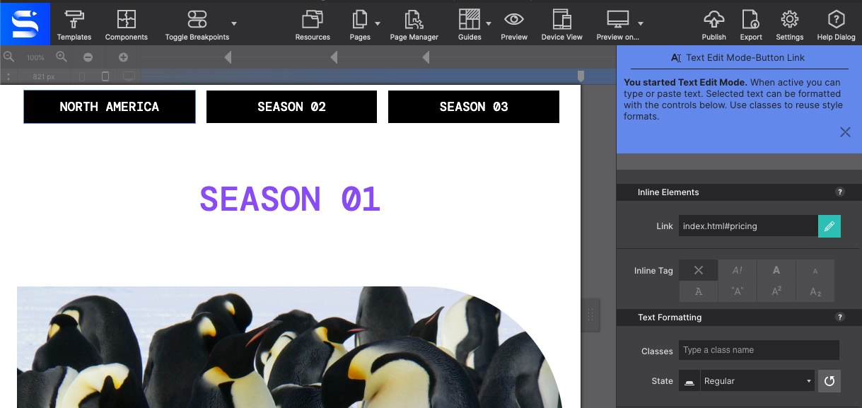
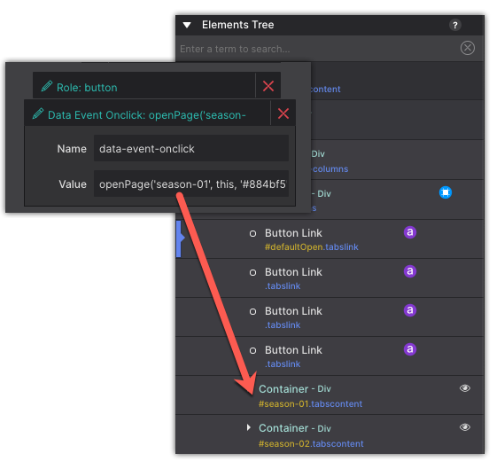
From the Inspector pane, next to each Button Link you’ll see a purple a icon to indicate the element has an attribute associated with it. The attribute provides the button with the action it is supposed to take when clicked. To view the attributes, click on the a icon to go to the Element pane.
On the Element pane you’ll see the ‘Role: button’ and the ‘Data Event’ attributes applied. The Data Event attribute has the value (ID Name) of the corresponding Container that you wish to display when the button is clicked.
Each button is associated with a nested container “season-01” “season-02” and “season-03”. If you change the button ID or add any new tabs you will need to come back to the attributes and adjust the Data Event location so that it points to the element ID you desire.
CSS Selectors For Easy Styling
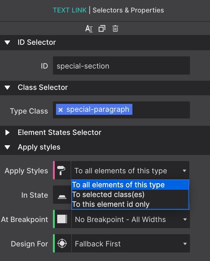
Class names are an important part of the design and it is good to get in the habit of naming your items as soon as you add them to your page. Class names allow you to style common items all at once. For example, all headings with the same name, all menu links, any button within the project that share the same name would all share the same styles (color, size, font type etc.) This saves you from having to apply the same styles every time. Everything stays in sync by using Class Names. This also makes it easy for you as the developer to identify items within your project quickly.
CSS ID Names allow you set a unique identifier to the object. Each ID is exclusive, the style definitions will only apply to the single element currently selected.
Learn more about CSS Selectors
Read MoreThe tab content is organized within the containers with the ID names “season-01” “season-02” and “season-03”. The eye icon next to each indicates the object may be out of view (hidden for the viewer). You can click on the eye to bring the item into view on the canvas for editing.
To modify the content select the container from the Inspector. You can click on any of the nested elements including the Heading, Picture, Paragraph elements and more.
Want more Components?
The Component Store keeps on growing. Our diverse range of components includes unique content layouts, special page regions such as quote or team about us sections, plus interactive objects like photo galleries, menus, and video backgrounds, and even ecommerce setups. Explore all of our component options below and streamline your design workflow for a more efficient and effective web development experience.