

Slide into this photo gallery component tutorial.
Arguably, one of the most popular features of a website is the use of photo galleries. In Site Designer there are several great options depending on your chosen framework. In this tutorial, we will demonstrate how to work with the Bootstrap Carousel component.
Semi-Framework Specific
If you are using a slider from another framework, this tutorial will still be helpful. While the class structure may be different, the general rules and structure would be the same. You can still learn how to locate the nested images, reveal hidden content for editing, add additional slides to a component, and more!
Working with the Carousel Component
We begin using a Bootstrap template (File > New From Template > Choose any Boostrap option). From the Components toolbar icon, you’ll find the collection of pre-made components that may be added to the project. From the list select the Carousel component and choose Add to Project.
Once imported into the project you can add the component to the canvas by going to the Content pane > Components section. Click the Insert into Canvas button to inject it into the page.
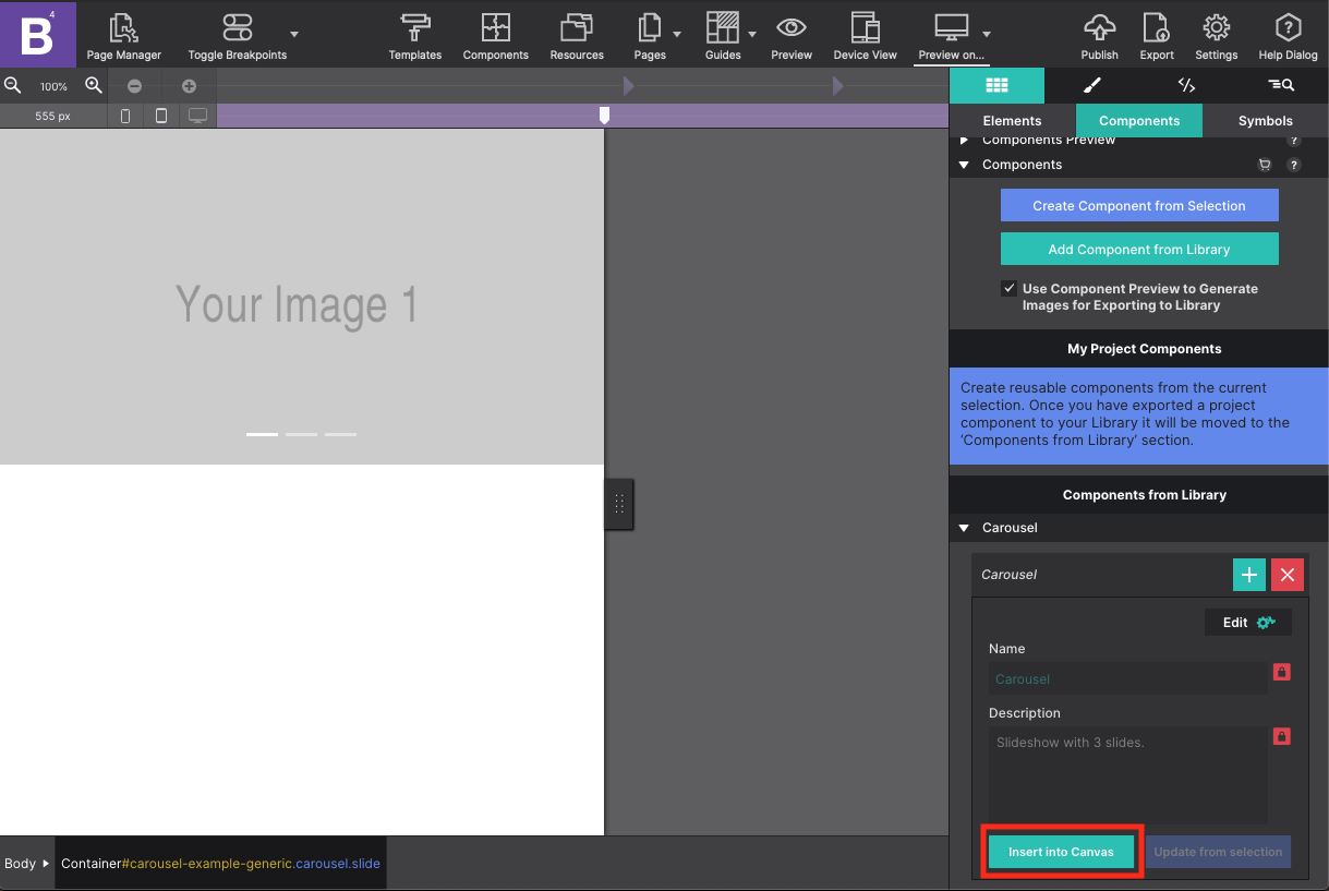
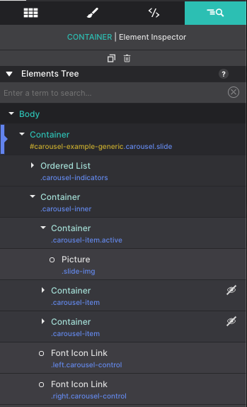
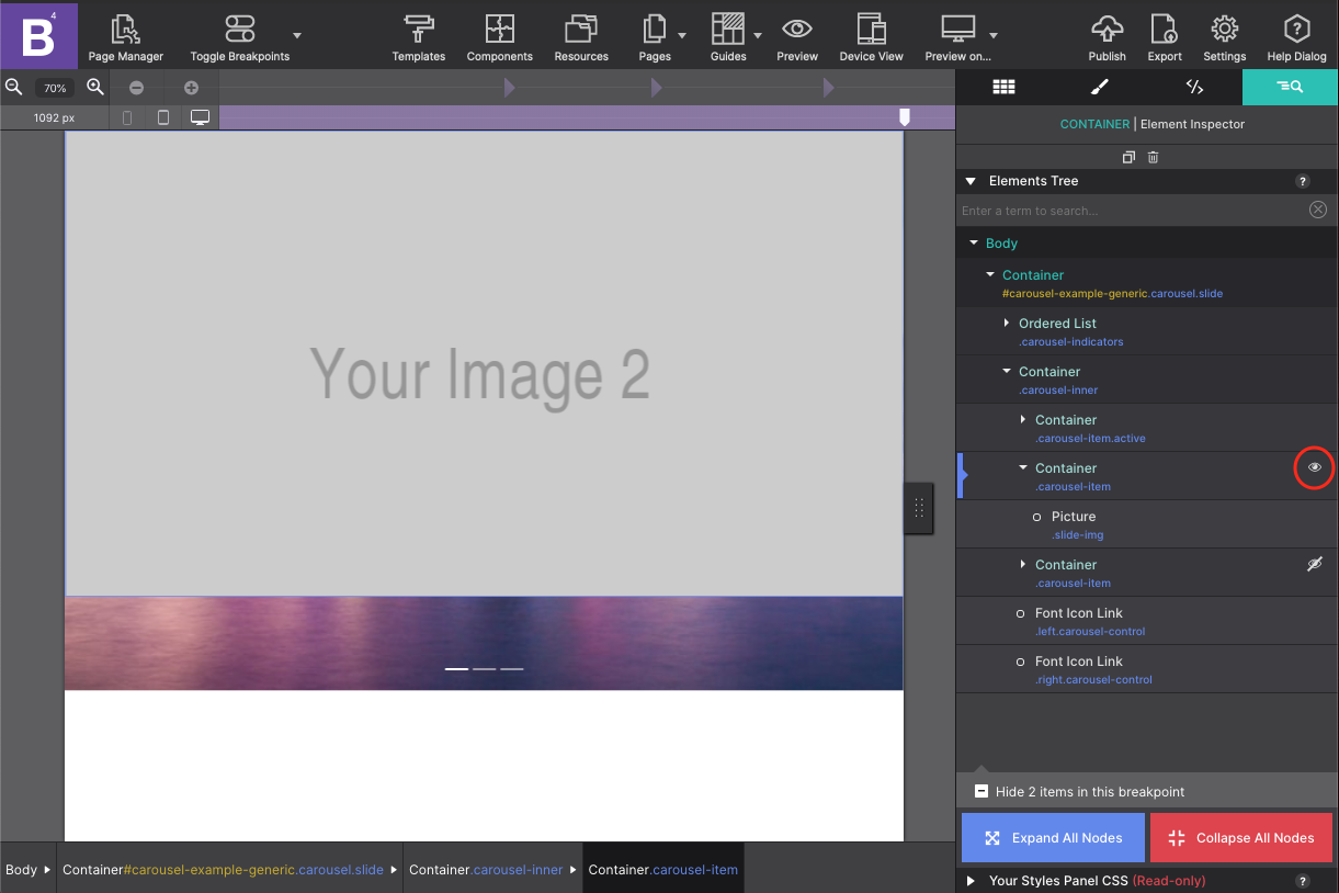
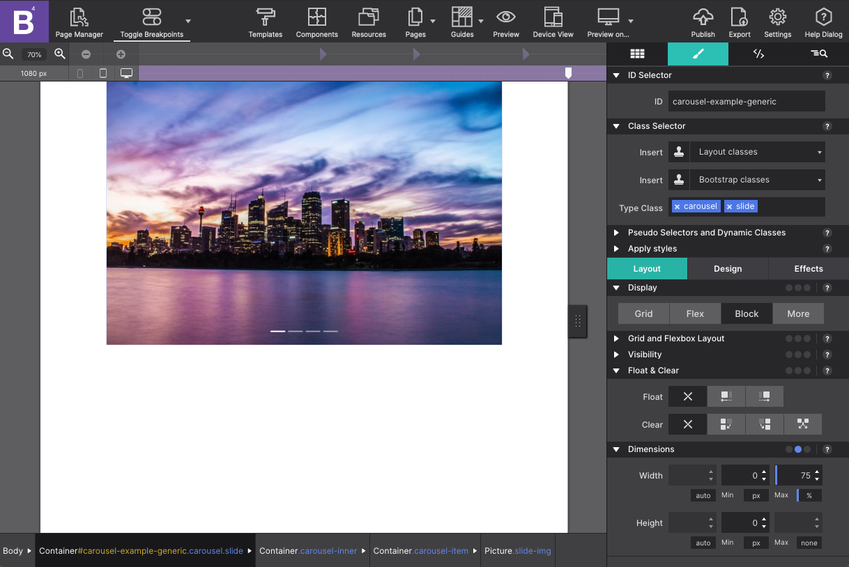
The component by default has three slides for your pictures. Using the Element Tree on the Inspector pane you will see the component is made up of a parent container with the ID name ‘carousel-example-generic’ with two children within it -- an Ordered List for the slide indicators and a Container with the photos.
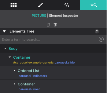
The inner Container consists of a Container with Picture element for each slide. The second and third images in the slide show are not seen on the canvas. These items have an eye with a slash next to them on the tree. Clicking the eye icon will bring that item into view so you can style it.
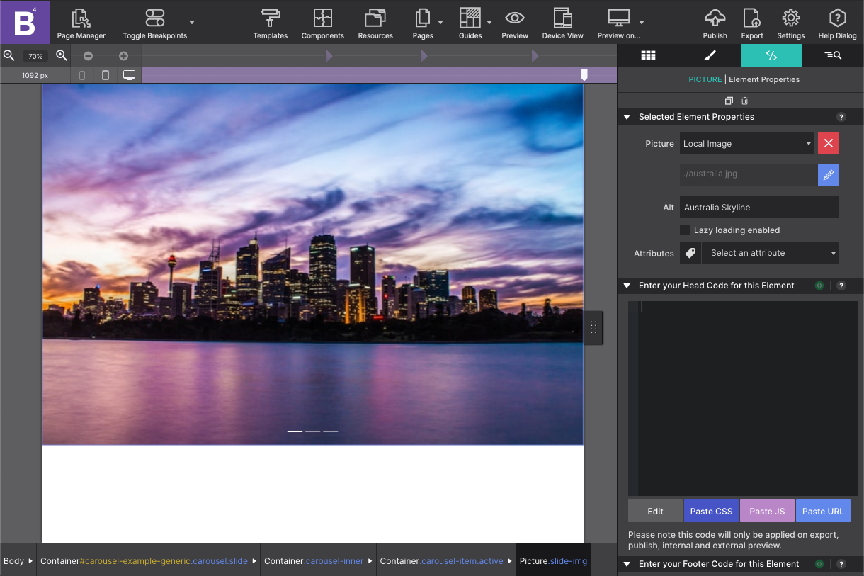
To add your image resources, click on the first Picture element. Then go to the Element pane > Picture and change the source to Local Image. Select your image source from your Resources. Once it appears on the screen you can set your Alternative Text so screen readers will be able to understand what is being shown.
Default Breakpoint
Be sure you are adding your images at the default breakpoint. This way the images will be applied at all screen sizes. You can also use the Toggle Breakpoints toolbar icon to disable this option so you can edit your design with the viewport slider at any size.
Next, let’s configure the two hidden pictures. On the Element Tree these Picture elements are nested in a ‘carousel-item’ Container. To show the hidden slide, click on the eye icon and the element will appear on the canvas. Then repeat the previous step for configuring the picture source.
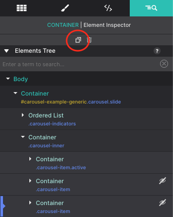
To add additional slides to the gallery, the easiest way would be to Duplicate one of the Carousel Items. From the Element tree select the last ‘carousel-item’ Container and click the Duplicate button at the top. Boom! This will add a whole new slide to your component.
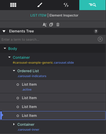
You will also need to add another indicator to your slider as well. From the Element Tree open the Ordered List container and duplicate one of the List Items within it.
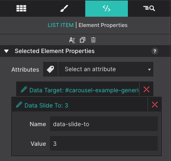
The slide indicators are numbered starting with zero. Zero being the slide that appears upon open. So the new slide that was added is considered the third slide. Select the newly added List Item and go to the Element pane > Attributes. Click on the Data Slide To attribute and change the Value to 3.
Resizing your gallery is managed at the parent level. You would select the top ‘carousel-example-generic’ container element. By resizing that element alone, all the children within it (the pictures) would be ruled under the styles you set. For example, if you select the parent and go to the Styles pane > Layout > Dimensions you can set the Max-Width of the slider to 75% of the viewer’s screen size. Then center it by setting the Left and Right Margin to AUTO. The entire gallery will fit within those parameters. Customize the size any way you want!
Congratulations! The slider looks great and ready to go live!
Level up with the Site Designer help guide.
Site Designer gives you the power to work with CSS visually. These code-free controls allows you to experiment with new styles and layouts without having to be a pro at hand coding. Discover the power of Site Designer and start dragging, droppping, clicking, and sliding your way to an epic website.