

Property Panes
Menu Builder has been developed to cope with the complexities of the CSS for navigation menu design. In Menu Builder the relevant CSS properties are represented by easy to use, visual controls. Any change or edit will have an immediate visual effect in the preview window, allowing for fast prototyping and an intuitive design process without have to wrestle your way through a bunch of code.
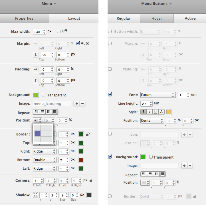
All elements listed at the beginning of the previous Chapter have their own properties pane. The property panes for the menu as a whole and all menu buttons (in hover state) are highlighted below.
Figure 10: The Menu and Menu Buttons Property Panes.
The Menu Properties
If you select 'Menu' from the selection dialog in the top right part of the application, the property pane with controls that help you change the design of the (outer) menu box will appear. This is the top level menu element—the (outer) container that holds all other navigation menu elements.
The set of properties that govern the main menu box include max-width, margins (width in percentages for a fluid layout and height in pixels), and padding (also width in percentages and height in pixels). Background colors can be added with the color picker, and background images can be used for an additional or specific killer effect. Our Glossy theme gives good insight in the use and possibilities of background images on the menu button. Other controls are for the borders and for applying effects (rounded corners, shadows etc.). The controls are self explanatory and like being tinkered with — we think it's best to just do that, toy with their settings and see what they do.
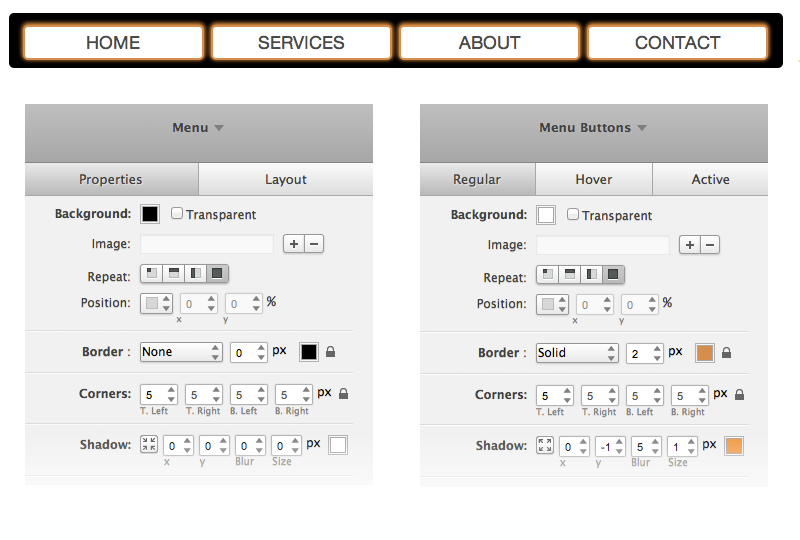
To help you get a good feeling for how this works we made an example where we changed a few of the property sets of the standard menu to a menu with rounded corners. The corners are applied to the menu itself and the buttons. Figure 11 shows this simple, yet effective navigation menu. The controls we adjusted and their values are highlighted below as well.
Figure 11: The Menu and Menu Buttons Property Panes.
Now let's look into a bit more detail what we can do when the menu buttons are selected.
Menu Button Properties
If you select all your menu buttons you will get a design pane with whoooole list of snazzy controls at your disposal. They will work on all buttons at the same time. Changing for example the background, will change the backgrounds of all buttons.
But you can also select a specific single Button. In that case you will see that all property values (design settings if you like) are inherited from the ‘all buttons' design pane. The controls are disabled, with a checkbox next to them. You will have to make a conscious decision to check the box before you can change the values for a specific property. You will see that the values are initially the same as for 'all buttons', making it easy to make small tweaks for the desired subtle effect.
Now changes will only affect the selected button. If uncheck the box and the style properties are again inherited from the ‘all buttons design pane’ gain. This makes it easy to see the difference. Pretty cool, right? It allows you to have granular control over each individual element, but also to make global edits fast and easy. Just remember what we told you in the previous Chapter though, as soon as you enable a property set for a specific menu button, these properties will not respond to changes made to 'all buttons' anymore.
Menu Button States
Officially these states are called pseudo classes, but since we here at CoffeeCup try to simplify web life and usually call them button states.
You probably have seen these 3 tabs, regular, hover, and active in previous example or when playing with the software. They show up as soon as one or more menu buttons are selected. Selecting them brings up their very own property panes that then can be used to make design changes for the 3 different states of the menu buttons:
- Regular = Default
- Hover = Mouse Over
- Active = Clicked on / pressed
The property values on the hover and active tabs are initially inherited from the values on the regular tabs, very similar to how the values for a single button are inherited from 'all buttons'. Again, this allows for fast design prototyping and subtle hover effects.
To change something on the hover or active tabs you also need to click the check box on the left of the property control. Then the property value(s) can be changed.
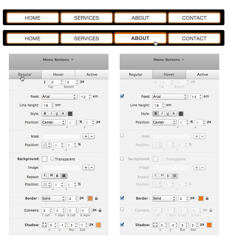
We created the mouse over effect below changing the border and shadow colors to a brighter orange, increasing the shadow size and making the font bold. Check it out:
Figure 12: Example of the hover effect and control changes.
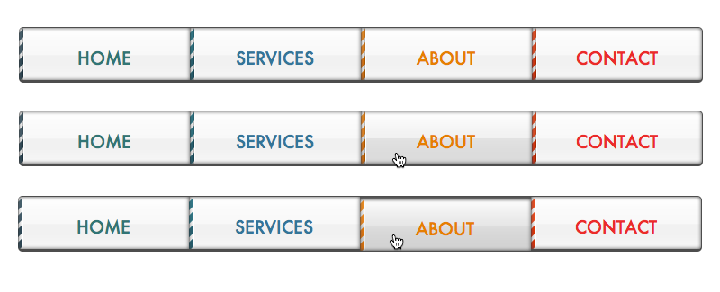
Here's an example of a navigation menu that received a bit more design love. Each button state, normal, hover and pressed have slightly different appearance and 'feel' to them. The hover state creates a subtle invitation to click, while the active state responds nicely to the click action by mimicking a press action on an actual button.
Figure 13: The regular, hover, and active state of a (really) well designed menu.
Submenu Properties
The design controls for the submenus work very similar to the menus controls — only now they style the submenu area! Here's one thing to keep in mind though: if the submenu buttons are the exact same size as the submenu area, changing design values on the submenu pane might not always have the desired visual effect. They are taking up the entire space, and are positioned on top of the submenu, so anything that is happening in invisible.
In this case just add some padding to the submenu and the preview will guide you again when you’re tweaking to your hearts content. To illustrate the point we took the Clean theme, added some padding around the submenu and gave the submenu an orange background and a purple 2px border. The submenu buttons are positioned in front of the submenu and have a white background. It’s not a design we would recommend using on your website, but it helps to bring the point across.
Figure 14: Illustrating the submenu and submenu button relationship.

Yep, we also increased the submenu width to 133%, amazing what can be done with Menu Builder right? Similar to the menu design pane you have width, positioning, background color and/or button images, border effects (rounded corners, shadows etc.), margin and padding. These properties work the same as the properties found on the menu pane. But you will need to be careful with the submenu margin settings. Here's why:
Submenu margins: As we learned, margin settings control the space between HTML elements. If top margin is added to a submenu, space will appear between the main menu button(s) and submenu(s). This is not necessarily bad, but if the space becomes too big it can influence the showing and hiding of the submenu drop downs. The submenus show as long as the mouse is positioned over a main menu button with a submenu, or over the submenu itself. If the mouse is above the space between these elements, the space added by top margin, the submenu will collapse.
There's one more thing you that is good to know about submenu margins — if there is no margin at all the submenu will be positioned right on top of the border of the main menu button. And under normal circumstances, the is not what you want ;)
Got your fingers and mind itching from anticipation? Understandable, this is exciting stuff. Just don't forget that you also might want to apply some creative design to the content of the submenus: the submenu buttons!
Submenu Button Properties
Very similar to the menu buttons section (see Figure 11), the design panels that appear when you select one or more submenu buttons will allow you to edit the styling, spacing and positioning of the selected element(s). You can select:
- All submenu buttons in every submenu,
- All submenu buttons in a specific submenu, or
- A specific submenu button.
This allows you to edit all the different aspects of button sets as a whole or tweak each buttons individually. Editing the button set as a whole will make all buttons use the same coloring, fonts, etc. If you want to add a little extra flare to a special submenu button, you can edit that individual submenu button by selecting it from the selection dialog at the top right. Otherwise, submenu button controls work the same way as the menu button controls.
You can also edit the regular and hover states for each of the selections specified above. Here's how it is done in the Glossy theme.
Figure 15: Design snazzy drop-downs with Menu Builder.
These property panes of tremendous design powers and often something that does not look very good initially, can be turned into a good looking navigation menu by simply playing with the control settings. Yep, even there's even hope for the menu from Figure 14!
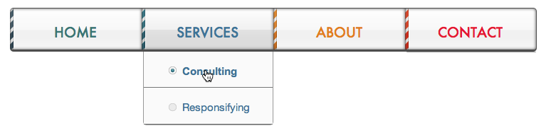
But that's for some other time, let's move on to something that makes this application unbelievably cool, unheard of and has never been shown before: designing responsive navigation menus!