

Video guide for creating a basic page in CSS Grid Builder & Site Designer V3 & V4.
Since the release of Responsive Site Designer V1, the Visions theme has always been a fan favorite. Including my own! It's simple, yet classy, and extremely versatile for any organization, business or profile. This design, while it doesn’t actually use any CSS Grid properties (more about that below) it is great for first timers to learn the basics.
I’ll be your guide throughout this tutorial, getting you familiar with the workflow as we build a webpage using the CSS Grid Builder app. These same steps would apply to the upcoming Site Designer V3 too! Once you master the fundamentals, you’ll be able to graduate to the higher-level Grid controls tutorials.
— Suzanne from The CoffeeCup Team
SuzieQ’s top four getting-started tips:
- For this tutorial, you'll want to select the Blank Foundation Theme upon opening the app. You can also click File > New From Theme > Blank > Foundation. This framework is a Mobile-first workflow. This means you will build for smaller screens first, applying all your default styles (colors, fonts, images, etc.) with the slider positioned to the left of the first breakpoint.
- Containers elements will be your best friend. Site Designer V3 and higher uses Containers to group multiple page elements together. This eliminates the restrictive row/column layouts that were a part of earlier versions. However, if you really love using that format, V3.5+ offers both workflows.
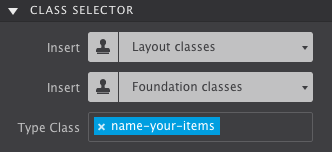
- Be sure to use Class Names. Give common items such as paragraphs a Class Name. Elements that use the same Class Name will share the same styles. Plus, they will always stay in sync if you change their appearance.
- CSS Grid positioning controls are optional. Not every design situation calls for Grid. Good ’ol
BlockandIn-line block, trustyFlexboxcontrols, andAbsolute Positioningcan still get the job done right for lots of tasks. Only when you need to tackle a more complex layout is when CSS Grid controls can come steal the show.

Now, let’s start building the page!
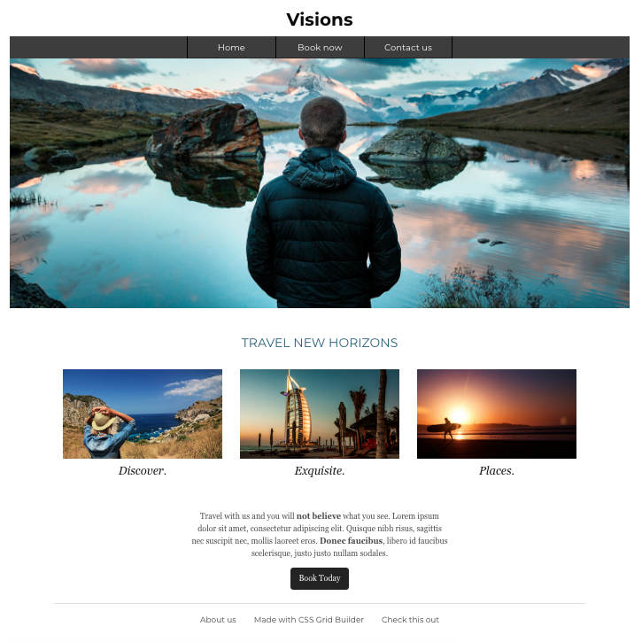
The entire Visions design is organized structurally into 7 sections! We’ll add on an 8th step for tweaking the page for larger screens. I have recorded all the steps so you can watch me as I work with the app. I also break down each step and provide the values for the controls I’m using. To build along with me, download the project resources:
Step One: The Page Heading
Video Recap...
- From the Content Pane
 drag-n-drop a Heading 1 element onto the canvas. Change the placeholder text to say Visions. You can type your text right on the screen. To active the editor you can:
 - Triple click,
- Right-click and select Edit Text,
- Select the Edit Text icon
 when hovering over the element.
 - Next select the Styles Pane
 . Like you will do with all elements (start good habits now!) go to the Class Selector section and in Type Class enter a class name. I used
 site-title. - Scroll down to Layout > Dimensions > then add
20pxtop Margin. - Still in the Style pane scroll to the Design section. Enter the following Typography settings:
- Font > Montserrat
- Fallback Font > Cursive
- Font Weight > 700 Bold
- Size > 40px
- Align > Center
Step Two: Building The Navigation
Video Recap...
- Add a Container element from the Content Pane to the canvas and give it a class name
nav-wrapper. - Next, drop a Text Link element into the Container. Then give the Text Link the class name
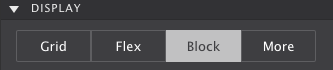
nav-button. - On the Styles Pane scroll to Layout and set to
Block. - Then add some space. Scroll to Dimensions and apply
10pxfor the top & bottom Padding. - The Text Link will then get the following Typography settings:
- Font > Montserrat
- Fallback Font > Cursive
- Size > 20px
- Align > Center
- Font Color > ffffff
- A Background Color of 3d3d3d is applied.
- On the canvas, change the placeholder text to say Home.
- Add two more Text Link elements into the Container and give each link the class name
nav-button. Boom! They will automatically take the styles we applied to the first Text link. (class names are so handy!) - Change the two new links to say Book Now and Contact Us.
- To separate them, I will add a faint bottom border.
- Finally, to spice them up and make it obvious to the user what button they are selecting, I will apply a Hover style by selecting Apply Styles > In State. With this state activated, I will change the background to black 000000.
- The link addresses are applied to each button on the Element pane in the Href box.
Step Three: The Eye-Catching Hero Image
Video Recap...
- First things first, add a Container element to the canvas beneath the navigation. Sometimes it can be tricky to see where the Container has been placed since it is kinda invisible. I personally find using the Element Pane
 makes it much easier. It lists all of the page elements in order. If you see an item in the wrong place, you can click on it and move it to the correct spot. Give the Container a class
 hero-section. - Next, add a Pictures element into the Container. You can change the placeholder image with the actual image under the Element Pane > Picture. Use the dropdown to select your source: Local Image (which you would browse your computer to import the image) or select the Online Image to paste in a URL to a file already online. In this case, select the Local Image and a pop-up will appear. Select the image titled Visions Hero.
- We are gonna mix it up a bit for the class name. Instead, on the Styles pane, go to the Apply Styles control and select To All Elements of this type. Now any of the styles we pick will be set as the default styles to every Image element we add to the project. I have a side note about CSS Class Selectors below if you are intrigued on how this will change your life.
- With the Type selector activated, scroll down to Layout > Dimensions > then set the Max-Width to
NONE.
Step Four: The Page Sub Heading
Video Recap...
This one is easy. Add a Heading 3 element onto the canvas from the Content pane . Then give it a class name section-title.
Change the placeholder text to TRAVEL NEW HORIZONS and apply the following Typography settings under the Style Pane :
- Font > Montserrat
- Fallback Font > Cursive
- Font Size > 28px
- Align > Center
- Font Color > 2a617d
Step Five: The Main Services Sections
Video Recap...
You know the drill, add a Container element with a class name services-section. This will serve as the main wrapper for the section content.
It will hold three more containers, each one grouped with their service’s respective image and text. We’ll build the first service group and then will duplicate it.
- Add another Container inside of the main wrapper
services-sectionand give this new Container the class nameservice. - On the Styles Pane , scroll to Layout > Dimensions > and set the Max-width to
400px. Add some space by giving it20pxleft & right Padding and60pxbottom Margin. - Insert a Picture Link element and a Heading 5 element inside the
servicecontainer. This element is given a Max-width >none. Make sure the Picture element is set to 'Block' positioning. You can check this by selecting the picture and go to the Style pane > Layout > Display > Block. - Give the Heading 5 the class name
service-titleand apply the following Typography settings: - Font > Georgia
- Font Size > 26px
- Align > Center
- Font Color > 18191a
- Font Setting > Italic
- Under the Layout section, add
10pxtop Margin and0.5rembottom Margin. - Change the placeholder text to say Discover. And change the image on the Element pane by choosing the Discover image in your resources.
- Select the
servicecontainer and duplicate it twice. The duplicate icon can be found when you hover over the item, at the top of the Styles Pane, or simply by right-clicking. Once the container is duplicated, replace the content (text and the image) in the new sections. The image resources are Exquisite and Places.
 - To center the content, select any of the three
servicecontainers and set the right & left Margin toAuto.
Step Six: The Closing Message
Video Recap...
- Add Container element with class name
closing-container, then add a Paragraph element with class nameclosing-pand a Button Link element. - Hover over the section on the canvas and select the newly added Container using the little dropdown in the corner (or if you prefer from the Element Pane). With the Container selected, go to the Styles Pane > Layout and set the Display to
Flex. Then set the follow Flex styles: - Direction > Column
- Align > Center
- Give some space to the item by adding
10pxleft & right Padding. - Select the Paragraph element and apply the following Typography settings:
- Font > Georgia
- Font Size > 18px
- Align > Center
- Font Color > 1e1e1e
- Finally, select the Button Link element it automatically includes the
buttonclass name from the framework. This has pre-set styles already associated with it. You can easily alter the styles though. In this case, go to the Styles Pane > Background > and change the color to 1e1e1e. To round out the button corners, scroll down the control panel a little more to Border > Radius and give both X and Y the value of7px.
When to use the Inline Editor
Whenever you start typing on the screen, automatically the Text Editor (also known as Inline Editor) will appear. Resist the temptation to style your text in this mode. This can cause a headache later and make your backend code messy.
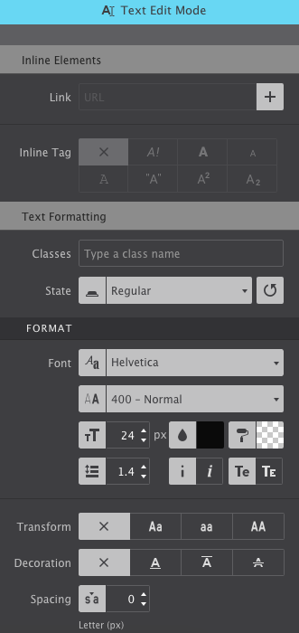
The Inline Text Editor is used only when you need to apply a style variation within a paragraph or text. For example, in the paragraph in Step 6, we want the words "not believe what you see" to stand out from the rest of the message.
The base styles are made on the Styles pane while using the inline edit to make the single change to the words in the sentence that we want. In this case, we highlight "not believe what you see" and make the words bold and the color red.
You can select a single word, multiple words, even individual letter add styes such as bold, italic, subscript, superscript, colors and more.
Step Seven: The Mighty Footer
Video Recap...
- Add a Container element with class name
footer. - Insert a Rule element.
- Nest another Container inside the
footerContainer and include a Text Link element. Name the Text Linkfooter-linkand the new Container the namefooter-nav. - With the Text Link element selected, give it
10px top and bottom Padding and20px left and right Padding. Then go to the Styles Pane > Design section and apply the following Typography settings: - Font > Montserrat
- Fallback Font > Cursive
- Font Size > 16px
- Background color > 424345
- Change the placeholder text with About Us
- Duplicate the Text Link element twice. Then change their text to say Made with CSS Grid Builder and Check this out.
- Select the
footer-navContainer and apply its Display toFlex. The Flex properties include Wrap > Wrap, Align Items > Center and Justify > Center. For more spacing, give it60px bottom Margin.
Step Eight: Responsify
Video Recap...
With default styles in place, the design can be tweaked for wider screens. Moving the slider at the top to the right, past the first breakpoint you can examine and determine if any changes are needed. Rinse and repeat for every breakpoint.
- Starting with the three services, I will adjust them so that they fit onto one line when space allows. Select the
services-sectioncontainer and change the control toFlexwith the Wrap property set toWrap. - The other change I will make for wider screens will be to the navigation so that it expands horizontally. Selecting the main container, I change the Layout Display to
Flexwith the Justify property toCenter. Then in the Design section I will apply a background color that matches the buttons. - Lastly, I will select one of the
nav-buttonand restrict it to a200pxWidth and add20pxleft and right padding.
Working with CSS Selectors
Before you style any item on your project, the first step you should take is choosing where you want the styles to apply to. On The Styles Pane, scroll down to the Apply Styles section. Using the dropdown you can choose to apply the settings to the Type, Class, or ID.
The Type is used to define default styles for all elements of the same type.
A Class is used for defining style variations of the Type. When styles are associated with a class name, all elements (of the same type) that have that class name will share the same styles.
The ID is used to set a single, unique style variation that will only apply to the selected element.
In the app, selectors are color-coded so you can identify their associated styles. Learn more about them in the Help Guide chapter Understanding The Color Coded CSS Selector System and watch a video tutorial below.
Level Up!
You’re now ready to take the next steps into learning how the Grid positioning controls work. Check out Bob’s video series and detailed guide on the subject. By applying Grid, you can use it to turn any Container element into a row/column grid of any size proportions!
Bob’s Grid Video Series Introducing CSS Grid Buy Site Designer with CSS Grid!I hope my video tutorials helped you out. If you have any feedback, questions, or have a topic you would like for me to cover in future videos, please don't hesitate to shoot me an email. I’m also on Twitter if you’d like to be friends or give me a shout out.

— Suzanne Norvell