

Build a Website From Start to Finish
Are you prepared to begin constructing a project with Site Designer? However, familiarizing oneself with a new application can be daunting. The Visions tutorial will guide you through the process of creating a complete web page, from the beginning to the end. The final product can be utilized for your project or serve as a foundation for learning the app's controls. We will highlight key features to ensure you feel confident using the app.
It's important to note that we are utilizing the Frameworkless Desktop Down framework. This results in any modifications made at the largest breakpoint being reflected in the smallest breakpoints. Conversely, using frameworks like Materialize, Bootstrap, or Foundation, which are mobile-first, would result in changes being made in smaller breakpoints affecting the larger ones.
If you would like to download the completed project file access that along with the project resources below.
Let’s get started!
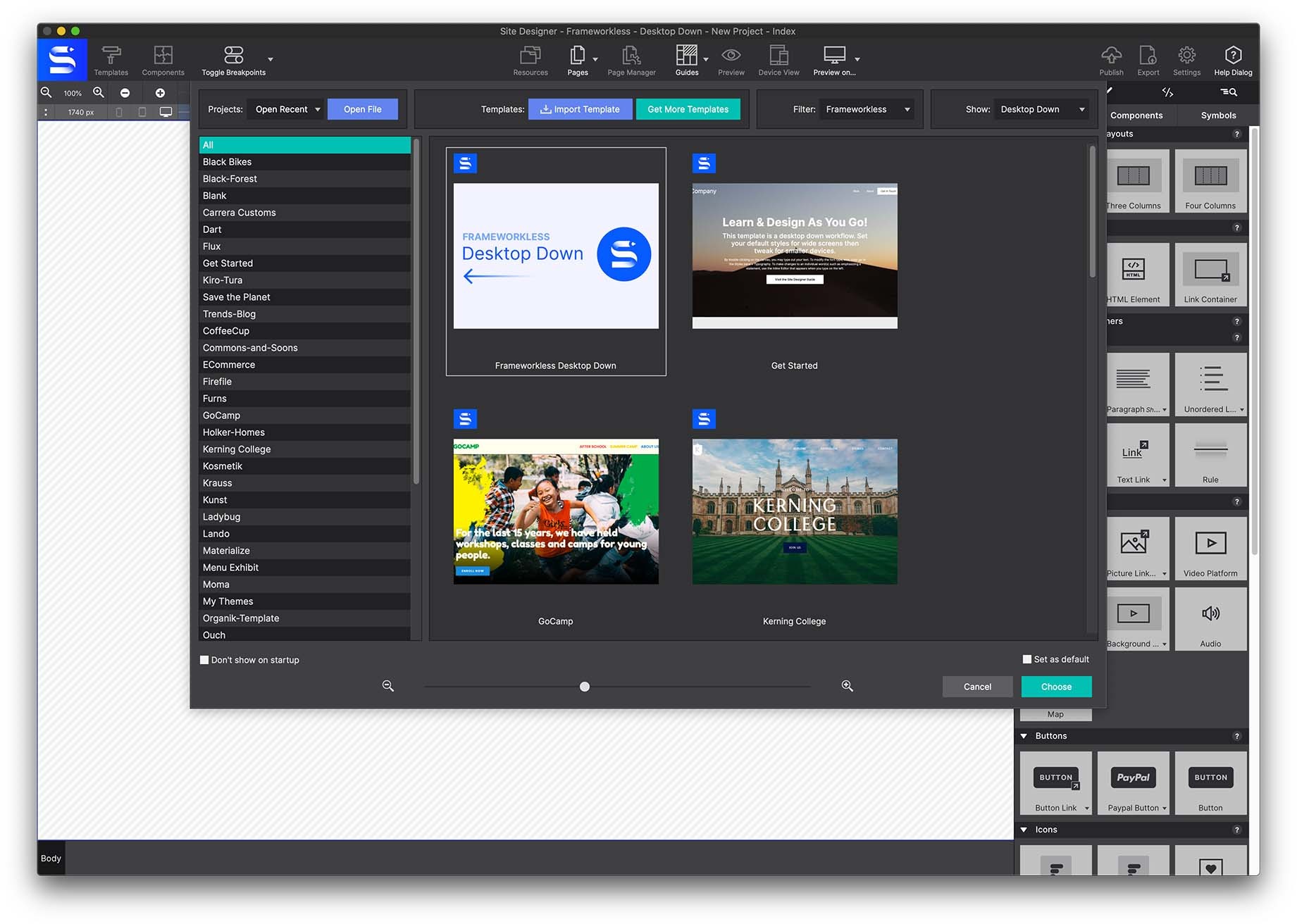
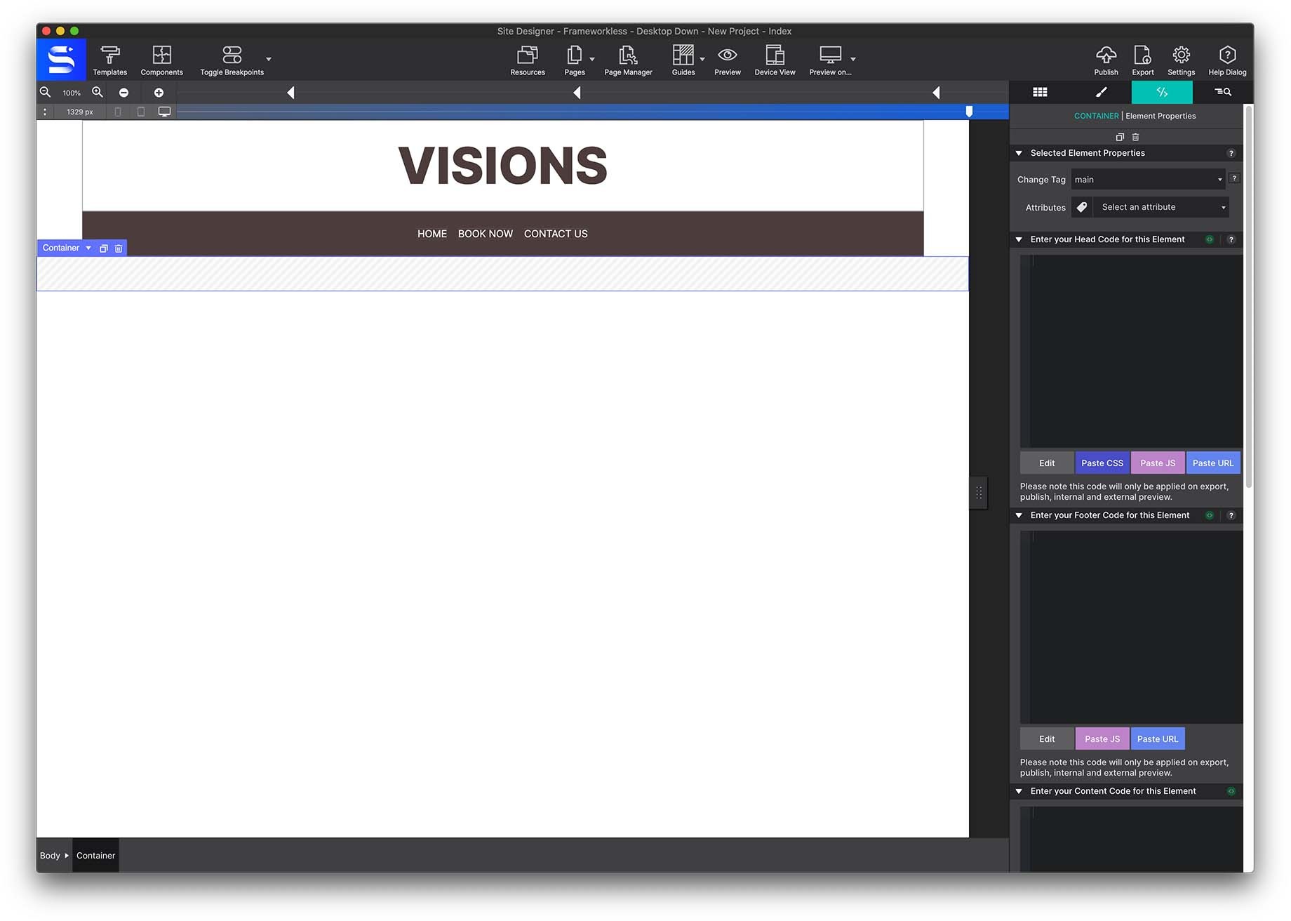
Begin by selecting the Templates toolbar icon and choosing the Blank Frameworkless Desktop Down framework. This will launch a blank canvas for you to work from.
The Heading Region
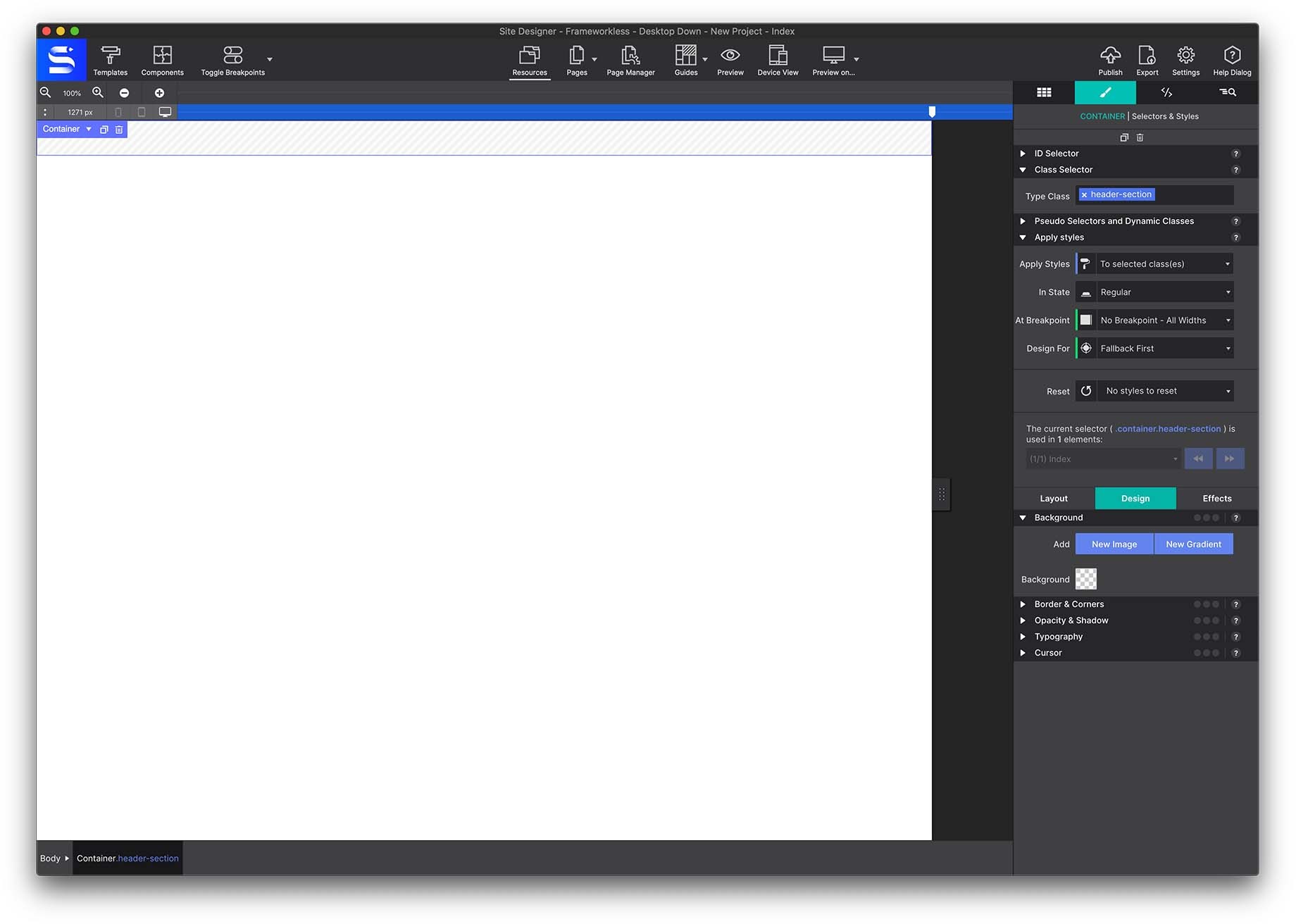
We will start the project by creating the Header region. Go to the Content pane > Elements section > Advanced Container and select a Container header. Click to add the element or drag and drop the container onto the canvas.
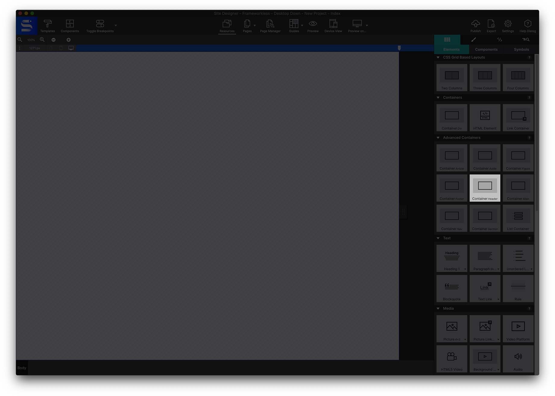
A regular container would also work, but for happy semantics, choosing the Header Container is the best for the back end script so the browser knows exactly what the content is displaying.
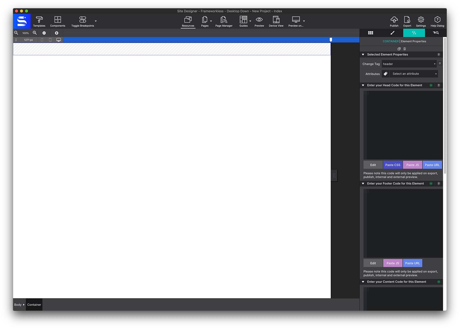
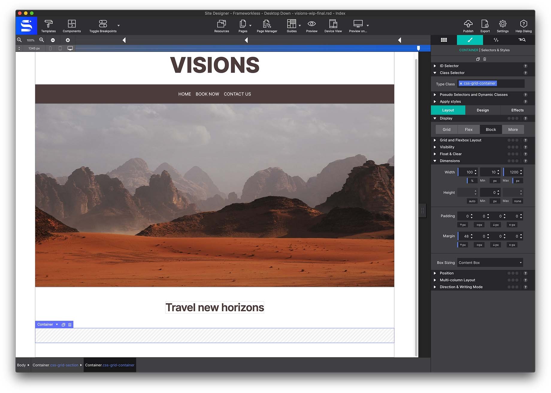
Once the element is on the canvas, you should give it a Class name. Go to the Styles pane > Class Selector > Type Class > and enter the class name header-section.
Using Class Names
Class names are an important part of the design and it is good to get in the habit of naming your items as soon as you add them to your page. Class names allow you to style common items all at once. For example, all headings with the same name, all menu links, any button within the project that share the same name would all share the same styles (color, size, font type etc.) This saves you from having to apply the same styles every time. Everything stays in sync by using Class Names. This also makes it easy for you as the developer to identify items within your project quickly.
Learn more about CSS Selectors here.
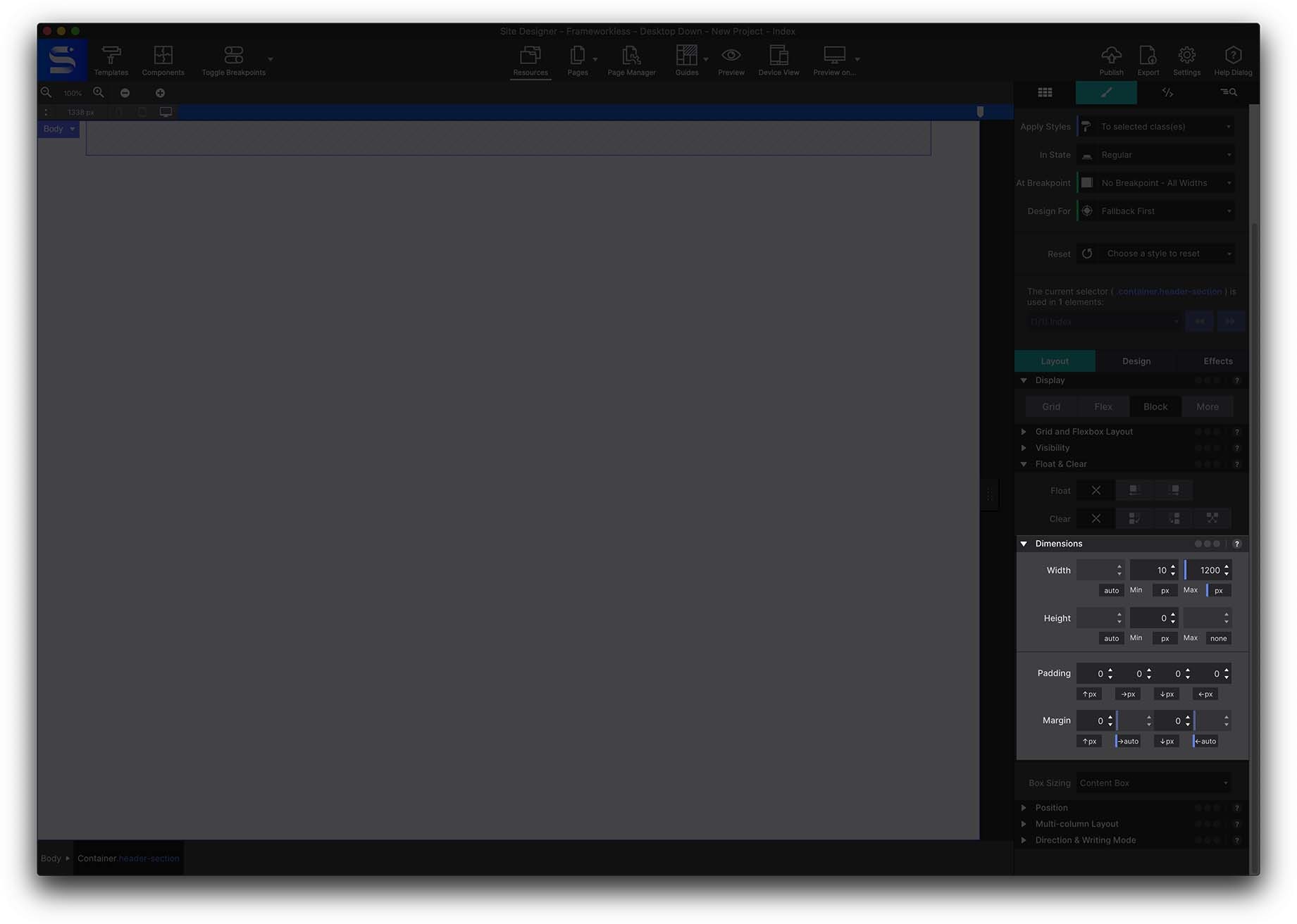
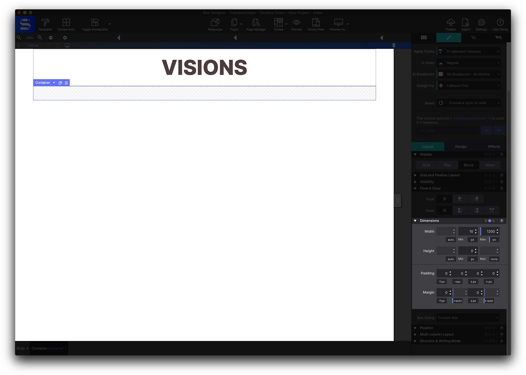
Next, give the container a max-width. Go to the Styles pane > Layout > Dimensions > and set the maximum width to 1200px. Doing this we are setting the width of the viewing area.
To center the content, from the Dimensions section, under Margin set both the Right and Left Margin to AUTO. This way, the container will be centered on the canvas regardless of the size screen the viewer is using.
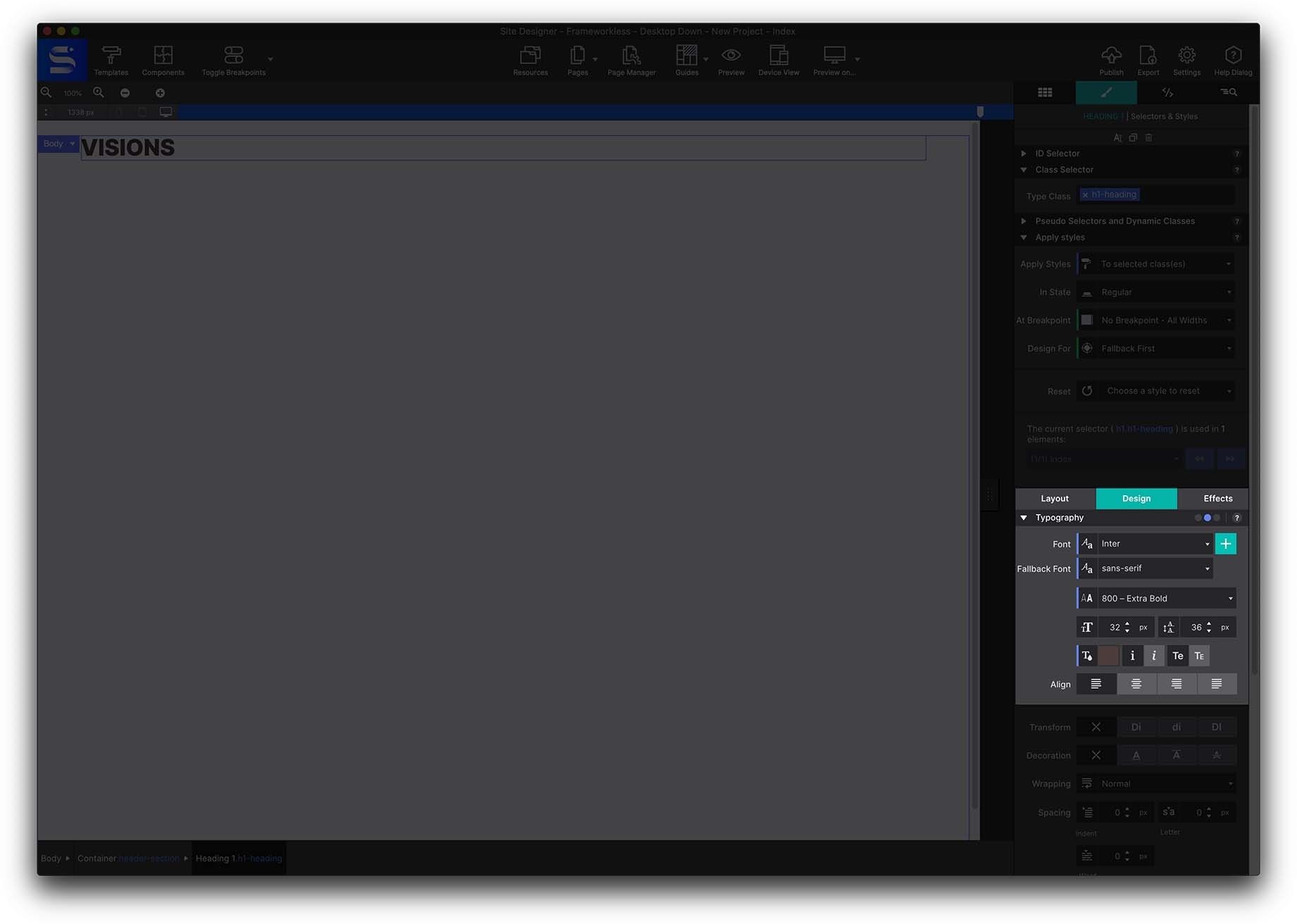
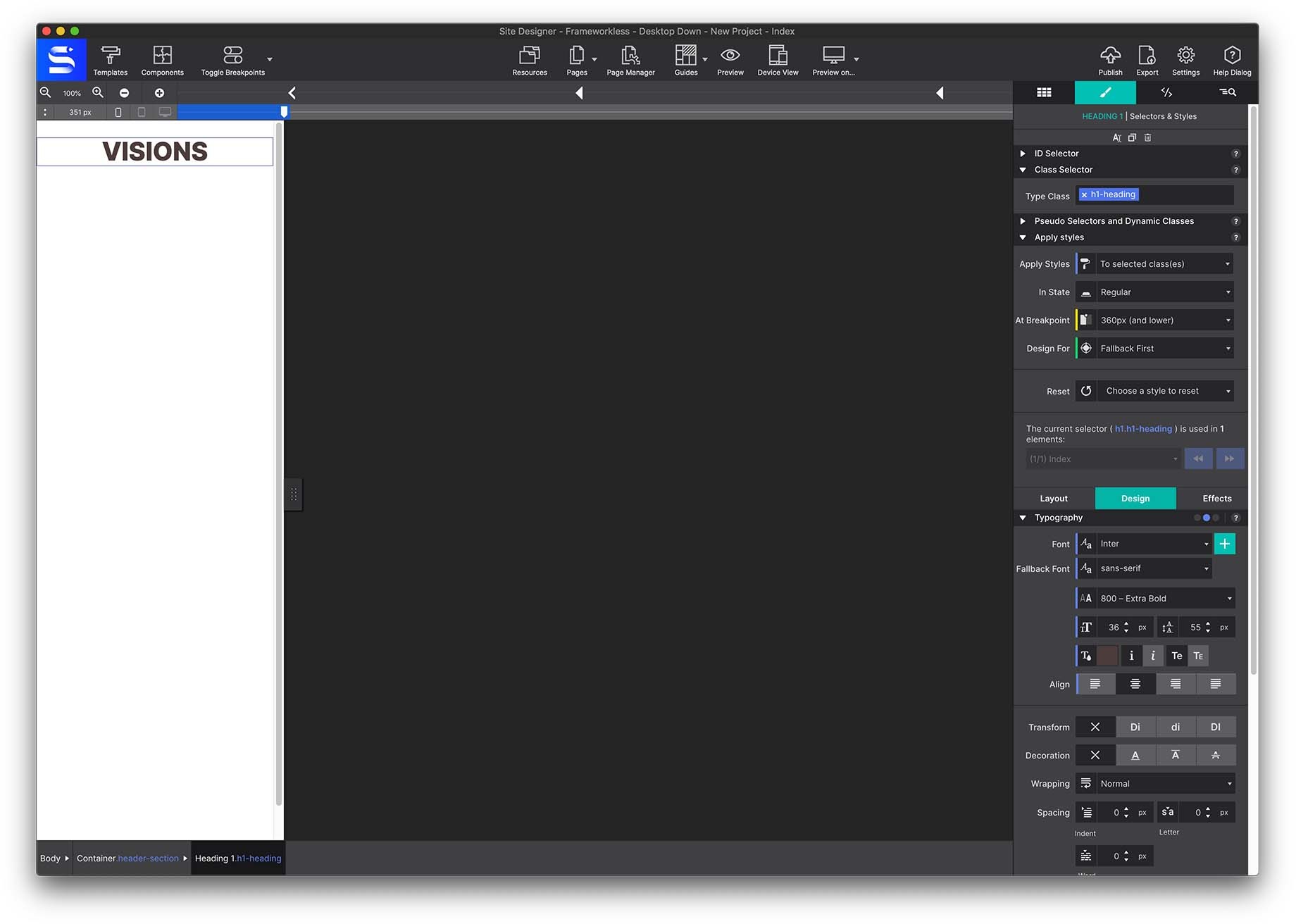
Next go to the Content pane > Elements and add a Heading H1 to the container. From the Styles pane give it a class name h1-heading.
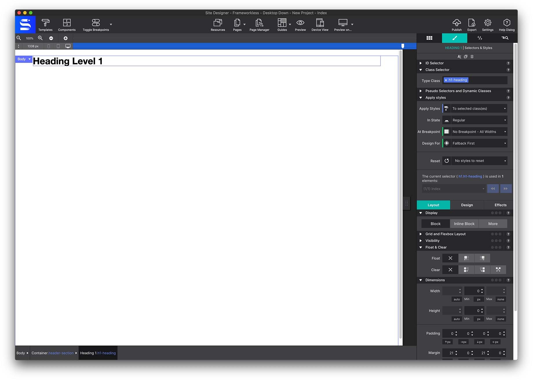
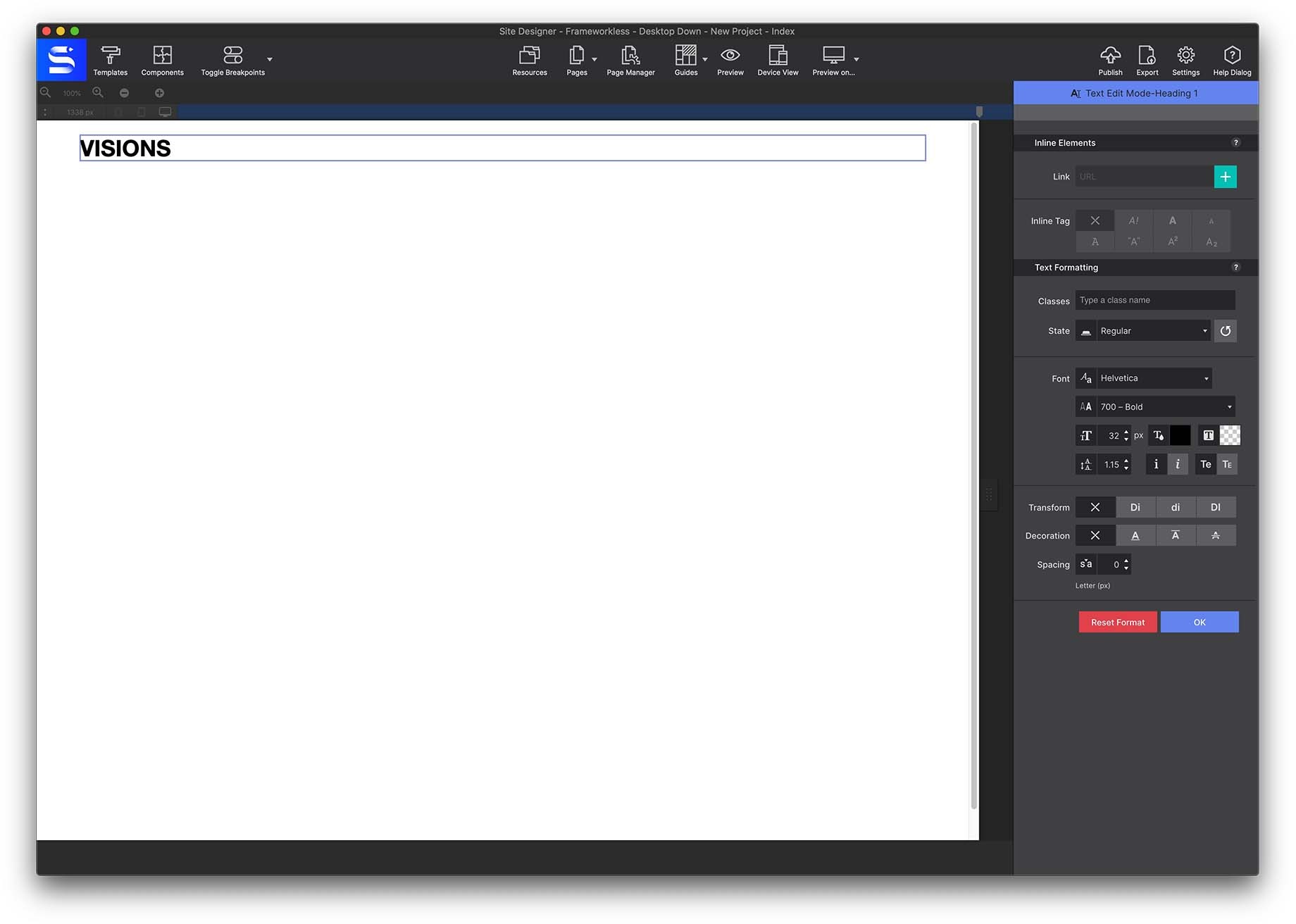
To edit the text, on the canvas right click and choose Edit Text or double click on the text to launch the Text Editor. Replace the placeholder text with the word Visions.
When To Use The Inline Text Editor
Whenever you start typing on the screen, automatically the Text Editor (also known as Inline Editor) will appear. Resist the temptation to style your text in this mode. This can cause a headache later and make your backend code messy. The Inline Text Editor is used only when you need to apply a style variation within a paragraph or text. You can select a single word, multiple words, even individual letter add styes such as bold, italic, subscript, superscript, colors and more.
Learn more about the Inline Text Editor here.
Click out of the area to close the Inline Text Editor. To complete the heading, it will need to be styled. To style the text, you will not use the Text Editor. Instead you will go to the Style pane > Design > Typography section. Apply the following controls:
- Font: Inter
- Fallback Font: Sans-Serif
- Weight: 800 Extra Bold
- Size: 72px
- Color: 4b3c3c
- Transform: Uppercase
Responsify the Heading
Along the top of the canvas is the Breakpoints Bar. Here is where you can inject different layouts and styles based on the screensize. Simply move the slider to the screen size and click on the bar to add a Breakpoint. Then you can make changes to the layout or styles. These changes would only be seen by screens of that size or lower. To the far left of the bar the exact pixel point is listed so you can add a breakpoint at a specific location.
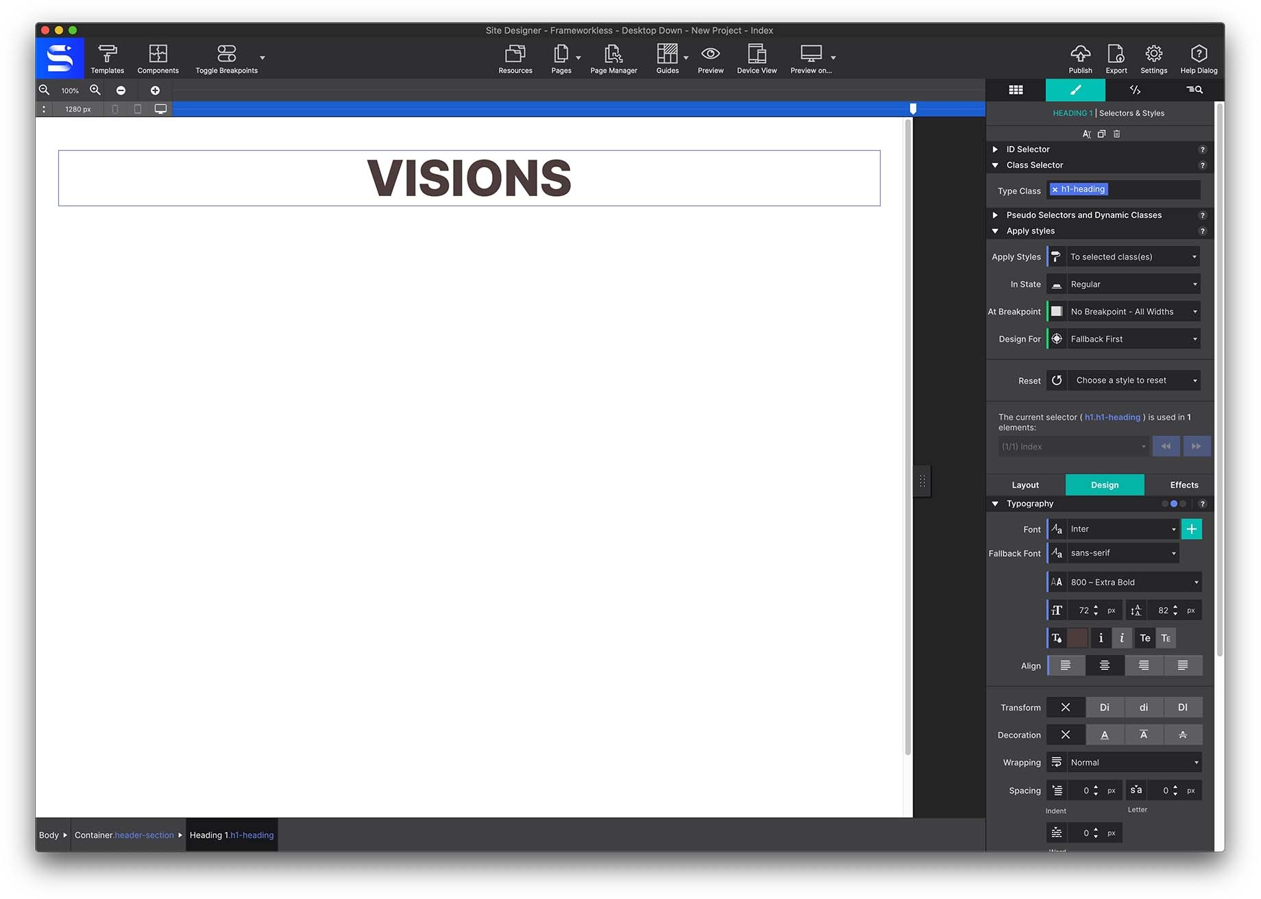
To practice this, add a breakpoint by clicking on the breakpoint bar around thee 1280px and 756px spots.
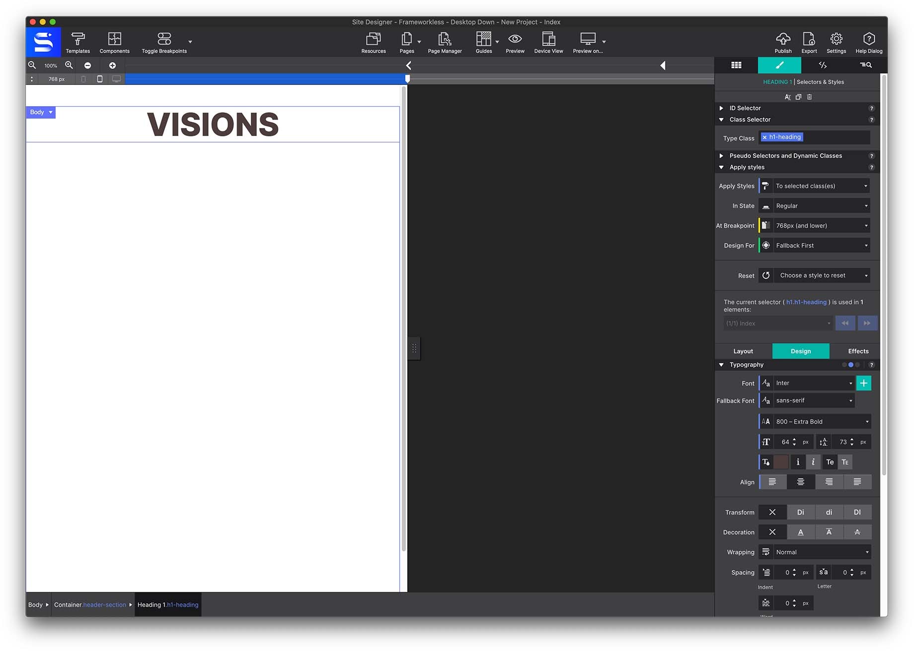
With the slider to the left of the points, tweak the Typography a bit. Most common adjustment to text would be the size. Smaller screens do not need to have such large Font Size. So lowering the font size would be a great practice. For example, at the first breakpoint you could lower the heading size to 64px.
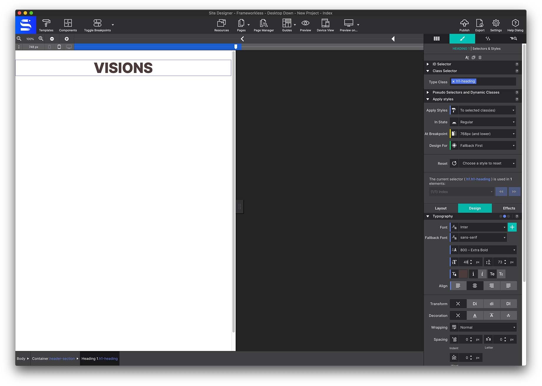
While for the smaller breakpoint/screen size the font could be changes to 48px.
Move the slider between the breakpoints and see how the size changes automatically. Still think that heading is too big for mobile users? Add in an extra breakpoint for even smaller devices and lower the font size some more.
The Powerful Breakpoint
Small yet mighty, breakpoints are the secret weapon of responsive web design. They are the places where layout or style changes are being made. They are represented by the little dots or 'points' above the Slider. An almost endless number of responsive actions may be specified, ranging from minor adjustments to image sizes, margins, and font sizes, to major layout changes. These major layout modifications are what Responsive Web Design is best known for. Responsive actions like shifting, stacking, and swapping of page elements is what make a site truly device agnostic.
Get the full scoop about the powerful Breakpoint here.
The Navigation Menu
Next we are going to make a basic navigation menu made up of a Container and 3 Text Link elements.
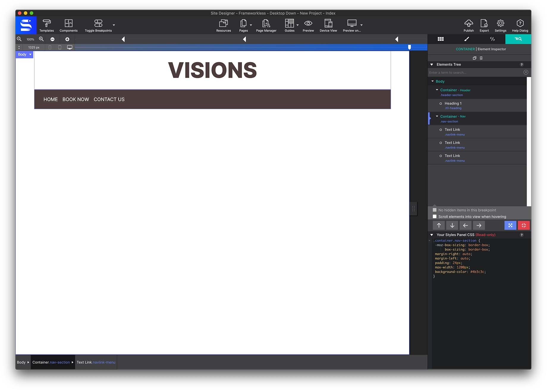
To do this, as we have done before, we will start placing a Container on the canvas. In this case, we will choose in Elements > Advanced Containers > Container Nav. This container serves as the Parent item. Meaning it is the first element that will hold children elements (ie the menu links). The Parent element controls the positioning of the child elements within it.
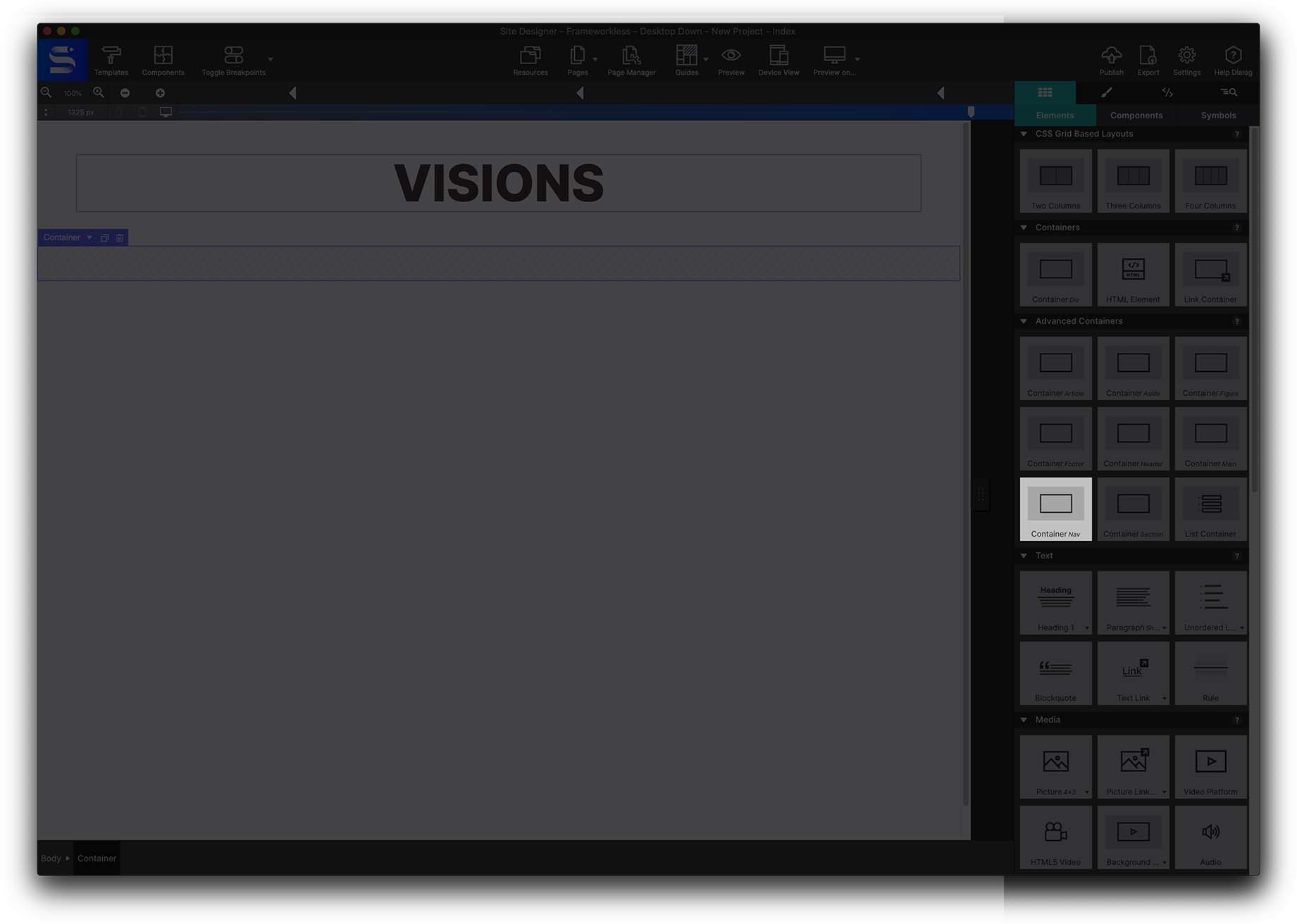
Give the Container a class name nav-section. Then apply the max width as before from the Styles pane > Layout > Dimensions > 1200px MAX and also center it by choosing Left and Right Margin to AUTO.
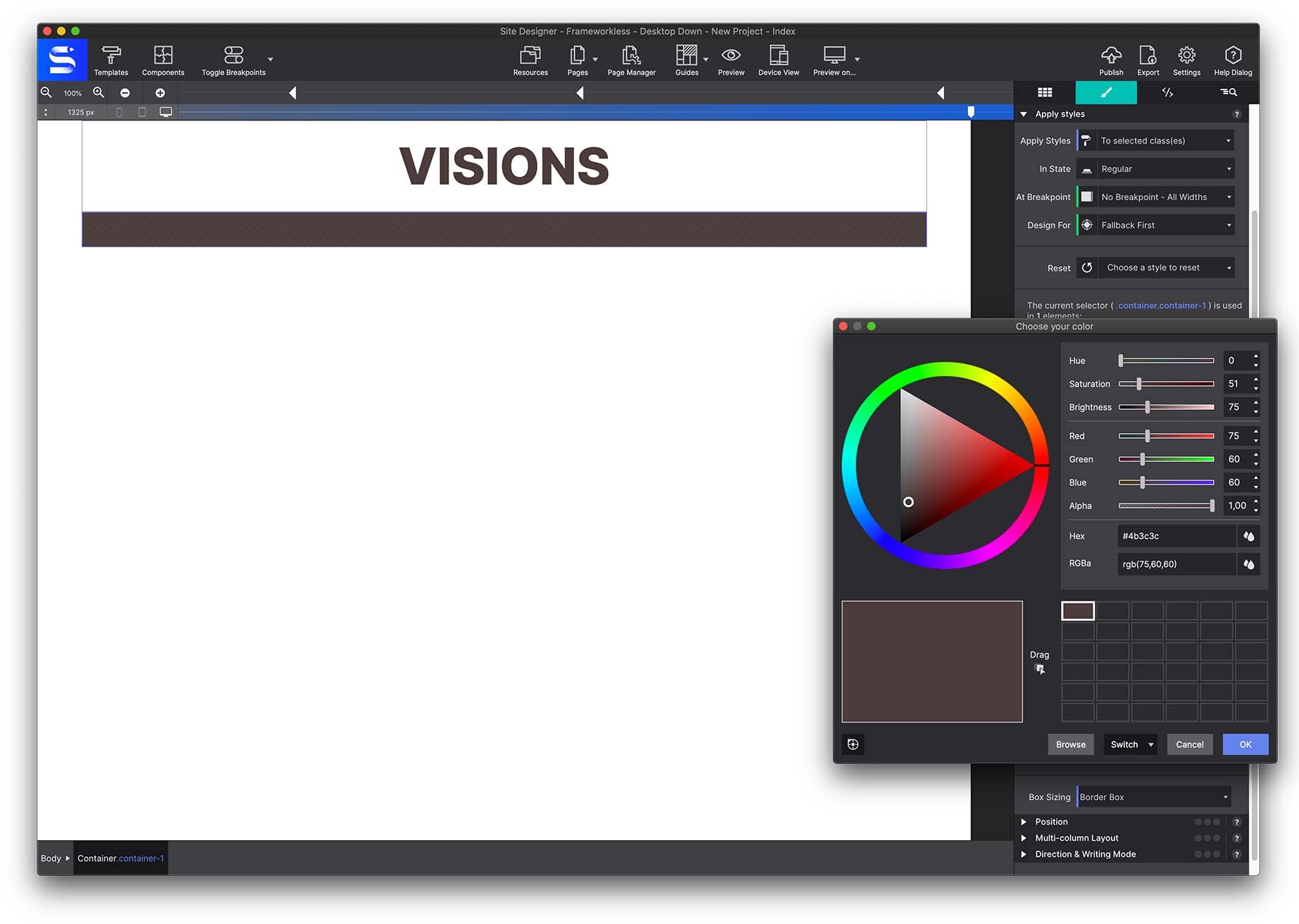
A background color can be applied to this container. Go to the Styles pane > Design > Background and click on the color box. The color box dialog will open. Use the wheel to choose a color or enter the exact color code you want. In this case we are using: #4b3c3c
Once this container nav is configured, go to Content pane > Text elements and add a Text Link Element to the container.
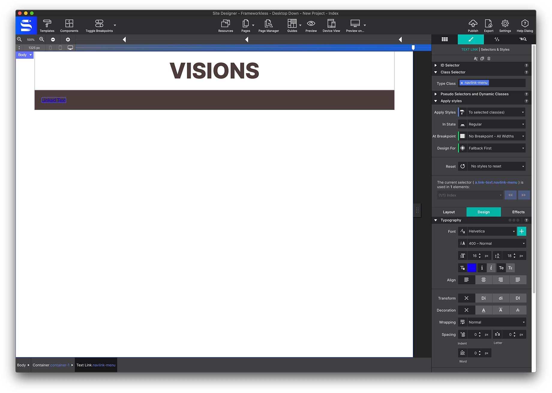
Give the element the class name navlink-menu.
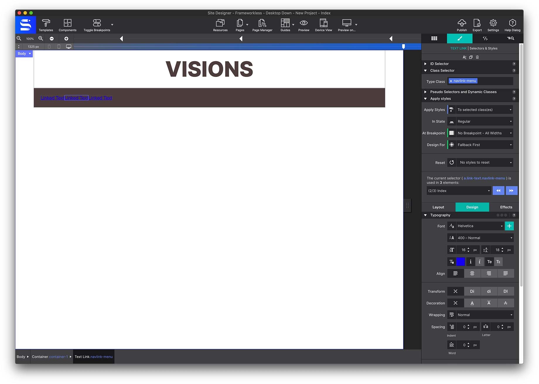
Use the Duplicate icon at the top of the panel to duplicate this element twice, providing you with a total of three menu links.
Double click on the elements on the canvas to launch the inline editor. Change the links to HOME, BOOK NOW, CONTACT US.
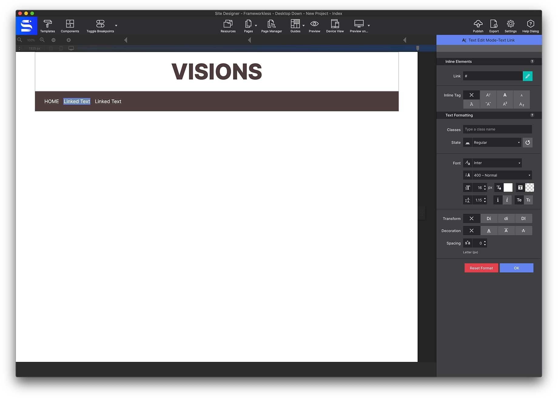
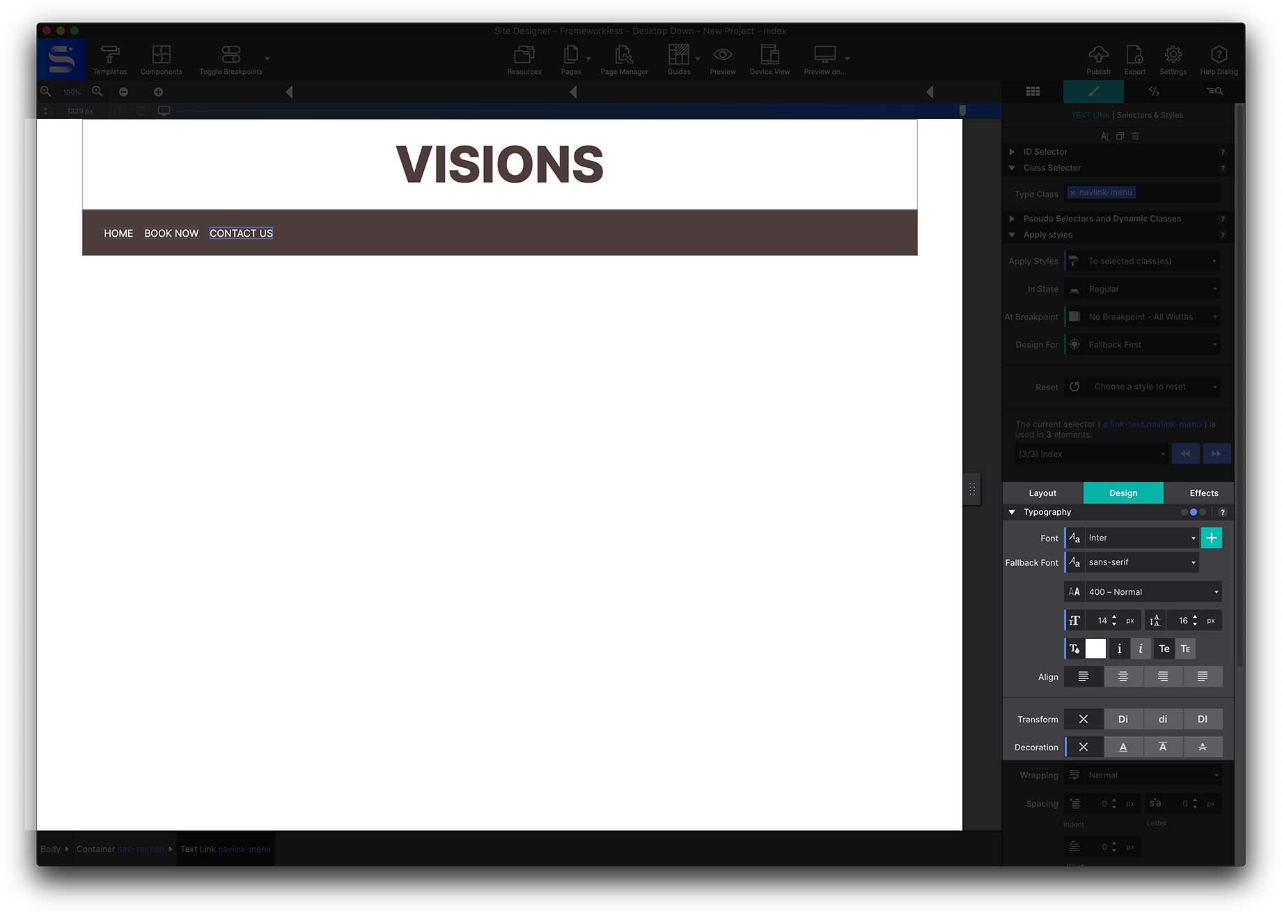
Typography settings under the Style > Design pane can be configured too. Set the following properties:
- Font: Inter
- Fallback Font: Sans Sarif
- Color: White
Link destinations would be configured on the Element pane > HREF. If you were linking to a new page in the project, you would simple enter the page name. Learn more about working with the Page Manager to add new pages and name them.
Need to link to a document or to a specific section on the page. Learn how to do that here.
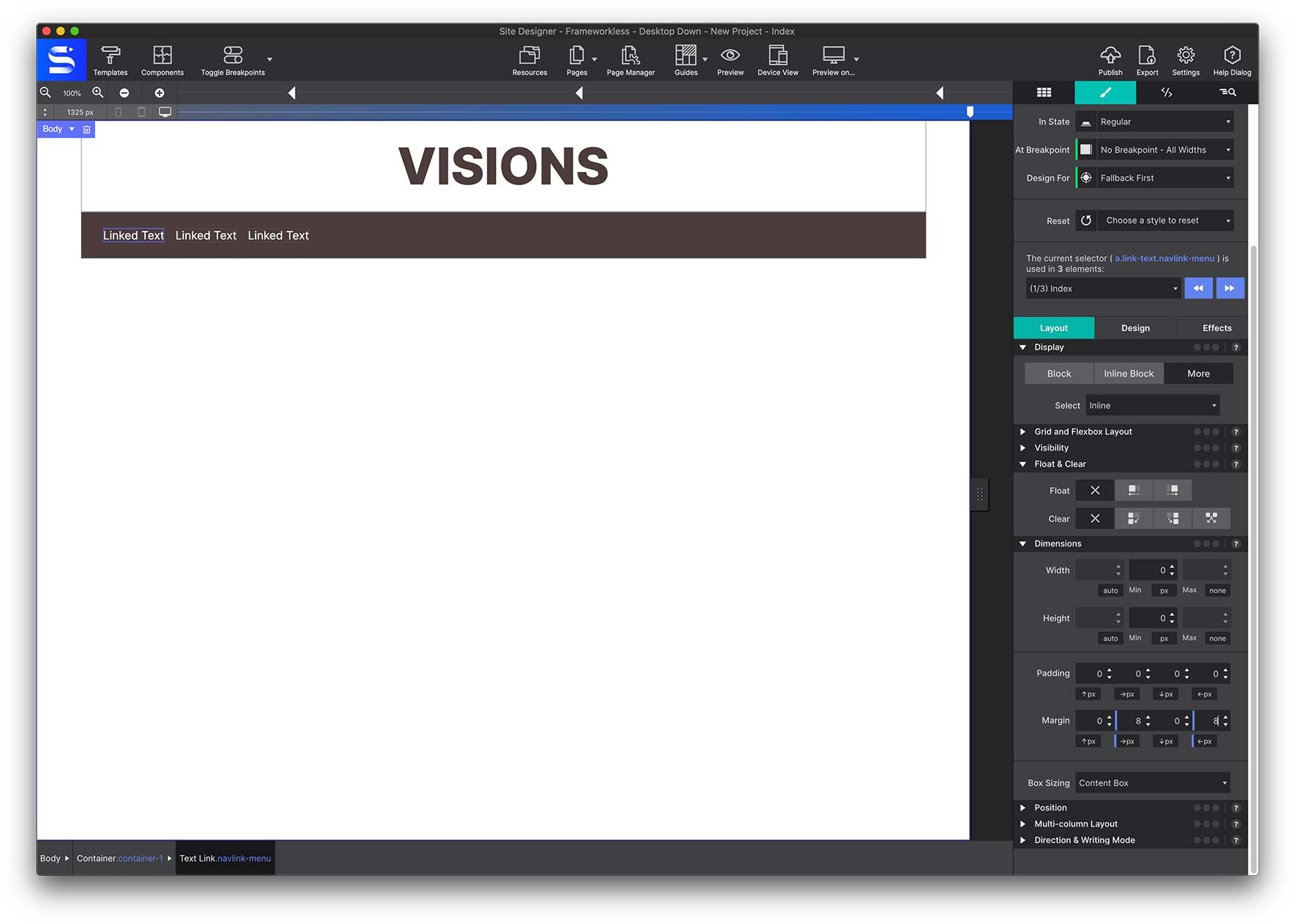
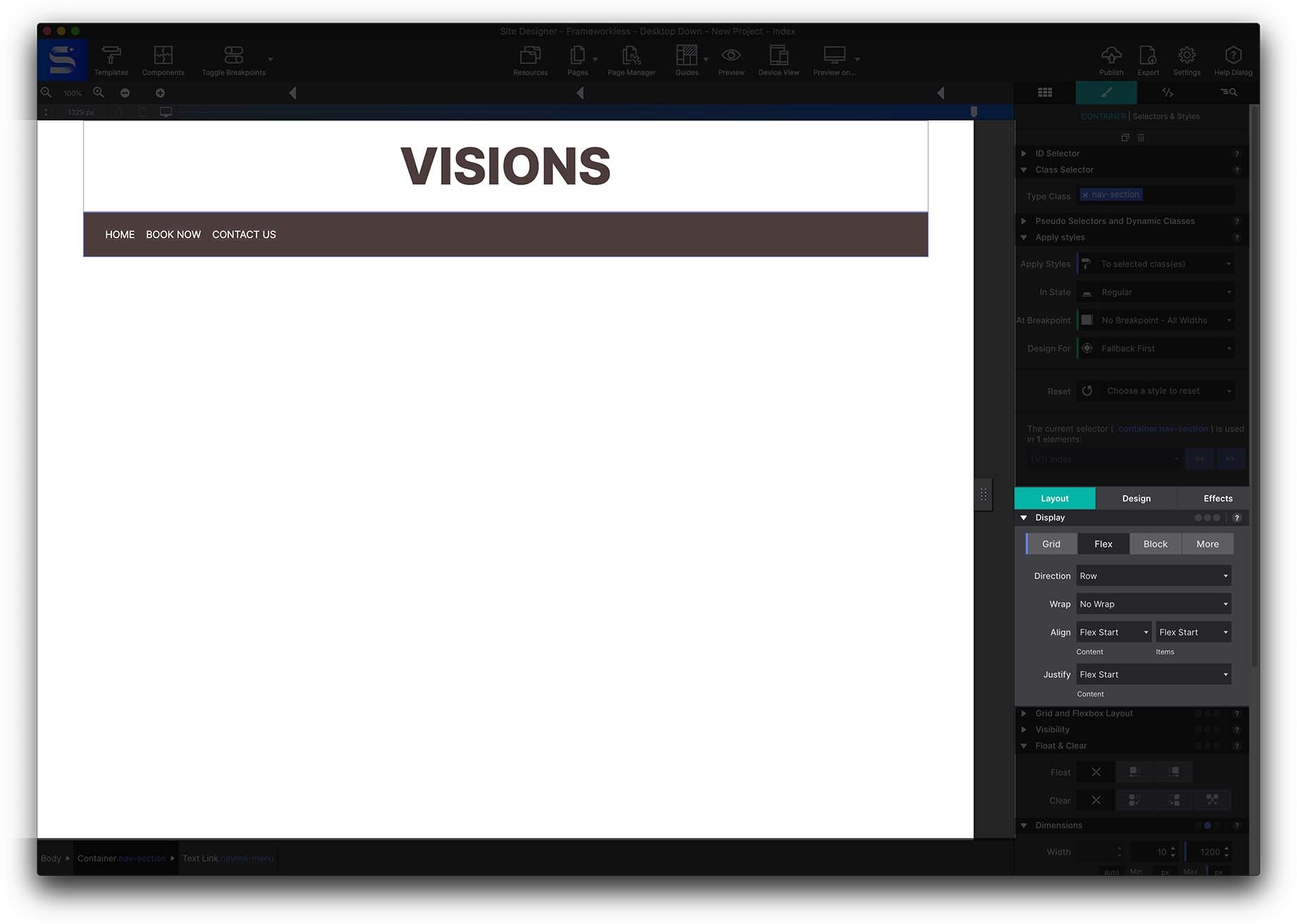
To position the menu links, we are going to apply Flexbox. This feature will allow us to choose how the elements are arranged inside the container. First, let’s apply some styles. Select the nav-section Container from the Inspector pane > Element Tree and go to the Styles pane > Design.
Next, apply a 24px padding on all sides by going to the Styles pane > Layout > Dimensions.
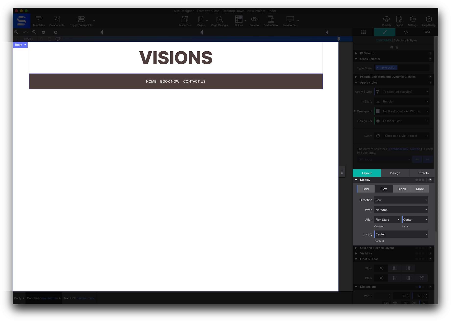
Once the padding is applied, the links can be arranged properly. Under the Styles pane > Layout > Display > choose Flex.
As it is desktop down, we want the elements to be in row, and since we want them to be centered on the page, we will select Align to center and Justify to center as well. If we wanted to change the layout of the menu items in the mobile breakpoint, we would try to change row to column.
Quick Access to the Style pane
Double click any element on the canvas or on the element tree to automatically launch the Styles pane!
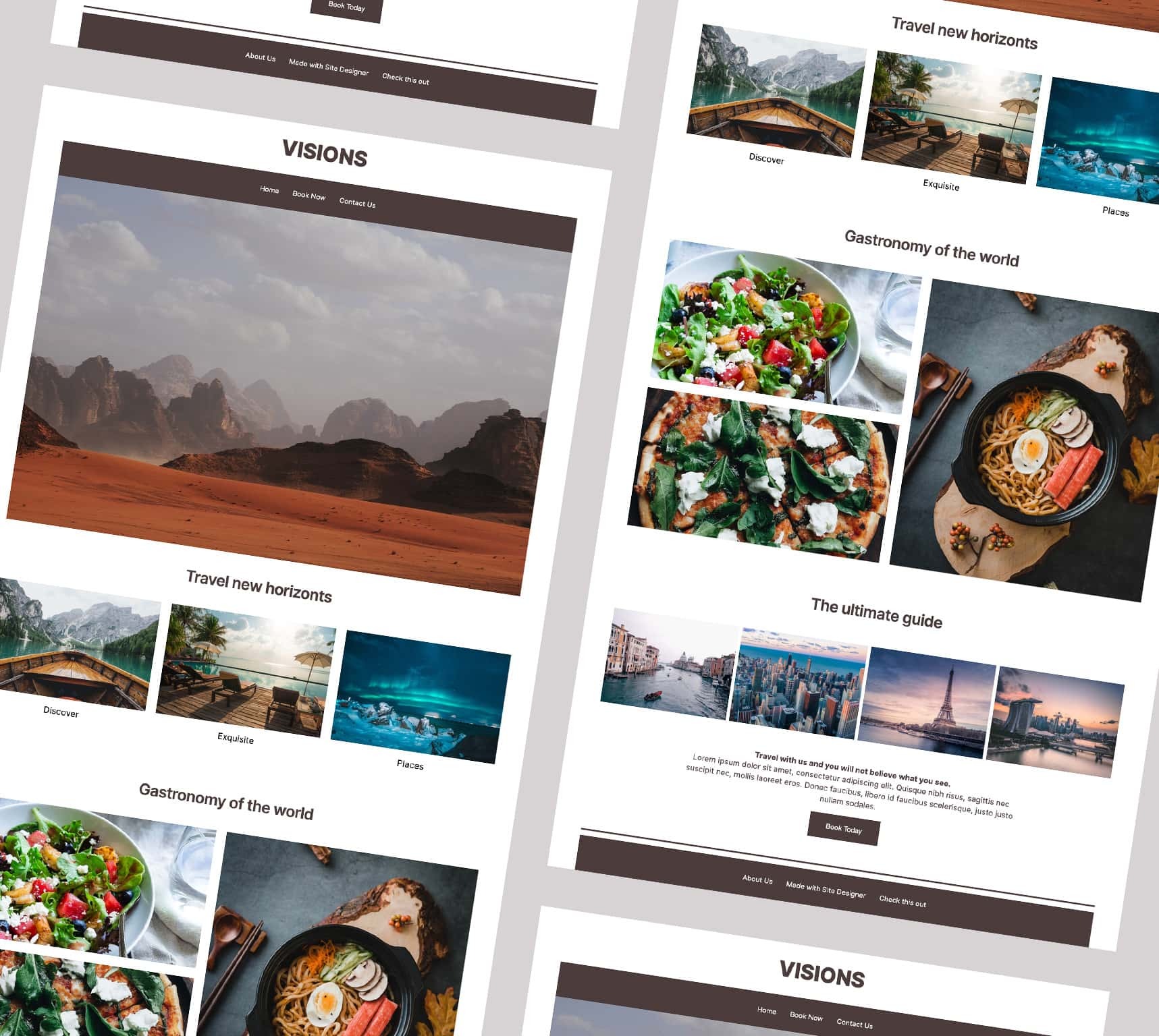
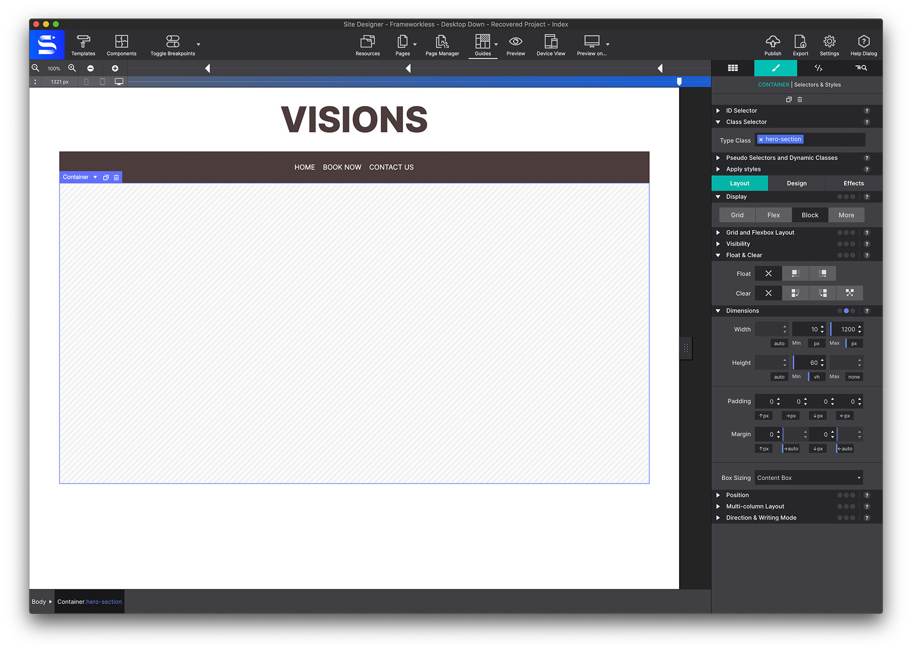
The Hero (Top) Image
Next we will create a section to showcase a main image. First, put a Main container onto the canvas, which in this case could be the Hero section.
This container will showcase a background image. Give this container a class name hero-section. To size the container, go to the Styles pane > Layout > Dimensions to increase the container size.
To load in an image, first you will need to import your image files. Click on the Resources toolbar icon. The resource dialog will appear. Click on the green Add Files and Folders button and select the image we want to insert from your local computer.
Once we have the image in resources, we go back to the canvas, and select the main container, and go to the Styles pane > Design > Background section, and click on Add Images, and select Local Image.
Once the image is inserted, we can change the parameters of the image, choose the size, and the position of the image inside the container. This example has the default options selected such as positioned center and the size Cover.
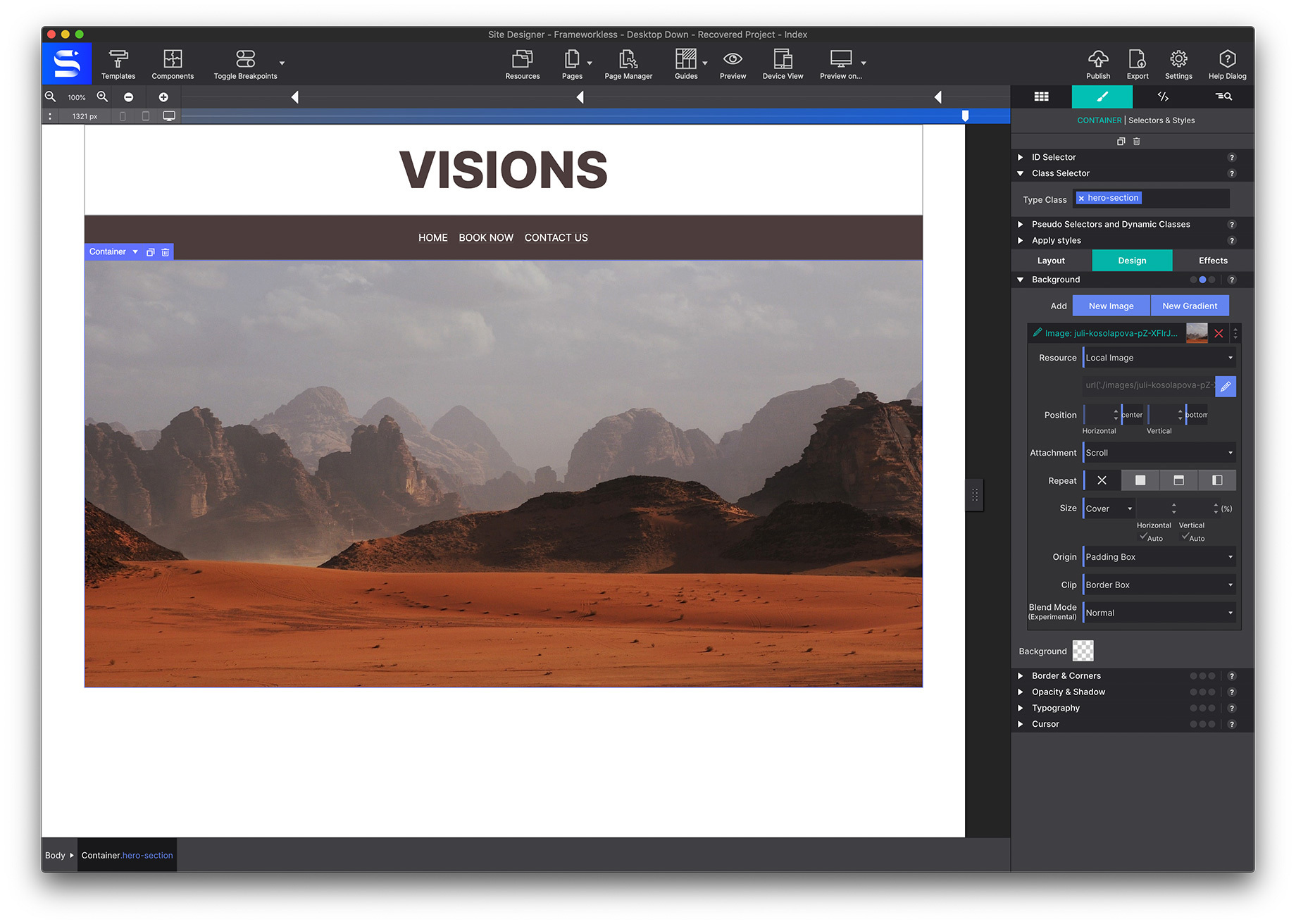
Perfect, the main image section is completed!
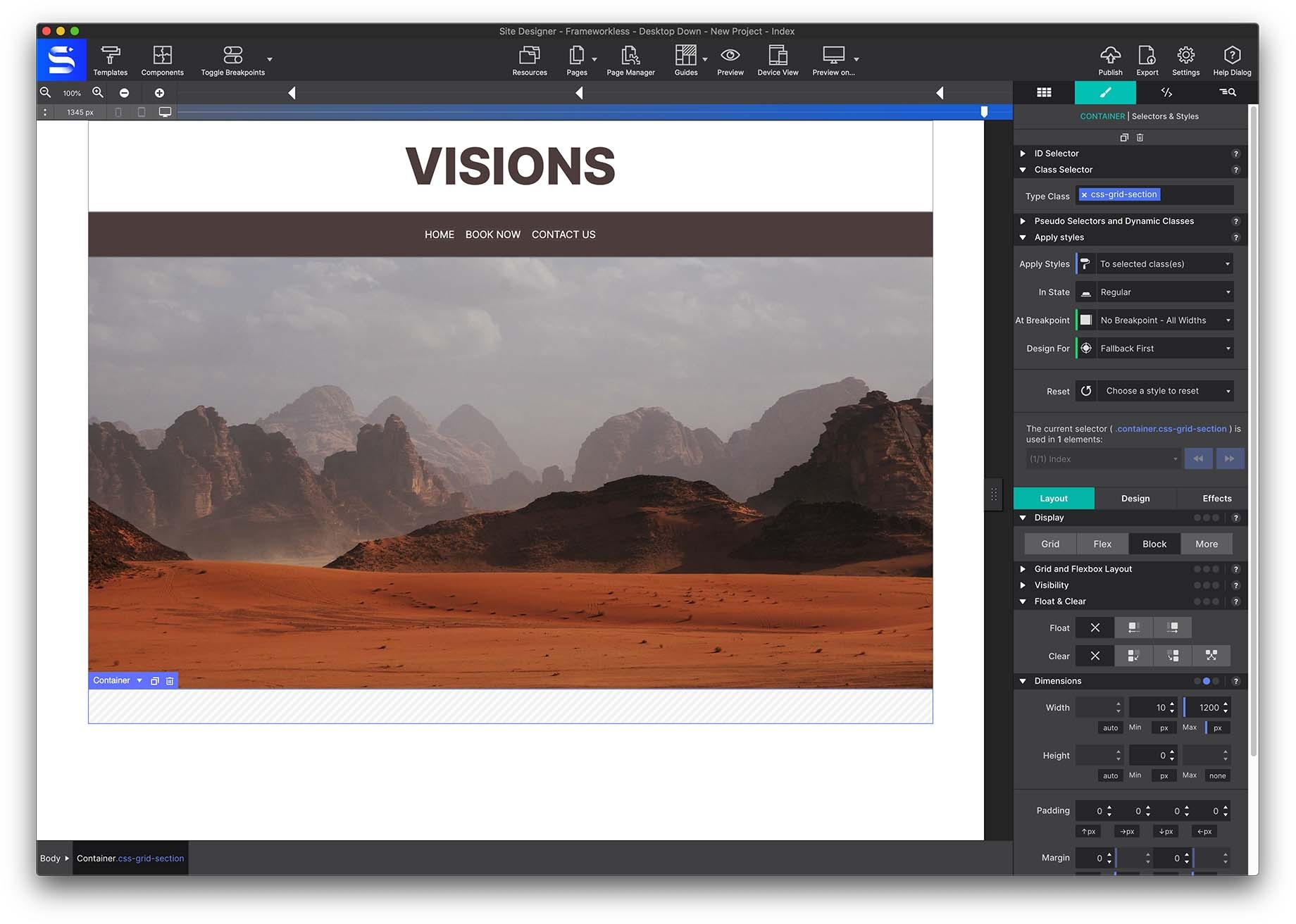
The CSS Grid Section (three horizontal images)
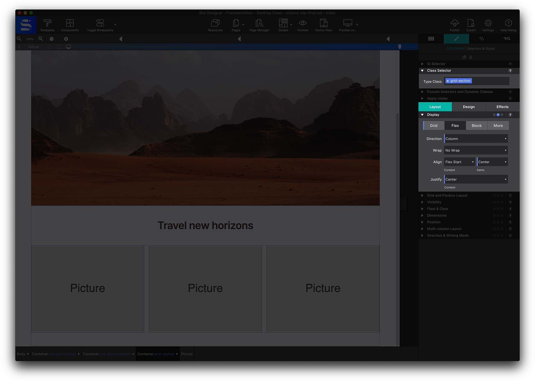
The next section is exciting because it uses CSS Grid to position the items within the parent container. CSS Grid is simply an alternative method in responsive design to position items. In this case we will use a simple grid of 3 columns.
We start by placing a regular container on the canvas, in which we are going to give the flexbox position center align property. This way, all the elements and div containers that we put inside will be centered on the canvas. Give this container the Class name css-grid-section.
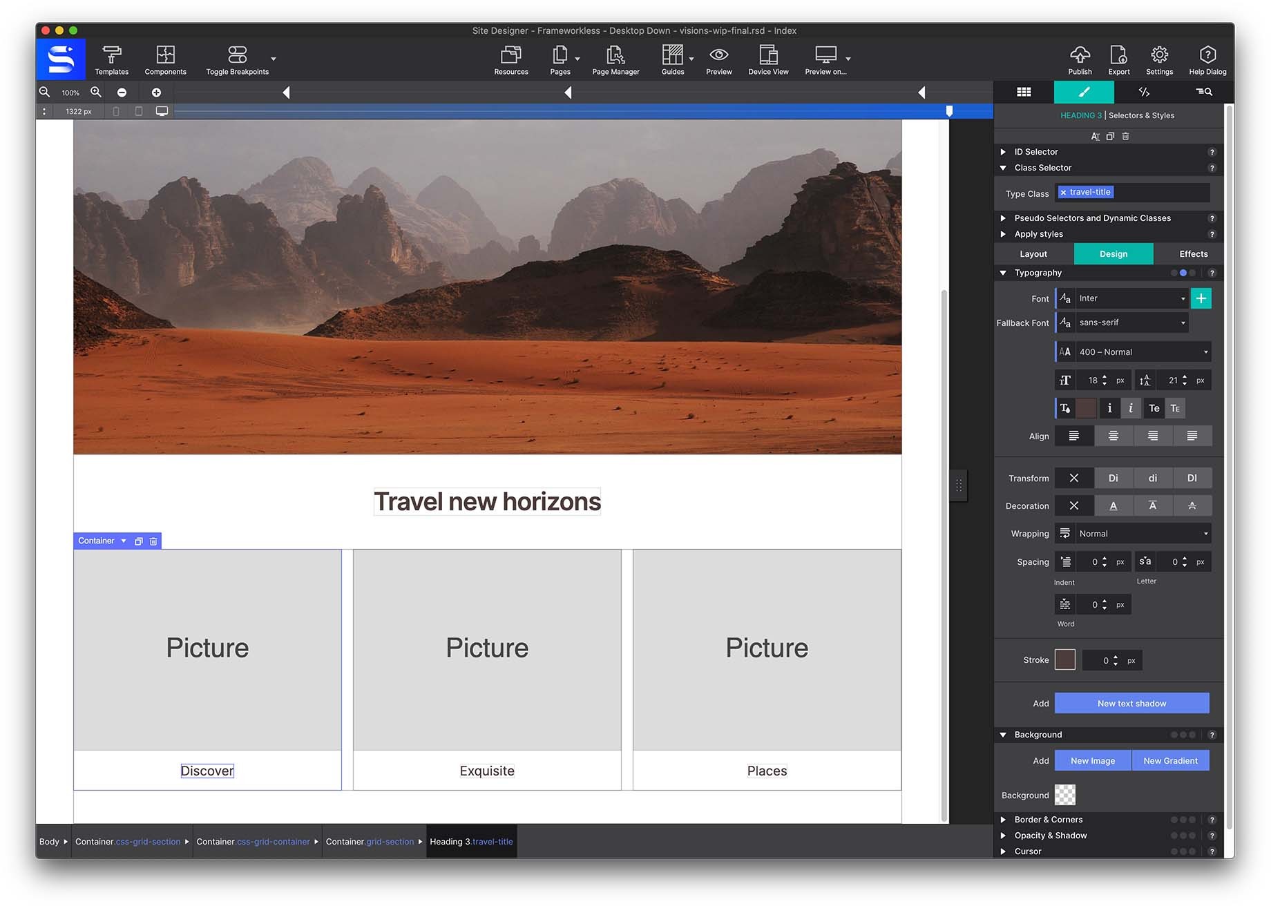
Once this step is done, place a Heading H2 on the canvas with the class name section-title. Double click on the canvas to replace the placeholder text to Travel New Horizons.
As we have mentioned previously, the classes are used to apply css styles, and they work in such a way that as long as the elements share the same class, all the changes we make such as typography, size, color, padding, etc. will be reflected. At the same time, greatly speeding up the process and helping us to keep the project tidy and clean.
The next step will be to build our CSS Grid. It is important to take the Parent/ Child concept into account. The Grid is made up of the parent container, and then the children, which are the containers, pictures, and text elements that are inside. Configuring the parent container will affect the children items nested within it.
Next, add a container in the canvas to which we are going to put the class name css-grid-container
Inside this container we are going to add 3 more containers to which we will apply the class grid-section. Inside this add three Picture elements. Hover over the Picture and use the swap icon to change the resource or use the Resource drop down on the Element pane.
To set the alignment for the parent container, select the grid-section Layout > Display > select Flex.
Once this step is done, we are going to go to the Inspector pane > Element Tree, and we are going to select the parent container css-grid-container.
Once this step is done, we are going to go to the Element tree from the Inspector pane, and we are going to select the parent container css-grid-container. With it selected, go to go to Styles > Layout > Display > select GRID.
When we select GRID, a new dialog appears on the right side of the toolbar. This is the CSS GRID dialog, in which we will be able to play with the layout of the elements inside the container. Using the +/- we are able to make a grid within the Container to position the items. For this demo, we are going to add 3 columns using the + in the top right.
By default, each column is by default with the “auto” feature, this means that depending on the size of the elements it will adjust automatically.
But in this case, what we are interested in is having 3 containers that each occupy the same space, and for this “fr” is the best option. As you can see in the image below, we select 1 fr for each of the columns, and we are also going to define the margins between these containers. In this case, we are going to put a 24px gap per column.
Using Fractional Space
The fr unit represents a fraction of the remaining free space in the grid container. The word 'remaining' is an important one here — first all the specifically defined space such as 100px or 20% is allocated. Then, if any space remains, it will go to the tracks using a fr unit. This space is proportionally divided between the 'fr tracks' according to the number of fr's.
As we explained at the beginning, we are working with a Frameworkless Desktop Down, this means that everything we change in the larger breakpoints will be automatically reflected in the smaller breakpoints, so this composition will work for desktop and tablet, but for the mobile breakpoint we are going to have to change the layout of the elements.
To do this, we are going to move the upper bar and place ourselves at the mobile breakpoint. At this point, we can just delete two of the columns, leaving just one column, and in this case, we're going to put a 24px gap but in row.
Now it is a matter of inserting the elements that we want, in this case we are going to insert 3 Picture elements with a title in each one.
To each grid section, apply Flexbox from the Style pane > Layout > Display. Shown below, in this way, the elements will appear centered within the container.
CSS Grid Area Placement Example
Now that we know how to create a CSS Grid, let's take it a step further. CSS Grid technology allows us to take the design to any level. It unlocks the flexibility to create almost any layout you can imagine.
This time we are going to play with the names of the areas called Grid Area Based Placement.
What we are going to do is duplicate the previous section, and change the name of the parent container, this time with the class css-grid-container-areas.
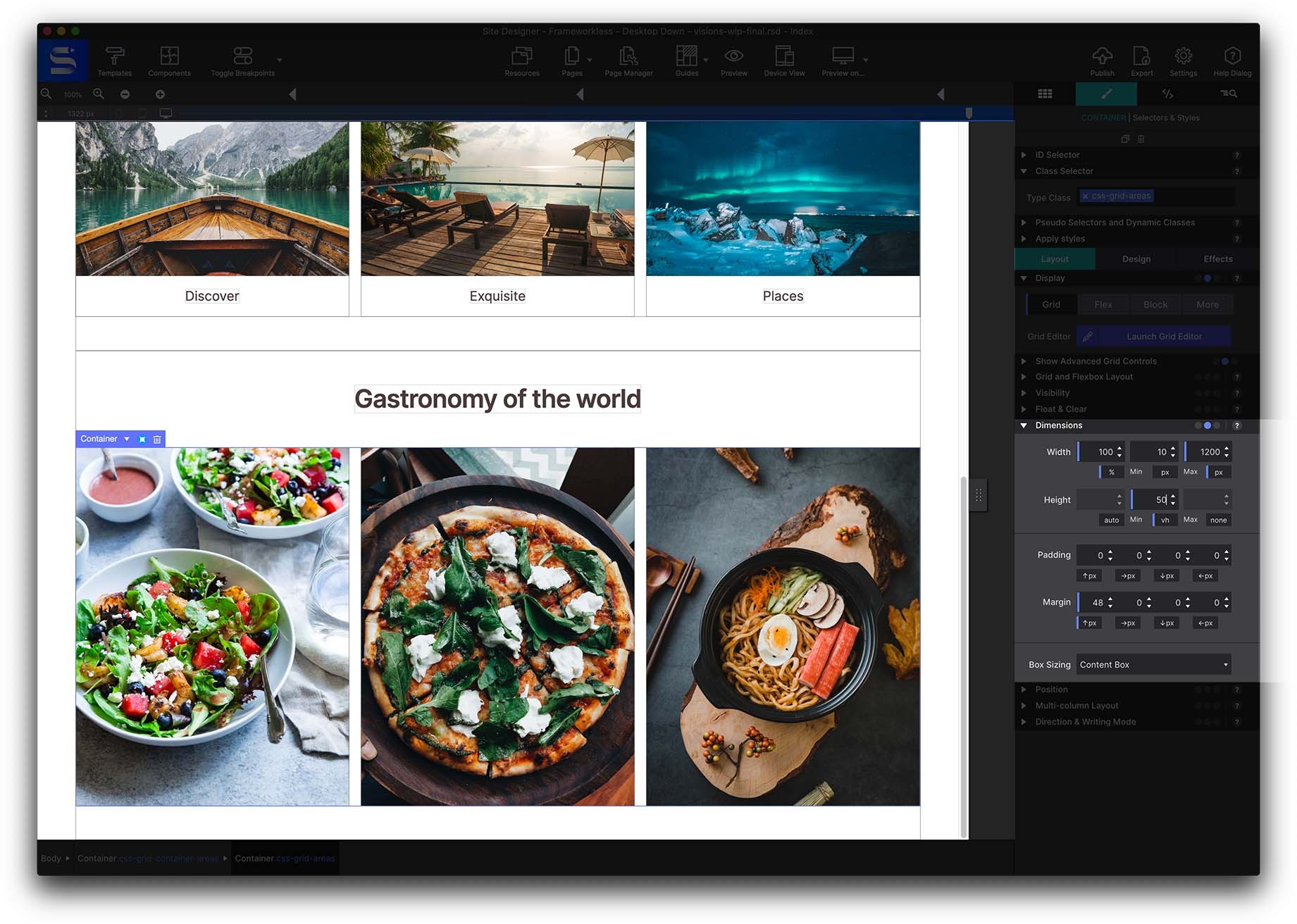
Duplicate the previous section, and we are going to change the name of the parent container, this time with the class css-grid-container-areas.
Since we already have the grid section containers, what we are going to do is add a Class to each of them, being “area-1”, “area-2” and “area-3”, as shown in the photo below.
Once these classes are added, we can change the background images by going to Styles pane > Design > Background. In this case, we are going to put 3 photos of different gastronomy.
Well, we already have the images inserted as background. We can play with the height of the parent container, which in this case is the container called css-grid-container-areas. We are going to put a minimum height of 50 vh (viewport height). In this way, it will be easier for us to visualize the changes that we are going to make next.
Next, we are going to start by assigning a name to each of the containers, so that later we can play with the grid to our liking. Use the drop down on the Styles pane > Layout > Grid and Flexbox Layout section to select Grid Area Based Placement.
When selected, you will see that a new field appears to fill in with the name. In this case, we are going to put salad, pizza and ramen, each one respectively.
In this case, it is possible that the grid in the Canvas the images appear in a disordered way, but that is okay! You need to select the parent container, and go to Styles > Layout > Grid, and open the Grid Dialog box.
Click into the center of the grid areas to enter the names previously applied to the images (salad, pizza and ramen). Be sure to remove the dot from the typing window. The dot would be used it you were wanting to leave that section blank.
At this point, you can experiment with different layouts, simply by adding more columns or rows, and as long as they share the same name. Enter the item name where you would like that object to appear within the Grid Container.
Once you are happy with the result of the layout, click on the OK button, and you will see that the layout that we just built is reflected on the Canvas.
For each breakpoint, we can change the layout, thus giving us total freedom to play depending on the device on which it is viewed.
Next, let’s create a new section, we can again copy the previous section, so we take advantage of the container with the flexbox property and the H2 Heading. Now we are going to create a container to which we will put the flexbox-section class.
Now insert 4 Pictures inside this container. Then assign the class name guide-photo-link. When it comes to Class names, it is important the names are unique so that the CSS changes we make to this element will only be reflected in those that share the same name. In this case, we are going to apply 8px margins on all sides from the Dimensions sections.
Once these changes are made, duplicate the image three times so there are four images in the Container.
Go to Styles > Layout > Display > Flexbox. Depending on how we want the elements to be displayed, we will play with the properties of Row and Column, as well as Align and Justify. Here feel free to play, that's what it's all about. Experimenting within Site Designer is simple to do. You’re able to explore fresh ways to layout content without having to know the code syntax.
The Footer
Finally, copy the menu from the header, and duplicate it, changing the name of the classes and having the footer property.
Remember that in the Page Manager, located in the upper toolbar, a window opens with many fields that will help keep your project organized, to be able to improve the SEO of the page, connect google analytics, and many more things.
Level up with the Site Designer help guide.
Site Designer gives you the power to work with CSS visually. These code-free controls allow you to experiment with new styles and layouts without having to be a pro at hand coding. Discover the power of Site Designer and start dragging, dropping, clicking, and sliding your way to an epic website.