Compare across viewports
Studies show that people are five times more likely to bail on a website that isn’t mobile-friendly or takes too long to load.
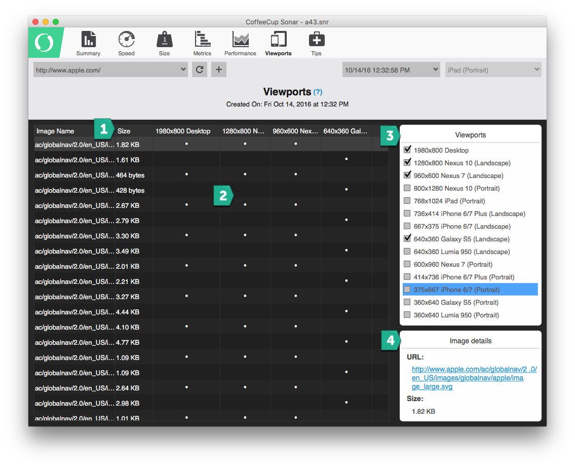
Curious how your site loads across mobile phones, tablets or desktop computers? You might be surprised to learn that it may not always load the same images for each visitor. Loading high-resolution images might be perfect for desktop users, but not so ideal for mobile users. Select from the Viewport lists and review how the images are loading across devices. Use this tool to determine if your website needs to be adjusted on a particular viewport to allow lower resolution images or alternative content to display that will speed up access to the page. You can also compare the viewports against others by checking the box.

- Size: This is the size of the file. By default they are shown in the order they are loaded. Click the column heading to re-sort them to list them in size highest to lowest or in reverse.
- Grid: Here you will see the file references found for the page scanned. The DOTS represent the file that was found on the Viewport heading. Clicking any of the column headings will resort the data.
- Viewports: Check the viewports that you want to see visible in the viewport grid.
- Image Details: Click the link to see the image.

