

Email design is not the same as web design
It is important to realize that designing an HTML email is nothing like building for the modern web. Indeed, it’s very much like the days of Internet Explorer 6 & 7 where endless tweaks had to be made so that sites would function across browsers that were using very different display rules.
While web browsers (mostly) adhere to web standards these days, the opposite is true for mail clients. Without the proper tweaks and precautions, even Outlook.com displays emails differently than desktop relatives like Outlook 2010/13.
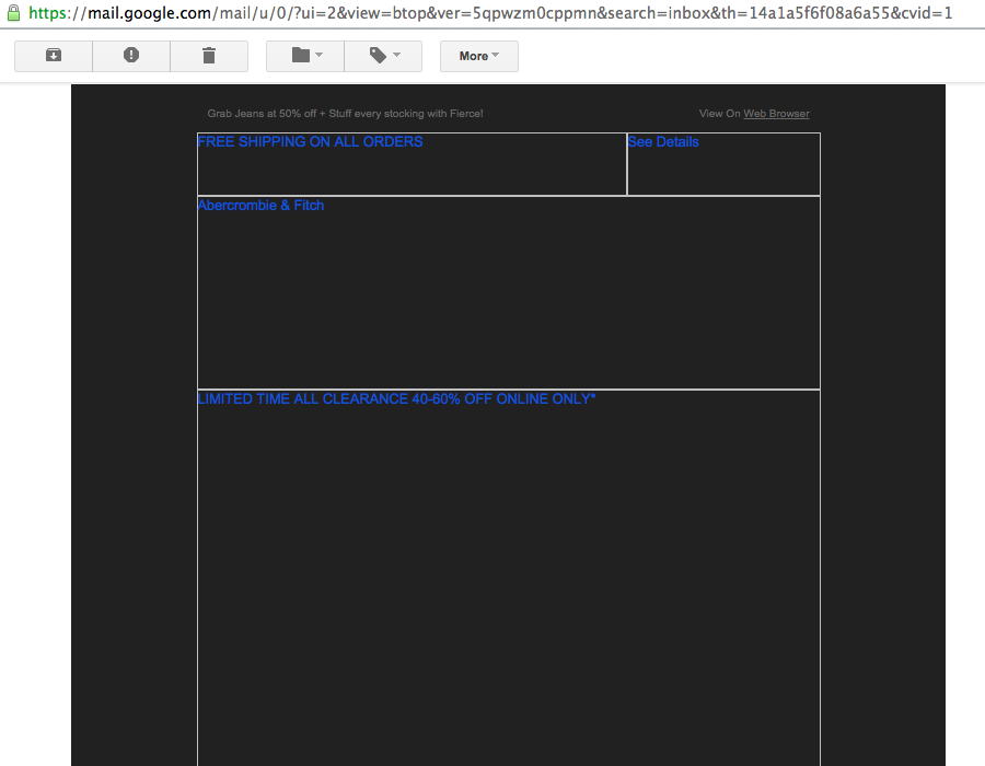
To battle that, email authors tried to revert to sending (large) images over email to broadcast their messages and promotions. Only to find that images don’t show by default in over half of emails opened.
And now with over 50% of emails opened on mobile devices first, email designers find that text on images can quickly become unreadably small on these narrow screens. That is, if the image loads at all!
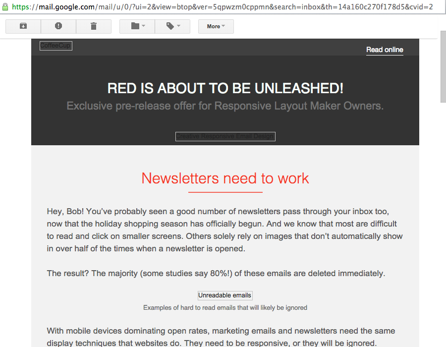
The right approach is to use HTML with inline CSS to deliver rich content to the recipients. Images are supplementary; the core message and design will always display. Enhancing the design and experience where possible was one of the most important guiding principles when we started out developing Responsive Email Designer (aka RED). The seemingly empty emails with rectangular lines? Hopefully RED will make them a thing of the past...
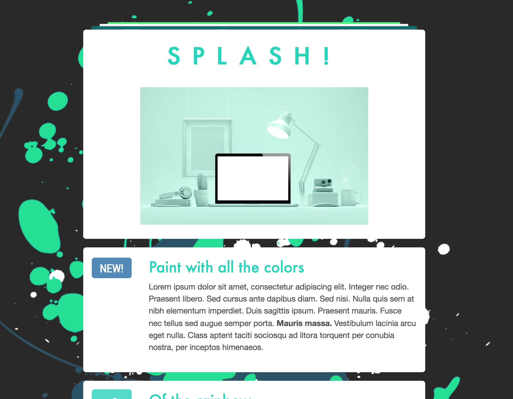
A email design overview
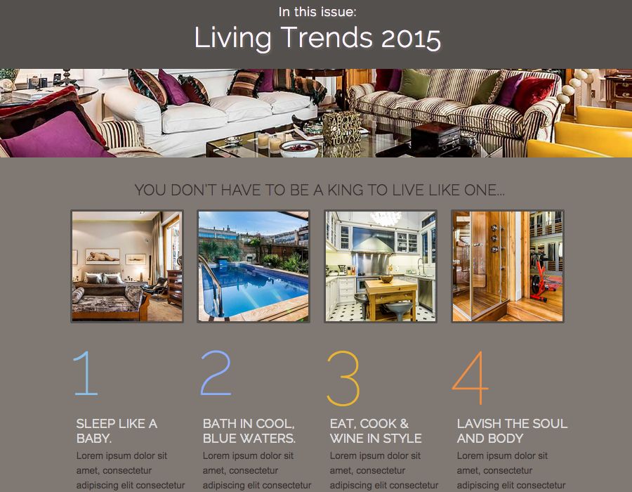
This article continues with explaining what the above means for the underlying code structure of HTML newsletters & emails. It then describes how Responsive Email Designer tackles this, creating the much desired combination of design freedom and display consistency. Progressive enhancement in email design is demonstrated with practical examples that also highlight the differences between the two versions of RED. Finally the advantages of using fluid newsletter layouts are discussed. The table of contents below can be used to jump directly to a specific section of the article.
Creating responsive HTML emails.
Design freedom, display consistency, plus custom design for mobile devices.
Creating (code for) responsive HTML Emails
Although email design is not like web design, RED does an amazing job in making it seem that way! The editing environment looks and feels like you are designing a website in a browser. Meanwhile, the underlying code structure is fundamentally different from any modern website.
HTML emails rely on (deeply nested) tables to display the content consistently across the various email clients. RED is powered by a cleverly engineered, but table-heavy, code structure that allows for reliable mobile and desktop email design with intuitive controls. If you’re interested in the hand coding part of responsive email design, we suggest taking a look at Ink — an HTML email framework created by the talented people of ZURB.
In addition, when an email is sent or exported, RED (and its server side companion) do a lot of heavy lifting to generate the final code. Which produces an email that holds its own in all major email clients. Styles are placed inline, modern CSS is supplemented or replaced with old fashioned HTML attributes, and conditional statements are smartly placed where needed (indeed mostly to battle you, Outlook).

Only strong foundations can be built upon...
The underlying code structure, together with the unique email code generator, compose the strong foundation both versions of RED have in common. It’s the complex common denominator that allows for the unprecedented combination of design freedom and display consistency.
Design freedom with intuitive controls, many of them never found before in an email editor. These tools allow for out of this world creations and gives control over the mobile design, while shielding designers and developers from the complex code.
Display consistency on all major email clients. Across devices. With the ability to make mobile specific design adjustments. Just WOW!!
This was our goal for both versions of the app; it’s what makes RED priceless, distinctive and unique. And then we were able to add some extra powers to RED for Business...
Progressive enhancement in email design
On top of the strong foundation RED Personal (and Free) offer, RED for Business features controls that can give a good boost to a solid email or newsletter design when viewed on supporting clients. In web design this principle, improving the design for supporting browsers, is referred to as progressive enhancement.
Just because the Outlook desktop clients do not show cool background images, doesn’t mean you should withhold them from readers on email clients like Gmail, iPhone, Android or Yahoo that do support them. Just make sure that your design and message remain intact for when a solid background color is displayed instead (on Outlook mainly).
RED for Business can spice up designs with background images, gradients, shadows, web fonts, border-radius and more for the growing number of recipients that use email clients supporting these styles. Send better email using accessible content and rich design without solely relying on troublesome graphics.
RED for Business is available as an upgrade for RED Personal owners. If you drop us a note here, our team will be more than happy to get you upgraded. New to RED or on the free version? Then please go ahead, get this awesome app and start creating newsletters that offer the possible best user experience on any email client.
Buy for windows Buy for osxPractical progressive enhancement examples
The examples are constructed with the controls that RED for Business features on top of the controls RED Personal offers. Design aspects that can be controlled or added with RED for Business range from Google Fonts integration to box-shadow. In addition, with the ability to use custom classes and IDs, the RED for Business workflow will feel very familiar to (website) front-end designers and developers.
There are a few more differences, such as the ability to use a fluid layout for better usability in mobile gmail and certain webmail clients. But first things first, let’s start with an overview of the design controls that are added to RED for Business:
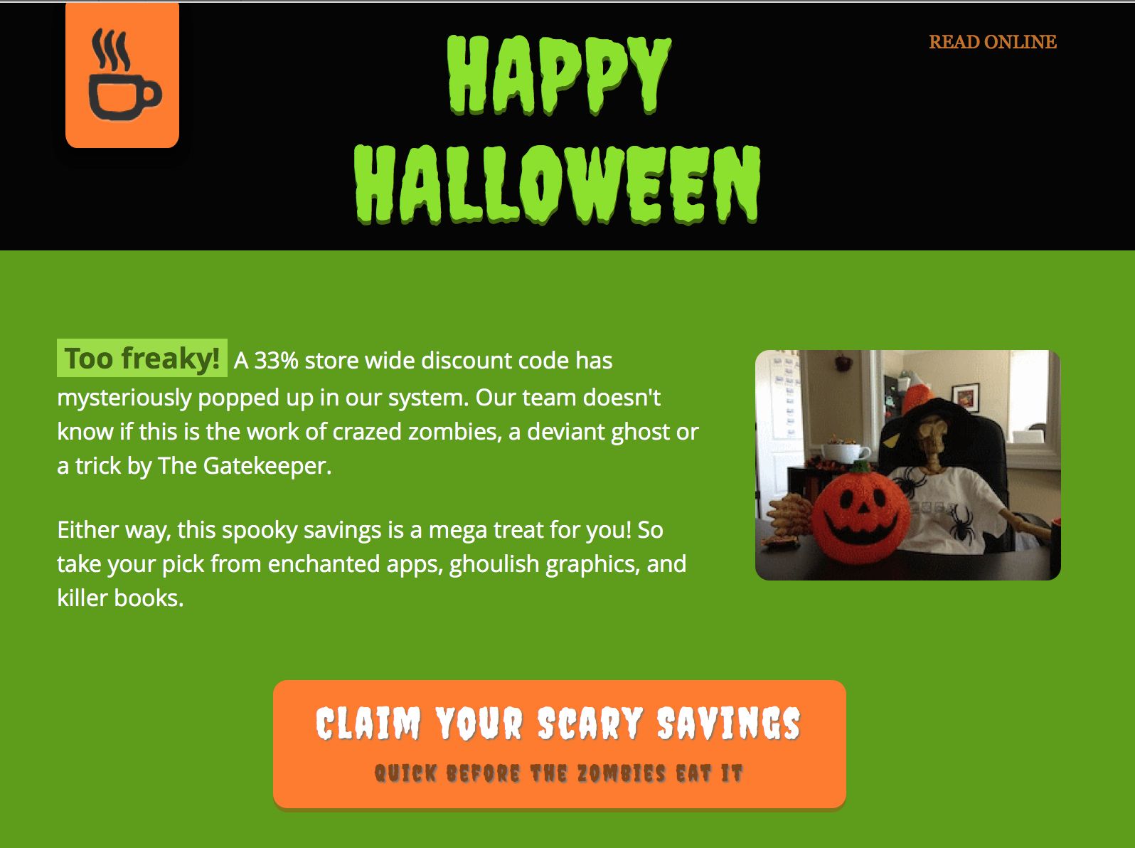
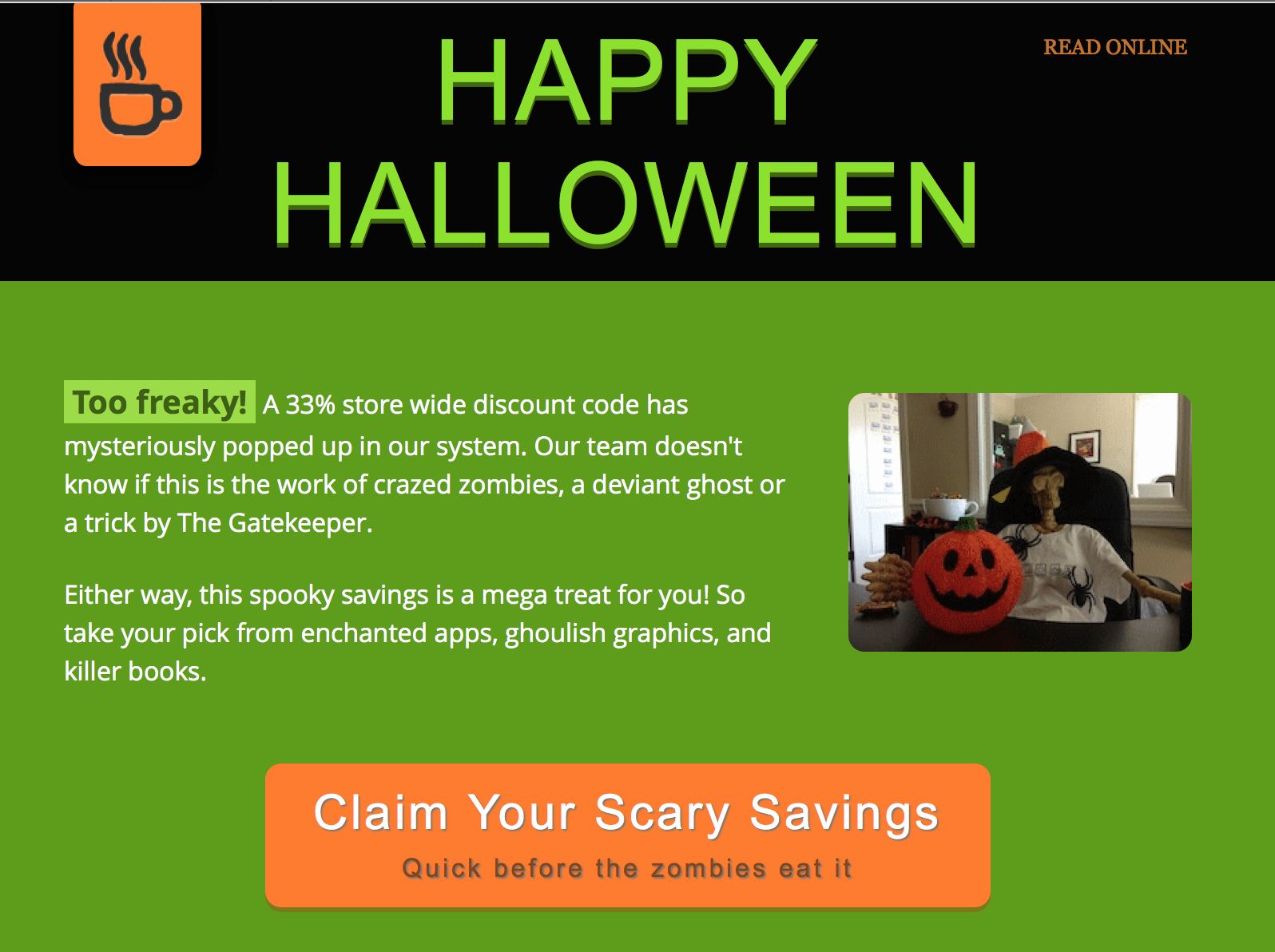
Background-image
Enhances design on: Apple Mail, Gmail, Gmail Android, iPhone, iPad, Yahoo Mail
Background images allow for a layered approach, placing content over an image, can create interesting the design effects.
The core message of the email remains intact even when the background doesn’t display (like in Outlook). The image can also be sliced and partially be used as a background and partially as normal image. In that case the email would display as seen on the right in Outlook.
Background-gradient
Enhances design on: Apple Mail, Gmail Android, iPhone, iPad
Looking at the support, background gradients are exclusive for mobile recipients. They can be used to add that little extra oomph for a mobile audience in a light-weight way (graphics are heavier and take longer to load).
Border-radius
Enhances design on: Apple Mail, Gmail, Gmail Android, iPhone, iPad, Outlook.com
Rounded corners can make the design feel smoother and more appealing. There is even research that suggests they are easier on the eyes and help to focus on the content inside of, for example, a button.

They are a great example of progressive enhancement, when not supported no real harm is done to the message, nor the design.
Box-shadow
Enhances design on: Apple Mail, iPhone, iPad, Outlook.com
Shadows add a sense of depth and liveliness to a design. Sometimes though a very similar result can be achieved by adding a darker colored border as in the example below.
Margin
Apple Mail, Gmail, Gmail Android, iPhone, iPad, Outlook.com, Yahoo, (partially) Outlook 2007/13
For some reason unknown to normal mankind, Outlook email clients (2007 - 2013) have never supported padding and width settings on paragraphs and divs. Even more mysteriously, Microsoft dropped support for margins in Outlook.com (Hotmail) in early 2013. In the meantime, margins are supported in the Outlook email clients. Confusing, right?
Luckily you don’t have to worry about this, RED solves the spacing issues automagically. The padding controls have been implemented so they have the same effect across email clients, including ‘The Outlooks’.
Margins work on all elements across email clients as well, with one exception. On rows and columns the Outlook desktop clients will ignore it. They can be helpful for more complex or creative designs, but to prevent potential issues we decided that the margin controls only had a place in RED for Business.
These CSS properties don’t always work without RED
Several of the CSS properties discussed here, including margin, won’t work naturally on all email clients when used outside of RED. Special techniques are used when generating the email that apply design styles and settings as broadly as possible.
Min-height
Enhances design on: Apple Mail, Gmail, Gmail Android, iPhone, iPad, Outlook.com, Outlook 2007/13
A minimum height can, for example, be useful to give columns the same height, independent of the content.
Text-shadow
Enhances design on: Apple Mail, Gmail Android, iPhone, iPad, Outlook.com, Yahoo Mail
Emails have to be able to shine without fully relying images. This makes typography in emails even more important than on a website. Shadows can help to make certain texts standout, make them more appealing or add style to the overall design. They can also be used in creative ways...
Unfortunately this is not supported by the Gmail Web Client and the Outlook desktop clients.
Vertical-align
Enhances design on: Apple Mail, Gmail, Gmail Android, iPhone, iPad, Outlook.com, Outlook 2007/13
Mainly useful in combination with the minimum height control.
Web Fonts
Enhances design on: Apple Mail, iPhone, iPad
Support is a bit limited, but it can greatly enhance the experience for recipients that can view them. RED for Business allows you to select a fallback web safe font too.
Word-spacing
Enhances design on: Apple Mail, Gmail, Gmail Android, iPhone, iPad, Outlook.com, Yahoo Mail
Create additional (or less) space between words.
That concludes the overview of design controls that are added to RED for Business. From this, it will be clear that this ‘big brother’ gives a significant power boost, but can also be more daunting to operate. There are a few more differences that we need to talk about to complete the comparison.
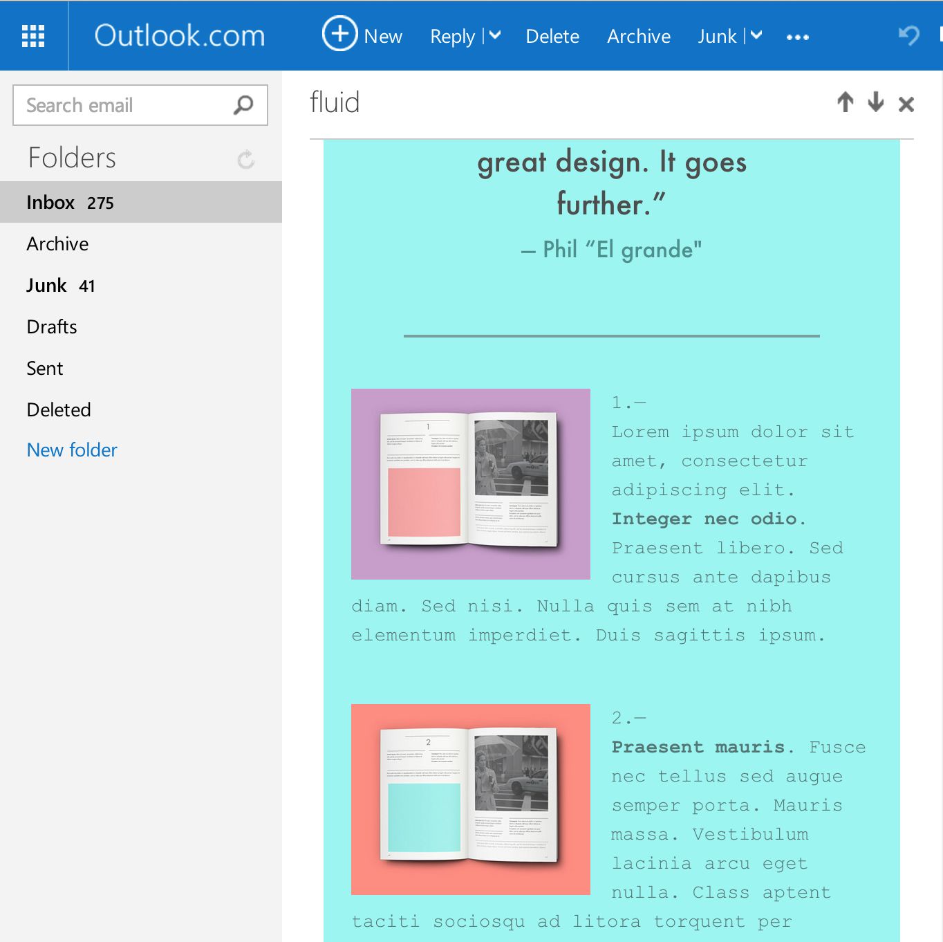
The fluid future of email design
Whereas fluid websites have been around forever, email designs and templates that use a fluid layout for both the desktop and mobile design are not easily found.
The email editors of newsletter sending companies like Mailchimp or Campaign Monitor don’t support this layout type. Hand coding solid fluid layouts is tedious and making campaign or design specific adjustments is time-consuming. However, fluid layouts hold several advantages over a fixed layout, both for mobile and desktop email clients.
Fluid layouts and web email clients
On smaller desktop screens and for people that prefer to narrow their browser window, the right part of a fixed size email can be cut off. If they want to read the right-side of the email, their either have to scroll or increase the display width.
In a fluid layout design, the content ‘flows’ down and adapts to the available display width. This does not happen everywhere. The most used desktop client (Outlook) only accepts a fixed variant and will still display a scrollbar when the email does not fit.
However, with two out of the three big webmail clients, Gmail and Outlook.com, supporting fluid layouts, there is a large audience that can benefit from a fluid design.
Fluid layouts and mobile email clients
Of all mobile opens, the vast majority of emails get opened on an iOS device. With support for fluid layouts and media queries and a whole series of cool style properties, emails can (and should) be made to look their best on the native iOS email clients.
Unfortunately, the Gmail mobile app does not support media queries and therefore does not allow for mobile specific design adjustments. Going from a 3 column design to a single column can’t be controlled in detail. (Since this was not addressed in their recently released inbox app we assumed Google is not going to fix this anytime soon, so we started working on a potential solution for one of the next releases. Fingers crossed!)
The good news is that the Gmail app (and ‘inbox’) do support fluid designs and a reasonable amount of CSS styles. This means that emails can be made to look pretty good on these apps too. The layout will be the same as the desktop version, but adapted to fit the available width. The content will flow down and as long as the desktop version does not use over two columns, the design will hold it’s own.
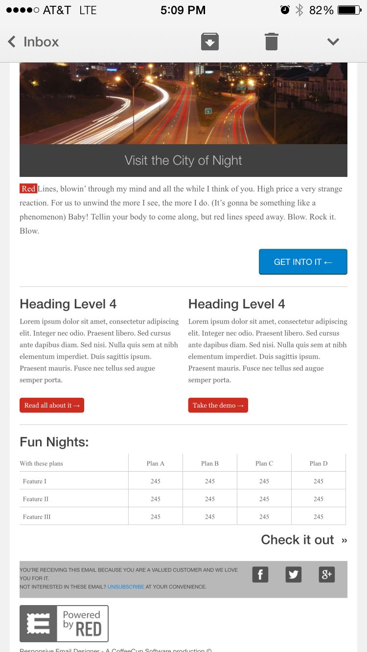
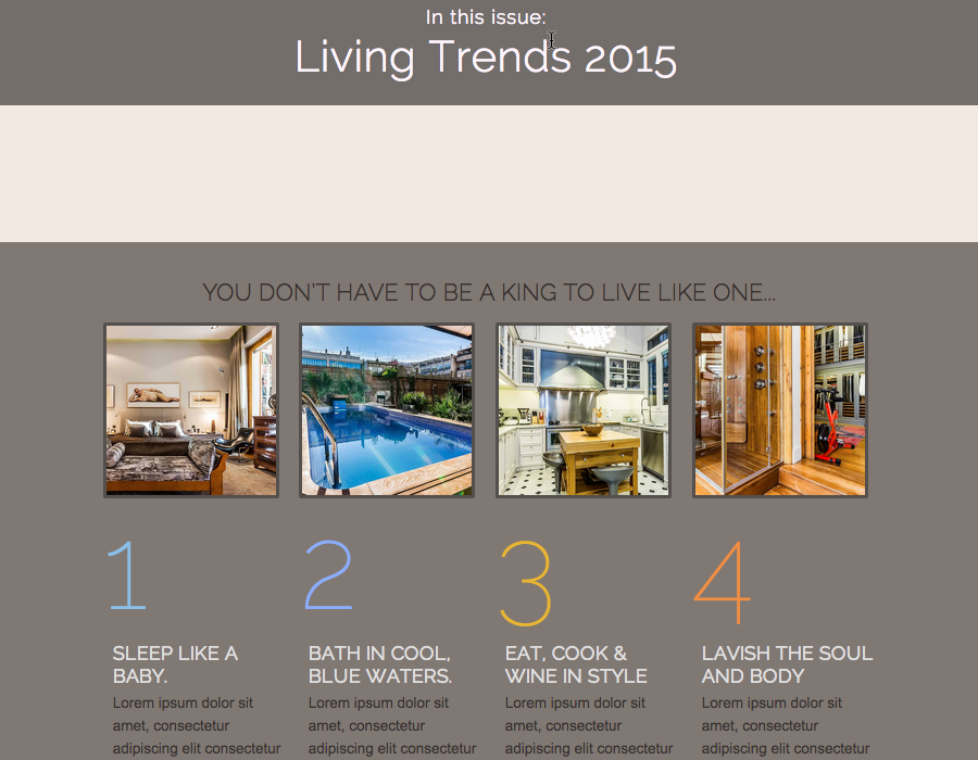
The flowing can become unpredictable for small columns though. Therefore, it is safer for desktop focussed designs that use more columns, to use a fixed layout. In this case the design will be ‘zoomed out’ to fit the screen width As can be seen above this makes everything appear (a lot) smaller, but with the exact same proportions as the desktop design. Being a bit more predictable, the table in the email would for example not work in a fluid layout, we decided to make the fixed layout the default for RED Personal.
Using RED for Business, the choice is yours! Depending on the design,audience or client, you can decide what layout type is the best fit. Until we crack the ‘adapt for Gmail app’ secret...if we solve that, fixed designs loose their last (but until then very valid) right of existence….
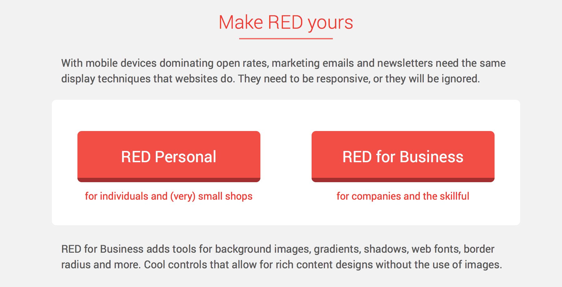
Email Designer for Business or Personal?
All the controls and tools mentioned above certainly give RED for Business an edge over RED Personal. But they make operating the app a bit more of a challenge at the same time. So which version is right for you?
RED Personal is for individuals and small business that want the flexibility of writing and adjusting their newsletters. For this version, we focussed on ease of use and display consistency with little or no exceptions. RED Personal can be used to design and create simple yet solid email marketing campaigns.
RED for Business takes email design and newsletter creation to a new level. This version is for designers, digital agencies and businesses that want to create exceptional newsletters and promotional campaigns. Seasoned front-end designers and developers that have shied away from HTML email design and coding will love the familiarity with a normal web design workflow.
Want to start out with RED Personal and maybe upgrade later? No problem, the projects are fully compatible, and our staff is happy to help you out. Just drop us a note here, and we will get you going!