

How to Create an Off-Canvas Menu
The Foundation CSS framework offers the ability to create a stylish off-canvas navigation menu. As you can see in the interactive demo below, when the menu is triggered, the navigation will slide into place on the screen pushing the website content aside. Upon close the menu will hide again from the screen.
Within Site Designer this is really easy to implement. Follow along as we teach you how to put this feature into action within your project. Download the project to use as a reference with the step by step instructions below.
A page with an off-canvas menu is organized into 2 Container elements. One Container will be used for holding the navigation menu while the second Container will serve as the wrapper for the page content. Before you begin, be sure your slider is in mobile position (to the left of the first breakpoint) as Foundation uses a mobile-first workflow.

Configure the First Container
Start by adding the first Container element to the canvas.
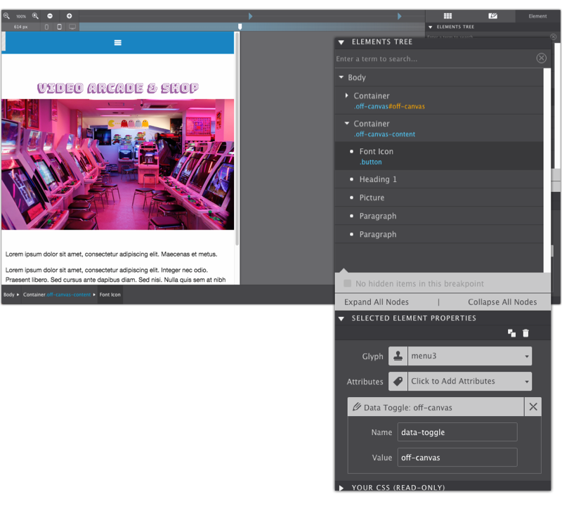
One the Style pane, give the Container element the Class name off-canvas. You'll also give it a unique ID on the Style pane > ID Selector section. In this example, the ID is set to off-canvas.
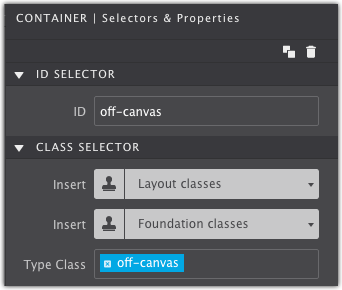
Lastly, apply the attribute data-off-canvas to the Container element on the Element pane under Properties.
Setup the Second Container
Next, we’ll work on the second container which will serve as the wrapper for the actual page content. With the Body selected (from the canvas or the Element pane) add a Container element to the canvas. Use the Element tree on the Element pane to make sure they are not nested within each other.
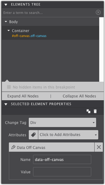
Give the Container element the class name off-canvas-content on the Style pane. Then apply the attribute data-off-canvas-content under the Element pane > Properties.
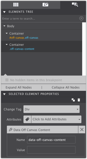
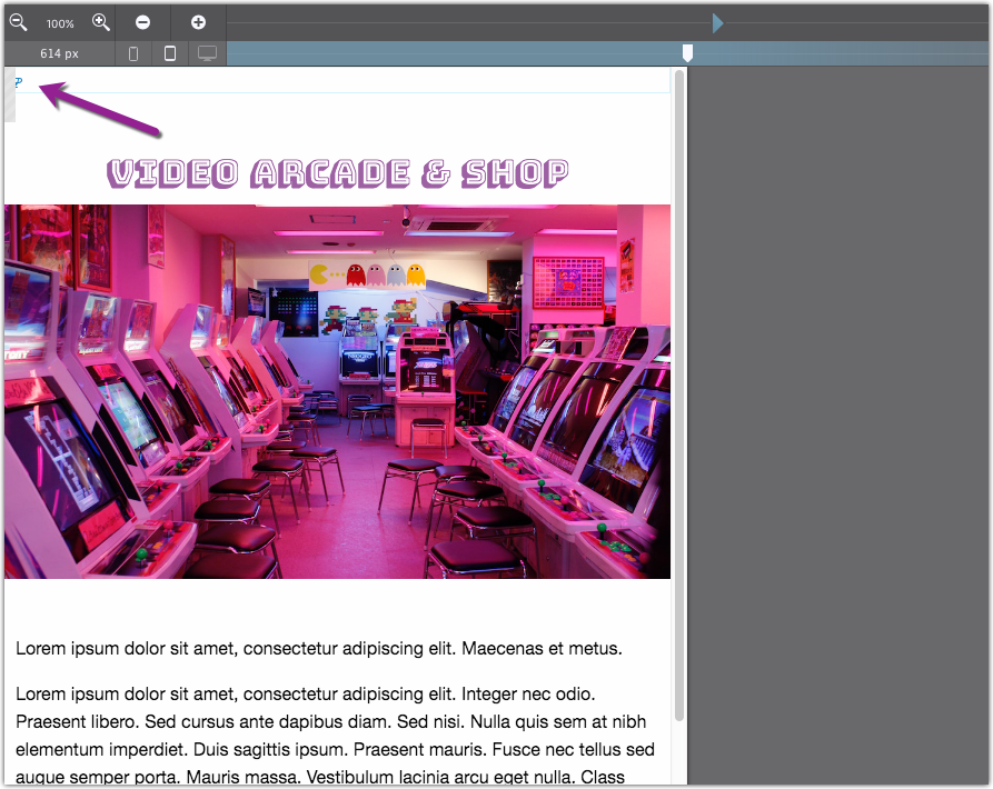
In the example, some placeholder content has been added to the second container for demonstration purposes (a Heading, Picture and Paragraph elements). You would replace this with your own custom content.
The Trigger Buttons
You’ll need a way to turn on and off the menu. These buttons can be styled however you like with icons and text.
Trigger Button One — Open Menu
Add a Font Icon element to the canvas. If it drops to the bottom of the canvas, drag and drop it to the top. At the top, it might be hidden by the off-canvas Container illustrated below. Don’t worry, with a little bit of styling we’ll fix that.
This button will serve as the trigger to activate the menu. Give it the class name button. Then apply the attribute data toggle with the value matching the unique ID you gave the off-canvas menu container.
Afterward, you can apply any styles you’d like to the button such as changing the text, color, size, etc. Under the Element pane > Properties section you can change the Glyph to the popular hamburger style menu icon.
Trigger Button Two — Close Menu
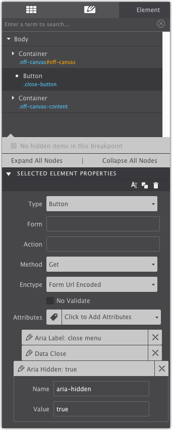
The second button will serve as a close button. Drag and drop a Button element into the off-canvas Container. You might find it easier to use the Element tree on the Element pane to move the Button into the container.
Change the text and give it a label such as Close or use the letter X to help the user identify it as a close feature. When viewed from on a desktop machine the menu can be closed by clicking anywhere outside of the menu container. The close button is important for mobile viewers as they will have the ability to close the menu from their device. With the button in place you can apply any styles you’d like.
Give the Button the Class name close-button. The last thing you’ll need to apply the following three attributes:
aria labelwith the value close menudata closearia hiddenwith the value true
Design Menu Buttons
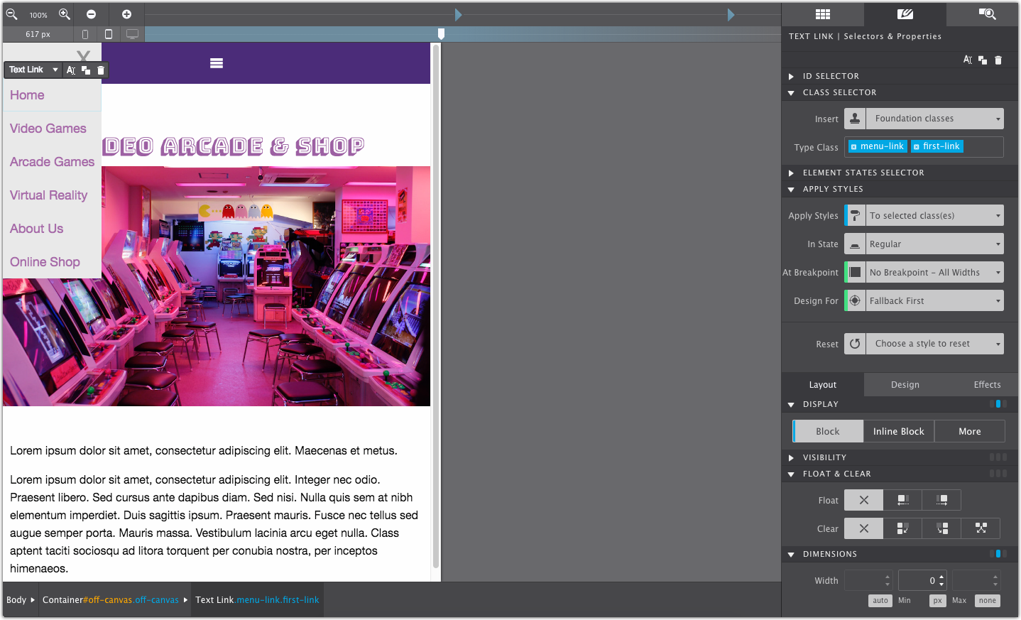
The final step is to create your navigation links. Select the off-canvas Container on the Element Tree then add a Text Link element. It should pop right into that Container. If not drag-n-drop it into the right place.
After you add the Text Link element to the canvas give it the Class name menu-link.
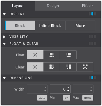
Under the Style pane > Layout > be sure the button is set to Block. This will allow the Text Links to stack. Apply any other styles such as margin & padding, color, size. Double click on the canvas to replace the placeholder text with your link term. Apply the link destination in the Element Pane > HREF box.
Duplicate the button a repeat for all the links your menu requires. Double click on the canvas to change out the placeholder text.
The last thing we show here in the example is we added a second Class name first-link to the top link in the list to apply some top margin. That will space the links apart from the close button. Alternatively, you could nest all the links together in a Container and then positioned that accordingly, but the second class was the easiest method.
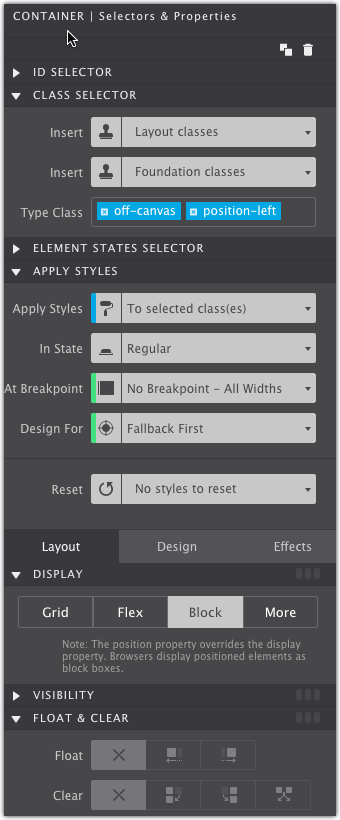
Position the Menu
The final step of this tutorial is for positioning the off-canvas container. The Container will need a positioning class to determine which side of the viewport it opens from. You can choose:
position-leftposition-rightposition-topposition-bottom
In the example, the menu will appear on the left side so the position has been set to position-left.
Editing Content With A Hidden Position Class
When the position class is applied, the content will become hidden from the canvas. Due to how the markup is written, that hidden content cannot be brought up for editing. That’s because the app reads the code as an intentional hidden field.
If you need to edit the content in the future, you’ll need to first remove the positioning class from the off-canvas container. This will bring the Container and the menu links into view on the canvas for you to manage. Once you’re done making your style and layout changes, re-add the positioning class to re-hide the content.
Success!
That was easy-peasy to implement. If you already have your project built and want to put this menu into place, use the Element Tree to drag-n-drop your content into the appropriate container element.
Get Site Designer Today!
Site Designer is the cutting edge solution for rapid, code-free, website design. The app provides a suite of layout and style controls so you can craft a website that stands out and helps your business grow. Purchase Site Designer and get free upgrades for one year plus discounted updates after that timeframe. Check out the stunning theme collection and watch detailed video tutorials to help you get started.