

Customizing the Mega Menu component for your Site Designer website.
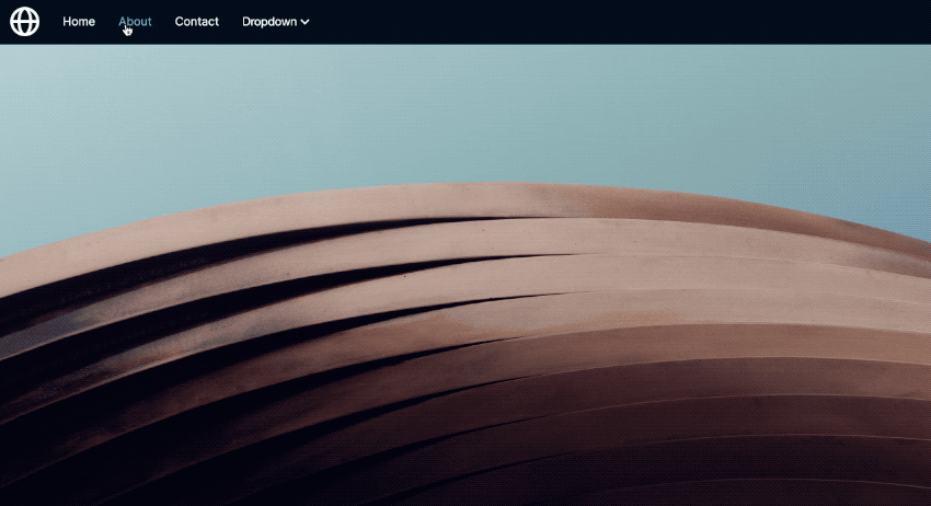
The Mega Menu is a unique navigation component. It includes your standard logo with page options. But the stunner is the drop down menu option that features additional links with a large hero heading.
This component is sure to make your website stand out. Available for all 4 framework options in the Site Designer. In this tutorial we will show you how to edit this feature to import it into your project, customize the options, and adjust its characteristics.
Import
Once you download the component from the component shop, you will first need to unzip the file. This will give you all four framework component files.
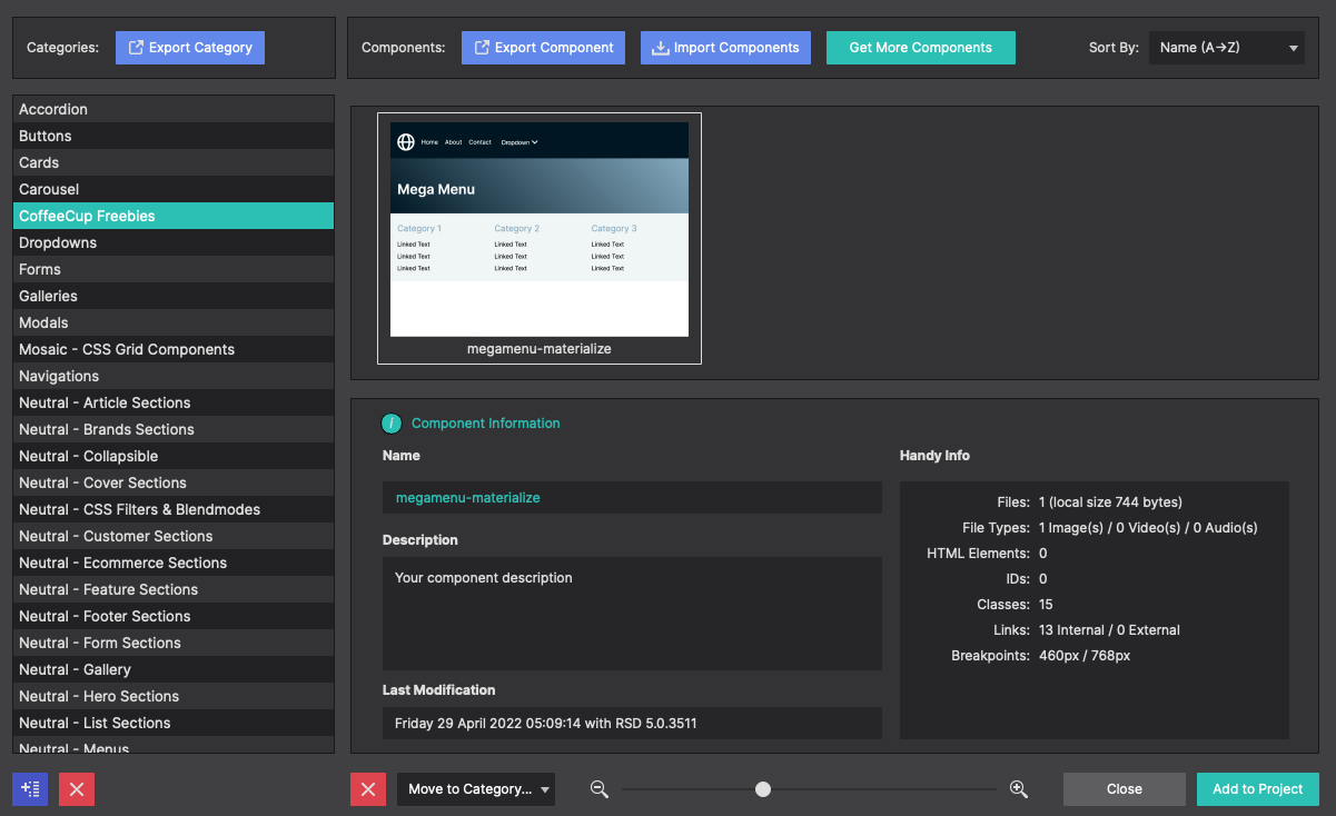
Open Site Designer and choose File > Import Component. You may select one or all 4 mega-menu.cccomponent files to import into the app. You will be asked if you want to import it into a category within your library. We made a folder called ‘CoffeeCup Freebies’ or make a folder for 'menus'.
Once the import completes, open your website project, or go to File > Templates > Blank to start a fresh website project.
Framework Specific
In this demonstration we will use the Materialize framework. When starting a blank template, be sure to choose the Materialize option to follow along with this tutorial. The other frameworks will also work in a similiar manner.
To load the component into the canvas, click the Components toolbar icon. Locate the imported menu from the list and choose Add to Project.
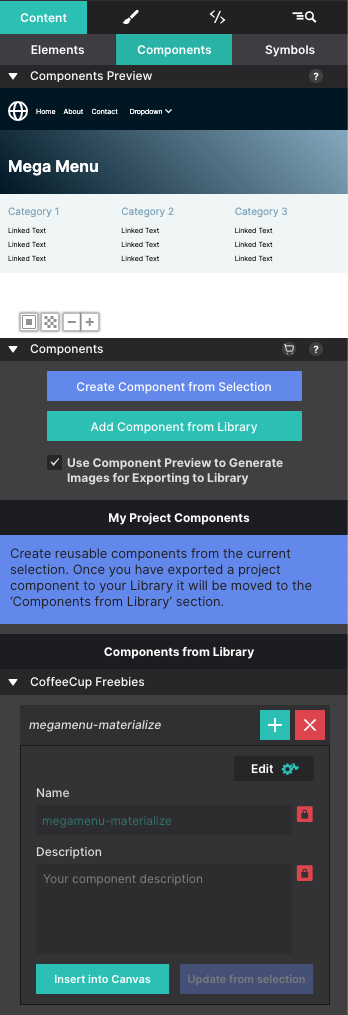
Next, go to the Content pane and choose the sub panel Components. This section will include any components you have within the project. Click the button Insert Into Canvas to inject the menu onto the page.
Customize
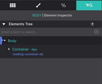
Using the Inspector pane > Element tree you can see the menu is organized into three nested container elements. The parent container (the top level container) is the ‘holding-container-dd’ Container Nav. This controls the overall size for the children within it. The children consist of a Container wrapper (holding all the navigation bar and the hero heading) as a Container holding all the navigation links.
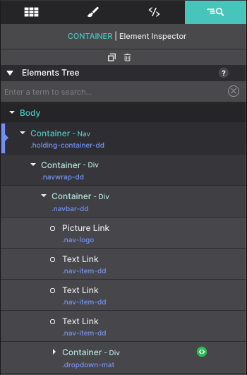
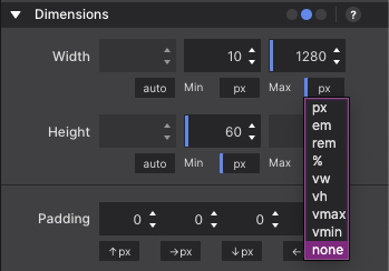
Currently, the menu is restricted to a max width of 1280px wide. Let’s say you want to change the size of the menu so that it extends full screen. You would need to select the parent ‘holding-container-dd’ Container Nav.
Double click it from the Element tree to launch the Styles pane. Then go to Layout > Dimensions. Change the Max-Width to NONE.
Watch your Workflow
When altering your styles be sure that your slider is at the default location. With Materialize, the workflow is mobile-first. This means that the styles need to be made for smallest screens first, this way they apply for all higher viewports. So in this demonstration, the slider needs to be located to the left of the 500px breakpoint.
Unsure what your workflow is? The arrows on the breakpoint bar will show you. They point up for a mobile-first workflow and down for a desktop design.
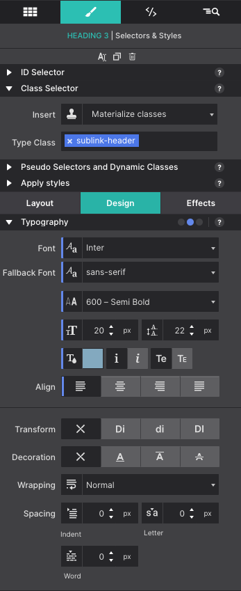
Change the text right on the canvas. Right-click or triple-click on the canvas to launch the text editor. Formatting the link colors, size, or font may be changed on the Styles pane > Design > Typography section. Changes made here will apply to all the items of the same class name. This way you don’t have to alter each link item.
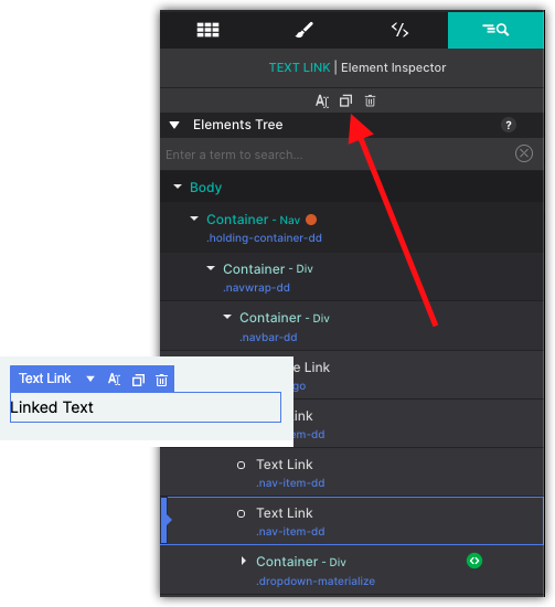
Need additional links in the menu? Using the Duplicate button is the fastest way to inject them into the menu. You can also hover over a Text Link on the canvas and use the context menu that appears to access the Duplicate button.
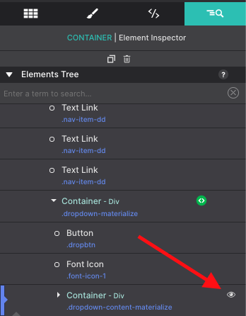
Some elements such as the drop down menu links are not always visible to the visitor and therefore also not always visible on the canvas. To bring these items into view for editing, go to the Inspector pane. The strike through the eye icon next to an element in the tree indicates whether it is hidden on the canvas at the current breakpoint or state. Click on the eye icon to show the hidden item.
Make it a Symbol
When working with menus, the last thing you want to do is have to re-build it for every page. To save you from that pain, you can save the menu as a Symbol. This way with any new page in the project you can simply pop that exact navigation menu into place.
What's even cooler is that the menus will always stay in sync. So if you make any changes - add new buttons, change link destinations, adjust colors or spacing, the menu will change everywhere.
To save the menu as a Symbol, go to the Inspector pane. Using the Elements Tree you will select the Container element that is parent (top) for the navigation. In this case it is the Container with the class name ‘holding-container-dd’.
With the parent container selected, go to the Content pane > Symbols sub pane. Click the button that says Create Symbol from Selection. A preview of the Symbol you made will appear in the top window. Below, you can give the Symbol a name so you can quickly identify the item.
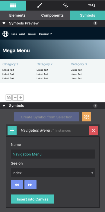
Next let’s practice adding the menu to a new page. Click on the Pages toolbar icon and choose Add Blank Page.
When the new blank page loads, go to the Content Pane > Symbols subpanel. Locate your menu symbol and click the Insert into Canvas.
Now anytime you make a change to your menu, it will stay in sync everywhere! Watch a Symbols demonstration below.
Level up with the Site Designer help guide.
Site Designer gives you the power to work with CSS visually. These code-free controls allows you to experiment with new styles and layouts without having to be a pro at hand coding. Discover the power of Site Designer and start dragging, droppping, clicking, and sliding your way to an epic website.