

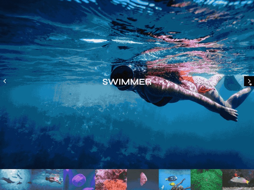
Slide into the Ocean Photo Gallery for Site Designer.
The Ocean Slider is the perfect photo gallery choice for Site Designer frameworkless projects. With just a few steps you can tweak this prebuilt component to fit your unique content. Grab this free component from the Component Shop and learn how to tweak it with the steps below.
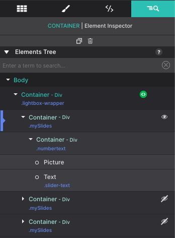
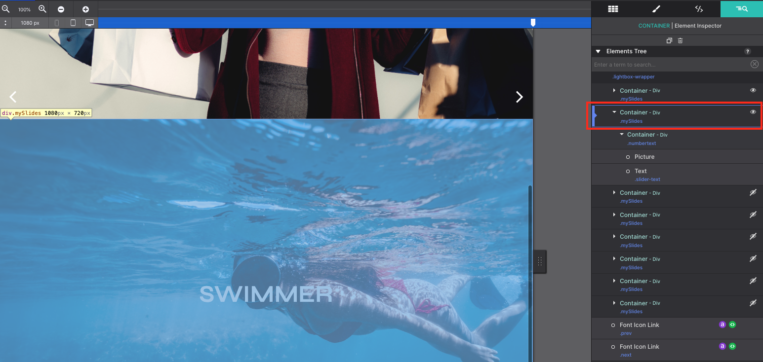
The Inspector Pane is your best friend when it comes to selecting nested elements as well as viewing hidden elements. Using the Inspector, you’ll see a tree of all the elements. Each slide within the gallery is nested in a Container DIV with the class ‘mySlides’. Within that is a child Container Div ‘numbertext’ which hold the gallery Picture and Text elements.
Pictures after the first in the slider order are hidden so that only a single image appears at once. The hidden images are indicated on the Inspector by the eye icon with the strike.
Swap out the Image Resources
From the Inspector, click on the Picture element to select it. You’ll now be able to modify the picture and its styles.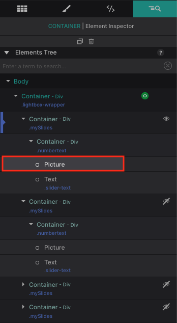
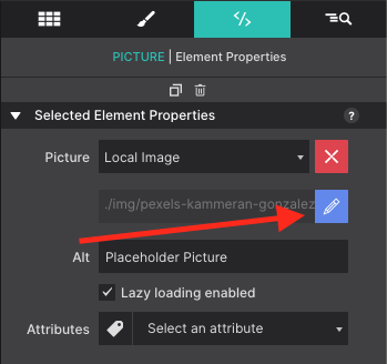
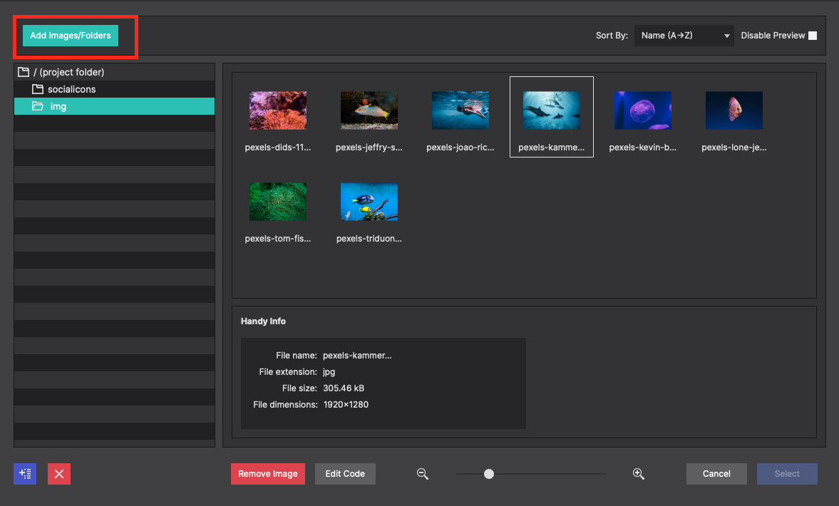
Once you have it selected, go to the Element Pane. From here you can change out the image resource. Click the blue pencil icon to launch the local image dialog box. You also have the option to change the source to an online option as well using the drop down.
When the resource dialog box opens, click on Add Images/Folders button in the top left corner. You’ll be able to select the images from your local computer to import them into the project. Click Select once for the image you want to import into your project.
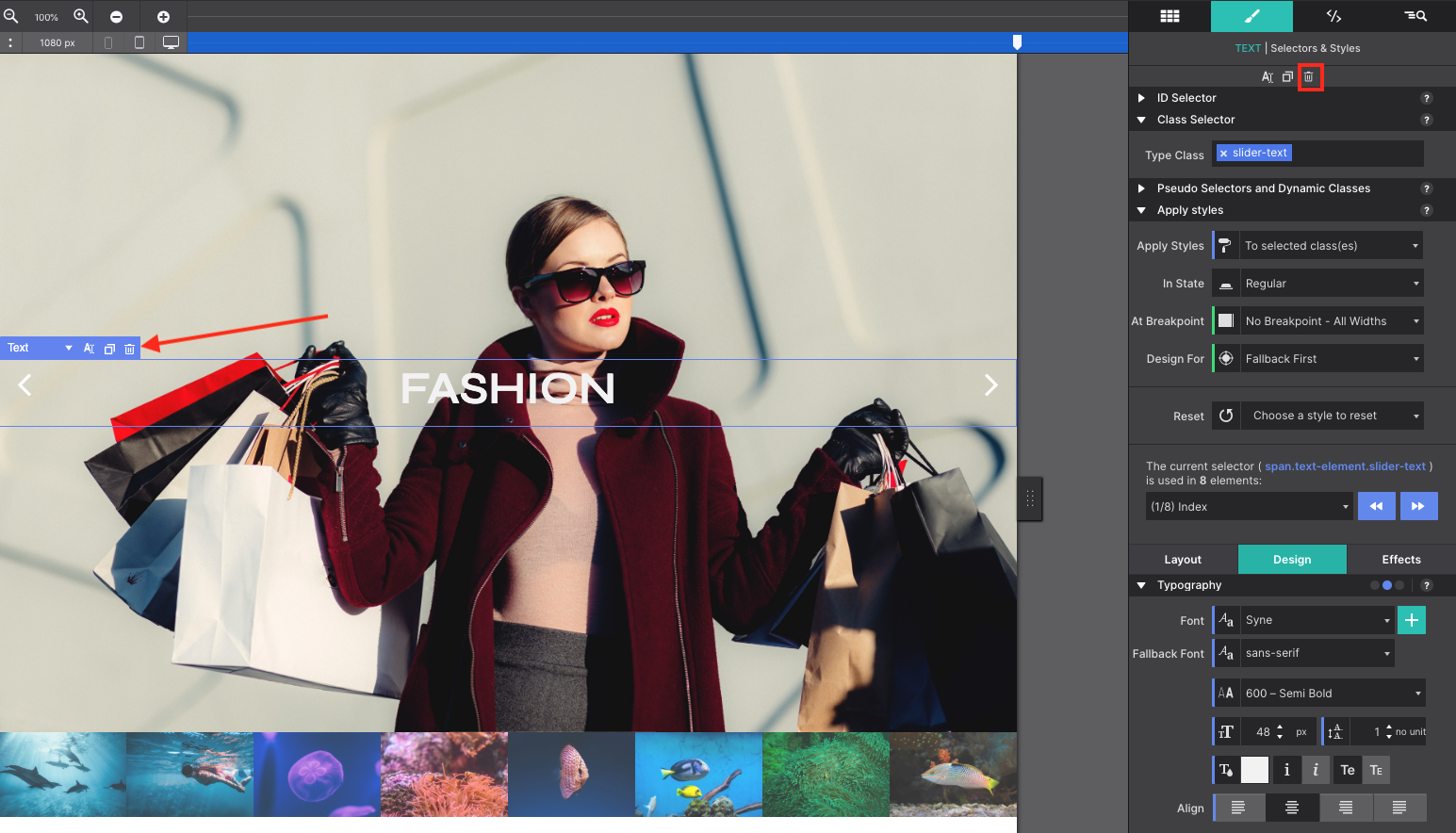
To modify the text element that is layered on top of the image, you can use the Inspector pane to click on the Text element or hover over the canvas. Double click on the text to change it out with a message of your own. Don’t need or want the text? Click on the trash can icon on the canvas, or at the top of the element pane to remove it. Hitting the delete key works too.
Edit Hidden Slides
Slides that are not seen until triggered are hidden on the canvas. To show these hidden elements, go to the Inspector pane and click on the eye icon to show the item. Instantly, you will see that next slide on the canvas for you to edit. The same editing steps are followed as you did previously to swap out the image and the text.
Learn more about working with hidden elements:
Hidden ElementsAdding ALT Text is Important
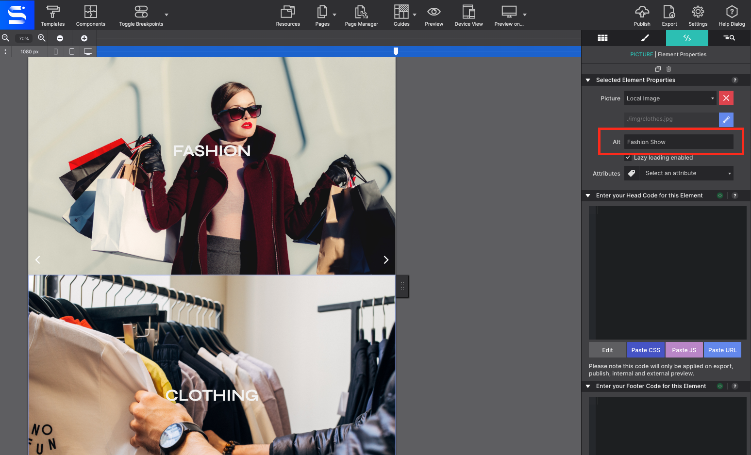
Be sure not to forget to add ALT Text for your Picture Elements in case your audience is using a screen reader or the graphic doesn’t load on their machine.
Learn more about working with the Picture element.
Read MoreModify the Slider Banner
The last section to edit would be the lower image thumbnails. These are Picture Link Elements. This means when the image is clicked by the viewer, then a larger image will load in the top part of the photo slider. To change the Picture Link Elements with your graphics, click on the image on the canvas and then go to the Element pane. Click the blue pencil icon to launch the local image dialog box.
Be sure you are organizing the images in the same order that you did in step 2 so they match when someone engages with the thumbnails on your website.
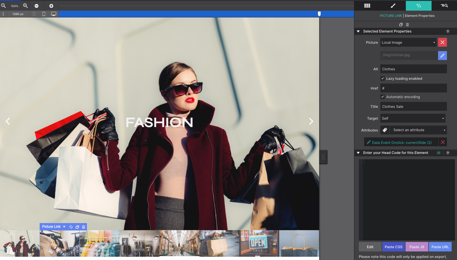
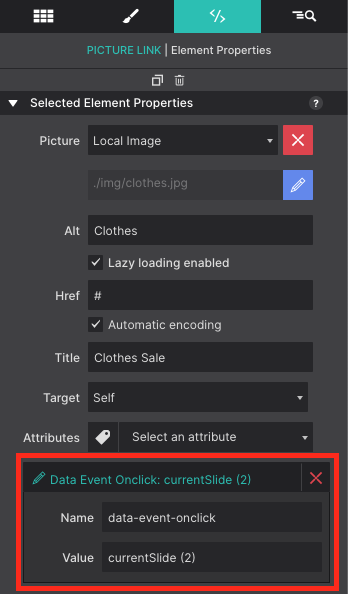
These Picture Link Elements are configured with a special Data Attribute ‘data-event-onclick’ that triggers the photo gallery to showcase the selected photo in the main window. The value indicates the slide number in the deck.
Adding Additional Slides
If you plan to add additional images to the photo album, the easiest method is to duplicate the ‘mySlides’ Container with all the children elements. From the Inspector pane, select the last ‘mySlides’ Container and click the Duplicate button at the top.
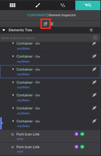
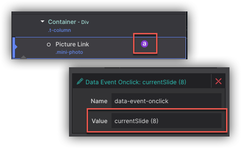
You’ll also need to do the same for the thumbnails at the bottom. Duplicate the ‘t-column’ Container. Once duplicated, click the ‘a’ symbol to launch the attributes for the element. You will need to update the slide number to reflect the additional slide in the deck.
Want more Components?
The Component Store keeps on growing. Our diverse range of components includes unique content layouts, special page regions such as quote or team about us sections, plus interactive objects like photo galleries, menus, and video backgrounds, and even ecommerce setups. Explore all of our component options below and streamline your design workflow for a more efficient and effective web development experience.