

How to Create a Bootstrap Nested Menu
The Bootstrap 4 CSS framework gives you the power to create interactive features quickly using a combination of Class names and attributes. The trick is knowing the right combination to fashion these features. Within Site Designer this is really easy to implement.
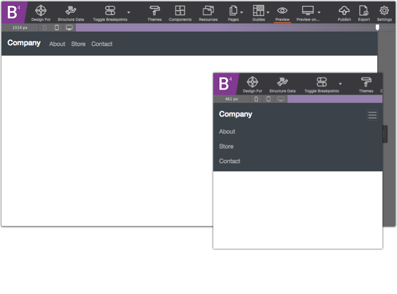
Follow along as we teach you how to create a nested menu. This navigation bar is stretched wide for large screens while automatically adapting to the hamburger menu for mobile viewers. The links will appear when triggered. This menu also includes branding, sub menu links too!
To start off, open Site Designer and choose a Bootstrap 4 blank theme. Bootstrap uses the mobile-first workflow so be sure your slider is positioned to the left of the first breakpoint.
Download the project to use as a reference with the step by step instructions below.
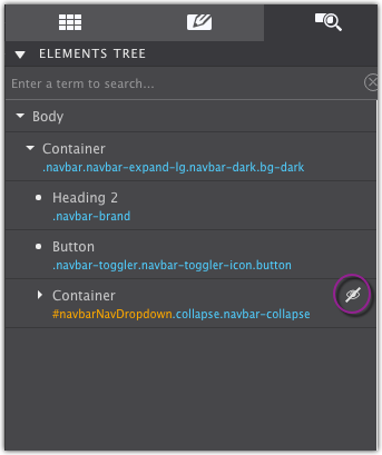
Start by adding a Container Nav element to the canvas. This will serve as the parent for the entire navigation bar and all links. By choosing the specific Nav short for navigation users with assistive technologies will be able to identify what the feature is.
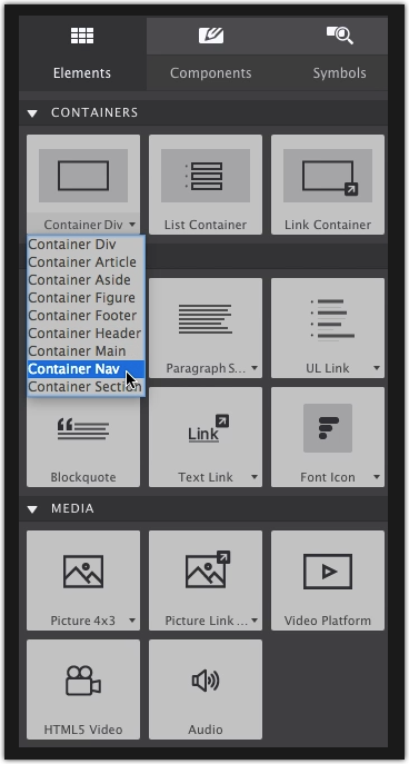
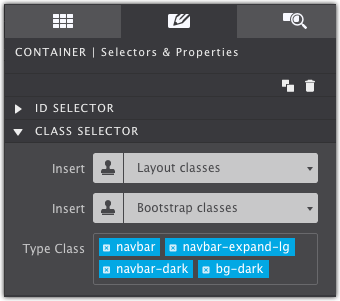
The Nav Container will get four Class names on the Style pane. The first one an identifier for the navigation and the others for applying positioning & styling of the bar. These Class names are:
navbarnavbar-expand-lgnavbar-darkbg-dark
Add Branding
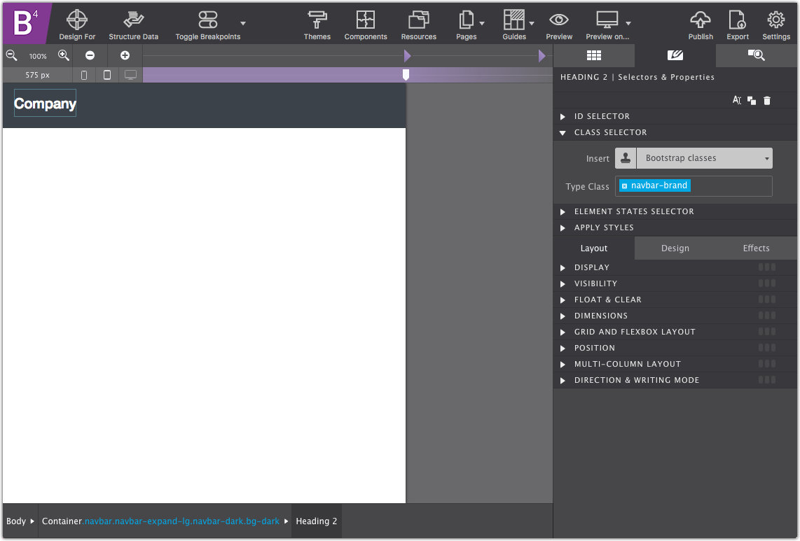
Drag-n-drop a Heading element into the navbar container. This will be used for the site title.
On the Style pane give the Heading the Class name navbar-brand. When you apply the class name, the text will automatically take on Bootstrap’s default styles (turning smaller and the color white). Feel free to change the placeholder text by double clicking on the canvas.
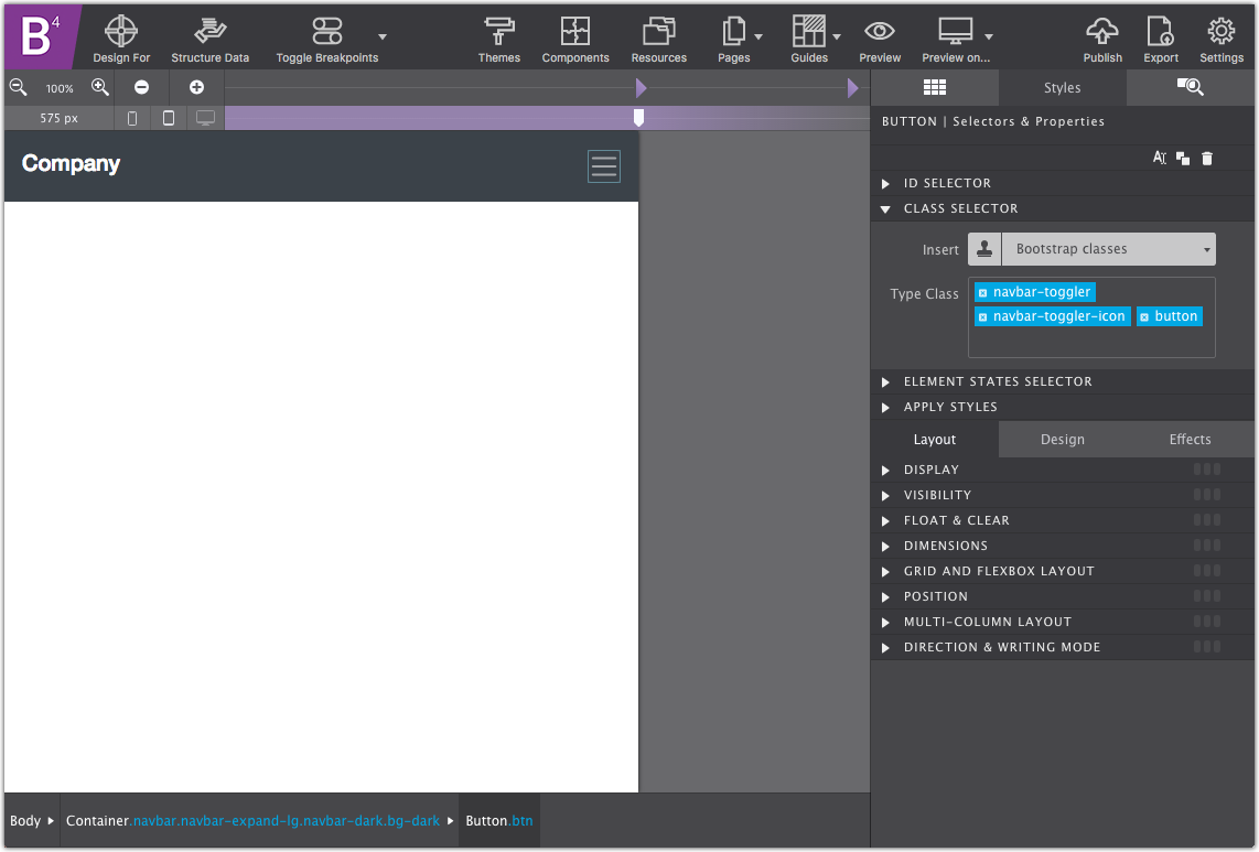
Add the Mobile Trigger Button
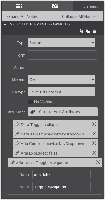
The next element nested within the navbar container is a Button element. Double click the canvas to delete the placeholder Action text. When applying the following Class names, the hamburger icon will automatically appear with default Bootstrap styling. Then on the Style pane, add the following Class names:
Navbar-togglerNavbar-toggler-iconButton
With the Button still selected, go to the Element pane > Attributes and use the dropdown menu to apply the following combination of data attributes:
Data-togglewith the value collapseData-targetwith the value #navbarNavDropdownAria-controlswith the value navbarNavDropdownAria-expandedwith the value falseAria-labelwith the value Toggle navigation
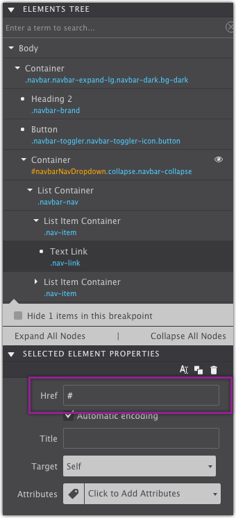
The Wrapper to Hold Navigation Links
With the trigger button completed, now you’re ready to add your collection of links. First, add a Container DIV to the navbar Container. On the Style pane give the container an ID name navbarNavDropdown and then apply the Class names:
collapsenavbar-collapse
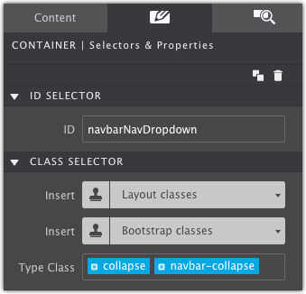
The Container will disappear from the canvas after applying the Class names. On the Element pane, use eye icon next to the element to show the hidden item. This allows you to see and style the normally hidden item.
The List Container & Links
Nested within the collapse Container element drag and drop a List Container element. On the Style pane give it the Class name navbar-nav.
Three List Item Containers will automatically be added. Each one will be able to hold the upcoming link information. Select each List Item Container and give it the Class name nav-item.
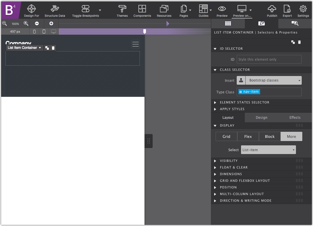
On the Content pane, drag a Text Link element into each one of the List Item Containers. The Text Links will all get the Class name nav-link.
Double click on the canvas to change out the placeholder text. Feel free to duplicate the List Item Container with Text Link for as many menu items that you require. Link destinations are configured on the Element pane under Properties. You can learn more about linking to pages and documents in this tutorial.
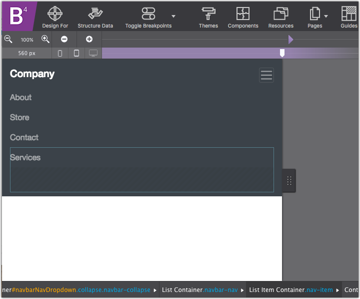
You Now Have a Basic Menu Completed
High-Five! You have completed a cool navigation bar that is fully adaptable to the viewport. If you click the Preview icon you can try it out within the app. You’ll see how when viewed on a wide screen the links stretch across the top. When the slider is moved to a smaller position, the mobile hamburger menu will appear bringing the menu links into view when clicked.
Add a Second Level of Links
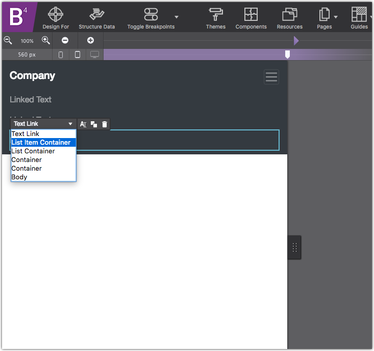
If your design calls for a second level of links it is easy to configure. You’ll need to drag and drop a Container DIV into a List Item Container.
On the canvas, hover over the third menu item and use the hover dropdown to select the List Item Container Element.
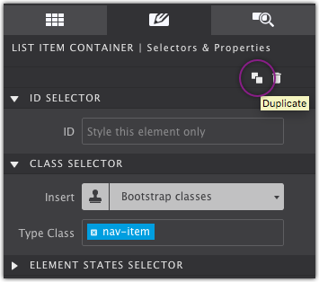
Use the Duplicate button on hover or on the Style pane to duplicate that List Item Container. For reference, in the example I changed the placeholder text of the duplicated menu item to say Services.
The duplicated List Item Container will get the Class name:
Nav-itemDropdown
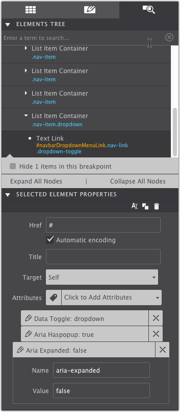
The duplicate menu link (Services in the example) will get an ID name navbarDropdownMenuLink as well as the Class names:
Nav-linkDropdown-toggle
On the Element pane configure the following data attributes:
Data-togglewith the value dropdownAria haspopupwith the value trueAria expandedwith the value false
With the new item in place, drag and drop a Container DIV into that List Item Container. Give this new Container the Class name dropdown-menu.
It will disappear after applying that class, so again you’ll need to use the eye on the Element pane. On the Element pane give it the data attribute aria-labelledby with the value navbarDropdownMenuLink.

Finally, add as many Text Link elements into this dropdown-menu container. Give each one the Class name dropdown-item and configure their link destinations on the Element pane.
Override Bootstrap’s Default Styles
In Site Designer is it easy to override the default styles of the elements. Simply apply a new Class name to the element you want to style and then configure it how you like. For example, in the tutorial, a second class name Link-style is added to the menu links so that their colors can be changed and the hover action tweaked.
Extra Class names are also applied to the dropdown Container and its links as well so their styles can be adjusted.
Get Site Designer Today!
Site Designer is the cutting edge solution for rapid, code-free, website design. The app provides a suite of layout and style controls so you can craft a website that stands out and helps your business grow. Purchase Site Designer and get free upgrades for one year plus discounted updates after that timeframe. Check out the stunning theme collection and watch detailed video tutorials to help you get started.