

Be bold with the Bootstrap Mega Menu Component
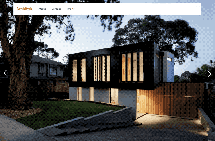
The Architek Template for Site Designer includes a unique navigation. What makes it special is the drop down menu located on the third link. Upon hover, it displays a large range of additional link options along with a bold heading region and section sub-headings. It is a fantastic way to organize your menu options when you have several page links.
In this tutorial, we will show you how to:
- Visually customize it to fit your content with Site Designer.
- Save this menu to your Bootstrap Component Library.
Want this menu for a different framework?
The CoffeeCup Component Library offers a similar design for all frameworks. Head over to the Mega Menu component to pick up this complimentary interactive navigation menu for your framework choice. The steps outlined below would still be helpful for you to learn how to modify the design for your content.
Customizing the Navigation Menu
Structure
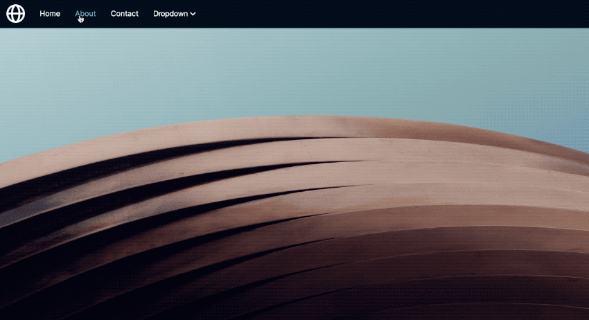
First, open the Architek template in Site Designer by choosing Templates > Architek in the top toolbar. The menu in the Architek design is created using the Bootstrap CSS Framework. Bootstrap refers to this feature as a Nav. You will see this term referenced often when editing the design.
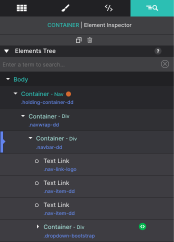
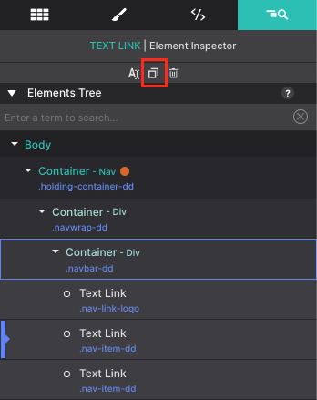
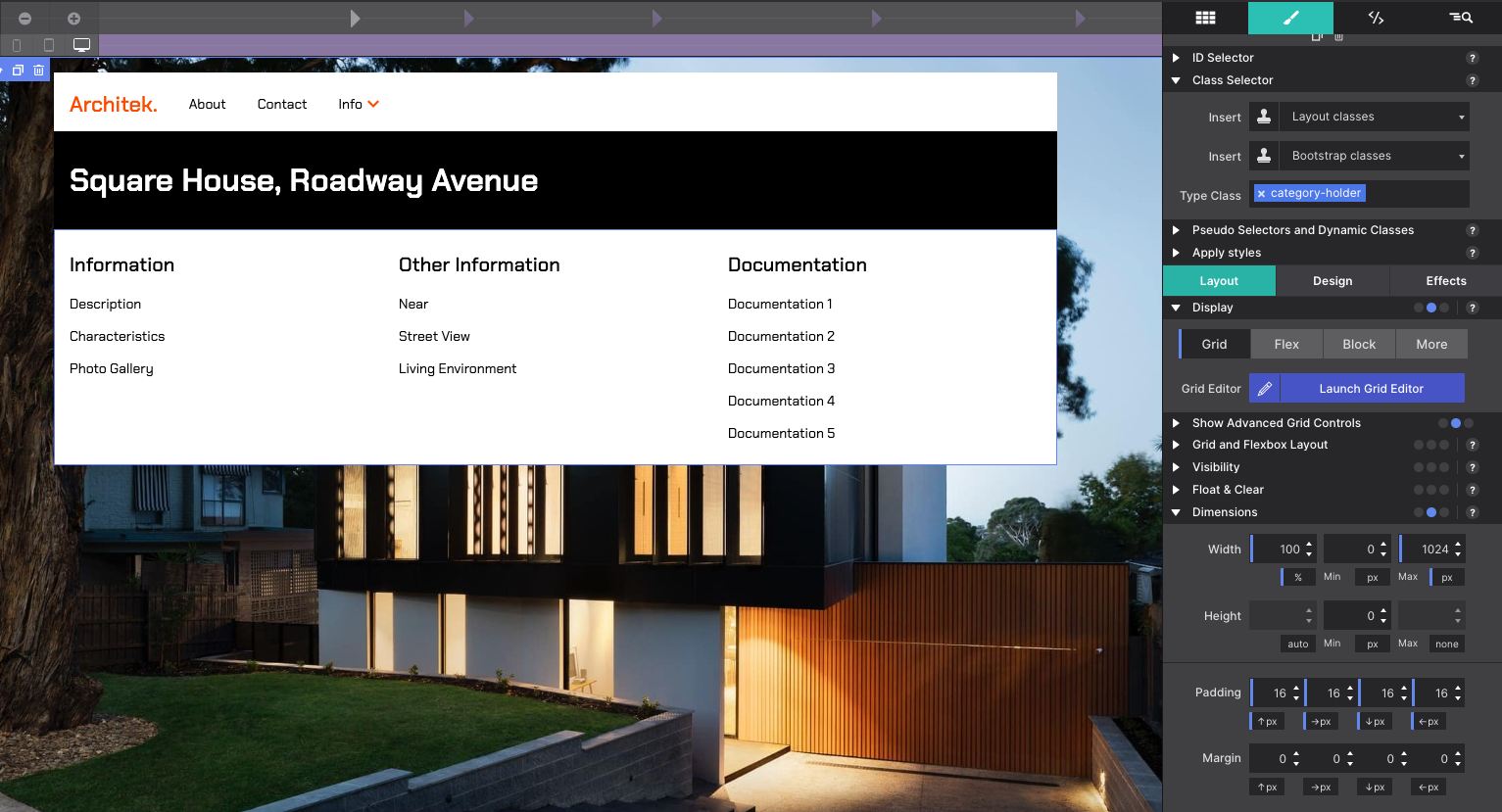
Once you have it open, select the Inspector pane to review a tree of all the page elements. You’ll see a Container element with Class name holding-container-dd. This container is the parent element for the menu’s elements including nested Containers, Text Links, Font Icon for mobile variation, and Heading elements.
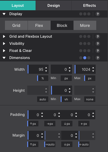
Sizing for the overall menu is configured on the parent level. If you go to the Styles pane, you’ll notice that under Layout > Dimensions the Max-Width is set to 1024px with the Left and Right Margin set to AUTO. This makes the menu a fixed length in the center of the page. However, if you wanted to change the size and alter it to make it span wider or shorter, you would simply adjust the Width configurations.
Text Link Elements
From the Inspector pane, you’ll find the main menu Text Link elements nested inside the Container class navbar-dd. The Text Links have the class names to identify their actions. This includes:
Nav-link-logo : which is the clickable logo link
Nav-item-dd : which is for the menu links
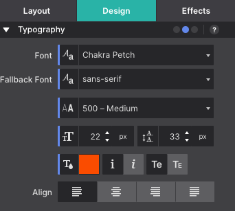
To modify these items, click on the canvas to launch the inline text editor for changing the words. The link URLs are configured on the Element pane using the HREF box. Colors, font type, and size are adjusted on the Styles pane > Design > Typography section.
To add additional options to the main menu, go to the Inspector pane. Then select one of the Text Link elements with the class Nav-item-dd and use the duplicate button at the top of the panel.
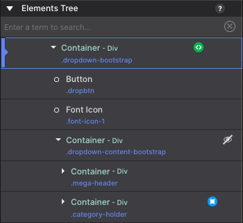
The Container element with class dropdown-bootstrap contains the special button for the drop down menu item. This includes the Button, Font Icon (for the down arrow), and a Container with the drop down selections.
The options to modify these styles would again be available on the Styles pane > Design > Typography section. While the Font Icon Glphy is configured on the Element pane. Though the snazzy down arrow carrot is perfect for relaying that the item has a drop down option.
Drop Down Region
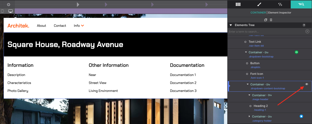
To launch the drop down selections, click on the Container dropdown-content-bootstrap. This holds the mega-header Container and category-holder Container. Click on the ‘eye’ icon to the right of the element will display the hidden content so that you may edit the items.
Rinse and repeat like the other Text Link elements. Click on the canvas to edit the menu link text, change styles on the Design pane, and change link destinations on the Element pane.
If you add additional items to the drop down region, the box will automatically expand to create room for the items as the Container Height is set to Auto and None for the set restrictions.
The drop down sub links ‘Text Links’ are arranged with the category Heading. Text links can be dragged and dropped to new positions if you need to reorganize the links. For best precision, drag and drop the items using the Inspector pane’s element tree.
Saving the Component to your Library
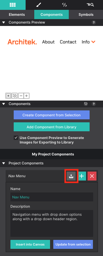
Do you already have a Bootstrap project you are working with? You can save the navigation menu to your component library to re-use in other projects. To begin, go to the Inspector pane and select the parent Container for the entire menu which is the Container element with the class name: holding-container-dd Then go to the Content pane > Components sub-panel. To create the component, click on the blue Create Component from Selection button. This will create the component by saving the parent container with all the children elements within it (Text Links, Buttons, and Font Icon).
You will see a preview of the component appear at the top along with the project component details below. Configure the Name and Description with details you understand so that you can identify the component at a later time.
To save the newly created component, click on the upload icon next to the component name.
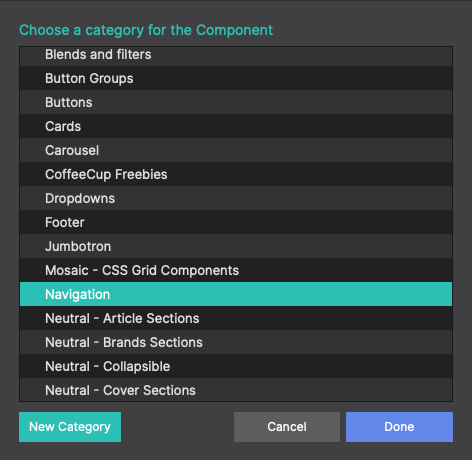
When uploading, you will be prompted to choose a category for the component. You can save it to the Navigation collection, or create a new category. You’re free to organize your components however you wish. Once you select a category, the component will save to that location and will be ready to use in other projects.
To load your new component into another project, open a Bootstrap project in Site Designer. Then click on the Components toolbar icon. Browse your categories to locate your saved menu and choose Add to Project.
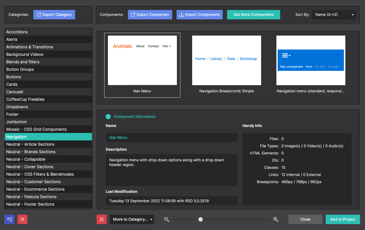
The Component will load into the Elements pane > Component sub panel. You’ll see the preview and your component details listed along the side. Click Insert Into Canvas to inject it into your page.
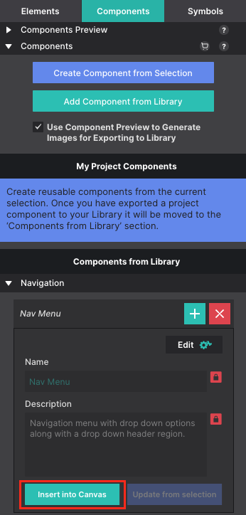
Just like that your newly saved component is ready to rock within your existing project. Tweak it and customize it to fit its new home!
Want to Discover More Components?
The CoffeeCup Component Library is loaded with pre-built, web items. Explore the collection of customizable photo sliders, navigation menus, interactive objects, unique content regions, and much more! We even offer a wide range of Free Components too that you can save to your library and use within your website projects.
Level up with the Site Designer help guide.
Site Designer gives you the power to work with CSS visually. These code-free controls allows you to experiment with new styles and layouts without having to be a pro at hand coding. Discover the power of Site Designer and start dragging, droppping, clicking, and sliding your way to an epic website.