

Modifying an Accordion Component.
An accordion component is a feature comprising of a vertically stacked list of items, such as links or paragraphs. Each item can be "expanded" or "collapsed" to reveal the content associated with that item. In this tutorial we will show you how to add additional items to the accordion and show how these type of interactive components may be customized.
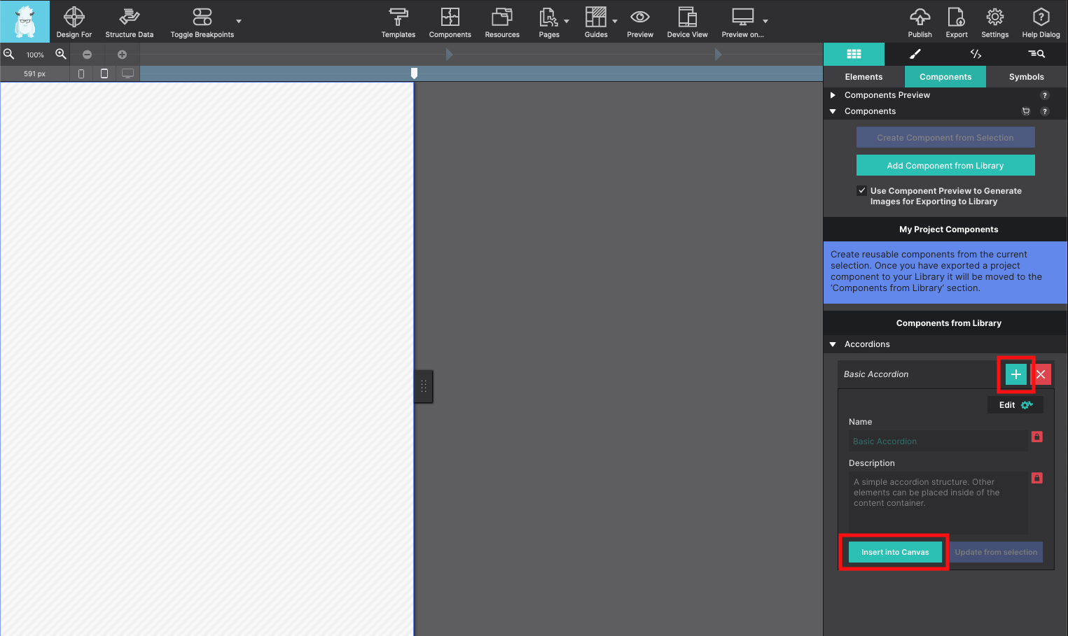
Starting with a Foundation CSS project, load in a Basic Accordion component from the Component Library. Once imported into your project the component will be available on the Content pane > Components section. Click the + or Insert Into Canvas to inject it into the page.
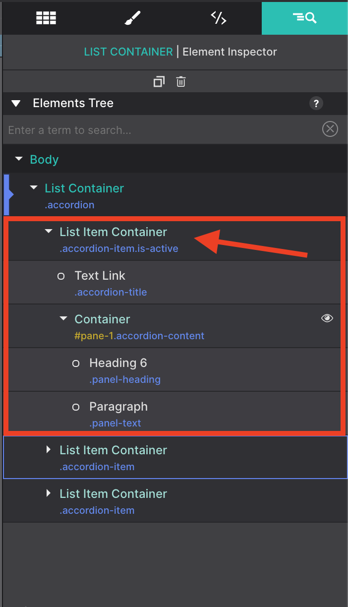
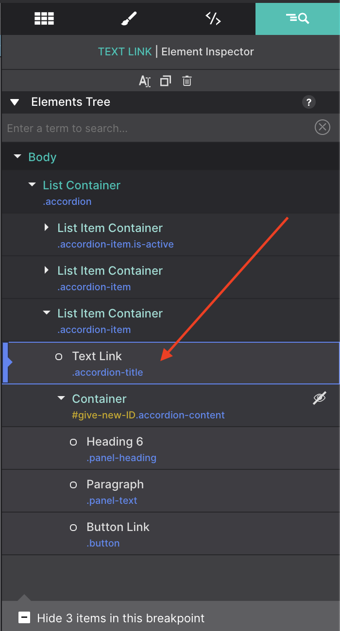
Using the Inspector pane, you can view a tree of all the elements used to make this Accordion feature. You can see on the tree that each drop down item (in this case the text) is organized within a parent List Item Container.
To add additional tabs the easiest method would be to select one of the List Item Container from the Insector Tree and use the duplicate button= so that all the children elements within it also get duplicated.
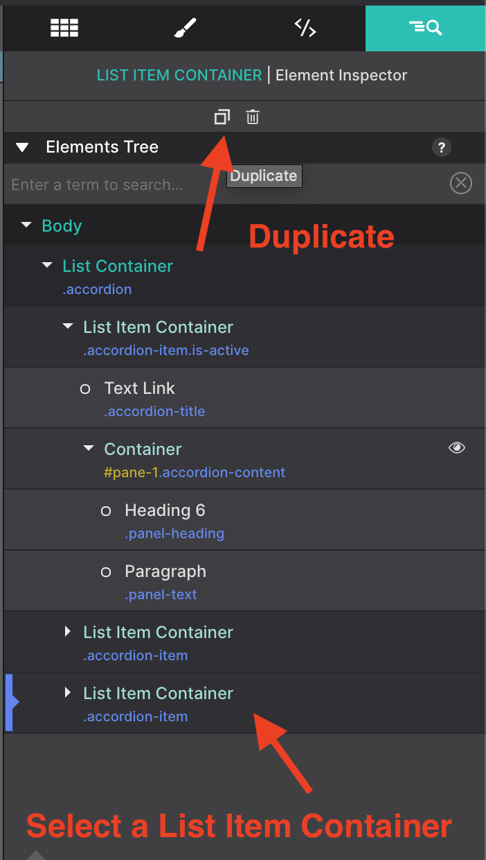
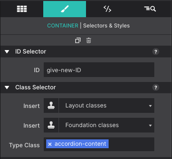
Once you duplicate a List Item Container, select the duplicated set using the Inspector tree. Select the Container element within it and give it a new ID name. The item will have a little "eye" icon to indicate that it is hidden on the canvas. This container and the items inside of it stay hidden until they are triggered to appear on screen by the Text Link.
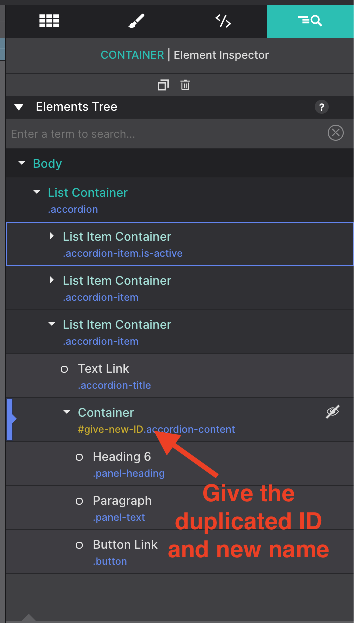
The ID Name selector is configured on the Styles pane at the top within the ID Selector section.
Next, select the Text Link within the group with the class name 'accordion-title'. This element is triggering the hidden Container that you just modified. You will need to update it to trigger the new ID name.
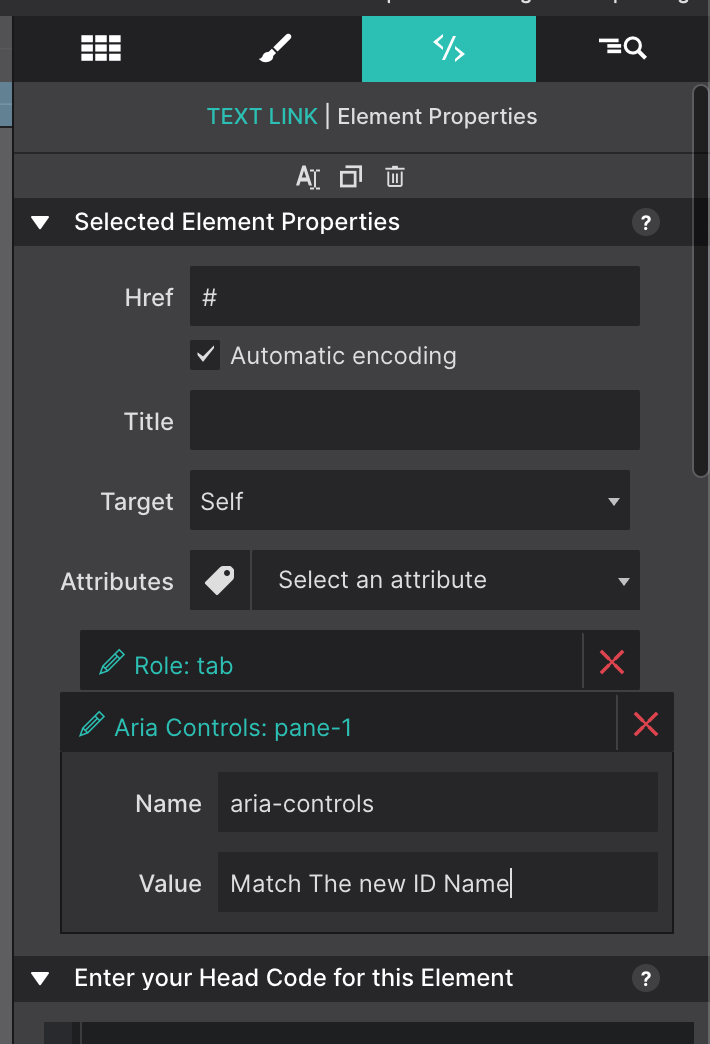
To update the Attribute with the new ID go to the Element pane > Attributes > Aria Controls and update the ID to match the name you gave your Container in the previous steps.
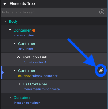
Show Hidden Elements
The strike through the eye icon next to an element in the Inspector Pane Element Tree indicates whether it is hidden on the canvas at the current breakpoint or state.
To show a hidden element — so it can be styled — just click on the icon. It will change to an eye and the app will override the styles that hide the item. You can also do that for all elements on a page by clicking the 'Show x hidden item' toggle at the bottom of the pane.
Video Demonstration
Level up with the Site Designer help guide.
Site Designer gives you the power to work with CSS visually. These code-free controls allows you to experiment with new styles and layouts without having to be a pro at hand coding. Discover the power of Site Designer and start dragging, droppping, clicking, and sliding your way to an epic website.