

6 Visual Tips for Killer Emails
Emails, emails, emails. Even though some people probably feel like they are practically drowning in emails and newsletters, it’s still a fantastic communication medium for brands, businesses, and bloggers. Cheap, effective, and emotive — clicking send on a cracking email is a great feeling.
With the power of email, you can get into people’s inboxes — and their lives— developing an intimate relationship with them remotely. Whether you’re sending out offers, content, or simply saying hello: an email is an excellent icebreaker and relationship power tool.
And what better way to build relationships than to embrace the power of visual emails in order to tell stories, engage, and entertain? Here are six tips to help you get the most out of your email visuals — plus why they might cause you some headaches.
Happy sending.
Old school nostalgia
You’re not exactly writing missives in beautiful, intricate calligraphy and sending them off to your customers via pigeon post — but that shouldn’t stop you from going a little bit old school with your emails!
There are a ton of different emotions you can evoke with your emails — from humor and curiosity, to disgust (!) and affection. Nostalgia is a powerful universal, emotion — why not use it to take your readers on a personal journey?
Nostalgia is defined as “a wistful desire to return in thought or in fact to a former time in one’s life, to one’s home or homeland, or to one's family and friends; a sentimental yearning for the happiness of a former place or time.” (Dictionary.com).
From its definition, we see that nostalgia is a deeply personal feeling — and that everyone will yearn in different ways for different things. So how can you successfully use nostalgia in your emails?
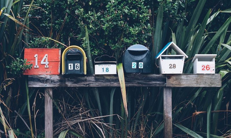
- Go back to a simpler time with email visuals that remind people ‘of the good old days’. A little bit of font wear and tear, the nostalgic ‘Polaroid effect’, or retro designs can transform your visuals from super slick and glossy to elegiac
- Images that tend to conjure nostalgia: nature photography (sea, sunsets etc), family & children, celebrations, historic moments. Learn how to tug on people’s heartstrings by evoking universal feelings
- Is there an untold story lurking in your brand history that has good ‘nostalgia’ value? Open your brand archives with an email.
In today’s frenetic world, a reminder of ‘simpler’ days can help people disconnect. History is always a great backdrop for storytelling and punchy, emotive messages.
Emojis, GIFs — embrace the net lingo
The internet has its own language with its own rules. If you are sending out emails and running social media campaigns, you need to get familiar with the new conventions and formats of this hybrid language.
What does internet speak sound like? It can be hard to define, and it changes for every niche, but here are some useful adjectives:
- Cheeky
- Ironic
- Supportive
- Casual
- Clever
- Funny
- Laidback.
Having said that, not every corporate marketer should start dropping emojis and ‘fleek’ into their emails, but it’s important to send out emails that don’t sound tone deaf, or worse — like they’ve been written by a robot.
The language of the internet is extremely visual — there is intense pleasure in an expertly-timed GIF or meme. Why not embrace this new, visual lingo in your emails and include memes, GIFs, and emojis in your emails too? These visual flourishes work especially well in ‘young’ industries, or for people whose emails are mainly centered around content.

This interactive email from Stitch Fix includes an animation that’s simulating a text conversation — replete with personal touches and emojis. This tactile email is a masterclass in social storytelling. It’s great to see a branded email so effortlessly mimicking a conversation: a true sign of our social media obsessed times.
Here are a few easy resources to help you get started with your visual email strategy:
- Find a GIF at Giphy
- A good post on emojis in email subject lines
- From GIFs to embedded videos, here is Campaign Monitor’s take on visual emails.
“Worth a thousand words”
The jury may be out whether a picture really is worth a thousand words, but it’s definitely true that they do help to tell better stories. Treat your image choices with due care and respect, and don’t just settle for cheesy stock images to ‘fill’ your email. A cheesy image says nothing about your brand, and may ever harm your customers’ perception of you.
- Choosing images for websites tends to get very granular, yet images for emails are often left to the last minute. Don’t fall victim to this, and choose better images for your emails. Go for ones that are branded, forceful, and 100% not stock!
- Think about essential image editing like cropping, shadowing, gradients, and overlaying copy well ahead of time so that you achieve the awesome visual designs your emails truly deserve
- Can’t decide on a visual direction? Email split-testing can help you decide which images resonate with your customers the most.
Paired back aesthetics
What’s wrong with a simple email written in plain text using point 12 Arial font? Not much, some people might say. “Bring back the black and white text email” they cry in an ocean of emojis.
The constant need to overcomplicate emails with fancy bells and whistles means that a simple black and white email may actually stand out in an inbox for all the right reasons.
And remember, embracing a paired back aesthetic doesn’t necessarily mean “don’t do anything” — just consider embracing a more minimalist, clean look over a colorful and cluttered one.
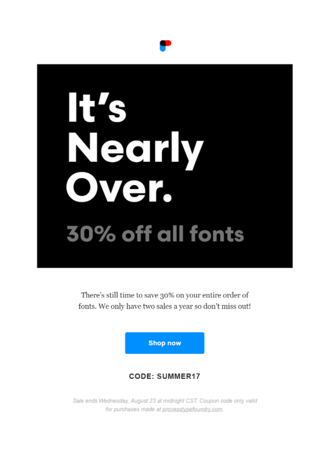
This email from Process Type Foundry is clear, visually coherent, and minimalist. For some brands, an email like this says it all.
Benefits of simpler emails:
- Less things to go wrong on different devices (some people still open emails on Blackberrys, and we all know what they do to emojis)
- They make for more accessible emails — many people can’t easily see images from their inbox (and most people won’t see images in the preview view anyway)
- Better deliverability rates as email servers will be less likely to flag the email up as promotional (or worse — spam).
Become a visual architect
At the end of the day, you want the user to do something with your email. Unless you are just sending out emails for the hell of it, you probably have clear commercial goals and analytics to back up your email campaigns.
- Pay attention to visual hierarchy and how images work together. Is there a clear logical sequence to how your email is being visually rendered? Is the sense of purpose and content flow obvious at first glance? If you are a retailer looking to make sales from email — check out this handy email guide for retailers that goes into how email and web design need to be joined up
- The final call to action(s) is crucial, so make sure that everything is leading up to it. Look specifically at the CTA colors and contrasting — how do these all fit together in the email?
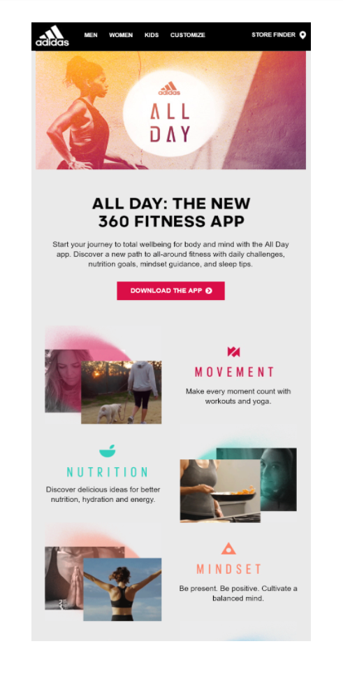
This email from Adidas, celebrating the launch of their new app, is a great example of an email whose visual hierarchy is centrally organized and coherent, sending the user a clear message.
Visual language
There is no point spending loads of time perfecting an email design with gorgeous photography, only for it to be coupled with language that’s about as interesting as watching paint dry.
Building a story out of words is worth it — an email won’t be saved by a great image if the copy sucks...

- The language you use should be visual — not bland and two-dimensional. Use metaphor and emotive language to complement your email design and really take it to the next level
- Play on the relationship and tensions between words and images — a good image can help illustrate a textual point and vice versa
- Overlaying images and graphics is a great idea, but you have to ensure the two work together in harmony
- Learn from the best: Ann Handley is a great copywriter, as is Joanna Wiebe who regularly write books, publish blogs, and feature in podcasts. There is a lot more to great email copywriting than meets the eye.
The problem with images in emails
Did you know that about 50% of email recipients will not be automatically shown any images? If images are the only point to your emails — you may be hitting a major stumbling block. You need to ensure that even without the supporting visuals, your email is still legible and meaningful.
- Tag up images correctly and use descriptive file names so that everyone has the best chance of ‘seeing’ them
- Use an email designer to help you design and create beautiful emails that balance copy with visuals.
Though you won’t get away with just sending people a lookbook and expecting them to buy it all up, visuals are a great way to make the most of your time in people’s inboxes. Just make sure that the images and pictures you use are compelling and on-brand.

Victoria Greene is a content strategist and freelance writer, blogging at VictoriaEcommerce. She loves to spend her time perfecting copy and content strategies for a variety of brands and businesses — both big and small. When she’s not writing, she’s out walking.
Build Epic Emails with Responsive Email Designer
We want you to create better emails. Because when your messages are unusable or unreadable for mobile users, then it is likely to get sent to the trash.
Responsive Email Designer is the best for the job. It is totally code-free so just drag-n-drop elements on the canvas and style using clickable controls. RED can handle small sends for testing or targeted recipients, or you can export to send to a large mailing list using an email marketing provider like MailChimp. Get started for free and get your first 3 sends/exports for free!