

Learn how to slide into full screen image galleries within your Site Designer websites.
Full screen, hero photo galleries are an uber popular trend on the web. A full page slider is generally placed at the top of a web page and fills the whole screen. These can make a stunning first impression to your visitors and relay tons of information in the blink of an eye.
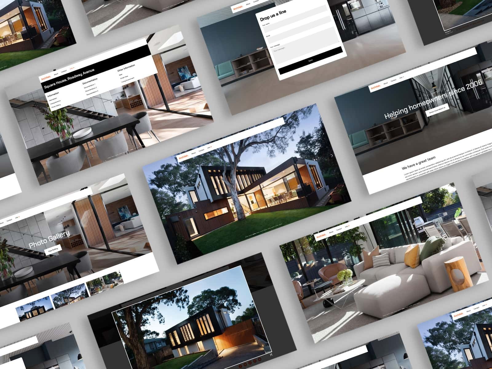
You can see this feature demonstrated within the Architek Bootstrap website template. In this tutorial we will teach you how to:
- Visually modify the slider in Site Designer
- Save the feature to your Component Library to use in other projects.
Customizing the Slider
Structure
First, open the Architek template in Site Designer by choosing Templates > Architek in the top toolbar. The slider in the Architek design is created using the Bootstrap CSS Framework. Bootstrap refers to this feature as a Carousel. You will see this term referenced often when editing the design.
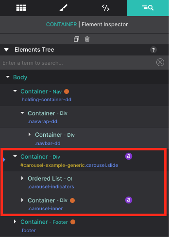
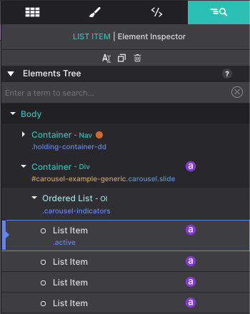
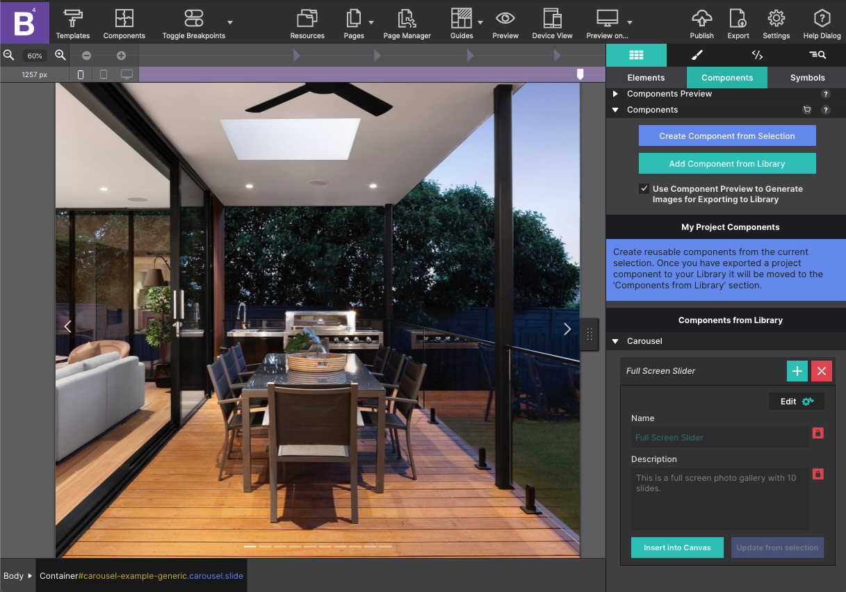
Once you have it open, select the Inspector pane to review a tree of all the page elements. You’ll see a Container element with an ID #carousel-example-generic with Class name carousel slide. This container is the parent element for the slider’s components including an Ordered List for the indicators and another Container for pictures.
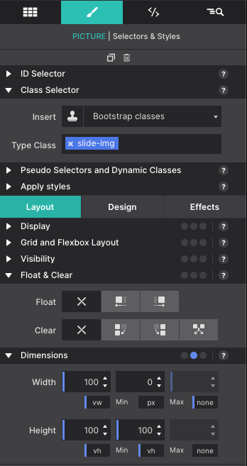
Sizing for the overall slider is configured on the parent level. If you go to the Styles pane, you’ll notice that under Layout > Dimensions > the Height is set to 100vh. This makes the gallery fill the viewer’s screen. However, if you wanted to change the size and alter it to make it a smaller gallery, you would simply adjust these Height and Width configurations.
Picture Elements
Each slide in the gallery is made up of a Container element called carousel-item with a nested Picture element called slide-img. The component includes 10 slides by default. If you want to add additional slides you would select the carousel-item Container and use the Duplicate button to add it to your list.
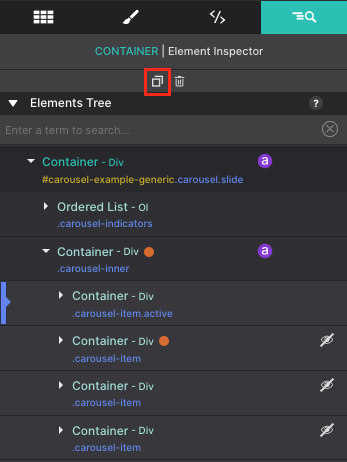
Slides that are hidden have an eye indicator on the side with a line striked through it. Click on that icon to toggle the slide into view on the canvas. That toggle option allows you to show and hide the hidden content for editing purposes.
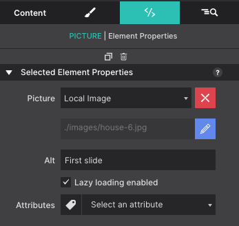
To configure the picture resources, select the picture element on the inspector tree and go to the Element pane. Under the Selected Element Properties > Picture click the blue pencil to edit the resource.
You can add new images to your project Resources. Organize your images into folders to keep things tidy or remove images you won’t be needing to help keep your project file size slim. Click Select to load the new picture into the canvas.
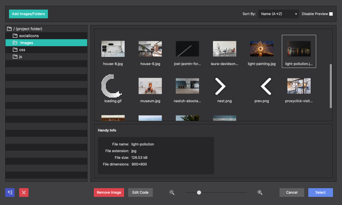
Alternatively, if your resource is already online, under the Selected Element Properties > Picture > change the Local Image to Online Image. You’ll be able to insert a URL for the online image resource instead.
The Alt option allows you to configure alternative text for the slide. This is helpful for viewers who are using screen readers. You can write descriptive text to outline what the image is portraying.
The picture sizes are configurable from the Styles pane > Layout > Dimensions section. The Height and Width options are pre-configured for a full screen display. If you would like to modify these sizes, you would adjust that here.
Each slide contains a small indicator at the bottom so the view can browse through at their own pace. If you have added or re-arranged your slides, you will need to adjust your indicators to ensure they match up to the correct order.
The indicators are located within the Ordered List element and are listed as List Items.
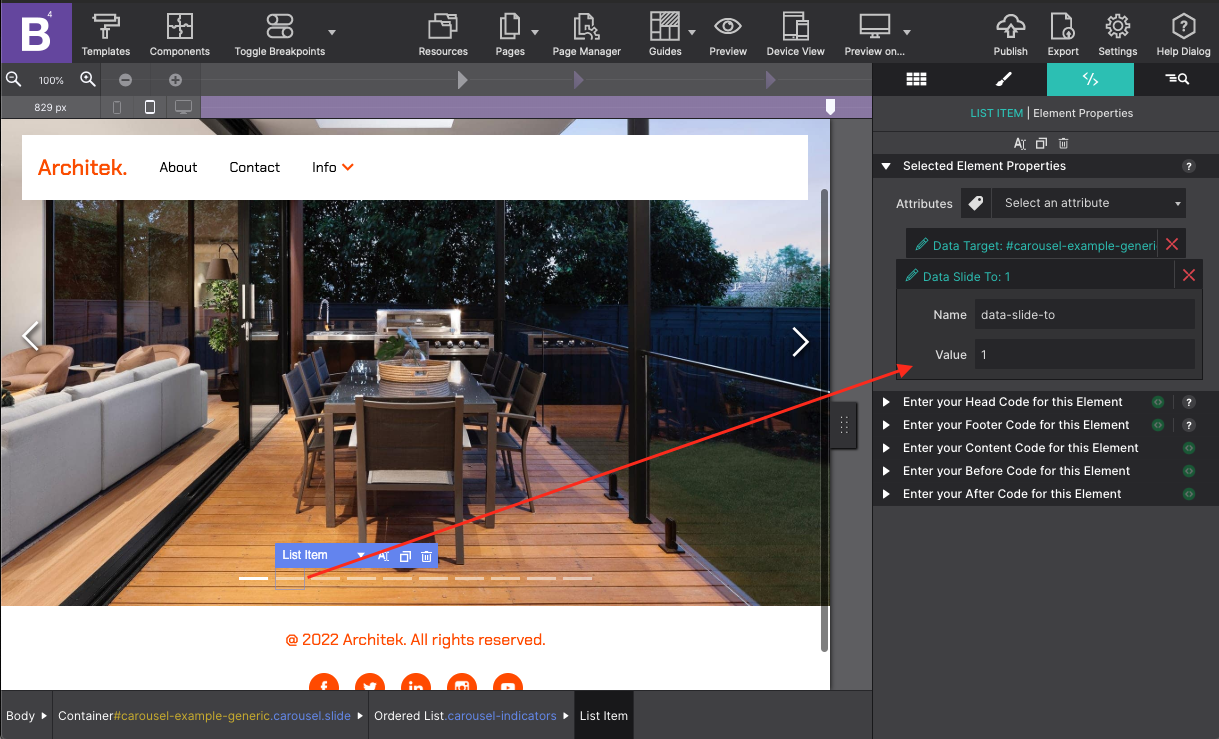
The indicator order is adjusted on the Element pane under the Selected Element Properties > Data Slide Attribute.
The slides go in order starting with zero. So the first slide in the gallery would have a value of 0. The second slide would be 1, etc.
Optimize your image sizes
Using large images can poorly affect your page loading times, especially for mobile users. As a result, a delay in page loading time can cause an unfriendly user experience, affect your SEO score, or cause you to lose customers. It is best if you optimize your images before you load them into your Site Designer resources. By slimming down the file size your projects and customers will be much happier.
Saving the Component to your Library
Do you already have a Bootstrap project you are working with? You can save the full screen slider to your component library to re-use in other projects. To begin, go to the Inspector pane and select the parent Container for the entire slider which is the Container element with an ID #carousel-example-generic
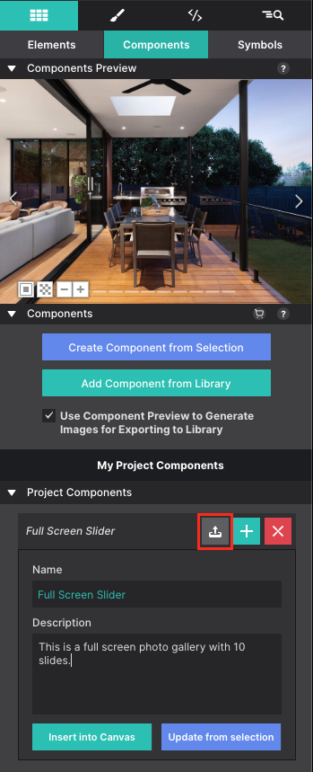
Then go to the Content pane > Components sub-panel. To create the component, click on the blue Create Component from Selection button. This will create the component by saving the parent container with all the children elements within it (indicators, pictures, etc.).
You will see a preview of the component appear at the top along with the project component details below. Configure the Name and Description with details you understand so that you can identify the component at a later time.
To save the newly created component, click on the upload icon next to the component name.
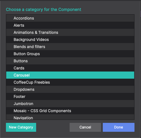
When uploading, you will be prompted to choose a category for the component. You can save it to the Carousel collection, or create a new category. You’re free to organize your components however you wish. Once you select a category, the component will save to that location and will be ready to use in other projects.
To load your new component into another project, open a Bootstrap project in Site Designer. Then click on the Components toolbar icon. Browse your categories to locate your saved slider and choose Add to Project.
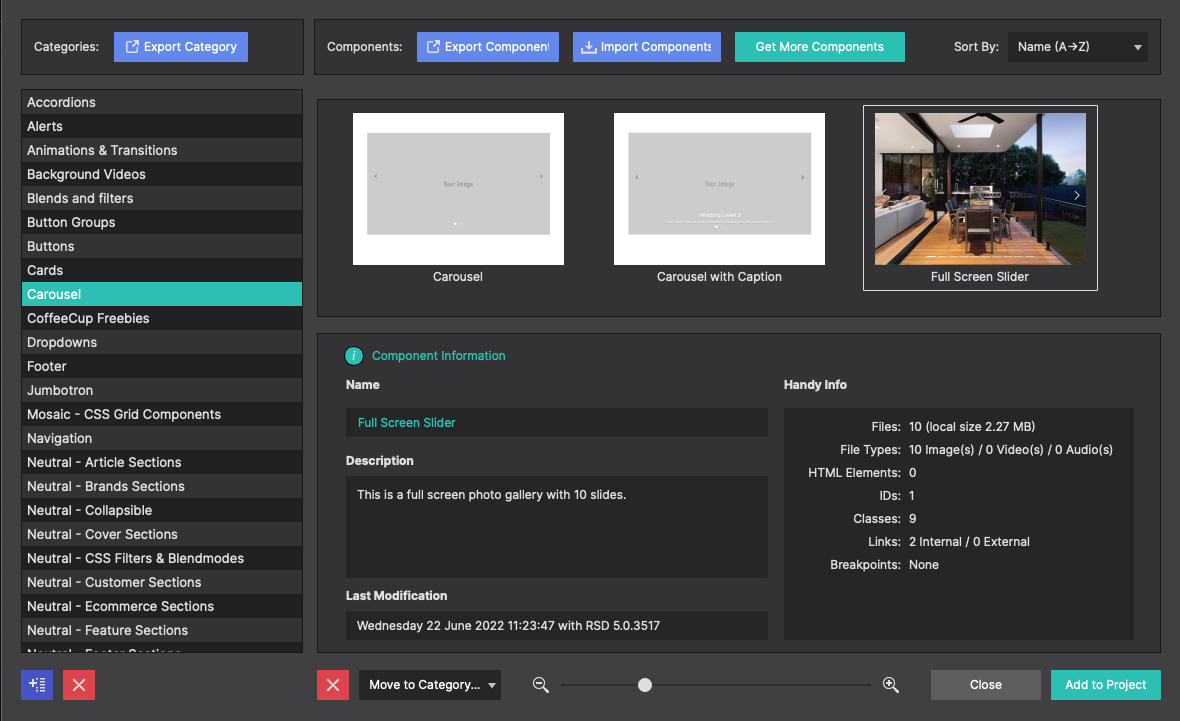
The Component will load into the Elements pane > Component sub panel. You’ll see the preview and your component details listed along the side. Click Add To Canvas to inject it into your page.
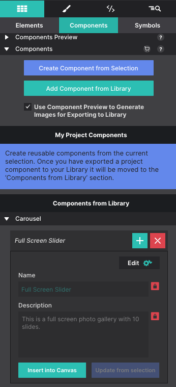
Just like that your newly saved component is ready to rock within your existing project. Tweak it and customize it to fit its new home!
Level up with the Site Designer help guide.
Site Designer gives you the power to work with CSS visually. These code-free controls allows you to experiment with new styles and layouts without having to be a pro at hand coding. Discover the power of Site Designer and start dragging, droppping, clicking, and sliding your way to an epic website.