First result - Post ID 227494

User 91713 Photo


Registered User
83 posts

I am excited, because I finished my first cycle from Mockup via RLM to a finished product which can be uploaded to a server. In used Mobile First (Coffeegrinder MFE) to develop the responsive page. I just wanted to share this with you guys.
Now I know the procedures I can produce the other pages.
A short summary can be seen here: http://www.youtube.com/watch?v=Qy47kS3B6gs
The perfection isn't reached in one pass.
User 2088758 Photo


Senior Advisor
3,086 posts

Good Job Hans!
Taking over the world one website at a time!

Steve Kolish
www.misterwebguy.com

YouTube Channel:
https://www.youtube.com/channel/UCL8qVv … ttneYaMSJA
User 603315 Photo


Registered User
938 posts

Hans van Overbeek wrote:
I am excited, because I finished my first cycle from Mockup via RLM to a finished product which can be uploaded to a server. In used Mobile First (Coffeegrinder MFE) to develop the responsive page. I just wanted to share this with you guys.
Now I know the procedures I can produce the other pages.
A short summary can be seen here: http://www.youtube.com/watch?v=Qy47kS3B6gs


Your not kidding a short summary indeed :lol: it would be nice to see the page once it's up there, but well done you on doing it that way. I'm trying to get my brain to think mobile first, mobile first, mobile first :P it's not doing it though :)
User 2088758 Photo


Senior Advisor
3,086 posts

The more I use the program the easier it gets Nigel. You will find it that way too. It takes me no time at all to bang out a grid. I have taken a different approach to setting the Breakpoints now. Instead of picking a size to set it at I just move the slider over until I think it looks like crap then set a breakpoint and fix... rinse and repeat until your down to the smallest possible screen size.
Taking over the world one website at a time!

Steve Kolish
www.misterwebguy.com

YouTube Channel:
https://www.youtube.com/channel/UCL8qVv … ttneYaMSJA
User 2147626 Photo


Ambassador
2,958 posts

I just move the slider over until I think it looks like crap then set a breakpoint and fix... rinse and repeat

Love it! :lol::lol:
Graphics for the web, email, blogs and more!
-------------------------------------
https://sadduck.com
User 603315 Photo


Registered User
938 posts

Steve wrote:
The more I use the program the easier it gets Nigel. You will find it that way too. It takes me no time at all to bang out a grid. I have taken a different approach to setting the Breakpoints now. Instead of picking a size to set it at I just move the slider over until I think it looks like crap then set a breakpoint and fix... rinse and repeat until your down to the smallest possible screen size.


Ha ha Steve you seem like a really decent chap :P I've had my mother in law staying, she went this morning, so I've had really no time at all to play as much as I would like. When people are staying you can't do what you want, I've had amazingly two job offers in that time, so see what happens, one for a shop and one for fundraising thing, that I've worked before on. What would happen if you didn't put breakpoints in?? when I've played with it still seems to make a decent job of it. Are you doing mobile first then Steve is that what your saying?
User 2088758 Photo


Senior Advisor
3,086 posts

No not at all. I don't think of mobile first per say but I just look at my layout and as I'm squishing it down if it begins to look "squishy" I change to colspans until my website looks perfect again.

In some cases I hide information for faster loading.

I have reworked my layout, not sure if you seen it or it may have got lost in the posts.

http://www.misterwebguy.com/ResponsiveWebguy/

Now it is just a mock up but take notice as you squish it down how things re-align and eventually it all turns into buttons (mobile version) or if someone had a very tiny monitor:D:D:D
Taking over the world one website at a time!

Steve Kolish
www.misterwebguy.com

YouTube Channel:
https://www.youtube.com/channel/UCL8qVv … ttneYaMSJA
User 603315 Photo


Registered User
938 posts

Steve wrote:
No not at all. I don't think of mobile first per say but I just look at my layout and as I'm squishing it down if it begins to look "squishy" I change to colspans until my website looks perfect again.

In some cases I hide information for faster loading.

I have reworked my layout, not sure if you seen it or it may have got lost in the posts.

http://www.misterwebguy.com/ResponsiveWebguy/

Now it is just a mock up but take notice as you squish it down how things re-align and eventually it all turns into buttons (mobile version) or if someone had a very tiny monitor:D:D:D


That's just squish :lol: 
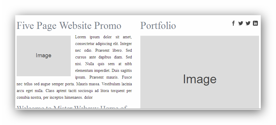
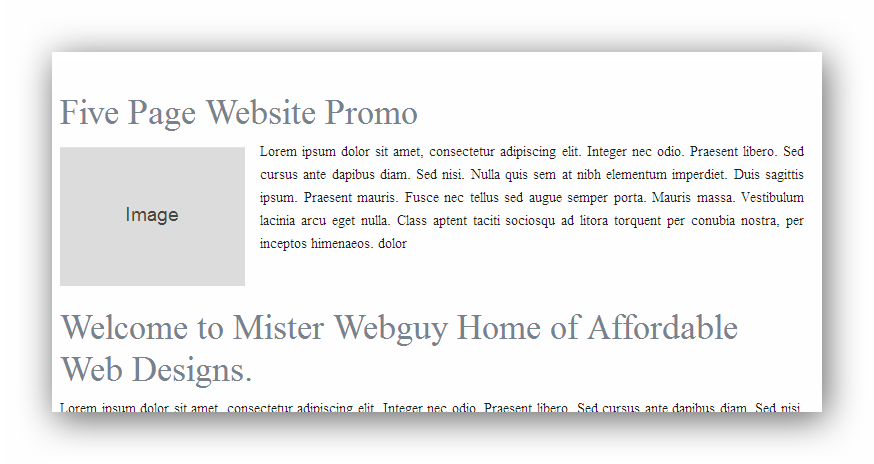
Yeah I can see how you are losing stuff, losing stuff is that the right term, yeah but you know what I mean on the small version. I would imagine in the images I've put is a bit of challenge really, where one thing begins and one ends. I would imagine that this is for tablets, but just a pixel here and there changes the whole layout really

http://i1131.photobucket.com/albums/m555/thenbman/SteveOne.png

http://i1131.photobucket.com/albums/m555/thenbman/SteveTwo.png
User 2088758 Photo


Senior Advisor
3,086 posts

Yes that's right it essentially changes the whole layout.
Taking over the world one website at a time!

Steve Kolish
www.misterwebguy.com

YouTube Channel:
https://www.youtube.com/channel/UCL8qVv … ttneYaMSJA
User 91713 Photo


Registered User
83 posts

@ Steve. Thanks.
"The more I use the program the easier it gets Nigel. You will find it that way too. It takes me no time at all to bang out a grid."
I am with you there. But I noticed that once you've chosen a grid you are stuck to that. You cann't change it on the fly. Something I would love to do.

@G'kar. There are some arguments in favor for starting the design process with mobile first. It is leaner in the code and content distributed to the mobile devices. Although in de desktop-down approach you can set the visibility to none for elements it will still load on all devices. That is often to heavy for a phone, for instance.
The difficulty is that one has to deal with different page-designs and content hierarchy in between the breakpoints. am still struggling with that.
The perfection isn't reached in one pass.

Have something to add? We’d love to hear it!
You must have an account to participate. Please Sign In Here, then join the conversation.