

Layout, Elements & Themes
In this chapter we will be starting the creation of a menu. You’ll get an overview of the different visual controls and and learn to use a bunch of them.
Figure 3: The all new (responsive) Menu Builder ladies and gentleman!
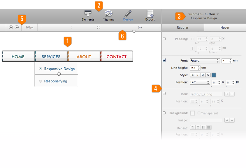
- Preview and Interaction Area
This is where you get a live preview of the changes you make to your menu. You can also interact with the menu to test mouse over actions, clicks and drop downs. - Main Toolbar
Your action settings are found here. Choose to add new elements, or apply a theme to your menu. You can also access the design properties, or export your when ready. - Element Selection Box
Choose which element collection or individual button within your menu you want to work on. You may edit a single button or select an entire group to modify all at once. - Powerful Property Panes
Here the workspace where you will be spending most of your time. These panes contain all the design controls you need to develop your menu. Everything from choosing size, color, fonts, spacing and more. - Breakpoint Management & Width Indicator
You can add or remove breakpoints with the plus and minus buttons. The numbers to the right show the current width of the display (viewport). - Introducing: Sizer & Breaker
You can simulate the width of the device or screen your menu is viewed on with the little triangle named Sizer. The dots allow you to make changes to your design in needed for the different screen sizes. We named this unique tool Breaker. You can learn more about these two groundbreaking tools in Chapter 7.
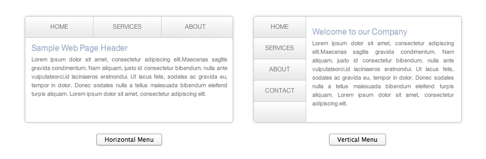
Pick your Layout
The first thing you do is choose a navigation layout or direction. With Menu Builder you can create vertical or horizontal menus (as if there would be anything else). Just choose the one you would like to create and the preview will then change to that particular layout. Vertical menus read from top to bottom and horizontal menus read from left to right. Vertical menus are normally used in a sidebar on the left or right of the page, and horizontal menus are usually displayed at the top area above or below the spotlight area of your site. In the near future we also plan to add support for creating footer navigation menus too, be excited! Once you start editing the menu, you cannot switch navigation layouts, so be sure which one you want to create before adding the elements or changing styles.
Figure 4: Choose a horizontal or vertical layout.
Elements
For this tutorial we will select a horizontal navigation menu. Now that we have our layout selected, we can start creating our menu items. In the Elements section, or 'elements mode', (single click on the element icon in the menu bar up top) you can manage your menu buttons, submenus and submenu buttons. Simply click on the plus button to add a navigation button. Then type the name of the menu element and drag and drop it in the location where you want it to appear.
Figure 5: Menu button, submenu and link management.
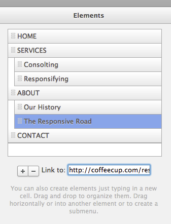
To create a Submenu, just select the button you want to put into a Submenu, click/hold and drag it slightly to the right, under the menu button where you want it to appear. When placed in the the new location, the menu item will indent, showing you that it is now a submenu. To change the text on an already created menu or submenu item, just double click on the text of the respective element in the right pane and it will allow you to edit it.
To add a link to a button, select it with a single click, then type the URL in the box named ‘Link to' below the elements box. Menu Builder supports both absolute and relative URL’s. Research indicates that absolute URL’s have several advantages over relative ones and are considered to be best practice. They are less likely to cause linking issues for search engine spiders and more beneficial when syndicating content like in a Sitemap or RSS feed. Although they might not have an immediate positive impact on search rankings, absolute URL’s are less likely to cause negative effects and hence favored.
To add an absolute link to for example an about page you would type http://www.yourdomain.com/about. The relative link alternative would be ../about.
Themes
Once you have your content and elements in place, look for the toolbar icon called Themes at the top. Here is where you can find predesigned included (or purchased) themes for your menus. You can jump right in and browse the themes included in the program. Select one and you can see what your theme will look like in the live preview area. In the near future you can also click “Get More Themes” to download (or buy) themes from our theme store.
Themes affect the entire menu design, but not your menu structure, button texts or links. So if you have been designing a bit already, hitting the purple apply button will overwrite all previous design settings. Can't wait to toy with all these shiny design controls yourself? Let's do it!