

Your help guide to the first real Content Slider app alive
Responsive Content Slider (RCS) is crazy cool. You can create highly sophisticated designs per slide, or build simple photo-based slide shows.
To create unique slide designs there’s variety of elements such as headings, buttons, icons, and (overlay) containers that can be dragged and dropped. The powerful, visual CSS tools give full style control over each and every element. Alternatively, you can simply start with one of the image-based themes, duplicate the slides and swap out the images. More elements can always be added later, the possibilities are endless as soon as you get a hang of this wonderful app!
Table of contents
If you’re looking for a specific topic to get your slide designs going, you can use the table of contents below to directly jump to the section, video or article of interest.
Getting started and interface overview The theme and template chooserOverview of the five User Interface sections
Working with the default templates. Using images with the picture elementUsing background images
An exceptionally responsive and modern app
RCS is the only slideshow or gallery creator that features a viewport slider and designer defined breakpoints for creating custom responsive designs. Working with the viewport slider and breakpoints to create great user experiences on any screen is easy, as shown by this video for responsive site designer. With Content Slider, layout and design adjustments can be made in a similar way.
The app also supports the <picture> element, allowing you to swap them out for smaller versions on smaller (mobile) screen. And as Suzanne explained, size does matter...especially when unnecessary large images negatively impacting the performance on mobile devices.
The slides rotate, using cool transition effects such as ‘fade’, ‘step’ and (of course) ‘slide’. We will be adding more, but don’t plan to go overboard with crazy effects. Player controls such as ‘play’, ‘next’ and so on are typically placed on the parts of the slideshow that do not rotate. Clearly the other elements can also be placed in these ‘outer’ parts. With granular design control over each of the content and slideshow elements, truly unique showcasing and storytelling experiences can be created. Right within the browser, without template restrictions, and embeddable anywhere.
Content Sliders are the new hipsters
Built with content blocks (HTML elements) and designed with styles (CSS), Content Sliders are very different from ‘Photo Sliders’. Most of us are mainly familiar with (old fashioned) photo sliders. Text, buttons and most other parts of the message are added to the image with a graphics editor. There is no control over the message for smaller screens; the images simply shrink and the image text, buttons or picture panoramas that looked great on a wide screen, becomes indecipherably small.
With a content slider on the other hand, all elements that make up the message are added on a canvas right within the app. And because RCS is responsive, every element, including any added pictures, can be controlled in granular detail for any screen size. There are other advantages too. The content is now accessible by screen readers and indexable by search engines. Also, you can make use of interactive CSS effects such as hover and (later) animations. After all, your website is not a big image (and for good reason), so why would your slides be?
Here’s a good example of transitional slides using content such as text and buttons mixed with images of different dimensions, background styles and more.
How to get started with RCS
The template chooser
The template chooser will give you various options to get started. If you have not worked with any of our other responsive apps, or if you have limited experience with CSS, we recommend starting with one of the default themes. They can be found under the Default folder on the left. We included two start templates with minimal content and design. To familiarize yourself with the app, we recommend replacing the existing pictures and editing the other elements before deleting or adding content. You’ll find that the styles are easy to update and mold into a unique custom design. More details on working with the <picture> element and adding or changing images can be found here. Sometimes background images are used, more details on working with them is available here.
Alternatively you can work from with any of the fully designed themes. They feature a lot more content and showcase a number of design tricks such as (absolute) positioning player controls and moving slides over background images. These themes are a little more involved to work with, but showcase the tremendous powers this app has to offer. Pictures, colors, backgrounds — everything can be updated, replaced, removed, added or tweaked to arrive at a design that is totally yours.
You can also start off a design using any of the blank templates. RCS is the only gallery app offering a mobile first workflow; starting a design for small mobile screen and using breakpoints to improve the user experience for wider screen sizes. With the desktop down templates a design is first created for large screens. Adjustments in layout and design are then made to make the design ‘fit’ smaller screens as well.
We’ll look in a bit more detail to the two default themes to understand the different approaches in a bit. First let’s get to know this versatile app a little better.
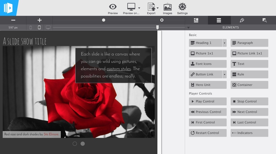
Overview of the interface sections
The User Interface (UI) can be divided in five main sections, they are summarized below
1. The real-time preview and working area: The embedded browser displays the status of the slideshow design in real-time; any changes to the content or design are reflected in immediately. Elements can be selected by single clicking on them, or by selecting them from the drop down on the top-left of each element. Right-clicking on an element shows additional options such as duplicating or editing (text elements only). Double-clicking an element opens the heavily used Design pane.
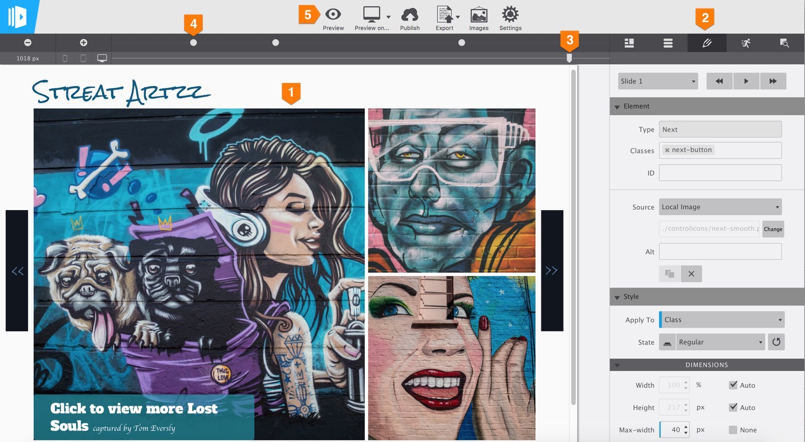
2. The control panes. Most of the design and creation powers of Responsive Content Slider can be found under one of these panes. The Design Pane, the one in the middle indicated by the pencil icon, is probably the most frequently used. This pane is therefore activated when an element is double-clicked. The pane is subdivided in a number of sections, each featuring a plethora of design controls for styling the element. With the ability to use selectors and controls for typography, dimensions, and backgrounds, this pane works very similar to the design pane in Responsive Site Designer.
The Slide Pane is for managing the slides and their rotations. The controls found here are pretty self-explanatory, but we'll add a short overview soon. The Elements Pane contains the content blocks that can be added to the presentation. Just drag-n-drop. Then use the controls on the design pane to whip them in shape!
Oooh...the Animations Pane! You're absolutely right, we do have to write a full tutorial, including cool examples, about that. And we will. For now, please select Presentation Animated from the template chooser and go to Slide 3. Select each of the elements and compare the setting on the (animations) pane. That will probably teach you more than any tutorial could! (Also, convincing people to leave the Adobe clan and join the force will help us expand our team so we can get these types of thing out faster...)
The last pane is the Inspector Pane. It works in a similar way as the inspector tools in Chrome and Firefox. You can use it to select elements, move them around, and view the styles that are applied (at the various breakpoints).
3. The viewport slider. Grab and slide to view what the presentation looks like at various display widths. Remember, there is no magical desktop, tablet or phone width, there are way too many different devices with different dimensions. This means that the design has to look good at every width, at every pixel from ginormous to very small. Breakpoints are used to make the necessary adjustments.
4. Breakpoints. They are represented by the little dots above the width slider. Whenever a design does not look at its best, a breakpoint can be added. As of this point layout and design styles can be updated to accommodate for the smaller screen. Good examples would be reducing font sizes for headings or giving certain elements like paragraph more width so they don't become unreadably small.
Working with the start (default) templates
Using content images with the picture element in the picture theme
The two slides in the ‘picture theme’ are very similar, they both contain the exact same two elements: a picture element and a paragraph functioning as caption for the image. Only the actual picture used and caption text differ. This is a good example of a simple slideshow most people are familiar with. This simple show is both easy to extend and build out into different design.
To replace an image, click the Change button on the Design pane. This brings up a dialog where you can add images to the project and select them for use in a picture element or as background. Selecting any of the images will replace the current image with the selected one. For linking to an online image select Online Image from the drop down and add the URL in the box below.
You can use different (smaller) images for small screens.
You can follow the exact same process using the change button to swap out images at breakpoints for a smaller version. Although that is not done in this theme — I wanted to keep the styles and content at a minimum — this is generally good practice. Our article about the picture element explains this in more detail.
In the ‘Full Blown Light’‘ theme the background images are changed at the breakpoint for a smaller, cropped, version. This makes the image / slideshow load faster on mobile screens while showing specific details of the image.
The texts can be styled on the design pane. These changes will apply to the entire element. Text can be edited, and selections can be formatted in Text Edit Mode. Triple-clicking a text element will start editing mode. Now just type and format selections — add styles, colors etc. with the controls on the pane with the blue bar that appeared on the right — just like with any word or document program.
To extend the show, simply select a slide and click the Duplicate Slide button. The duplicated slide is automatically active as can be seen from the Slide Selection drop down. You can use the steps outlined above to update any text or images. The video below highlights the different steps.
Using background (style) images
Depending on the specific situation, using background images instead of content (HTML) images can have advantages...or disadvantages. If the image is mainly intended as visual improvement — is part of the design of the slide — background images are preferable. Image background tools such as Position and Size give excellent control over how the image will be displayed. The size of the image can be managed in even more detail with the Min-height control of the element the background is applied to (usually a container, slide or the slideshow outer container). At smaller (or larger if you design with a mobile-first — workflow coming in one of the next RCS updates) display widths the image flexes nicely with the other elements and can easily be repositioned or otherwise adjusted if needed.
In addition, other elements such as text and buttons (even other images) can easily be placed on top of the image. Often in combination with semi-transparent backgrounds on these elements, this can create really stunning slide and slideshow designs.
A potential disadvantage is that background images are interpreted as design, not content, by screen readers and search engines. In case an image is (an important) part of the content, it is best practice to use the picture element. In some cases a combination, like for example a big background image applied to the slide with a picture element largely containing the same message, is a good alternative.
To change the images in the ‘background theme’ select the slide and scroll down to the Background section on the design pane. The change workflow here is identical to the workflow described above for the picture element. In fact, just as most of the other controls, the background controls work in the exact same way as described in this article for Responsive Site Designer.
Tips for stellar slides
The workflow, user interface, tools and controls are very similar for all of our responsive apps. In Content Slider the selector system works in the exact same way as in Responsive Site Designer. The same is true for grabbing and dropping content elements and working with the design pane. Check out the links if you want to learn more about these topics or need a refresher. The rest of this section is used to go over tips & tricks specific to creating successful slideshows.
No grid, no glory?
Although we are a big believer of using a grid system when creating a website, we felt this to be potentially limiting when it comes down to content slide design. Slides are typically not as tall as a page and include less content variety. Therefore, we approached each slide as a flexible empty canvas that you can fill as you see fit.
Element positions can be controlled with the dimension and position controls. Sometimes we group elements in containers and position the containers next to each other using a float reducing their width. If the combined width is less than 100% they will appear next to each other. The video below illustrates this. A quick run-through of the themes that came (complimentary) with the pre-release will show you how this works as well.
Maintaining height between slides
In RCS, each slide can have a unique, very different, layout and design. This can cause height differences between the various slides and create a visible ‘jump’ following a transition. For slideshows embedded in a website, this can be undesirable. Luckily there are several ways to maintain the height following transitions.
For slideshows mainly using pictures and very similar designs for each slide, using the exact same image dimensions will keep the height the same. Our default picture theme is a good example of this.
If the image sizes are different, it can be more convenient to use background images instead. In which case the height is (mainly) determined by the min-height setting of the element (usually the slide) with the background image.
Defining a minimal height for the slideshow (container) or slide is usually a good idea in general. Please make sure to always review this for different widths. Text might wrap, potentially causing a slide to become slightly higher than its peers. Adding a breakpoint and adjusting the minimum height will remedy this most of the times. If this is done on the Type selector or if the slides share the same class, this can be done across all slides with a single tweak.
A few of our themes feature very different content and design between slides, yet height is maintained at any display width. Sometimes this is done by not showing paragraph text at the smallest breakpoints. Working from these themes will give you a good feeling for the different approaches. After all, practice makes perfect!
The duplicate slide pitfall
Duplicating slides can be fast and handy when the content and design are similar. However, since the duplicated and original elements share the same classes, style tweaks to the new slide and elements often have an impact on the original, currently not visible, slide. When a slide design differs, it is usually better to create a new blank slide. Then simply add the same classes to the appropriate elements. Alternatively you can an additional class for a design variation or apply styles to the ID.
Publishing slideshows
We are working on two great features that makes publishing, sharing and adding slideshows to Site Designer super fast and easy. In the meantime, you can use the export function and embed the slideshows in any website. You can also upload the files and for standalone usage. Specific instructions on how to add slideshows to a RSD project can be found here.