

Practical responsive site design
Creating a static reference design
There are many, many good existing fixed-width websites. Instead of redoing the entire design and approach, they can be made responsive without too much effort. The first step is to (re)create such a fixed width desktop design with Responsive site Designer. Then we can make the proper adjustments to the layout and design that will make the site look great and be usable at any width device.
As starting point for creating our reference design, we’ll work with a slightly adjusted version of the layout that we used to explain the responsive concept.
We need content to work with!
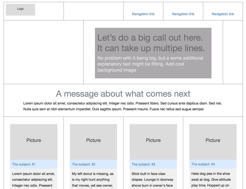
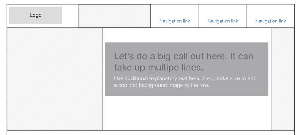
In the example below we popped in a logo, some navigation links, and a big callout message (aka a Hero Unit element). The callout message will appear in the middle of the screen, before any scrolling needs to happen. This section is important, so we’ll want to make sure it grabs the attention of mobile visitors as well when we get to responsifying our creation later.
Then we added a transitional message, which takes up all the cells in the next row. The last visible row uses 4 cells (columns) that contain explanatory texts, some details, and possibly a click action.
We could have continued adding content like buttons and a footer. However, this will be enough to get us started and illustrate how the grid is used to orderly place content on a page. We can always do the lower / extra parts of the page when we’re one with the above.
The initial setup above looks like a very general website template and can probably be used for different types of sites. However when creating this, we already had a pretty good idea of the message we wanted to bring across and what the real content was going to be. After all, designing with real content and purpose in mind is easier, more meaningful, and leads to better results than decorative design.
Several hints of what the site will be about are in place, but for the purpose of this tutorial we’ll add the real content later. First let’s recreate the wireframe above; with either Responsive Layout Makeror Site Designer this will be easy enough. In this case, I am using the Designer. You can download a free trial copy here to follow along (just in case you don’t own RSD yet...).
Want to get familiar with the Responsive Site Designer UI before continuing? It’s not required to finish your first responsive design but if you decide you need more details, you can go here for a good overview of the different sections and control panes.
When the app is opened for the first time (just in case you skipped the link above), you will see the start of a grid in the preview window.
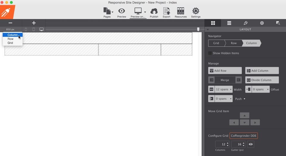
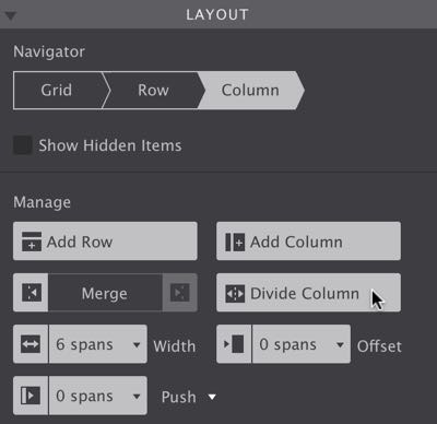
This first row contains a single column (or cell as in the spreadsheet reference we used before). The second row has three different columns. To recreate the structure of the top row in our refence design we need to split up the single column into smaller ones. We do this by clicking on the column, this will select it. Now press the Divide Column button in the pane on the right. Each time the button is pressed, the selected column will be divided in half. Here are the remaining steps to come to the exact same top row structure:
1.
Select the newly created left column and click the Divide Column button again.
2.
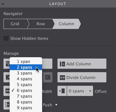
Select the newly created right column and change the width using the Span Width drop down from 6 to 2.
3.
Click the Add Column button twice. The default width is 2 spans (just like 2 merged spreadsheet cells) but following the previous step you would know how to adjust this if needed.
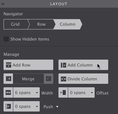
Following this, recreating the other row & column structures is easy. For the second row, we give the first column a span width of 4, the second column a span 7, and the last column a span 1. If you did this in the right order you will see that the last column was placed underneath the other columns...until its width was changed from 2 to 1! Later we’ll be using this principle — column stacking — to adjust the layout for small screens. Now on to inserting content elements in our columns.
Adding content elements
Click on the second tab at the top of the layout pane (the hamburger-like icon) to activate the Elements pane. Then grab the Text Link and drop it in one of the three columns on the top right. Repeat this for the other two columns.
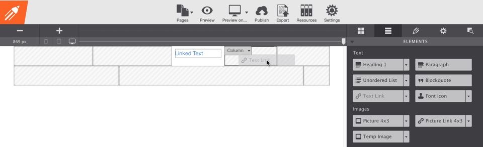
A little arrow is located on the right side of most elements. This opens a drop down with element variations—the logo placeholder image can found under the variations of the Temp Image button. Select it from the drop down and add it to the first column. With that, the content for the first row is complete. However, it does not look the same as in our prototype. For that, we need to go to the third pane.
This third pane, the Design pane, is probably the most frequently used part of the app. Therefore, double-clicking any element will immediately activate it, and put all the design power CSS3 has to offer at your fingertips. Not to worry, the controls are as visual and intuitive as people have come to expect from CoffeeCup. We are going to whip that logo element in shape in just a few clicks!
On the design pane, in the middle of the very first section labeled Element, you’ll see a control called Size Ratio. Change that to 3:1. Then, going down the pane a little further, you’ll find a the Dimensions section. The second control there is Max-Width; entering 180px will make sure the logo never gets wider than that number.
Specifying styles for multiple elements.
Responsive Site Designer uses a cool selector system that makes it possible to specify which elements the styles will be applied to. This allows us to define styles for multiple elements at once. Selector names are automatically generated, but can be customized.
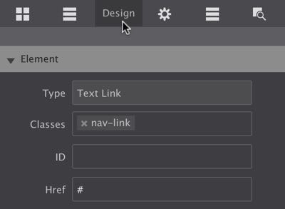
Using a names that correspond to the role of the element is good practice and will save you time later. Below we’re going to give the text links a class called nav-link. Guess what the text link elements will be used for later!
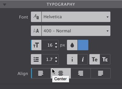
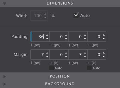
Time to do some work on the text links. First select the text link element on the far right. Then, on the design pane, enter nav-link in the Classes box. To position the link in the middle of the column, go down to the Typography section and set the Align control to center. While we’re in that section we might as well increase the font size a bit. We also want to make the element line up with the bottom of the logo. For that we specify a top Padding of 36px in the Dimensions section. (Using Margin would have had the same effect but you’ll see that the padding comes handy when we will be working on the full design later.) Here are the steps in detail:
1.
Add a class name. We used nav-link.
2.
Set the font size to 16px and click center on the text align control.
3.
Add padding of 36px.
The blue vertical lines like this | on the controls indicate that these styles have now been applied to class(es). Styles can also be applied to other selectors such as the ID. A more detailed article on working with selectors can be found here. Now, in order for us to finish the top row, all we need to do is select the other links and enter the same class name. Just click in the classes input box and the handy autocomplete will do most of the work already!
This also completes the first row. Now, havin the initial experience with the some of the RSD controls behind us, things will only get easier from here.
Creating the attention grabber
The callout message in the second row consists of two elements, a header and a paragraph. To position them together and give them the same background color, a container element that wraps them can be useful. Go ahead, grab a Container (located at the bottom of the elements pane) and drop it in the second column. Now add a header (we are using a Header 2, available under the header drop down) and a Paragraph to the container.
Adding initial styles to the callout.
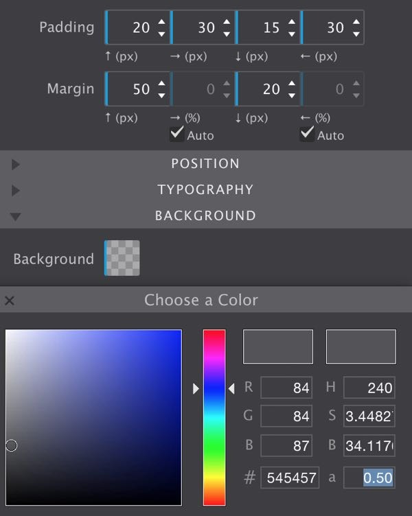
To create space between the border of the container and the text elements, we added a bit of padding. Select the Container then set the padding with pixel values of 20 30 15 30 respectively.
The container is then pushed down using top margin of 50px and centered in the column by checking the margin Auto settings. It gets a bit of room by with 20px bottom margin.
We limit the width of the container a bit by using a max-width of 600px.
For the background color a grey tint is used (for now) with hex value #545457. Also, since we know there will be an image in the background later, it would be nice to make the container ‘see through’. That is what the 0.5 in the a field is for. It makes the background on the container half transparent. This will be clear(er) as soon as we add the actual background image.
You can verify (or copy) your settings using the example image above. The only setting not reflected is the max-width.
Selecting the header and going to the typography section on the design pane, we reduce the the font-size to 32px. The paragraph gets a font-size of 18px and a different color — on the color picker drag the little circle to the top-left to make the font white.
To edit the text in the callout message, we triple-click the element (or select the element and click the edit icon located in the first section of the design pane). This will launch Edit Mode; let’s crank it up and change the header text to:
Let’s do a big call out here. It can take up multiple lines.
Please note that in editing mode, the formatting controls on the right only apply to the selected text, and not to the entire text element. The font colors and size for the entire header or paragraph can be changed in the typography section on the design pane, after leaving edit mode. To stop edit mode, simply click anywhere in the preview window or use the Finish button.
With everything we’ve learned, adding the third row, its content and related basic styles, can be done in about 60 seconds. Really! Here are the steps:
- Go to the layout pane and click Add Row,
- Switch to the elements pane, add a Container. On the design pane give the container a Max-Width of
900pxand set the left and right Margin toauto. - Add a Heading 3 plus a Paragraph to the container. Edit or remove some of the text if you like.
- Double-click the Heading to activate the design pane. In the typography section we
centerAlign the text; then add a Top Margin of about20pxin the dimension section. You can change the auto generated class to something more meaningful (best practice) like ‘section-header’,
BAM—done! Did you time yourself? Now just imagine that you’ll only be able to do this faster as we go…
Building the 4-column row.
On to the last row of the prototype already. Please go ahead and add it from the Layout pane. Then select the column by clicking on it and change the width to a span 3. Now go to the elements pane and add a Picture (the 4x3 will do), a Heading (a heading 3 or 4 seems appropriate) and a Paragraph (remove some of the placeholder text if you like). Next we’ll add some basic styling to these elements, mostly using controls that we already worked with above.
Double-click the picture to edit its width and margins. For width we are using 90%. The top margin is 20px, and the bottom margin 0px. To center the picture we know to set the left and right margin to auto. The heading below gets the same width of 90%. The size of the font can be reduced a bit, we are using 17px. We also want to center align the text as we did before.
Just a few more tweaks to the heading is needed. We want to give if a different background, something we did before on the callout container. Click the Background color tile and change the color to hex #dbeaff. (Make sure the a value is set to 1.) This will look weird, but we’re about to solve that. Simply remove the top and bottom margins and center it with the margin auto checkboxes. Finally add some padding, 12px al around will do for now.
The paragraph gets the exact same treatment for the width, margins and padding. The only difference is the background color, in this case we used #f0f0f0. Again, giving the various elements meaningful class names is good practice, especially considering what will be happening next…
With the first column complete, the row can now be finished in just a few clicks. Make sure the column is selected, then click the Duplicate icon (next to the X) on the design pane. BOOM, column two is ready as well. Adding the next two columns is not that interesting, but here’s something that is: since all elements share the same class, they can all be styled at the same time. Just try it by selecting the heading element and adding some additional top and bottom padding. Cool, uh?
So, what if you want to change the styles for an individual element only?
In that case you can set the Apply To drop down to ID. Now any changes will only apply to the currently selected element. The associated controls will show a yellow indicator instead of a blue one. Alternatively you could also add an additional class, in which case the changes will only be applied to elements that have both classes applied.
You can learn more about the possibilities of this powerful selector system here.
With the recreation of the static structure complete, we can see how it behaves at smaller display widths. Yup, the time to convert our creation into a responsive design has arrived!
All clear?
For any feedback or questions, you can hit me up on twitter. Or just leave a note in the vibrant CoffeeCup forums or our Facebook page. Want to share this article? Please go wild with any of the buttons at the top of the page, Twitter, Facebook, Pinterest or Google+ are all good to me!